


ux和ui
UX designers are constantly thinking about the experience of a concept or product. As we work through the UX process it allows us to discover growth opportunities for existing products or explore improvements to develop an entirely new design concept. It is extremely important that during this process we include the appropriate design principles to deliver the best positive user experience and encourage returned users.
用户体验设计师一直在思考概念或产品的体验。 在我们进行UX流程时,它使我们能够发现现有产品的增长机会或探索改进以开发全新的设计概念。 在此过程中,我们必须包括适当的设计原则,以提供最佳的积极用户体验并鼓励回头用户,这一点极为重要。
As designers, we often ask ourselves, “Are we using the best UX/UI elements to achieve our product’s purpose?” Check out my selection of 10 key UX and UI elements that will help achieve the best positive user experience and save you time on deciding what design components to incorporate.
作为设计师,我们经常问自己:“我们是否使用最佳的UX / UI元素来达到产品的目的?” 查看我选择的10个关键UX和UI元素,这些元素将有助于获得最佳的积极用户体验,并节省您决定合并哪些设计组件的时间。
1. Best Performing CTA buttons
1.效果最好的CTA按钮

Your call-to-action buttons are a highly important feature within your product. It’s crucial that the correct context is added to its action so it can perform effectively to its dedicated purpose. For example, instead of “Buy” use “Buy Now”. Keep it to a maximum of three words.
号召性用语按钮是产品中的一项非常重要的功能。 至关重要的是,将正确的上下文添加到其操作中,以便可以有效地执行其专用目的。 例如,使用“立即购买”代替“购买”。 最多三个字。
2. CTA on Mobile
2.移动版CTA
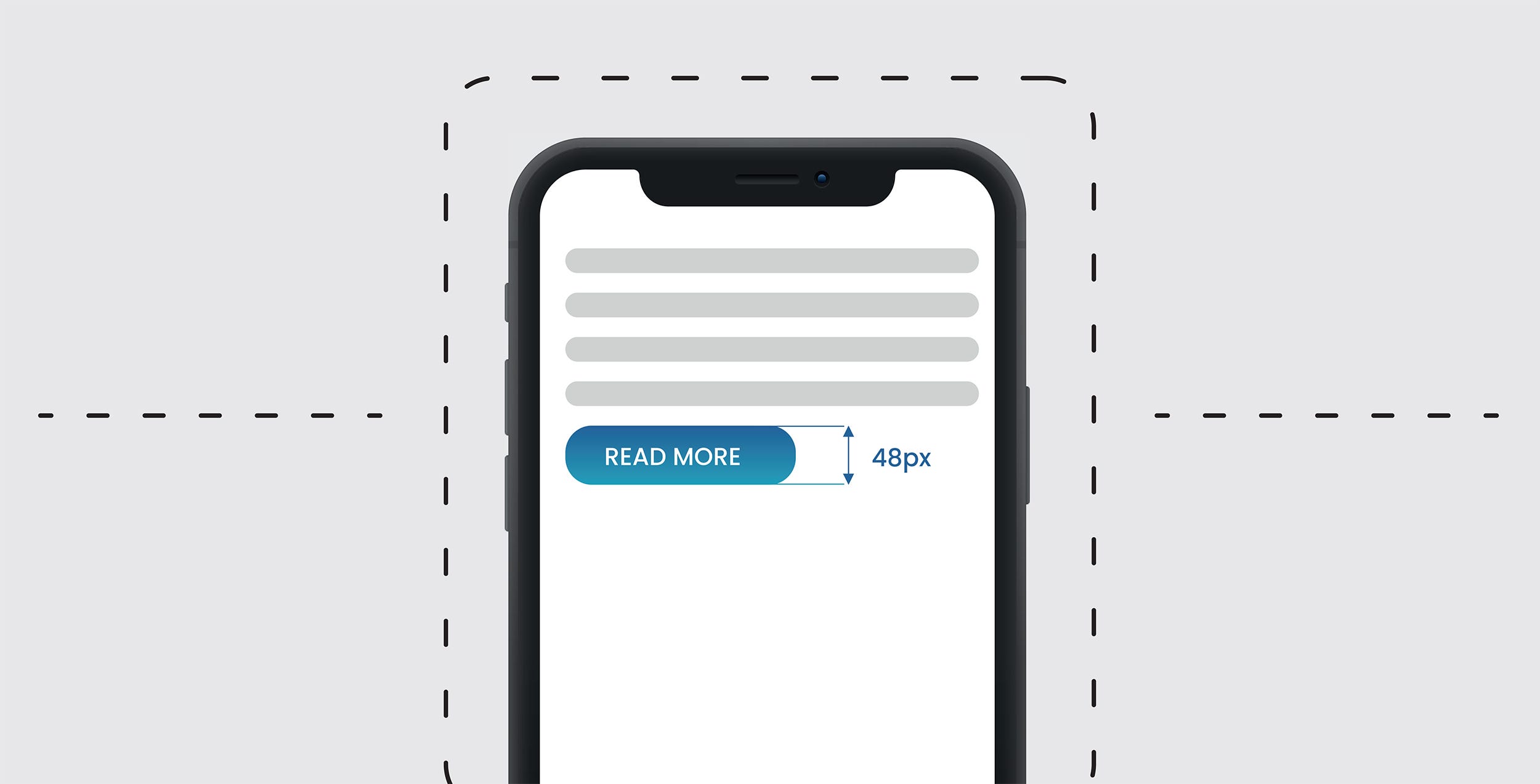
Designers use various sizes for CTA buttons. The article by MIT Touch Lab study of Human Fingertips, indicates the average width of the index finger is 16–20 mm for most adults, which makes the ideal button size 40–50px wide.
设计人员使用各种尺寸的CTA按钮。 麻省理工学院触摸实验室研究人类指尖的文章指出,大多数成年人的食指平均宽度为16-20毫米,这使得理想的按钮尺寸为40-50像素。
Depending what platform in which the application is created for will use different design specs.
根据在哪个平台上创建应用程序,将使用不同的设计规范。
For example:iOS — Button Height 44pxiOS — Clickable area for icons 44x44pxAndroid — Button Height 48pxAndroid — Clickable area for icons 48x48px
例如:iOS-按钮高度44pxiOS-图标的可单击区域44x44pxAndroid-按钮高度48pxAndroid-图标的可单击区域48x48px
3. Primary Action Button
3.主要动作按钮

The primary action button should be prominent, larger in size and easily accessible. The button should also be wider and tappable on mobile as this will always perform better for the users as it is easier for them to confirm an action.
主要操作按钮应突出显示,较大且易于访问。 该按钮也应该更宽且可以点击 在移动设备上,因为这对于用户来说总是会更好,因为他们更容易确认操作。
As stated earlier and as per the MIT Touch Lab study of Human Fingertips publication, the ideal button size 40–50px wide. Therefore, a larger primary action button allows users to hit their target accurately even when their finger is slightly off target.
如前所述,根据麻省理工学院触摸实验室对“人类指尖 ”的研究 ,理想的按钮尺寸为40–50像素宽。 因此,较大的主操作按钮即使用户的手指稍微偏离目标,也可以准确地击中目标。
4. Image Overlaying
4.图像叠加

If you need to bring that WOW factor to emphasise a certain element in your design, consider image overlaying. Visually it becomes more interesting and appealing to the user, drawing their eye to be persuaded in buying the product or signing up for the service.
如果您需要利用WOW因素来强调设计中的某个元素,请考虑使用图像叠加。 在视觉上,它变得更加有趣并吸引了用户,吸引了他们的视线以说服他们购买产品或注册服务。
5. When to use Radio Buttons and Dropdown Menus
5.何时使用单选按钮和下拉菜单
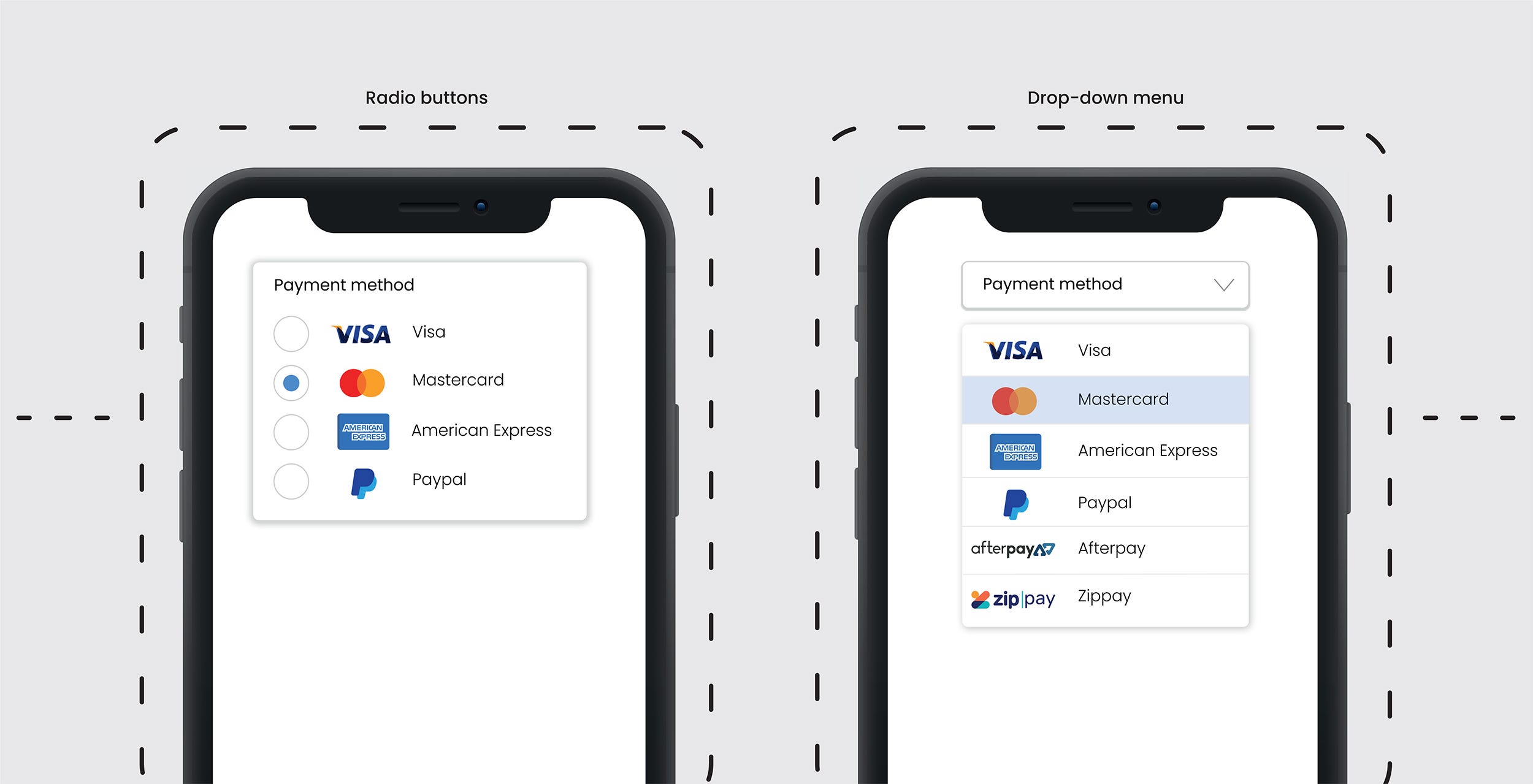
Not sure when to use radio buttons or a dropdown menu? If you want the user to scan the options easily and quickly and have less than 5 options, radio buttons are the perfect feature.
不确定何时使用单选按钮或下拉菜单? 如果您希望用户轻松快速地扫描选项并且选项少于5个,则单选按钮是理想的功能。
When there are more than 5 options or they can be categorised, the drop-down menu is essential as it becomes less cluttered on the UI. Either feature will avoid long scrolling making the users selection quicker and easier.
如果有5个以上的选项,或者可以对其进行分类,则下拉菜单必不可少,因为它在UI上变得不再那么混乱。 两种功能都可以避免长时间滚动,从而使用户选择更加快捷方便。
6. Placeholder — Context of Field Requirement
6.占位符-字段要求的上下文

Using a placeholder with a sample copy example sets a clear direction of what is required and increases form conversion. For example, insert a sample phone number in the field text instead of putting the text “phone number”. Same goes for email, insert a sample email like “alex@gmail.com” instead of the text “email”. It’s a proven UX principle.
在示例副本示例中使用占位符可为要求的内容设定明确的方向,并增加表单转换。 例如,在字段文本中插入示例电话号码,而不是在文本中输入“电话号码”。 电子邮件也是如此,请插入示例电子邮件,例如“ alex@gmail.com”,而不是文本“ email”。 这是行之有效的UX原理。
7. Error Message
7.错误讯息

We often make mistakes and when we do it’s important to offer suggestions to correct our errors. To boost conversion rates the ‘instructional’ error message needs to be short and concise.
我们经常会犯错误,并且当我们这样做时,提供纠正错误的建议很重要。 为了提高转换率,“说明性”错误消息必须简短明了。
The style of the error fields needs to be distinguishable from the normal input field as well as careful placement of the error message. We need users to read the error instruction and follow to correctly fill in the field.
错误字段的样式需要与普通输入字段区分开,并且必须仔细放置错误消息。 我们需要用户阅读错误说明并按照要求正确填写该字段。
The style and location of the error will help users easily spot where they have made mistakes and rectify them promptly.
错误的样式和位置将帮助用户轻松发现错误所在并及时纠正。
8. Icons
8.图标
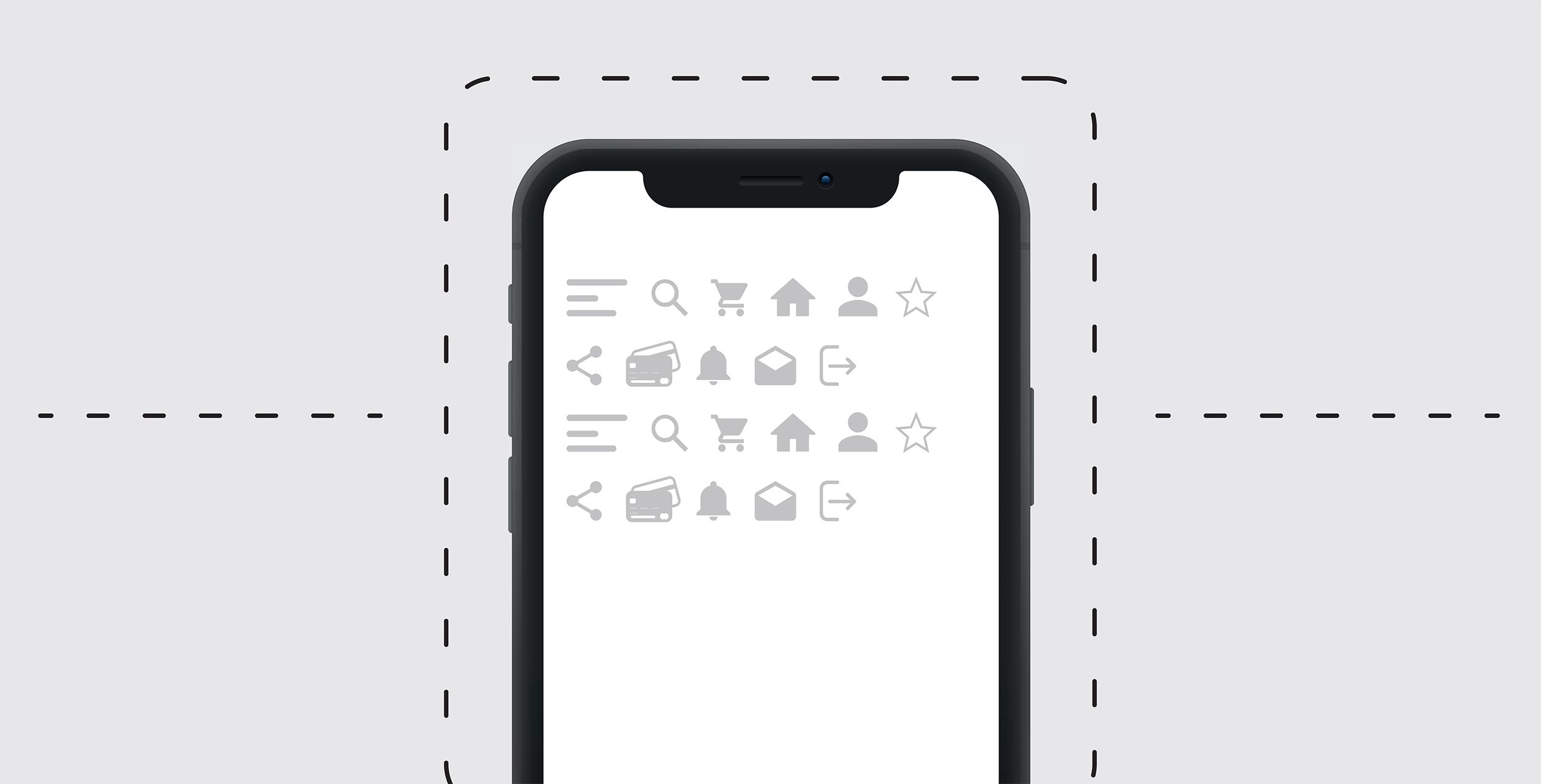
The use of icons should always have a primary goal to communicate a concept quickly. The design should have an understandable symbol that is readable, represents a strong meaning and reinforces the functionality that can’t best be described with words. Overusing icons is a big UI mistake, often compromising the UX so make sure you use them purposefully.
图标的使用应始终以快速传达概念为主要目标。 设计应具有易于理解的易于理解的符号,代表强烈的含义并增强了无法用文字最好地描述的功能。 过度使用图标是一个很大的UI错误,通常会损害UX,因此请确保有目的地使用它们。
9. Create a Hierarchy of Text Styles and Fonts
9.创建文本样式和字体的层次结构

Developing a hierarchy of text styles and choosing fonts before a products UI development is started is extremely important for consistent UI design within the entire project. To do this, you need to create a design system for your product displaying hierarchy of styles with text styles starting from the largest to the smallest and keeping it to a minimum of 2 typefaces. That does not mean you can’t use more, but it’s better not to.
在开始产品UI开发之前,开发文本样式的层次结构并选择字体对于整个项目中一致的UI设计非常重要。 为此,您需要为产品创建一个设计系统,以显示样式的层次结构,并使用从最大到最小的文本样式,并将其保持为最少2种字体。 这并不意味着您不能使用更多,但最好不要使用。
Use a font that has a font family with various weights like light, regular, medium, bold and extra bold, as well as styles like condensed, expanded, and italic. This will add some more dynamics to your design without adding an additional typeface.
请使用具有各种字体(包括轻,常规,中号,粗体和超粗体)以及压缩,扩展和斜体样式的字体的字体。 这将为您的设计添加更多动态效果,而无需添加其他字体。
10. Colours & Gradients
10.颜色和渐变

Colours are an essential part of visual design language you use to communicate with your users. 5 colours are a good maximum when designing your design system. If you do decide to use more colours, you will notice it’s harder to use them effectively.
颜色是您用来与用户交流的视觉设计语言的重要组成部分。 设计设计系统时,最好选择5种颜色。 如果您决定使用更多的颜色,则会发现有效地使用它们更加困难。
If you are working on a brand colour scheme, ideally you will have between 1–4 colours depending on the vision of your brands product or service.
如果您正在使用品牌配色方案,则理想情况下,根据品牌产品或服务的愿景,您将拥有1-4种颜色。
Gradients make objects stand out by adding a new dimension to the design and add realism to the object. Whether your gradients are used in backgrounds, image overlays, illustrations, or logos, it adds more depth to your design. However, make sure you don’t overload with too many colours within the gradient, use two or three.
渐变通过在设计中添加新尺寸并为对象增加逼真度来使对象脱颖而出。 无论您的渐变是用于背景,图像叠加层,插图还是徽标,它都可以为您的设计增加深度。 但是,请确保不要在渐变中添加过多颜色,而应使用两种或三种。
Not only do gradients add depth to your visual elements but they can also be used to control the user flow in applications or websites. A well-designed gradient subconsciously leads the user’s eye towards the focal point and creates a seamless flow.
渐变不仅可以增加视觉元素的深度,还可以用于控制应用程序或网站中的用户流量。 精心设计的渐变会在不知不觉中将用户的视线引向焦点,并创造出流畅的流程。
Closing NoteThe UX and UI elements mentioned above are designed to sustain users and deliver growth because they create a seamless and positive experience for the user. I have selected these 10 based on my own work experience, takeaways from research and design articles and discussing with other UX/UI Designers.
结束语上面提到的UX和UI元素旨在维持用户并实现增长,因为它们为用户创造了无缝,积极的体验。 我根据自己的工作经验,研究和设计文章的摘录以及与其他UX / UI设计师的讨论中选择了这10个。
Robert Golotta, a UX/UI/Digital/Graphic Designer has years of experience in solving business problems for clients and brands. Robert creates beautiful visuals and engaging digital products that provide positive experiences for users and increased brand awareness and company growth.
UX / UI /数字/图形设计师Robert Golotta具有多年为客户和品牌解决业务问题的经验。 Robert创造了精美的视觉效果和引人入胜的数字产品,为用户提供了积极的体验,并提高了品牌知名度和公司发展。
ux和ui


 扫一扫
扫一扫

 被折叠的 条评论
为什么被折叠?
被折叠的 条评论
为什么被折叠?
 到【灌水乐园】发言


