


令牌桶生成令牌
This is a three-part series where I present what I believe is a great way to consume and maintain design tokens. Examples are written in React and styled-components but the ideas in this article could be adapted to any frameworks.
这是一个分为三个部分的系列文章,我在此介绍我认为是消费和维护设计令牌的一种好方法。 示例是用React和样式化组件编写的,但是本文中的思想可以适用于任何框架。
介绍 (Introduction)
In Part 1 of this series, we came up with a set of desired interfaces for consuming design tokens. In this article, we implement the tokens to fit those interfaces. In Part 3, we will look at how to make the tokens more maintainable.
在本系列的第1部分中,我们提出了一组使用设计令牌的所需接口。 在本文中,我们实现了令牌以适合这些接口。 在第3部分中,我们将研究如何使令牌更易于维护。
流程 (The Process)
There will not be a lot of reading/reasoning in this article. I will follow through each iteration, as defined in the last article, and show you what the design tokens might look like at each stage. To see the reasoning behind each iteration please see Part 1.
本文将不会有太多的阅读/理由。 我将按照上一篇文章中的定义进行每次迭代,并向您展示设计令牌在每个阶段的外观。 要查看每个迭代背后的原因,请参阅第1部分 。
We start by assuming that our tokens are initially defined like so:
我们首先假设我们的令牌最初是这样定义的:
const tokens = {
  orange: "#ff9b00",
  purple: "#5f259f",
  blue: "#0096e6",
  red: "#ff0000",
  white: "#ffffff",
  lighter: "#e8e8e8",
  lightest: "#b2b2b2",
  dark: "#999999",
  darker: "#666666",
  darkest: "#333333",
  black: "#000000",
};
迭代1 (Iteration 1)
In this iteration, we want to group the tokens together by type; whether they are text color or background colors or icon color.
在此迭代中,我们希望按类型将标记分组在一起; 它们是文本颜色还是背景颜色还是图标颜色。
Desired interface:
所需接口:
const MyBanner = styled.div`
  color: ${tokens.text.darkGray}; //color: #333333
  background-color: ${tokens.background.purple};
`;
New token definition:
新令牌定义:
const tokens = {
  text: {
    orange: "#ff9b00",
    purple: "#5f259f",
    blue: "#0096e6",
    red: "#ff0000",
    white: "#ffffff",
    grayDarkest: "#333333",
  },
  background: {
    orange: "#ff9b00",
    purple: "#5f259f",
    blue: "#0096e6",
    white: "#ffffff",
    grayLightest: "#b2b2b2",
    black: "#000000",
  },
  icon: {
    white: "#ffffff",
    grayDark: "#999999",
  },
};
迭代2 (Iteration 2)
Next, we introduce other token categories such as sizes (font sizes, line heights)and layouts (media queries, z-indices).
接下来,我们介绍其他令牌类别,例如大小(字体大小,行高)和布局(媒体查询,z索引)。
Desired interface:
所需接口:
const MyBanner = styled.div`
  color: ${tokens.color.text.darkGray}; //color: #333333
  background-color: ${tokens.color.background.purple};
  font-size: ${tokens.size.font.sm1};
  line-height: ${tokens.size.lineHeight.small};
  @media (min-width: ${tokens.layout.media.tablet}) {
    font-size: ${tokens.size.font.lg1};
    z-index: ${tokens.layout.zIndex.bottomlessPit};
  }
`;
New Token Definition:
新令牌定义:
const tokens = {
  color: {
    text: {
      orange: "#ff9b00",
      purple: "#5f259f",
      ...
    },
    background: {
      orange: "#ff9b00",
      purple: "#5f259f",
    ...
    },
    icon: {
      orange: "#ff9b00",
      purple: "#5f259f",
    ...
    },
  },
  layout: {
    media: {
      tablet: "640px",
    ...
    },
    zIndex: {
      bottomlessPit: "-9999",
    ...
    },
  },
  size: {
    border: {
      small: "solid 1px",
    ...
    },
    font: {
      sm1: "12px",
    ...
    },
    lineHeight: {
      small: "1",
    ...
    },
    radius: {
      small: "4px",
    ...
    },
  },
};
迭代3 (Iteration 3)
In this iteration, we want to simplify the interface by including CSS property name as part of the tokens.
在此迭代中,我们希望通过将CSS属性名称作为令牌的一部分来简化接口。
Desired interface:
所需接口:
const {color, size, layout} = tokens;
const MyBanner = styled.div`
  ${color.text.darkGray}; //color: #333333
  ${color.background.purple};
  ${size.font.sm1};
  ${size.lineHeight.small};
  ${layout.media.tablet} {
    ${size.font.lg1};
    ${layout.zIndex.bottomlessPit};
  }
`;
New tokens:
新令牌:
const tokens = {
  color: {
    text: {
      orange: "color: #ff9b00",
      purple: "color: #5f259f",
      ...
    },
    background: {
      orange: "background-color: #ff9b00",
      purple: "background-color: #5f259f",
      ...
    },
  },
  layout: {
    media: {
      tablet: "@media (min-width: 640px)",
      ...
    },
    zIndex: {
      bottomlessPit: "z-index: -9999",
      ...
    },
  },
  size: {
    border: {
      small: "border: solid 1px",
      ...
    },
    font: {
      sm1: "font-size: 12px",
      ...
    },
    lineHeight: {
      small: "line-height: 1",
      ...
    },
    radius: {
      small: "border-radius: 4px",
      ...
    },
}
迭代4 (Iteration 4)
Next, we want to name colors not by their color names, but according to the purpose it serves on the page.
接下来,我们不想使用颜色名称来命名颜色,而是根据其在页面上使用的目的来命名。
Desired interface:
所需接口:
const MyBanner = styled.div`
  ${color.text.alt}; //color: #999999 OR color: #FFC0CB
  ${color.background.main1};
  ${color.border.alt};
`;
New Tokens:
新令牌:
const tokens = {
  color: {
    text: {
      brand1: "color: #ff9b00",
      brand2: "color: #5f259f",
      interaction: "color: #0096e6",
      error: "color: #ff0000",
      inverse: "color: #ffffff",
      default: "color: #666666",
      alt: "color: #333333",
    },
    background: {
      brand1: "background-color: #ff9b00",
      brand2: "background-color: #5f259f",
      interaction: "background-color: #0096e6",
      default: "background-color: #ffffff",
      alt: "background-color: #b2b2b2",
      inverse: "background-color: #000000",
    },
  },
  ...
}
迭代5 (Iteration 5)
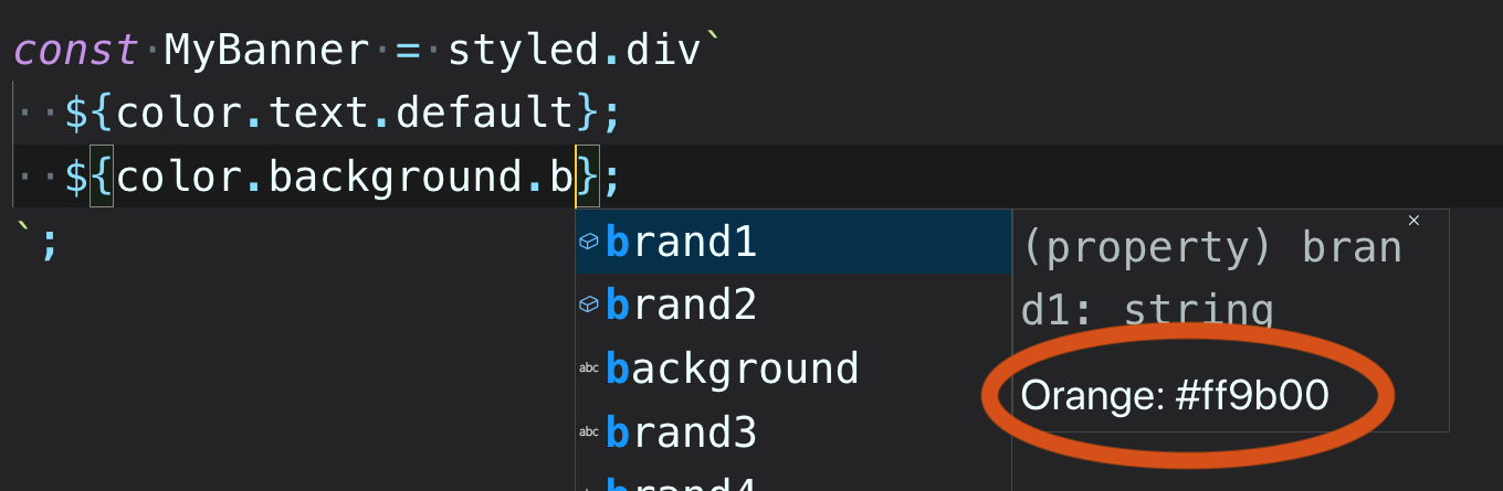
With Iteration 5, we want intellisense to give us more information about the tokens we are using. The interface itself does not change, but we need to add comments into the token definitions:
对于迭代5,我们希望智能感知为我们提供有关正在使用的令牌的更多信息。 接口本身不会改变,但是我们需要在令牌定义中添加注释:
New Tokens:
新令牌:
const tokens = {
  color: {
    text: {
      /** Orange #ff9b0 */
      brand1: "color: #ff9b00",
      /** Purple #5f259f */
      brand2: "color: #5f259f",
      /** Blue #0096e6 */
      interaction: "color: #0096e6",
    ...
  },
  layout: {
    media: {
      /**  min-width: 640px */
      tablet: "@media (min-width: 640px)",
      /**  min-width: 940px */
      desktop: "@media (min-width: 940px)",
      /**  min-width: 1200px */
      largeDesktop: "@media (min-width: 1200px)",
    },
    zIndex: {
      /** -9999 */
      bottomlessPit: "z-index: -9999",
      /**  1*/
      default: "z-index: 1",
      /**  800 */
      overlay: "z-index: 800",
      /**  9999 */
      overTheMoon: "z-index: 9999",
    },
  },
  ...
};
You can already see that this is getting quite complicated. We will talk about how to simplify things so they are more maintainable in Part 3. For now, lets keep going.
您已经看到,这变得非常复杂。 在第3部分中,我们将讨论如何简化事物,使它们更易于维护。现在,让我们继续。
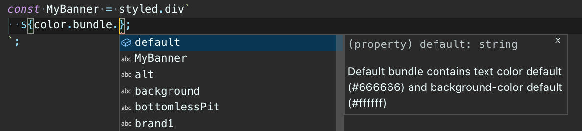
迭代6 (Iteration 6)
For this iteration, we want to be able to bundle together CSS properties that always go together. For example text color and background color combo:
对于此迭代,我们希望能够将始终在一起CSS属性捆绑在一起。 例如文本颜色和背景颜色组合:
const Banner = styled`
  ${color.bundle.bgTextInverse}`const Button = styled`
  ${color.bundle.bgTextDefault}
`
We can add this into our tokens like so:
我们可以像这样将其添加到令牌中:
const tokens = {
  color: {
    bundles: {
      /** Default bundle contains text color default (#666666)
          and background-color default (#ffffff) */
      default: "color: #666666; background-color: background-color: #ffffff;"
    },
    ...
  },
  ...
};
Make sure you don’t forge the doc:
确保您不伪造文档:
迭代7 (Iteration 7)
Lastly, we want to expose typescript interfaces with the keys of the tokens. To do this, we would write something like:
最后,我们要使用令牌的键公开Typescript接口。 为此,我们将编写如下内容:
export interface ColorBundleKey = "default" | "inverse";
export interface ColorTextKey = "default" | "inverse" | "error"
export interface BgTextKey = "defualt | "inverse" | "alt"
...
结论 (Conclusion)
Here’s what our final tokens looks like:
这是我们最终的代币外观:
const tokens = {
  color: {
    bundle: {
      /**  Text color default (#333333) and background-color default (#ffffff) */
      default: "color: #333333; background-color: #ffffff;",
      /**  Text color inverse (#ffffff) and background-color inverse (#000000) */
      inverse: "color: #ffffff; background-color: #000000;"
    },
    text: {
      /** Orange #ff9b0 */
      brand1: "color: #ff9b00",
      /** Purple #5f259f */
      brand2: "color: #5f259f",
      /** Blue #0096e6 */
      interaction: "color: #0096e6",
      /** Red #ff0000 */
      error: "color: #ff0000",
      /** White #ffffff */
      inverse: "color: #ffffff",
      /** Darkest Gray #333333 */
      default: "color: #333333",
    },
    background: {
      /** Orange #ff9b00 */
      brand1: "background-color: #ff9b00",
      /** Purple #5f259f */
      brand2: "background-color: #5f259f",
      /** Blue #0096e6 */
      interaction: "background-color: #0096e6",
      /** White #ffffff */
      default: "background-color: #ffffff",
      /** Gray #b2b2b2 */
      alt: "background-color: #b2b2b2",
      /** Black #000000 */
      inverse: "background-color: #000000",
    },
    icon: {
      /** Black #ffffff */
      white: "color: #ffffff",
      /** Black #999999 */
      grayDark: "color: #999999",
      /** Blue #0096e6 */
      interaction: "color: #0096e6",
    },
  },
  layout: {
    media: {
      /**  min-width: 640px */
      tablet: "@media (min-width: 640px)",
      /**  min-width: 940px */
      desktop: "@media (min-width: 940px)",
      /**  min-width: 1200px */
      largeDesktop: "@media (min-width: 1200px)",
    },
    zIndex: {
      /** -9999 */
      bottomlessPit: "z-index: -9999",
      /** 200 */
      dropdown: "z-index: 200",
      /** 400 */
      sticky: "z-index: 400",
      /** 600 */
      popover: "z-index: 600",
      /**  1*/
      default: "z-index: 1",
      /**  800 */
      overlay: "z-index: 800",
      /** 1000 */
      modal: "z-index: 1000",
      /** 1200 */
      snackbar: "z-index: 1200",
      /** 1400 */
      spinner: "z-index: 1400",
      /**  9999 */
      overTheMoon: "z-index: 9999",
    },
    size: {
      font: {
        /** 12px - Small fonts starts at 12px and increments by 2 */
        sm1: "font-size: 12px",
        /** 14px - Small fonts starts at 12px and increments by 2 */
        sm2: "font-size: 14px",
        /** 16px - Small fonts starts at 12px and increments by 2 */
        sm3: "font-size: 16px",
        /** 18px - Small fonts starts at 12px and increments by 2 */
        sm4: "font-size: 18px",
        /** 24px - Large fonts starts at 24px and increments by 8 */
        lg1: "font-size: 24px",
        /** 32px - Large fonts starts at 24px and increments by 8 */
        lg2: "font-size: 32px",
        /** 40px - Large fonts starts at 24px and increments by 8 */
        lg3: "font-size: 40px",
        /** 48px - Large fonts starts at 24px and increments by 8 */
        lg4: "font-size: 48px",
      },
    }
  },
};type ColorBundleKeys = keyof typeof tokens.color.bundle
type ColorBackgroundKeys = keyof typeof tokens.color.background
type ColorTextKeys = keyof typeof tokens.color.text
type ColorIconKeys = keyof typeof tokens.color.icon
type LayoutMediaKeys = keyof typeof tokens.layout.media
type LayoutZIndexKeys = keyof typeof tokens.layout.zIndex
type SizeFontKeys = keyof typeof tokens.size.font
This works, and it satisfies all the requirements we came up with in Part 1. However, it looks a little bit intimidating and could be a bit difficult to maintain. We’ll refer to this structure as the Consumption-friendly-format from now and. And in Part 3, we’ll look at how to make it easier to maintain.
这行得通,并且满足了我们在第1部分中提出的所有要求。 但是,它看起来有点吓人,可能很难维护。 从现在开始,我们将这种结构称为“ 消耗友好”格式 。 在第3部分中,我们将研究如何使其更易于维护。
令牌桶生成令牌


 812
812


 被折叠的 条评论
为什么被折叠?
被折叠的 条评论
为什么被折叠?
 到【灌水乐园】发言


