


 这篇博客介绍了如何在Android应用中创建一个既优美又灵活的进度条视图,详细解析了rcp(Rich Client Platform)在视图构建过程中的使用方法。
rcp 在视图中创建进度条
Progressbar is one of the most frequently used widgets in Android development. However as we know, the default ProgressBar provided by Android SDK has poor customizable options. There is no way to show the current progress value, no progress animations, no gradient/rounded basic attributes. Every time we should create a different drawable XML file, but it is still limited. This posting is about how to implement a polished and flexible ProgressView, fully customizable with animations and its UX design philosophy.
P rogressbar在Android开发中最常用的部件之一。 但是,正如我们所知,Android SDK提供的默认ProgressBar具有很差的自定义选项。 无法显示当前进度值,没有进度动画,没有渐变/四舍五入的基本属性。 每次我们应该创建一个不同的可绘制XML文件时,它仍然受到限制。 这篇文章是关于如何实现优美而灵活的ProgressView的 ,该动画可以完全通过动画及其UX设计理念进行自定义。
UX哲学 (UX philosophy)
Generally, progressBar draws only progress. So we have to create a TextView or another view for showing the progress to users.
通常,progressBar仅绘制进度。 因此,我们必须创建一个TextView或另一个视图来向用户显示进度。

This kind of design has some bad points.- We have to manage one more separate resource like TextView.- Requires more spaces in the layout.- We have to make new text color definitions for supporting Dark mode.- From the perspective of UX, users have to look separated two views and merge as one in their heads.
这种设计有一些坏处。-我们必须管理一个单独的资源,例如TextView。-需要在布局中占用更多空间。-我们必须创建新的文本颜色定义以支持深色模式。-从UX的角度来看,用户必须将两个视图分开,然后合并为一个视图。
Then how can we make it better?
那我们怎样才能使它更好呢?

Integrating the TextView and progress bar is a very simple solution. Now we have to resolve one more issue, the color of the TextView. If we align the textView in the center, the color of the TextView should be changed following progress. So the result will be that some letters would be colored and the rests are not colored. Depending on the color, the readability may be poor because the color of the TextView does not have consistency.
集成TextView和进度条是一个非常简单的解决方案。 现在,我们必须解决另一个问题,即TextView的颜色。 如果我们将textView居中对齐,则应随进度更改TextView的颜色。 因此,结果是有些字母会着色,其余字母不会着色。 取决于颜色,由于TextView的颜色不一致,因此可读性可能很差。
So what is the next candidate?
那么下一个候选人是什么?

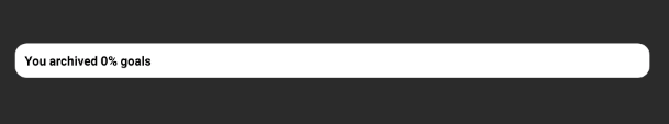
TextView is integrated into the progress bar and the TextView moves flexibly according to the progress. If the width size of the TextView is bigger than the width size of the progress, the TextView will be located on the outside (right side) of the progress bar. We can consider the color of the TextView according to the background color of the container. And if the width size of the progress is bigger than the width size of the TextView, the TextView will be located on the inside of the progress bar.
TextView已集成到进度条中,并且TextView根据进度灵活移动。 如果TextView的宽度大于进度的宽度,则TextView将位于进度条的外部(右侧)。 我们可以根据容器的背景色来考虑TextView的颜色。 并且,如果进度的宽度大小大于TextView的宽度大小,则TextView将位于进度条的内部。
Now the TextView has the color consistency, and looks more polished! I was inspired by Bella Choi who worked with me in the previous company as a UI/UX designer.
现在,TextView具有颜色一致性,并且看起来更加优美! 我受到Bella Choi的启发,他曾在我之前的公司担任UI / UX设计师。
包括在您的项目中 (Including in your project)
Now let’s include the ProgressView in our project!Firstly we should add a dependency code to your module’s build.gradle file.
现在让我们在项目中包含ProgressView!首先,我们应该在模块的build.gradle文件中添加一个依赖代码。
dependencies {
    implementation "com.github.skydoves:progressview:1.0.8"
}
If you want to get the latest version, you can check it here.
如果要获取最新版本,可以在此处进行检查。
如何使用 (How to use)
Here is a basic example of implementing ProgressView in your XML layout.
这是在XML布局中实现ProgressView的基本示例。
<com.skydoves.progressview.ProgressView
  android:id="@+id/progressView1"
  android:layout_width="match_parent"
  android:layout_height="35dp"
  app:progressView_colorBackground="@color/white" // the color of the container.
  app:progressView_colorProgress="@color/skyBlue" // the color of the progress bar.
  app:progressView_progress="40" // progress value.
  app:progressView_min="15" // min progress value.
  app:progressView_max="100" // max progress value.
  app:progressView_progressFromPrevious="true" // animates progress from previous progress.
  app:progressView_autoAnimate="true" // starts filling animation automatically when finishing inflate.
  app:progressView_radius="12dp" // the corner radius of the progressView and progress bar.
  app:progressView_padding="1dp" // the padding of the progress bar.
  app:progressView_labelColorInner="@color/white" // the text color when the label placed on the progress bar.
  app:progressView_labelColorOuter="@color/black" // the text color when the label placed out of the progress bar.
  app:progressView_labelSize="13sp" // the label text size.
  app:progressView_labelSpace="10dp" // the space size of the between label and progress bar.
  app:progressView_labelText="achieve 65%" // the text of the label.
  app:progressView_labelTypeface="bold" // the typeface of the label.
 />
We can fully customize the attributes of the ProgressView including colors, min/max/current progress, animation, rounding, padding, spaces between the label and progress bar.
我们可以完全自定义ProgressView的属性,包括颜色,最小/最大/当前进度,动画,舍入,填充,标签和进度条之间的空格。
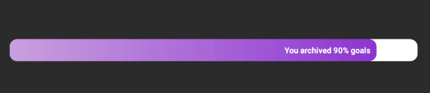
梯度 (Gradient)

We can give a gradient effect to the progress bar using the below attributes.
我们可以使用以下属性为进度栏提供渐变效果。
app:progressView_colorGradientStart="@color/md_yellow_100" // starting color of the gradient.
app:progressView_colorGradientEnd="@color/md_yellow_200" // ending color of the gradient.
We can change the progress color and gradient colors using the below methods.
我们可以使用以下方法更改进度颜色和渐变颜色。
progressView.highlightView.color = ContextCompat.getColor(this, R.color.colorPrimary)
progressView.highlightView.colorGradientEnd = ContextCompat.getColor(this, R.color.colorPrimary)
progressView.highlightView.colorGradientStart = ContextCompat.getColor(this, R.color.colorPrimary)
动画制作 (Animations)
We can implement progress animations when the progress value is changed. There is four basic animations are provided in this library.
当进度值更改时,我们可以实现进度动画。 该库提供了四个基本动画。
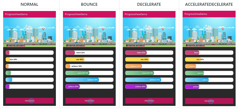
We can control the progress filling animation using the below attributes or method.
我们可以使用以下属性或方法控制进度填充动画。
app:progressView_autoAnimate="true" // starts filling animation automatically when progress is changed.


// if you want to animate progress from previous progress.
app:progressView_progressFromPrevious="true"


// or we can animate manually using below method.
progressView.progressAnimate()
突出效果 (Highlighting Effect)

We can give a highlighting effect on the progress bar when clicked.
单击时,我们可以在进度栏上突出显示效果。
app:progressView_highlighting="true" // gives the highlighting effect or not.
app:progressView_highlightAlpha="0.8" // the alpha of the highlight.
app:progressView_highlightColor="@color/skyBlue" // the color of the highlight.
app:progressView_highlightWidth="1.5dp" // the thickness of the highlight.
app:progressView_padding="1.5dp" // the padding of the progress bar.
Here is the real code result.
这是真实的代码结果。
The highlighting effect will be shown on the progress bar exclude the container. We can improve the visuality using a popup or toast. Here is one more tip, we can get the highlight view from the progress view, and we can show up the popup in the center of the progress. The height of the highlight view is variable, so we can improve something using the highlight view.
突出显示效果将显示在进度条上(不包括容器)。 我们可以使用弹出窗口或烤面包来改善视觉效果。 这是另一个提示,我们可以从进度视图中获取突出显示视图,并可以在进度中心显示弹出窗口。 高光视图的高度是可变的,因此我们可以使用高光视图来改善某些功能。
OnChangeListener,OnClickListener (OnChangeListener, OnClickListener)
We can listen to the progress value is changed or the progress bar is clicked. By using the OnProgressChangeListener we can listen about the progress value changing and we can change the label text using the changed progress value. Also, we can use the OnProgressClickListener instead of the OnClickListener. The difference is OnProgressClickListener will be invoked when clicked the progress bar excluding the container.
我们可以听进度值更改或单击进度条。 通过使用OnProgressChangeListener,我们可以侦听进度值的更改,并可以使用更改后的进度值更改标签文本。 另外,我们可以使用OnProgressClickListener代替OnClickListener。 区别在于,单击进度条(不包括容器)时,将调用OnProgressClickListener。
progressView.setOnProgressChangeListener(new OnProgressChangeListener() {
  @Override
  public void onChange(float progress) {
    progressView.setLabelText(progress + "% archived");
  }
});


progressView.setOnProgressClickListener(new OnProgressClickListener() {
  @Override
  public void onClickProgress(boolean highlighting) {
    // do something
  }
});


// We can simplify it using kotlin.
progressView.setOnProgressChangeListener { progressView.labelText = "achieve ${it.toInt()}%" }
progressView.setOnProgressClickListener { Toast.makeText(baseContext, "clicked", Toast.LENGTH_SHORT).show() }
结论 (Conclusion)
In this posting, we looked around how ProgressView library is originated and how to use it. Android developers should understand basic UI/UX related philosophies because we are coworking with designers directly and anyway we are creating visible things. So we should combine well the designs and development philosophy to suit each situation in the company’s project.
在这篇文章中,我们研究了ProgressView库是如何产生的以及如何使用它。 Android开发人员应该了解与UI / UX相关的基本原理,因为我们直接与设计师合作,无论如何我们都在创造可见的东西。 因此,我们应该将设计和开发理念很好地结合起来,以适合公司项目中的每种情况。
You can reference more details about the ProgressView in the below link!
您可以在下面的链接中参考有关ProgressView的更多详细信息!
翻译自: https://medium.com/swlh/a-polished-and-flexible-progress-view-for-android-5a4e90eff25e
rcp 在视图中创建进度条


 扫一扫
扫一扫
 1463
1463

 被折叠的 条评论
为什么被折叠?
被折叠的 条评论
为什么被折叠?
 到【灌水乐园】发言


