


kotlin 隐藏 组件
系列路线图 (Series Roadmap)
Android provides us with a huge set of views that already cater to our basic needs. Whether it’s a TextView to display the status of a launched transaction, or an ImageView to showcase a retrieved image from a URL, all of these views are amazing, and we can always change few attributes handed to us by Android to customize the already existing views to our needs.
Android为我们提供了已经满足我们基本需求的大量视图。 无论是用于显示已启动交易状态的TextView ,还是用于显示从URL检索到的图像的ImageView ,所有这些视图都很棒,并且我们总是可以更改Android交给我们的一些属性以自定义现有视图满足我们的需求。
But that is not always the case.
但这并非总是如此。
At the same time, designing an application that’s unique across android’s “design” scheme, and does not necessarily depend on existing android views to mock its look and feel is a skill that is very great to have up our sleeves. In this light, we are presented with Custom Views.
同时,设计一个在android的“设计”方案中唯一的应用程序,并且不一定要依赖现有的android视图来模拟其外观和感觉,这对我们来说是一项非常出色的技能。 因此,我们将看到“ 自定义视图” 。
Custom Views are views that subclass existing View or ViewGroup implementations to provide absolute control over the appearance and functions of the element.
定制视图意见认为 现有View或实现的ViewGroup 子类 ,以提供对元素的外观和功能的绝对控制。
Custom Views in android can be created in two ways:
android中的自定义视图可以通过两种方式创建:
Extending a View: This process entails creating a subclass of the View class or any of its subclasses, giving us implementation data present in a basic android view to work with, after which overriding can then follow.
扩展视图:此过程需要创建View类或其任何子类的子类 ,为我们提供在基本android视图中可以使用的实现数据,然后可以进行覆盖。
Extending a ViewGroup: Views that accommodate other views as children are referred to as ViewGroups — Layouts. Examples are LinearLayout, ConstraintLayout, RelativeLayout and a lot more. These ViewGroups can also be extended by grouping various views with different functions into a single ViewGroup, and then referencing the ViewGroup and its sub-elements with a single view name — Compound Components.
扩展ViewGroup :将其他视图作为子视图容纳的视图称为ViewGroup的—布局。 示例包括LinearLayout,ConstraintLayout,RelativeLayout等。 还可以通过将具有不同功能的各种视图分组到单个ViewGroup中 ,然后使用单个视图名称(复合组件)引用ViewGroup及其子元素,来扩展这些ViewGroup 。
Sounds a bit obscure? don’t worry, hang in there.
听起来有点晦涩? 别担心,挂在那里。
This article discusses Compound Components, and how they can be used in isolating a certain number of elements, whose functionality is closely related, and would be needed more than one time across the whole application. Most times, you might not need to extend a basic view and provide custom implementations to it, the design you’re looking for might be attained by joining a set of views already provided by the Android Framework, and Voila!, your compound component is ready!
本文讨论了复合组件 ,以及如何将它们用于隔离一定数量的元素,这些元素的功能密切相关,并且在整个应用程序中将需要不止一次。 大多数时候,您可能不需要扩展基本视图并为其提供自定义实现,可以通过加入Android Framework和Voila已经提供的一组视图来实现所需的设计! ,您的复合组件已准备就绪!
Now that you understand what Compound Components are, let us jump right in!
现在您了解了什么是复合组分 ,让我们直接进入!
PS:如果整个事情仍然令人感到模糊,您可以随时在此处查看 Google的精明人士对整个主题所说的话。 干杯! (P.S: If the whole thing still feels blurry, you can always check out what the smart folks at Google had to say about the whole topic here. Cheers!)
我们要建造什么? (What would we be building?)
At the end of this three-part tutorial on compound components, we should come up with this application right here! 👇🏾
在有关复合组件的三部分教程的最后,我们应该在这里提出这个应用程序! 👇🏾
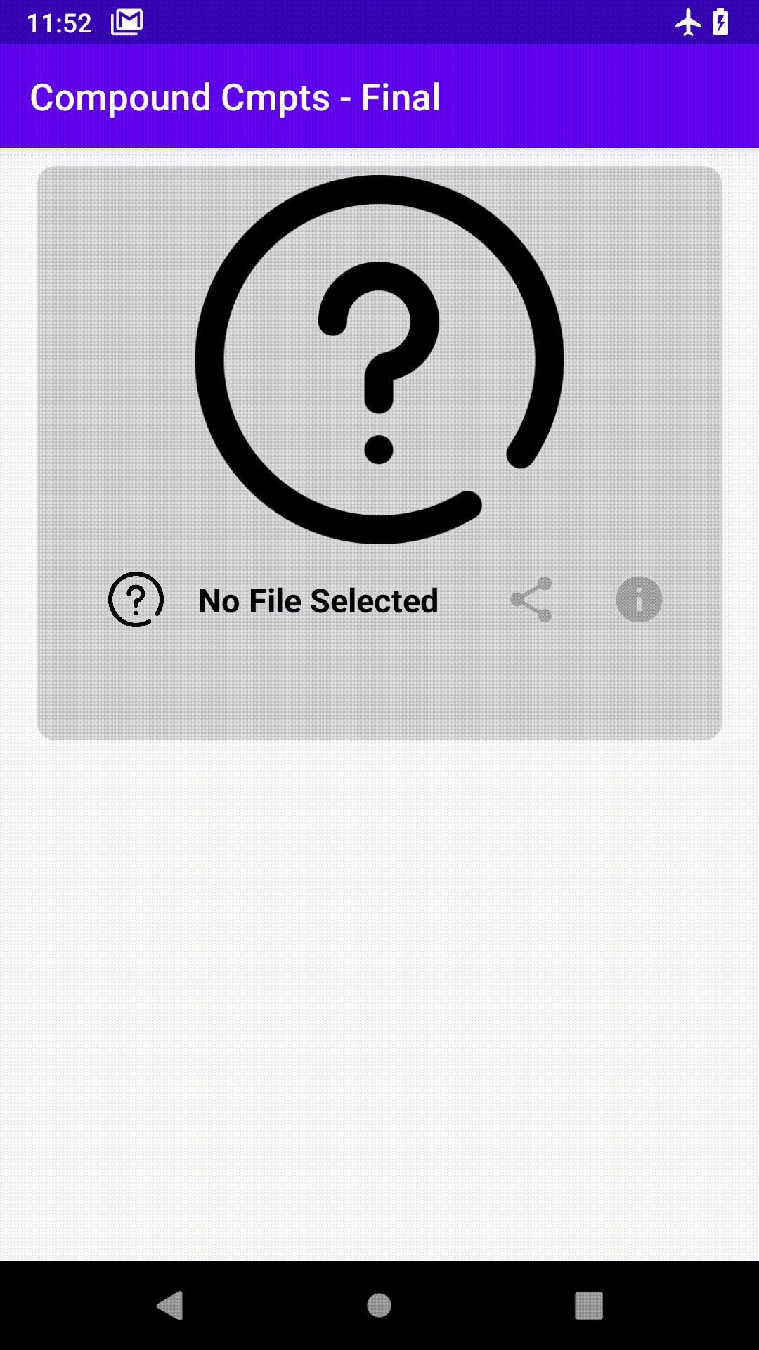
The view to be built is what I refer to as a File Descriptor (not so fancy?, I know). It is a compound component that provides the functionality of displaying information about selected files present on the Android File System, and these include a preview of the file itself, its name, the date it was last modified, size of the file, and a bit more!
我将要建立的视图称为文件描述符 (不是很花哨吗?,我知道)。 它是一个复合组件,提供显示有关Android File System上选定文件的信息的功能,其中包括文件本身的预览,文件名,上次修改日期,文件大小以及一些内容。更多!
Excited? let’s dive right in!
激动吗 让我们潜入吧!
To be able to follow this article closely, I expect you to at least be familiar with Android development and the Android SDK. Also, some Kotlin-specific features would be used in this tutorial, but that should not be a problem.
为了能够密切关注本文,我希望您至少熟悉Android开发和Android SDK。 另外,本教程中将使用某些Kotlin特定的功能,但这应该不是问题。
The starter code for this project can be found here. It basically is a new android project with an empty activity, it also contains a set of vector drawables and images that would be used across the entire project.
该项目的启动代码可在此处找到。 它基本上是一个新的android项目,活动为空,它还包含一组将在整个项目中使用的矢量可绘制对象和图像。
哇!这将是一段漫长的旅程! 你可能想喝杯咖啡☕ (Whew!, this is going to be a long ride! you might want to grab a cup of coffee☕)
创建我们的复合组件 (Creating Our Compound Component)
To create our compound component, we would need to put two important pieces together — layout and logic. The layout contains the views we would be joining together to create our compound component, while the logic would contain specific functions the views in the compound component could execute.
要创建复合组件,我们需要将两个重要部分放在一起- 布局和逻辑。 布局包含我们将要连接在一起以创建复合组件的视图,而逻辑将包含复合组件中的视图可以执行的特定功能。
布局 (The Layout)
Remember, a compound component has to extend an existing ViewGroup implementation, so in this article, we would be extending the ConstraintLayout. ConstraintLayout is an amazing ViewGroup provided to us by Android that lays out its items by attaching constraints on one View to another in the ViewGroup or the parent itself. This helps hugely in eliminating nested view hierarchies.
记住,复合组件必须扩展现有的ViewGroup实现,因此在本文中,我们将扩展ConstraintLayout。 ConstraintLayout是Android提供给我们的一个惊人的ViewGroup ,它通过将一个视图上的约束附加到ViewGroup中的另一个视图或父视图本身来布置其项目。 这极大地有助于消除嵌套视图层次结构。
To create the layout, navigate to res > layout, and create a new file labelled file_descriptor.xml, below is the code for the layout.
要创建布局,请导航至res > layout ,并创建一个名为file_descriptor.xml的新文件,下面是该布局的代码。
<?xml version="1.0" encoding="utf-8"?>
<androidx.constraintlayout.widget.ConstraintLayout xmlns:android="http://schemas.android.com/apk/res/android"
    android:layout_width="match_parent"
    xmlns:tools="http://schemas.android.com/tools"
    xmlns:app="http://schemas.android.com/apk/res-auto"
    android:layout_height="wrap_content">


    <androidx.constraintlayout.widget.Guideline
        android:layout_width="wrap_content"
        android:layout_height="match_parent"
        android:id="@+id/start_guideline"
        android:orientation="vertical"
        app:layout_constraintGuide_begin="20dp"/>


    <androidx.constraintlayout.widget.Guideline
        android:layout_width="wrap_content"
        android:layout_height="match_parent"
        android:id="@+id/end_guideline"
        android:orientation="vertical"
        app:layout_constraintGuide_end="20dp"/>


    <androidx.constraintlayout.widget.Guideline
        android:layout_width="wrap_content"
        android:layout_height="match_parent"
        android:id="@+id/top_guideline"
        android:orientation="horizontal"
        app:layout_constraintTop_toBottomOf="@id/file_preview_image"
        app:layout_constraintGuide_begin="210dp"/>


    <ImageView
        android:layout_width="match_parent"
        android:layout_height="200dp"
        android:src="@drawable/no_file_selected"
        app:layout_constraintBottom_toTopOf="@id/top_guideline"
        android:id="@+id/file_preview_image"
        app:layout_constraintTop_toTopOf="parent"/>


    <ImageView
        android:layout_width="50dp"
        android:layout_height="50dp"
        android:id="@+id/file_type_image"
        android:paddingTop="10dp"
        android:paddingBottom="10dp"
        app:layout_constraintStart_toEndOf="@id/start_guideline"
        app:layout_constraintTop_toBottomOf="@id/top_guideline"
        app:layout_constraintEnd_toStartOf="@id/file_name"
        android:src="@drawable/no_file_selected"/>


    <TextView
        android:id="@+id/file_name"
        android:layout_width="wrap_content"
        android:layout_height="wrap_content"
        app:layout_constraintTop_toBottomOf="@id/top_guideline"
        app:layout_constraintStart_toEndOf="@id/file_type_image"
        app:layout_constraintEnd_toStartOf="@id/share_file_image"
        android:textColor="@color/colorBlack"
        app:layout_constraintBottom_toBottomOf="@id/file_type_image"
        android:textSize="18sp"
        android:textStyle="bold"
        android:ellipsize="end"
        android:paddingTop="10dp"
        android:paddingBottom="10dp"
        android:maxLines="1"
        android:scrollHorizontally="true"
        android:ems="7"
        android:text="No File Selected" />


    <ImageView
        android:layout_width="50dp"
        android:src="@drawable/ic_share"
        android:paddingTop="10dp"
        android:paddingBottom="10dp"
        android:id="@+id/share_file_image"
        app:layout_constraintTop_toBottomOf="@id/top_guideline"
        app:layout_constraintEnd_toStartOf="@id/info_file_image"
        app:layout_constraintStart_toEndOf="@id/file_name"
        android:layout_height="50dp"/>


    <ImageView
        android:layout_width="50dp"
        android:src="@drawable/ic_info"
        android:id="@+id/info_file_image"
        android:paddingTop="10dp"
        android:paddingBottom="10dp"
        app:layout_constraintEnd_toStartOf="@id/end_guideline"
        app:layout_constraintTop_toBottomOf="@id/top_guideline"
        android:layout_height="50dp"/>


    <TextView
        android:layout_width="0dp"
        android:layout_height="wrap_content"
        android:id="@+id/file_info"
        android:lineHeight="20dp"
        android:textSize="16sp"
        android:textStyle="bold"
        android:paddingTop="10dp"
        android:paddingBottom="10dp"
        app:layout_constraintStart_toEndOf="@id/start_guideline"
        app:layout_constraintEnd_toStartOf="@id/end_guideline"
        app:layout_constraintTop_toBottomOf="@id/file_type_image"
        android:layout_marginTop="10dp"
        android:padding="10dp"
        tools:text="@string/lorem"/>


</androidx.constraintlayout.widget.ConstraintLayout>
In the code above, there are five main views, the first ImageView whose purpose is to show a preview of the file (image/video) selected, the small image with id: file_type_image aligned to the mid-left of the component denotes the type of file selected. There are also two text views that display the name and information about the file selected respectively. Then, we have two icons whose functions are to share and toggle the information state.
在上面的代码中,有五个主视图,第一个ImageView的目的是显示所选文件(图像/视频)的预览,id为file_type_image且与组件左中角对齐的小图像表示类型选择的文件。 还有两个文本视图,分别显示所选文件的名称和信息。 然后,我们有两个图标,其功能是共享和切换信息状态。
在继续进行下一步之前,如果您下载了本文的入门代码,那么您将在drawables文件夹中拥有一组将在应用程序中使用的图标,因此您无需担心! (Before we move any further, if you downloaded the starter code for this article, you’d have in the drawables folder, a set of icons that would be used in the application, so you have nothing to worry about!.)
Our layout is almost ready!, but there is a teeny-tiny issue, remember when I said a compound component is actually a ViewGroup accommodating views with closely-related functions, yes! exactly!. The idea here is to create an independent layout and then connect the views to an implementation of a certain ViewGroup — ConstraintLayout. But the issue here is, the layout created above has a ConstraintLayout as its parent, so doesn’t that mean that we are done? not quite😤!.
我们的布局几乎已经准备就绪!,但是还有一个很小的问题,请记住,当我说复合组件实际上是一个ViewGroup容纳具有紧密相关功能的视图时,是的! 究竟!。 这里的想法是创建一个独立的布局,然后将视图连接到某个ViewGroup ConstraintLayout的实现 。 但是这里的问题是,上面创建的布局以ConstraintLayout作为其父级,所以这并不意味着我们完成了吗? 不太😤!
That is not the behaviour we want, if we go on with that layout, we would end up adding the parent of that layout — ConstraintLayout as a child of our Compound Component which happens to be a ConstraintLayout also, so our Compound Component would end up having one and only one direct child which would be a ViewGroup. This does not quite give us direct access to our inner views, so how do we go about this?
这不是我们想要的行为,如果继续该布局,我们最终将添加该布局的父级-ConstraintLayout作为我们的Composite Component的子元素,而后者恰好也是ConstraintLayout ,因此我们的Composite Component最终会有一个,只有一个直接 子级,它将是一个ViewGroup。 这并不能完全让我们直接访问我们的内在观点,那么我们该如何做呢?
合并标签 (The Merge Tag)
Android provides us with the merge tag. The merge tag takes a group of views and merges them together. So, instead of ordering them under a ViewGroup, they are independent and without a parent. Following this method, our views would be added directly as children of our Compound Component.
Android为我们提供了merge标签。 merge标签采用一组视图并将它们合并在一起。 因此,它们是独立的并且没有父级,而不是在ViewGroup下对其进行排序。 按照这种方法,我们的视图将直接添加为复合组件的子代。
So, our file_descriptor.xml file can be modified as such:
因此,我们的 file_descriptor 。 xml 文件可以这样修改:
<?xml version="1.0" encoding="utf-8"?>
<merge xmlns:android="http://schemas.android.com/apk/res/android"
    android:layout_width="match_parent"
    android:layout_height="wrap_content"
    xmlns:tools="http://schemas.android.com/tools"
    xmlns:app="http://schemas.android.com/apk/res-auto">


    <androidx.constraintlayout.widget.Guideline
        android:layout_width="wrap_content"
        android:layout_height="match_parent"
        android:id="@+id/start_guideline"
        android:orientation="vertical"
        app:layout_constraintGuide_begin="20dp"/>


    <androidx.constraintlayout.widget.Guideline
        android:layout_width="wrap_content"
        android:layout_height="match_parent"
        android:id="@+id/end_guideline"
        android:orientation="vertical"
        app:layout_constraintGuide_end="20dp"/>


    <androidx.constraintlayout.widget.Guideline
        android:layout_width="wrap_content"
        android:layout_height="match_parent"
        android:id="@+id/top_guideline"
        android:orientation="horizontal"
        app:layout_constraintTop_toBottomOf="@id/file_preview_image"
        app:layout_constraintGuide_begin="210dp"/>


    <ImageView
        android:layout_width="match_parent"
        android:layout_height="200dp"
        android:src="@drawable/no_file_selected"
        app:layout_constraintBottom_toTopOf="@id/top_guideline"
        android:id="@+id/file_preview_image"
        app:layout_constraintTop_toTopOf="parent"/>


    <ImageView
        android:layout_width="50dp"
        android:layout_height="50dp"
        android:id="@+id/file_type_image"
        android:paddingTop="10dp"
        android:paddingBottom="10dp"
        app:layout_constraintStart_toEndOf="@id/start_guideline"
        app:layout_constraintTop_toBottomOf="@id/top_guideline"
        app:layout_constraintEnd_toStartOf="@id/file_name"
        android:src="@drawable/no_file_selected"/>


    <TextView
        android:id="@+id/file_name"
        android:layout_width="wrap_content"
        android:layout_height="wrap_content"
        app:layout_constraintTop_toBottomOf="@id/top_guideline"
        app:layout_constraintStart_toEndOf="@id/file_type_image"
        app:layout_constraintEnd_toStartOf="@id/share_file_image"
        android:textColor="@color/colorBlack"
        app:layout_constraintBottom_toBottomOf="@id/file_type_image"
        android:textSize="18sp"
        android:textStyle="bold"
        android:ellipsize="end"
        android:paddingTop="10dp"
        android:paddingBottom="10dp"
        android:maxLines="1"
        android:scrollHorizontally="true"
        android:ems="7"
        android:text="No File Selected" />


    <ImageView
        android:layout_width="50dp"
        android:src="@drawable/ic_share"
        android:paddingTop="10dp"
        android:paddingBottom="10dp"
        android:id="@+id/share_file_image"
        app:layout_constraintTop_toBottomOf="@id/top_guideline"
        app:layout_constraintEnd_toStartOf="@id/info_file_image"
        app:layout_constraintStart_toEndOf="@id/file_name"
        android:layout_height="50dp"/>


    <ImageView
        android:layout_width="50dp"
        android:src="@drawable/ic_info"
        android:id="@+id/info_file_image"
        android:paddingTop="10dp"
        android:paddingBottom="10dp"
        app:layout_constraintEnd_toStartOf="@id/end_guideline"
        app:layout_constraintTop_toBottomOf="@id/top_guideline"
        android:layout_height="50dp"/>


    <TextView
        android:layout_width="0dp"
        android:layout_height="wrap_content"
        android:id="@+id/file_info"
        android:lineHeight="20dp"
        android:textSize="16sp"
        android:textStyle="bold"
        android:paddingTop="10dp"
        android:paddingBottom="10dp"
        app:layout_constraintStart_toEndOf="@id/start_guideline"
        app:layout_constraintEnd_toStartOf="@id/end_guideline"
        app:layout_constraintTop_toBottomOf="@id/file_type_image"
        android:layout_marginTop="10dp"
        android:padding="10dp"
        tools:text="@string/lorem"/>


</merge>
At this point, your layout is probably looking disorganized, don’t worry, we’d be done in a sec.
此时,您的布局可能看起来杂乱无章,请放心,我们会在几秒钟内完成。
逻辑 (The Logic)
Now that the layout is all set, what’s left is to connect it to a ViewGroup implementation. Go ahead and create a file called FileDescriptor.kt, this class would contain our logic for implementing our compound component.
现在已经设置好布局,剩下的就是将其连接到ViewGroup实现。 继续并创建一个名为FileDescriptor.kt的文件,该类将包含用于实现复合组件的逻辑。
As a reminder, we would be extending the existing implementation of the ConstraintLayout class, so now would be a good time to see how the class looks like.
提醒一下,我们将扩展ConstraintLayout类的现有实现,因此现在是查看该类外观的好时机。
public class ConstraintLayout extends ViewGroup {

  // ...

  public ConstraintLayout(Context context) {
        super(context);
        this.init((AttributeSet)null);
    }


    public ConstraintLayout(Context context, AttributeSet attrs) {
        super(context, attrs);
        this.init(attrs);
    }


    public ConstraintLayout(Context context, AttributeSet attrs, int defStyleAttr) {
        super(context, attrs, defStyleAttr);
        this.init(attrs);
    }

  // ...

}
Let’s start by comprehending the anatomy of our ConstraintLayout class, it has three constructors.
让我们从理解ConstraintLayout类的结构开始,它具有三个构造函数。
ConstraintLayout(Context context): this constructor takes in one parameter — the context of the activity inflating the layout
ConstraintLayout(Context context):此构造函数采用一个参数-扩大布局的活动上下文
ConstraintLayout(Context context, AttributeSet attrs): this constructor accepts two parameters — the context (see above), and the set of attributes defined for this layout
ConstraintLayout(Context context,AttributeSet attrs):此构造方法接受两个参数-上下文(请参见上文)和为此布局定义的属性集
ConstraintLayout(Context context, AttributeSet attrs, int defStyleAttr): this constructor takes in one additional parameter defStyleAttr, this denotes the default style to be used for this layout, usually defaults to 0.
ConstraintLayout(Context context,AttributeSet attrs,int defStyleAttr):此构造函数接受一个附加参数defStyleAttr,它表示用于此布局的默认样式,通常默认为0。
Extending the ConstraintLayout class demands we provide adequate calls to the constructors of the superclass, so we don’t get caught “off-guard”. So, we have to provide constructors in our Compound Component that effectively invokes all three of the constructors present in the superclass. So, let us start by doing that! Below is the code for our FileDescriptor class.
扩展ConstraintLayout类的需求,我们提供了对超类的构造函数的足够调用,因此我们不会被“措手不及”。 因此,我们必须在我们的复合组件中提供构造函数,以有效地调用超类中存在的所有三个构造函数。 因此,让我们开始这样做! 下面是我们的FileDescriptor类的代码。
class FileDescriptor : ConstraintLayout {

    constructor(ctx: Context): super(ctx) {
    }

    constructor(ctx: Context, attributeSet: AttributeSet) : super(ctx, attributeSet) {
    }

    constructor(ctx: Context, attributeSet: AttributeSet, defStyleAttr: Int): super(ctx, attributeSet, defStyleAttr) {
    }

}
In the code above, we declare explicitly, three constructors matching the ones present in the superclass. Amazing!.
在上面的代码中,我们明确声明了三个与超类中存在的构造函数匹配的构造函数。 惊人!。
But if you are a fan of Kotlin (like me), this approach isn’t really the best. Kotlin provides optional and default function parameters that allow us to specify parameters that might be included or omitted in the function invocation and default values for those that weren’t included. One more thing is: the class being extended is written in Java, and we are about to use some Kotlin-specific features in here, so there would be issues as Java does not know about default or optional parameters.
但是,如果您像我一样是Kotlin的粉丝,这种方法并不是最好的方法。 Kotlin提供了可选的和默认的函数参数,这些参数使我们可以指定函数调用中可能包含或省略的参数,以及未包含的参数的默认值。 还有一件事是:扩展的类是用Java编写的,并且我们将在此处使用一些Kotlin特定的功能,因此会出现问题,因为Java不了解默认或可选参数。
So, here comes the @JvmOverloads annotation. This annotation carefully converts the default and optional parameters used in the function declaration to independent functions with separate parameters when transpiled to Java. Here is how the class looks after using default and optional parameters.
因此,这里是@JvmOverloads批注。 当转换为Java时,此批注会仔细地将函数声明中使用的默认参数和可选参数转换为具有单独参数的独立函数。 这是使用默认和可选参数后该类的外观。
class FileDescriptor @JvmOverloads
    constructor(private val ctx: Context, private val attributeSet: AttributeSet? = null, private val defStyleAttr: Int = 0)
    : ConstraintLayout(ctx, attributeSet, defStyleAttr) {
}
By adding the @JvmOverloads annotation, we must provide a secondary constructor that takes in all the arguments supposed to be passed into the ConstraintLayout constructors. As you can see above, only the Context object ctx is compulsory, since all constructors of the ConstraintLayout class accept it. The second parameter attributeSet is optional since only two of the constructors accept it, and it defaults to null if none is passed in originally. The final parameter defStyleAttr also defaults to 0 if none is provided. The annotation takes care of creating the constructors in the Java equivalent of this class.
通过添加@JvmOverloads批注,我们必须提供一个辅助构造函数,该构造函数接受应该传递给ConstraintLayout构造函数的所有参数。 正如您在上面看到的那样,因为Context对象ctx是强制性的,因为ConstraintLayout类的所有构造函数都接受它。 第二个参数attributeSet是可选的,因为只有两个构造函数接受它,并且如果最初没有传入任何参数,则默认为null。 如果未提供任何参数,则最终参数defStyleAttr也默认为0。 注释负责在此类的Java等效物中创建构造函数。
At this point, we are one step away from showing our layout on the screen. We are going to take advantage of the init block given to us by Kotlin, it serves as a block of code that runs whenever any of the constructors is used to create an object of the class.
至此,我们距离在屏幕上显示布局仅一步之遥。 我们将利用Kotlin给我们提供的init块,它用作代码块,只要使用任何构造函数创建该类的对象,该代码块便会运行。
那么,我们到底要在init块中做什么? (So, what exactly do we want to do in the init block?)
扩大布局 (Inflate the layout)
Yeah!, you heard that right. Inflating layouts is a very common concept in android development, as it processes the tags created in our XML layouts and converts them to their equivalent objects in code — Inflation. This concept is widely used when creating fragments or instantiating viewholders for a recyclerview.
是的,你没听错。 膨胀布局是android开发中一个非常普遍的概念,因为它处理在我们XML布局中创建的标签并将其转换为代码中的等效对象Inflation 。 当创建片段或实例化recyclerview的viewholder时,该概念被广泛使用。
This process entails getting the views declared in the XML for this component and then inflating them as children of this compound component.
此过程需要获取XML声明的该组件的视图,然后将其作为该复合组件的子代进行充气。
To inflate the layout for the compound component into this class, we go through two steps.
要将复合组件的布局添加到此类中,我们需要完成两个步骤。
Get the layout inflater service — the object that does the inflating
获得布局充气服务- 进行充气的对象
- Inflate! 膨胀!
class FileDescriptor @JvmOverloads
    constructor(private val ctx: Context, private val attributeSet: AttributeSet? = null, private val defStyleAttr: Int = 0)
    : ConstraintLayout(ctx, attributeSet, defStyleAttr) {


    init {


        // get the inflater service from the android system
        val inflater = ctx.getSystemService(Context.LAYOUT_INFLATER_SERVICE) as LayoutInflater

        // inflate the layout into "this" component
        inflater.inflate(R.layout.file_descriptor, this)


        // finally, we set the background of our component
        setBackgroundResource(R.drawable.round_file_descriptor_background)


    }


}
The first step is to get the inflater service from the android system by invoking getSystemService() on the context object and casting it to a type of LayoutInflater. We then inflate the layout into our compound component and we’re done!
第一步是通过调用getSystemService()从android系统获取充气机服务 在上下文对象上,并将其强制转换为LayoutInflater类型。 然后,将布局充气到复合组件中,我们就完成了!
Finally, we set the background of our component by calling setBackground and passing in our drawable resource. And that’s actually it!.
最后,我们通过调用setBackground并传入可绘制资源来设置组件的背景。 就是这样!
在屏幕上显示 (Showing on-screen)
After all the setup, we can now call our custom view using its fully-qualified name in our XML layout by inserting the code below.
完成所有设置后,我们现在可以通过在下面的代码中插入XML视图中的标准名称来使用自定义视图。
<?xml version="1.0" encoding="utf-8"?>
<androidx.constraintlayout.widget.ConstraintLayout xmlns:android="http://schemas.android.com/apk/res/android"
  xmlns:app="http://schemas.android.com/apk/res-auto"
  xmlns:tools="http://schemas.android.com/tools"
  android:layout_width="match_parent"
  android:layout_height="match_parent"
  tools:context=".MainActivity">


  <dev.olaore.compoundcmpts_final.FileDescriptor
	  app:layout_constraintTop_toTopOf="parent"
	  android:layout_width="match_parent"
	  android:layout_marginLeft="20dp"
	  android:layout_marginRight="20dp"
	  android:layout_marginTop="10dp"
	  android:layout_height="wrap_content" />


</androidx.constraintlayout.widget.ConstraintLayout>
Android studio might not know how to render the view straightaway in your layout preview, so you might want to rebuild the project, so it records the changes made to the component.
Android Studio可能不知道如何在布局预览中直接渲染视图,因此您可能想要重建项目,以便记录对组件所做的更改。
您应该提出这个! (And you should come up with this!)
下一步是什么? (What’s next?)
We are not done with the application yet, though we have learnt a lot, we still have to wire up the functions of the view, and we would cover that in the next part right here!
我们不与应用程序尚未完成,但我们学到了很多东西,我们还是要连接视图的功能,我们将覆盖在未来部分权在这里 !
See you on the other side!😃
另一边见!😃
kotlin 隐藏 组件


 扫一扫
扫一扫
 829
829

 被折叠的 条评论
为什么被折叠?
被折叠的 条评论
为什么被折叠?
 到【灌水乐园】发言


