It’s not always easy to choose the right layout for the UI of our apps. A wrong root layout can lead to a complex hierarchy and consequently to poor performance in the rendering phase.
为我们的应用程序的UI选择正确的布局并不总是那么容易。 错误的根目录布局可能导致复杂的层次结构,并因此导致渲染阶段的性能下降。
Many developers, especially beginners, often make the wrong choice because they don’t know the characteristics of the different layouts.
许多开发人员,尤其是初学者,常常会做出错误的选择,因为他们不知道不同布局的特征。
In this article, I would like to challenge you with a little exercise. We’ll analyze 3 screens together and imagine what could be the best way to implement them.
在本文中,我想做些练习来挑战您。 我们将一起分析3个屏幕,并想象什么是实现它们的最佳方法。
For each screen, I will show you a mockup with a brief description. You will make your hypothesis and then I will describe what I think is the best solution.
对于每个屏幕,我都会为您显示一个带有简短描述的模型。 您将提出自己的假设,然后我将描述我认为是最佳的解决方案。
登录 (Login)

Let’s start with a simple login screen. An ImageView, two EditText for username and password, and a submit Button.
让我们从一个简单的登录屏幕开始。 一个ImageView ,两个用于用户名和密码的EditText以及一个Submit Button 。
Which layout would you choose for this Activity? Take a moment to think, make your guess, and then continue reading.
您将为此活动选择哪种布局? 花一点时间思考,做出猜测,然后继续阅读。
A few options. The first is to use a LinearLayout with android:layout_gravity="center”. By setting a margin_top for views 2, 3, and 4 we would easily get the desired result.
一些选择。 首先是使用LinearLayout 使用android:layout_gravity="center” 。通过为视图2、3和4设置margin_top ,我们很容易获得所需的结果。
A second option would be a RelativeLayout. The views 1 and 4 could be aligned respectively at the top and the bottom of their parent. The views 2 and 3 should be centered and positioned one below the other.
第二个选项是RelativeLayout 。 视图1和4可以分别在其父视图的顶部和底部对齐。 视图2和3应该居中放置,一个位于另一个下方。
The same thing could be done with a ConstraintLayout, anchoring the views at the top (1), at the bottom (4), and at the center (2 and 3).
使用ConstraintLayout可以完成相同的操作,将视图固定在顶部(1),底部(4)和中心(2和3)。
These last two hypotheses would lead to the desired result with some adjustments. However, in my opinion, the simplest and cleanest solution is the first one, a LinearLayout.
这最后两个假设将通过一些调整得出所需的结果。 但是,我认为,最简单,最干净的解决方案是第一个解决方案,即LinearLayout。
目录 (Catalog)

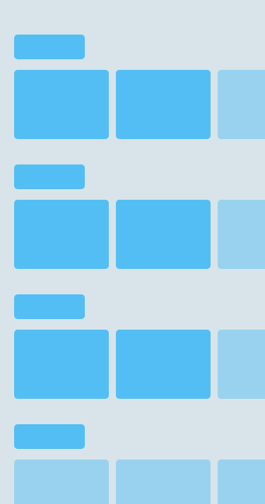
A typical example of a catalog. Several categories of elements, for each of which there is a horizontally scrollable list. Much like Netflix and Amazon apps.
目录的典型示例。 元素的几种类别,每个类别都有一个水平滚动列表。 非常类似于Netflix和Amazon应用程序。
Which layout would you choose for this Activity? As before, take a moment to think, make your hypothesis, and then continue reading.
您将为此活动选择哪种布局? 和以前一样,花点时间思考,提出您的假设,然后继续阅读。
The first thing to note is the vertical scroll. This directs our choice to a NestedScrollView as the root layout. Since the NestedScrollView can only have one direct child, we need to choose which ViewGroup to use.
首先要注意的是垂直滚动。 这将我们的选择引向NestedScrollView 作为根布局。 由于NestedScrollView只能有一个直接子级,因此我们需要选择要使用的ViewGroup。
The child views are organized vertically in a single column, so the best option could be a LinearLayout with a margin between the different categories.
子视图垂直组织在单个列中,因此最好的选择可能是在不同类别之间留有边距的LinearLayout。
The same result could be obtained with a RelativeLayout or a CosntrainLayout but also this time a LinearLayout seems the most natural and clean solution.
使用RelativeLayout或CosntrainLayout可以获得相同的结果,但是这次,LinearLayout似乎是最自然,最干净的解决方案。
As for the lists, it is necessary to think that in most cases the elements are loaded dynamically. The right choice would, therefore, be a RecyclerView with a LinearLayoutManager to display the elements horizontally.
至于列表,有必要考虑在大多数情况下元素是动态加载的。 因此,正确的选择是RecyclerView 使用LinearLayoutManager 水平显示元素。
The RecyclerView is an optimized version of the old ListView and is scrollable by default so the result will be exactly what we want.
RecyclerView是旧ListView的优化版本,默认情况下可滚动,因此结果将完全是我们想要的。
饲料 (Feed)


Imagine this is the home page of a social network similar to LinkedIn.
想象一下,这是类似于LinkedIn的社交网络的主页。
There is a Toolbar at the top, two tabs, and a floating button at the bottom. In the first tab, there’s a list of elements in a single column. In the second, the elements are organized in two columns. Pay attention to the scrolling behavior: the Toolbar disappears when you scroll down to give space to the main content, while the two tabs remain fixed at the top.
顶部有一个工具栏 ,底部有两个选项卡,一个浮动按钮。 在第一个标签中,单列中有一个元素列表。 在第二部分中,元素分为两列。 请注意滚动行为 :向下滚动以在主要内容中留出空间时,工具栏将消失,而两个选项卡将固定在顶部。
Take a moment to think about what kind of layout you would use for this Activity and then read on.
花一点时间考虑一下您将为此活动使用哪种布局,然后继续阅读。
The detail that can guide us is certainly the scrolling behavior of the toolbar. This suggests what the root of the document may be, a CoordinatorLayout. CoordinatorLayout allows you to specify the behavior and interactions with its child views.
可以指导我们的细节当然是工具栏的滚动行为。 这表明文档的根可能是CoordinatorLayout 。 CoordinatorLayout允许您指定行为及其与其子视图的交互。
In this case, I would choose an AppBarLayout with a toolbar and a TabLayout. To get the desired behavior you need to set the app:layout_scrollFlags="scroll|enterAlways" for the Toolbar only. In this way the CoordinatorLayout will take care of hiding the Toolbar when scrolling down and showing it when scrolling up.
在这种情况下,我会选择一个AppBarLayout 使用工具栏和TabLayout 。 要获得所需的行为,您只需要为工具栏设置app:layout_scrollFlags="scroll|enterAlways" 。 这样,CoordinatorLayout将负责在向下滚动时隐藏工具栏,并在向上滚动时显示工具栏。
For the main content, I would use a ViewPager with two Fragments. The first Fragment will have a RecyclerView with a LinearLayoutManager. For the RecyclerView of the second Fragment instead, the best option is a GridLayoutManager with two columns.
对于主要内容,我将使用ViewPager 有两个碎片 。 第一个片段将具有一个带有LinearLayoutManager的RecyclerView。 对于第二个Fragment的RecyclerView,最好的选择是GridLayoutManager 有两列。
外卖 (Takeaways)
LinearLayout is perfect for displaying views in a single row or column. You can add
layout_weightsto the child views if you need to specify the space distribution.LinearLayout非常适合在单行或单列中显示视图。 如果需要指定空间分布,则可以将
layout_weights添加到子视图中。Use a RelativeLayout, or even better a ConstraintLayout, if you need to position views in relation to siblings views or parent views.
如果需要将视图相对于同级视图或父视图放置,请使用RelativeLayout ,甚至更好的ConstraintLayout 。
CoordinatorLayout allows you to specify the behavior and interactions with its child views.
CoordinatorLayout允许您指定行为及其与其子视图的交互。
Use RecyclerView to create dynamic content lists paying attention to the choice of the LayoutManager.
使用RecyclerView来创建动态内容列表,并注意LayoutManager的选择。
Try to keep your layout hierarchy as flat as possible. The flatter your hierarchy, the less time that it takes for the layout stage to complete.
尝试使布局层次结构尽可能平坦。 您的层次结构越扁平,完成布局阶段所需的时间就越少 。
翻译自: https://levelup.gitconnected.com/choosing-the-right-android-layout-8c35fe476b35


 840
840


 被折叠的 条评论
为什么被折叠?


