


jetpack
介绍 (Introduction)
“Jetpack Compose is a modern toolkit for building native Android UI. Jetpack Compose simplifies and accelerates UI development on Android with less code, powerful tools, and intuitive Kotlin APIs”. — Android Developers
“ Jetpack Compose是用于构建本机Android UI的现代工具包。 Jetpack Compose使用更少的代码,功能强大的工具和直观的Kotlin API简化并加速了Android上的UI开发。” -Android开发人员
There have been interesting developments since we discussed Jetpack Compose last time. Compose 0.1.0-dev010 and Compose UI 0.1.0-dev10 were released on April 29. As they’re still in development phase, it will be difficult to understand the errors, so make sure you’re using the latest versions for a smooth experience.
自从我们上次讨论Jetpack Compose以来,已经有了有趣的发展。 Compose 0.1.0-dev010和Compose UI 0.1.0-dev10于4月29日发布。由于它们仍处于开发阶段,因此很难理解错误,因此请确保使用最新版本流畅的体验。
In my past two articles about Compose, I mostly focused on basics and how Compose is evolving. In this article, we’re going to build a messaging app using Kotlin and Compose through which we will learn how to use components like adapterview, image, Modifiers, and more.
在过去的两篇有关Compose的文章中,我主要关注基础知识以及Compose的发展方式。 在本文中,我们将使用Kotlin和Compose构建一个消息传递应用程序,通过它我们将学习如何使用adapterview , image , Modifiers等组件。
Moving forward, I assume you’re familiar with the basics of Jetpack Compose. If not, refer to this article.
展望未来,我假设您熟悉Jetpack Compose的基础知识。 如果不是,请参阅本文 。
我们正在尝试构建什么? (What Are We Trying to Build?)
As Android users and developers, we’re very familiar with the native messages app. In this article, we’re going to explore how to build the chats list screen and conversation screen using Jetpack Compose. To be clear, have a look at following.
作为Android用户和开发人员,我们对本机消息应用程序非常熟悉。 在本文中,我们将探讨如何使用Jetpack Compose构建聊天列表屏幕和对话屏幕。 为了清楚起见,请看以下内容。
应用程式模型 (App Models)
Before we start building UIs, let’s go through model classes for messages and a conversation list : Message and ChatMessage respectively. Both are data classes. Have a look:
在开始构建UI之前,让我们看一下消息和对话列表的模型类:分别是Message和ChatMessage 。 两者都是数据类。 看一看:
// Messages list model
data class Message(val time: String,
                   val message : String,
                   val sender : String,
                   val senderImage : String? = null)

// Conversation list model
data class ChatMessage (val message : String,
                        val senderImage : String)
主屏幕 (Home Screen)
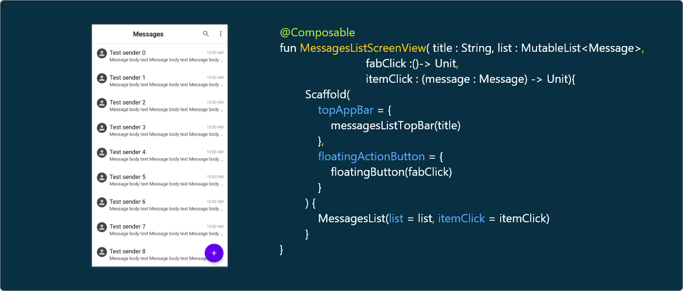
On the home screen, we have a top bar with a title and two actionable menu items: Search and more options. Then we have the messages list and finally the FAB icon. See the below image to have a bird’s eye view of Compose UI for designing the home screen.
在主屏幕上,我们有一个带标题的顶部栏和两个可操作的菜单项:搜索和更多选项。 然后我们有消息列表,最后还有FAB图标。 参见下图,鸟瞰用于设计主屏幕的Compose UI。
Now, let’s go through each segment.
现在,让我们遍历每个细分。
TopBar和FAB设计 (TopBar and FAB Design)
脚手架 (Scaffold)
Scaffold implements the basic material design visual layout structure. This component provides the API that holds UI components together by ensuring proper layout strategy.
脚手架实现了基本的材料设计视觉布局结构。 该组件提供通过确保适当的布局策略将UI组件结合在一起的API。
TopAppBar (TopAppBar)
topAppBar is a parameter in the scaffold to show a top bar of the screen. To this parameter, we have to pass a composable function, messagesListTopBar, with the actual topbar design.
topAppBar是支架中的一个参数,用于显示屏幕的顶部栏。 对于此参数,我们必须传递具有实际顶栏设计的可组合函数messagesListTopBar 。
@Composable
fun messagesListTopBar(title : String){
    TopAppBar(
        title = {
            Text(
                text = title,
                modifier = Modifier.weight(1f),
                style = TextStyle(
                    textAlign = TextAlign.Center,
                    fontStyle = FontStyle.Normal,
                    fontWeight = FontWeight.Bold,
                    fontSize = 20.sp
                )
            )
        },
        actions = {
            Icon(asset = vectorResource(id = R.drawable.ic_search),modifier = Modifier.padding(start = 8.dp,end = 10.dp))
            Icon(asset = vectorResource(id = R.drawable.ic_options_menu),modifier = Modifier.padding(start = 10.dp,end = 8.dp))
        },
        backgroundColor = Color.White
    )
}
A TopAppBar is a UI component that displays information relating to the current screen, such as title, actions, search, and more options. It’s placed at the top of the screen.
TopAppBar是一个UI组件,用于显示与当前屏幕有关的信息,例如标题,操作,搜索和更多选项。 它位于屏幕顶部。
Here we’ve used the text component to show the title of the TopAppBar and then used it’s components to style it. actions is another parameter in TopAppBar to show actionable items. Finally we set the background color for TopAppBar.
在这里,我们使用tex t组件显示TopAppBar的标题,然后使用其组件对其进行样式设置。 actions是TopAppBar另一个显示可操作项的参数。 最后,我们为TopAppBar设置背景色。
修饰符 (Modifier)
Modifier is an empty companion object by default. We can use Modifier to set animations, padding, and other styling-related stuff to the views.
Modifier默认为空的伴随对象。 我们可以使用Modifier将动画,填充和其他与样式相关的内容设置为视图。
FloatingActionButton (FloatingActionButton)
With the FloatingActionButton UI component, we can easily implement a FAB button in the UI. Using onclick and icon parameters, we can set the click listener and drawable asset for the FAB button. Have a look:
使用FloatingActionButton UI组件,我们可以轻松地在UI中实现FAB按钮。 使用onclick和icon参数,我们可以为FAB按钮设置点击侦听器和可绘制资产。 看一看:
@Composable
fun floatingButton(fabClick :()-> Unit){
    FloatingActionButton(onClick = {
        fabClick()
    }) {
        Icon(asset = vectorResource(id = R.drawable.ic_add))
    }
}
Here we’ve used higher-order functions to invoke on FAB and messages item clicks. To learn more about features like higher-order functions in Kotlin, refer this article.
在这里,我们使用了高阶函数来调用FAB和消息项单击。 要了解有关Kotlin中高阶函数等功能的更多信息,请参阅本文 。
讯息清单项目 (Messages List Item)
In the messages item, we have three texts indicating sender name, message shot description, and receive time. All these three views are designed using the Text UI component. Then we have the sender icon, which is designed using the Icon UI component. Gathering the pieces together, we will have a composable function as shown below:
在邮件项中,我们有三个文本,指示发件人姓名,邮件镜头描述和接收时间。 所有这三个视图都是使用Text UI组件设计的。 然后,我们有了使用Icon UI组件设计的发送方图标。 将各个部分聚集在一起,我们将具有如下所示的可组合功能:
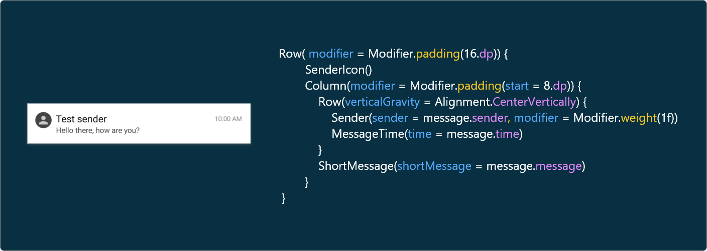
Let’s explore them one-by-one, starting with the sender icon.
让我们从发送者图标开始一个一个地探讨它们。
@Composable
fun SenderIcon() {
    Box(
        backgroundColor = Color.DarkGray,
        modifier = Modifier.clip(CircleShape)
            .preferredSize(30.dp)
    ) {
        Icon(
            asset = vectorResource(id = R.drawable.ic_person),
            tint = Color.LightGray,
            modifier = Modifier.fillMaxSize()
        )
    }
}
The sender icon is designed using the Icon component, which draws asset using tint. It has three parameters:
发送者图标是使用Icon组件设计的,该组件使用tint绘制asset 。 它具有三个参数:
asset: We can assign a vector asset to the icon using this attribute.asset:我们可以使用此属性将矢量资产分配给图标。modifier: For decoration purposes like padding, and moremodifier:用于装饰目的,例如填充等tint: Color code for icontint:图标的颜色代码
@Composable
fun Sender(sender: String, modifier: Modifier = Modifier) {
    Text(
        text = sender,
        style = TextStyle(
            color = Color.Black,
            fontSize = 18.sp
        ),
        modifier = modifier,
        overflow = TextOverflow.Ellipsis,
        maxLines = 1
    )
}
To display the sender name, we used the Text UI component. style is an attribute in text used to decorate it, similar to the style attribute in XML design. Then we have typical attributes like overflow, maxlines, and more to deal with UI stuff.
为了显示发件人名称,我们使用了Text UI组件。 style是用于装饰它的text属性,类似于XML设计中的style属性。 然后,我们具有典型的属性,例如overflow , maxlines ,用于处理UI内容。
Time and a short description for the messages list item are also implemented using the Text UI component with the same attributes. Refer to the GitHub sample for more details (Master branch).
消息列表项的时间和简短描述也可以使用具有相同属性的Text UI组件来实现。 有关更多详细信息,请参阅GitHub示例 (Master分支)。
讯息清单 (Messages List)
Now, it’s time to design the list. AdapterList is the new UI component from Compose for designing lists. It has three parameters:
现在,是时候设计列表了。 AdapterList是Compose中用于设计列表的新UI组件。 它具有三个参数:
data: List of items to show.data:要显示的项目列表。modifier: companion object for stylingmodifier:用于样式化的伴侣对象ItemCallback: To implement click on the list item.ItemCallback:要实现,请单击列表项。
@Composable
fun MessagesList(list: MutableList<Message>,
                 itemClick : (message : Message) -> Unit){
        AdapterList(data = list) {
            MessageView(message = it,itemClick = itemClick)
        }
}
With that, we have built the entire messages app home screen using Jetpack Compose. The next step is to design the conversation screen.
这样,我们就使用Jetpack Compose构建了整个消息应用程序的主屏幕。 下一步是设计对话屏幕。
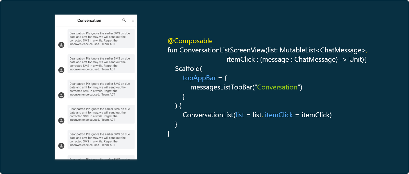
对话画面 (Conversation Screen)
Building the conversation screen is similar to building the home screen. We can reuse the components like TopAppBar from the messages list by changing the title. Coming to the conversation list, we have to use the same adapterlist. The only change is the conversation list item design.
构建对话屏幕类似于构建主屏幕。 我们可以通过更改标题来重用消息列表中的TopAppBar之类的组件。 进入对话列表,我们必须使用相同的adapterlist 。 唯一的变化是会话列表项的设计。
聊天消息列表项 (Chat Message List Item)
In the chat message list item, we have a sender icon similar to the messages list item, so we can reuse the SenderIcon composable function. The new thing we can learn from the chat message item is how to create a background with a custom color and corner radius.
在聊天消息列表项中,我们有一个类似于消息列表项的发件人图标,因此我们可以重用SenderIcon可组合功能。 我们可以从聊天消息项中学到的新知识是如何创建具有自定义颜色和角半径的背景。
At the top level, we have a clickable component to invoke a click on the list item. Then we have Row to align the views horizontally. We’ve used a new attribute, verticalGravity, to align the user icon to the bottom line of the message.
在顶层,我们有一个clickable组件来调用对列表项的单击。 然后,我们使用Row将视图水平对齐。 我们使用了一个新属性verticalGravity ,将用户图标与消息的底行对齐。
@Composable
fun ConversationMessageiew(chatMessage: ChatMessage,
                           itemClick : (message : ChatMessage) -> Unit){


    Clickable(onClick = {
        itemClick(chatMessage)
    }) {
        Row(
            verticalGravity = Alignment.Bottom,
            modifier = Modifier.padding(start = 16.dp, top = 16.dp, end = 16.dp, bottom = 16.dp)
        ) {
            SenderIcon()
            Row(modifier = Modifier.padding(start = 16.dp)
                .drawBackground(color = Color(0xFFf2f3f5),
                    shape = RoundedCornerShape(10.px))) {
                conversationMessage(chatMessage.message)
            }
        }
    }
}
Using Modifier, we created padding with 16dp and a background with a corner radius and custom color — one of the many powerful features of Modifier. Then coming to the chat message, there is nothing new to learn; it’s just a Text component with some padding and text attributes.
使用Modifier ,我们创建填充用16DP和一个圆角半径和自定义颜色背景-中的许多强大的功能之一Modifier 。 然后,进入聊天消息,没有什么新鲜的东西要学习了。 它只是具有某些填充和文本属性的Text组件。
结论 (Conclusion)
Today we’ve learned so many things related to Jetpack Compose, like modifiers, gravity, Icon, actionable items, Adapterlists, how to reuse Compose functions, and more. Feel free to play around with the sample at the GitHub link noted above. In my next article about Compose, we’ll learn how to build server-driven UI using Compose.
今天,我们已经学到了许多与Jetpack Compose相关的东西,例如修饰符,重力, Icon ,可操作项, Adapterlists ,如何重用Compose函数等等。 请随意在上述GitHub链接上试用该示例。 在下一篇有关Compose的文章中,我们将学习如何使用Compose构建服务器驱动的UI。
I hope you learn something useful, thanks for reading.
希望您能学到一些有用的东西,感谢您的阅读。
资源资源 (Resources)
To learn more about JetPack Compose and server-driven UI, check out the following articles.
要了解有关JetPack Compose和服务器驱动的UI的更多信息,请查看以下文章。
翻译自: https://medium.com/better-programming/jetpack-compose-how-to-build-a-messaging-app-e2cdc828c00f
jetpack


 1642
1642


 被折叠的 条评论
为什么被折叠?
被折叠的 条评论
为什么被折叠?
 到【灌水乐园】发言


