


In this post, we are going to learn some tricks about ConstraintLayout to build a more flexible UI for our Android Application.
在本文中,我们将学习有关ConstraintLayout的一些技巧,以便为Android应用程序构建更灵活的UI。
什么是ConstraintLayout? (What is ConstraintLayout?)
According to the official documentation:
根据官方文件:
ConstraintLayoutallows you to create large and complex layouts with a flat view hierarchy (no nested view groups). It's similar toRelativeLayoutin that all views are laid out according to relationships between sibling views and the parent layout, but it's more flexible thanRelativeLayoutand easier to use with Android Studio's Layout Editor.
ConstraintLayout允许您使用平面视图层次结构(无嵌套视图组)创建大型且复杂的布局。 它与RelativeLayout的相似之处在于,所有视图都是根据同级视图和父级布局之间的关系进行布局的,但是它比RelativeLayout更加灵活,并且更易于在Android Studio的布局编辑器中使用。
ConstraintLayout helps us to maintain a flat view hierarchy and ultimately increasing the performance. There are many benefits of using ConstraintLayout but in this post, I will be showing the Circular Positioning in ConstaintLayout.
ConstraintLayout帮助我们维护平面视图层次结构并最终提高性能。 使用ConstraintLayout有很多好处,但是在这篇文章中,我将展示ConstaintLayout中的循环定位。
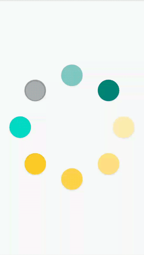
The final design will look like this:
最终设计将如下所示:
To use CircularPostioning, we need to have a reference view which will act as a base for other views to laid out in circular fashion.
要使用CircularPostioning,我们需要有一个参考视图,该参考视图将作为其他以循环方式布局的视图的基础。
<?xml version="1.0" encoding="utf-8"?>
<androidx.constraintlayout.widget.ConstraintLayout xmlns:android="http://schemas.android.com/apk/res/android"
    xmlns:app="http://schemas.android.com/apk/res-auto"
    xmlns:tools="http://schemas.android.com/tools"
    android:id="@+id/main_layout"
    android:layout_width="match_parent"
    android:layout_height="match_parent">


    <Button
        android:id="@+id/main_button"
        android:layout_width="36dp"
        android:layout_height="36dp"
        android:visibility="invisible"
        app:layout_constraintBottom_toBottomOf="parent"
        app:layout_constraintEnd_toEndOf="parent"
        app:layout_constraintStart_toStartOf="parent"
        app:layout_constraintTop_toTopOf="parent" />


</androidx.constraintlayout.widget.ConstraintLayout>
In the above code snippet, the button is the base view around which other views will be laid out.
在上面的代码片段中,按钮是基础视图,其他视图将围绕该基础视图进行布局。
Once we have the XML ready, we can add views to ConstraintLayout dynamically.
准备好XML之后,可以将视图动态添加到ConstraintLayout中。
private fun createButtons() {
        val length = 7
        val angle = 360 / (length + 1)
        for (i in 0..length) {
            val button = Button(this)
            button.id = View.generateViewId()
            button.background = ContextCompat.getDrawable(this, R.drawable.dr_round_bg)
            val layout = ConstraintLayout.LayoutParams(
                50.toPx(),
                50.toPx()
            )
            layout.circleRadius = 120.toPx()
            layout.circleConstraint = R.id.main_button
            layout.circleAngle = (i * angle).toFloat()
            layout.topToTop = ConstraintLayout.LayoutParams.PARENT_ID
            layout.bottomToBottom = ConstraintLayout.LayoutParams.PARENT_ID
            layout.endToEnd = ConstraintLayout.LayoutParams.PARENT_ID
            layout.startToStart = ConstraintLayout.LayoutParams.PARENT_ID
            button.layoutParams = layout
            buttonList.add(button)
            main_layout.addView(button)
        }
    }
layout.circleRadius is the length of the radius from the base view(main_button in our case).
layout.circleRadius是从基本视图开始的半径的长度(在本例中为main_button )。
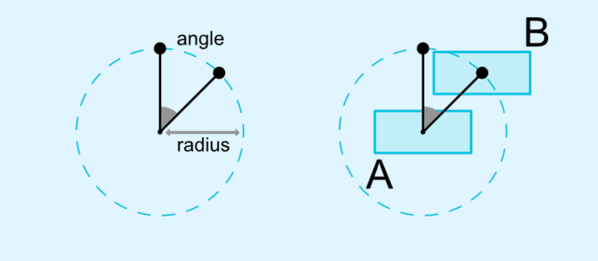
layout.circleConstraint is the view id of the base view relative to which the views will be laid out.
layout.circleConstraint是基础视图的视图ID,将相对于该基础视图进行布局。
layout.circleAngle which angle the widget should be at (in degrees, from 0 to 360)
layout.circleAngle小部件应处于的角度(以度为单位,从0到360)
In this sample app, I am changing the color of the background drawable every 100 milliseconds to make it look like a progress bar. The complete sample code is available here.
在此示例应用程序中,我每隔100毫秒更改背景可绘制的颜色,使其看起来像进度条。 完整的示例代码在这里。
Happy coding!!😊
编码愉快!!😊
翻译自: https://medium.com/swlh/circular-positioning-in-constraintlayout-9c4214889b35


 扫一扫
扫一扫


 3506
3506

 被折叠的 条评论
为什么被折叠?
被折叠的 条评论
为什么被折叠?
 到【灌水乐园】发言


