


 本文探讨了在Android应用程序中管理样式和外观的策略,包括使用字体、Android设计系统、Material设计类型系统以及主题定制等内容,旨在简化样式定义并提高开发效率。
网格系统与版式设计pdf
1.简介 (1. Introduction)
Managing the look and feel of an Android app can get tedious, and more when the app gets bigger. Style definitions, color attributes, sizes, etc. grow and grow if we don’t manage them properly. Even if we can control them, a big set of style definitions can be difficult to follow.
管理Android应用程序的外观可能会很乏味,而当应用程序变得更大时,管理它会变得更加繁琐。 如果我们管理不当,样式定义,颜色属性,大小等就会越来越大。 即使我们可以控制它们,也很难遵循大量样式定义。
To solve this problem it is recommended, first, to have a Style System (a concrete and small set of styles). And secondly, apply it in your application. For this second part, Android Theming can help us.
为解决此问题,建议首先使用样式系统(一组具体的样式)。 其次,将其应用到您的应用程序中。 对于第二部分, Android Theming可以为我们提供帮助。
Because this topic is large, in this article I will focus just on the typography.
因为这个主题很大,所以在本文中,我将仅着眼于版式。
We will see first, how to apply different text fonts in our app. 2. Using Fonts
我们将首先看到如何在我们的应用程序中应用不同的文本字体。 2.使用字体
Then we will review how Android uses differents text styles internally and how we can use them. 3. The Android Design System
然后,我们将回顾Android如何在内部使用差异文本样式以及如何使用它们。 3. Android设计系统
After that, we will review 4. The Material Design Type System and its relation with 5. Android Theming
之后,我们将回顾4. The Material Design Type System及其与5. Android Theming的关系。
And finally, we will see how to use and customize our typography. 6. Creating custom Theme Styles
最后,我们将看到如何使用和自定义字体。 6.创建自定义主题样式
Companion App: You can read and follow this article in this Github Project: Android Design System and Theming: Typography
配套应用 :您可以在Github项目: Android设计系统和主题:版式中 阅读并关注本文
2.使用字体 (2. Using Fonts)
将字体添加到您的项目 (Add Fonts to your project)
Since Android 8.0 fonts can be used as resources. For previous versions, you can use the Support Library 26.
由于Android 8.0字体可以用作资源。 对于以前的版本,您可以使用支持库26。
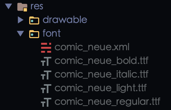
Firstly create the font folder under the res folder. Secondly, add your fonts there. Names must be lower case and with underscores. Like other xmls in Android.
首先在res文件夹下创建font文件夹。 其次,在此处添加字体。 名称必须小写并带有下划线。 像Android中的其他xml一样。
Finally, create your font family resources xml file. Here is where the definitions of your fonts will be.
最后,创建您的字体系列资源xml文件。 这是字体的定义所在。
<?xml version="1.0" encoding="utf-8"?>
<font-family xmlns:app="http://schemas.android.com/apk/res-auto">
 <!-- You can use `android:` instead of `app:` for API level >= 26   -->
  <font
    app:font="@font/comic_neue_regular"
    app:fontStyle="normal"
    app:fontWeight="400" />


  <font
    app:font="@font/comic_neue_bold"
    app:fontStyle="normal"
    app:fontWeight="700" />


  <font
    app:font="@font/comic_neue_light"
    app:fontStyle="normal"
    app:fontWeight="200" />


  <font
    app:font="@font/comic_neue_italic"
    app:fontStyle="italic"
    app:fontWeight="400" />


</font-family>
fontWeight: Positive number, a multiple of 100, and between 100 and 900, inclusive. The most common values are 400 for regular weight and 700 for bold weight.
fontWeight:正数,为100的倍数,且介于100和900之间(含100和900)。 最常见的值是常规重量的400和粗体重量的700。
fontStyle:normaloritalic
fontStyle :normal或italicUsing in Support Library: Declare font families in XML, using the
appnamespace. Official Documentation在支持库中使用 :使用
app名称空间声明XML字体系列。 官方文件
We have everything set up. Now let’s use it.
我们已经准备好一切。 现在让我们使用它。
应用字体 (Applying the fonts)
There are 3 ways to do that.
有3种方法可以做到这一点。
Check the companion
appto see it working. fragment_simple.xml检查配套
app以查看其是否正常运行。 fragment_simple.xml
i. We can use the fonts directly in the view
一世。 我们可以直接在视图中使用字体
<TextView
    ...
    android:fontFamily="@font/comic_neue"/>
ii. Or we can better create and use a style
ii。 或者我们可以更好地创建和使用样式
<style name="MyFontStyle">
    ...
    <item name="fontFamily">@font/comic_neue_bold</item>
  </style>
<TextView
...
style="@style/MyFontStyle"/>iii. But what we really want is to use the Android built-in Design System
iii。 但是我们真正想要的是使用Android内置的设计系统
Let’s see how it can be done.
让我们看看如何完成它。
3. Android设计系统 (3. The Android Design System)
内置样式 (Built-in styles)
Android AppCompat library and the Material Design library offer us a set of premade styles that we can use and modify. Like for example the TextAppearance.AppCompat.Display1
Android AppCompat库和Material Design库为我们提供了一组可以使用和修改的预制样式。 例如,例如TextAppearance.AppCompat.Display1
We can use it like any other style
我们可以像使用其他style一样使用它
<TextView
    style="@style/TextAppearance.AppCompat.Display1"
    .../>
In Android Studio right-clicking on the style and following the path, we can reach the definition of the style. In this case TextAppearance.AppCompat.Display1 inherits from Base.TextAppearance.AppCompat.Display1 that results in this definition:
在Android Studio中,右键单击样式并遵循路径,我们可以达到样式的定义。 在这种情况下, TextAppearance.AppCompat.Display1继承自Base.TextAppearance.AppCompat.Display1 ,从而得出以下定义:
<style name="Base.TextAppearance.AppCompat.Display1">
        <item name="android:textSize">@dimen/abc_text_size_display_1_material</item>
        <item name="android:textColor">?android:textColorSecondary</item>
    </style>
in
v21is actuallyTextAppearance.Material.Headlinebut the attributes are very similar.在
v21中,实际上是TextAppearance.Material.Headline但是属性非常相似。
The same happens with the Material Design Library. For TextAppearance.MaterialComponents.Body1 we can see that it inherits from an appcompat style.
材料设计库也会发生同样的情况。 对于TextAppearance.MaterialComponents.Body1我们可以看到它继承自appcompat样式。
<style name="TextAppearance.MaterialComponents.Body1" parent="TextAppearance.AppCompat.Body2">This is cool. We can get some premade styles to use in our Design System and tweak them instead of building them from scratch.
这很酷。 我们可以在设计系统中使用一些预制样式,并对其进行调整,而不是从头开始构建它们。
The first question could be: Is there a list of all these cool styles?
第一个问题可能是:是否有所有这些酷风格的清单?
There are predefined styles for AppCompat and Material Design libraries. In the next image, you can see some TextAppearance styles from the AppCompat library.
AppCompat和Material Design库具有预定义的样式。 在下一个图像中,您可以从AppCompat库中看到一些TextAppearance样式。
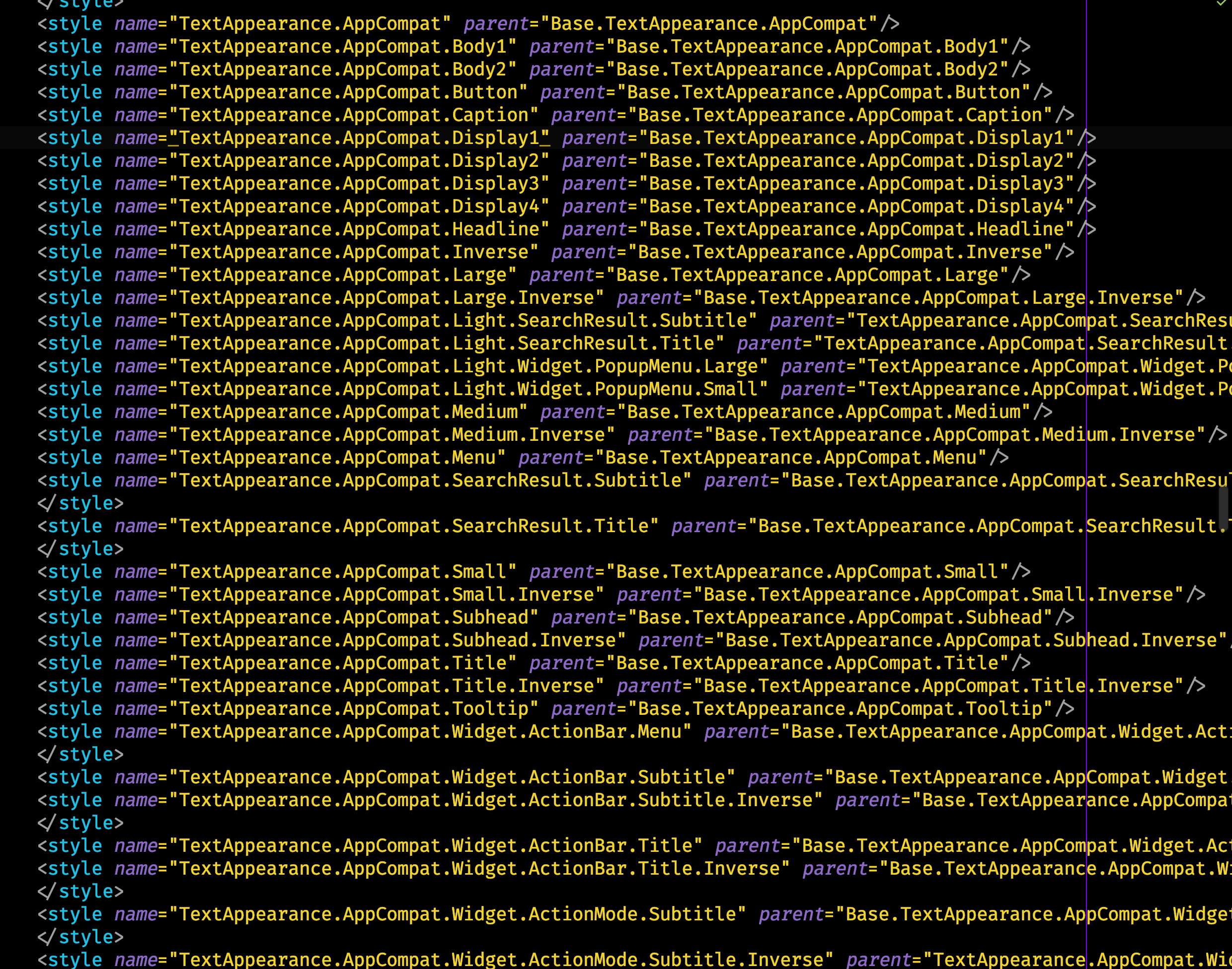
These look big and overwhelming but don’t worry we are going to simplify all of it.
这些看起来很大而压倒性的,但是不用担心我们将简化所有这些。
4.物料设计类型系统 (4. The Material Design Type System)
To continue, let’s check the Material Design documentation for Type Scale about typography.
要继续,让我们检查材料设计文档中关于字体类型比例的信息。
The main 2 points of its definition are:
其定义的主要两点是:
A range of contrasting styles that support the needs of your product and its content.
一系列可支持产品及其内容需求的对比样式。
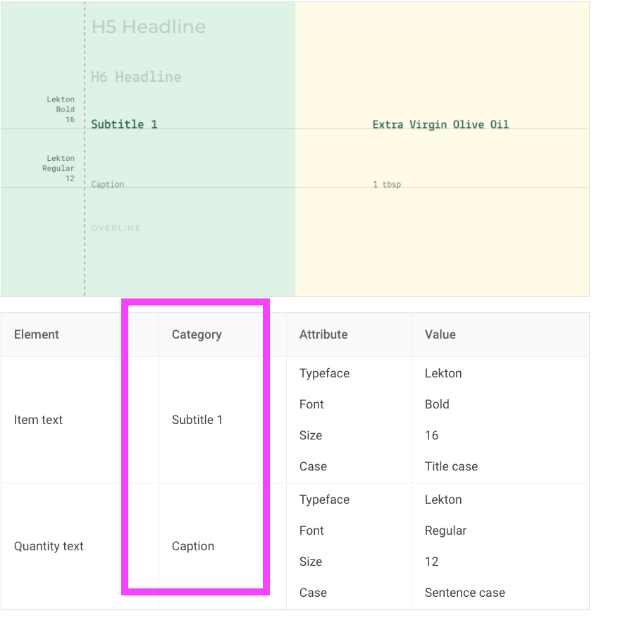
A combination of thirteen styles that are supported by the type system. It contains reusable categories of text, each with an intended application and meaning.
类型系统支持的十三种样式的组合。 它包含可重用的文本类别,每种类别都有预期的应用程序和含义。
TL;DR: They defined 13 styles that should be enough for any application.
TL; DR:他们定义了13种样式,足以满足任何应用程序的需求。
Here are the 13 styles:
以下是13种样式:

These styles are used in all the Material Design Definitions. If you go to the Material Design documentation and look for a component you will find the corresponding Type Scale Category associated with each element.
所有材料设计定义中都使用了这些样式。 如果转到“材料设计”文档并查找组件,则会找到与每个元素关联的相应的“ 类型比例 C” 分类 。
For example, in the List component in the theming typography section you can see how they use the Type Scale Category to define the styles of the different list components.
例如,在主题排版部分的“ List组件中,您可以看到它们如何使用“ 类型比例”类别来定义不同列表组件的样式。
Now let’s go back to Android
现在让我们回到Android
5. Android主题 (5. Android Theming)
主题属性与视图属性(少于100个字) (Theme attributes vs View attributes (in less than 100 words))
The Android system defines Theme Attributes. Let’s see how they differ from the View Attributes.
Android系统定义主题属性 。 让我们看看它们与View Attributes有何不同。
View attributes:
查看属性:
Applied to a single View.
应用于单个View 。
android:textColor=red,android:fontFamily="@font/comic_neue".android:textColor=red,android:fontFamily="@font/comic_neue"。
<TextView
    ...
    android:fontFamily="@font/comic_neue"/>
Theme attributes.
主题属性。
Applied to a Theme, not a view.
应用于主题 ,而不是视图。
colorPrimary = red,textAppearanceBody1 = ....colorPrimary = red,textAppearanceBody1 = ...They are defined in the Theme
它们在主题中定义
The Theme provides and varies them.
主题提供并改变了它们。
- They will be the same in all the application. 它们在所有应用程序中都是相同的。
- Should be used widely. 应该被广泛使用。
<style name="Base.Theme.MyApp" parent="Theme.MaterialComponents.DayNight.DarkActionBar">
    <item name="textAppearanceBody1">@style/TextAppearance.MyApp.Body1</item>
  </style>
To use them just call them with the ?attr keyword first.
要使用它们,只需先使用?attr关键字调用它们。
<TextView
  ...
  android:textAppearance="?attr/textAppearanceBody1" />
Android文字外观属性 (Android text appearance attributes)
We are talking about typography, so which are the Theme Attributes for typography.
我们正在谈论印刷术,因此印刷术的主题属性是这些。
textAppearanceBody1
   textAppearanceBody2
   textAppearanceButton
   textAppearanceCaption
   textAppearanceHeadline1
   textAppearanceHeadline2
   textAppearanceHeadline3
   textAppearanceHeadline4
   textAppearanceHeadline5
   textAppearanceHeadline6
   textAppearanceOverline
   textAppearanceSubtitle1
   textAppearanceSubtitle2
If you remember, the Material Design Docs said: “ 13 typestyles would be enough”. Android provides us with these 13 theme attributes.
如果您还记得,那么Material Design Docs会说:“ 13种字体就足够了 ”。 Android为我们提供了这13个主题属性 。
All these Theme Attributes are set to a specific premade style, and as we did before with the premade styles, we can do it with the theme attributes.
所有这些主题属性都设置为特定的预制样式,就像我们之前使用预制样式所做的那样,我们可以使用主题属性来完成 。
<TextView
  ...
  android:textAppearance="?attr/textAppearanceHeadline5" />
To know which are the default styles that Android uses we just need to follow the path of the theme. Right-click on the attribute, follow the thread until you find the style. For Theme.MaterialComponents.DayNight.DarkActionBar you can reach how textAppearanceBody1 is set to the style TextAppearance.MaterialComponents.Body1
要知道哪些是Android使用的默认样式,我们只需要遵循主题的路径即可。 右键单击属性,跟随线程,直到找到样式。 对于Theme.MaterialComponents.DayNight.DarkActionBar您可以了解如何将textAppearanceBody1设置为样式TextAppearance.MaterialComponents.Body1
<item name="textAppearanceBody1">@style/TextAppearance.MaterialComponents.Body1</item>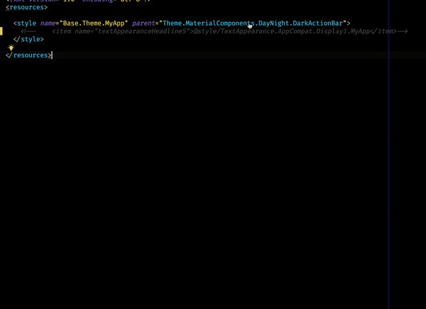
You can see that we end up in Base.V14.Theme.MaterialComponents.Light.Bridge
您可以看到我们最终到达Base.V14.Theme.MaterialComponents.Light.Bridge
Remember:
请记住:
res/values/styles.xml: themes for all versions
res/values/styles.xml:所有版本的主题
res/values-v21/styles.xml: themes for API level 21+ only
res/values-v21/styles.xml:仅适用于API级别21+的主题
The full list of Typestyles in the Material Design library is this one.
Material Design库中的Typestyles的完整列表是此列表。
<!-- Type styles -->
    <item name="textAppearanceHeadline1">@style/TextAppearance.MaterialComponents.Headline1</item>
    <item name="textAppearanceHeadline2">@style/TextAppearance.MaterialComponents.Headline2</item>
    <item name="textAppearanceHeadline3">@style/TextAppearance.MaterialComponents.Headline3</item>
    <item name="textAppearanceHeadline4">@style/TextAppearance.MaterialComponents.Headline4</item>
    <item name="textAppearanceHeadline5">@style/TextAppearance.MaterialComponents.Headline5</item>
    <item name="textAppearanceHeadline6">@style/TextAppearance.MaterialComponents.Headline6</item>
    <item name="textAppearanceSubtitle1">@style/TextAppearance.MaterialComponents.Subtitle1</item>
    <item name="textAppearanceSubtitle2">@style/TextAppearance.MaterialComponents.Subtitle2</item>
    <item name="textAppearanceBody1">@style/TextAppearance.MaterialComponents.Body1</item>
    <item name="textAppearanceBody2">@style/TextAppearance.MaterialComponents.Body2</item>
    <item name="textAppearanceCaption">@style/TextAppearance.MaterialComponents.Caption</item>
    <item name="textAppearanceButton">@style/TextAppearance.MaterialComponents.Button</item>
    <item name="textAppearanceOverline">@style/TextAppearance.MaterialComponents.Overline</item>
Now we can use the Material theme as a base for our custom Type Styles.
现在,我们可以将Material主题用作自定义类型样式的基础。
6.创建自定义主题 (6. Creating Custom Themes)
For example, to create our custom style for the Headline5, we can do as follows.
例如,要为Headline5创建自定义样式,我们可以执行以下操作。
First, create a file under the res folder called type.xml.
首先,在res文件夹下创建一个名为type.xml文件。
Instead of creating the style in the
styles.xmlthe new recommendation is the one presented in Developing Themes with Style (Android Dev Summit '19)新建议不是在
styles.xml中创建样式,而是在“ 使用样式开发主题”(Android Dev Summit '19)中提出的建议。
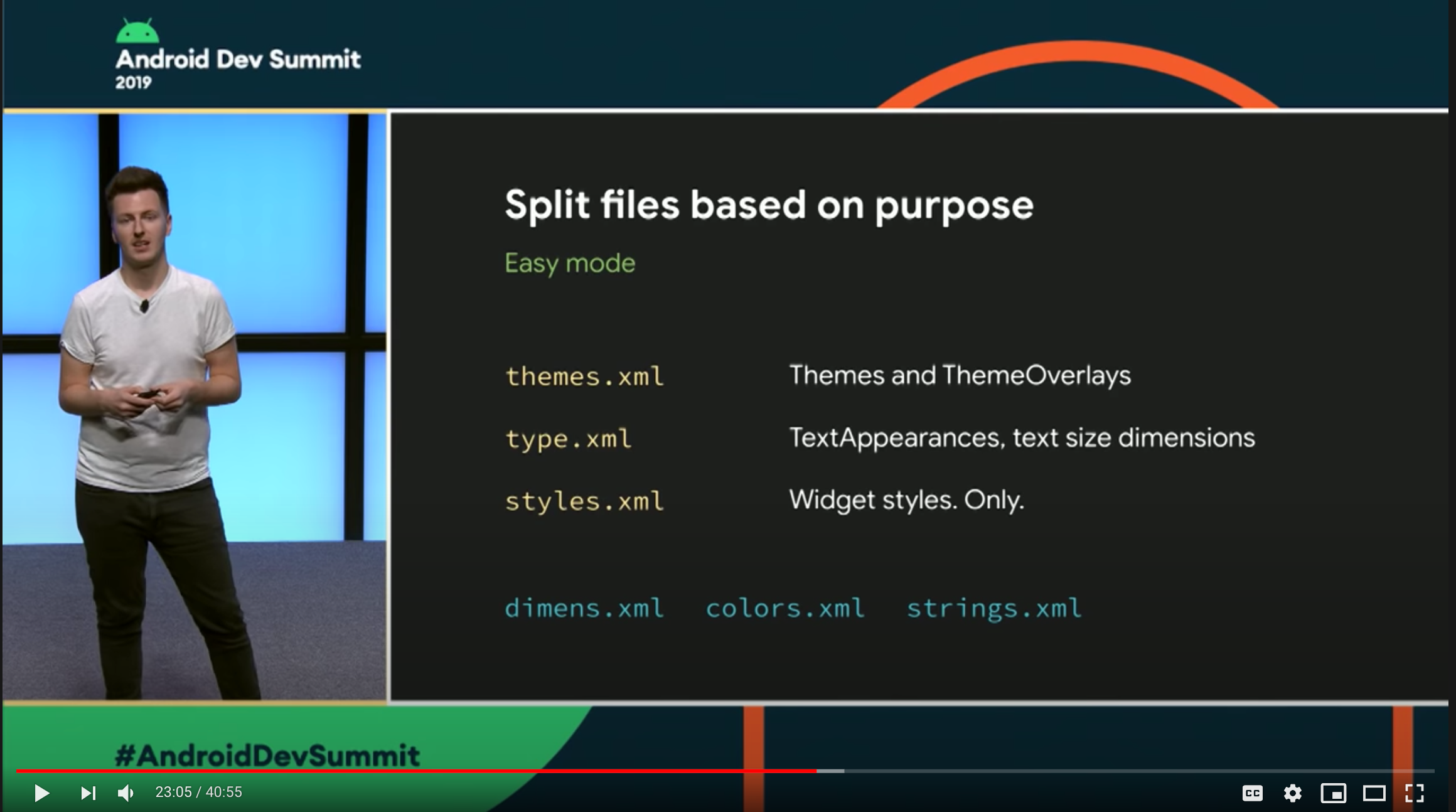
Second, add your TextAppearance style.
其次,添加您的TextAppearance样式。
<style name="TextAppearance.MaterialComponents.Headline5.MyApp">
  <item name="fontFamily">@font/comic_neue_light</item>
  <!-- You can customize other attributes -->
  <item name="android:textColor">...</item>
  <item name="android:textSize">...</item>
</style>
Easy Hierarchy: Dot notation also applies inheritance so this
TextAppearance.MaterialComponents.Headline5.MyAppinherits fromTextAppearance.MaterialComponents.Headline5. You don't need to specify the parent explicitly.简易层次结构 :点符号也应用继承,因此此
TextAppearance.MaterialComponents.Headline5.MyApp继承自TextAppearance.MaterialComponents.Headline5。 您无需显式指定父级。
Inheriting from the MaterialComponents styles will reduce the number of attributes to set and will make your application more consistent with the Material Design Guidelines.
从MaterialComponents样式继承将减少要设置的属性数量,并使您的应用程序与Material Design Guidelines更加一致。
Finally, we need to set up this style to our Theme Attribute in our Theme Definition.
最后,我们需要在主题定义中将这种样式设置为主题属性 。
In your themes.xml add the definition.
在您的themes.xml添加定义。
<style name="Base.Theme.MyApp" parent="Theme.MaterialComponents.DayNight.DarkActionBar">
  <item name="textAppearanceHeadline5">@style/TextAppearance.MaterialComponents.Headline5.MyApp</item>
</style>
Don’t forget to add your theme in the manifest.
不要忘记在清单中添加主题。
<application
...
android:theme="@style/Base.Theme.MyApp">
And that’s it.
就是这样。
In all the TextViews whose textAppearance is set to textAppearanceHeadline5, your custom style will be set.
在所有textAppearance设置为textAppearanceHeadline5的TextViews ,将设置您的自定义样式。
<TextView
  ...
  android:textAppearance="?attr/textAppearanceHeadline5" />
7.额外 (7. Extra)
叠加层 (Overlays)
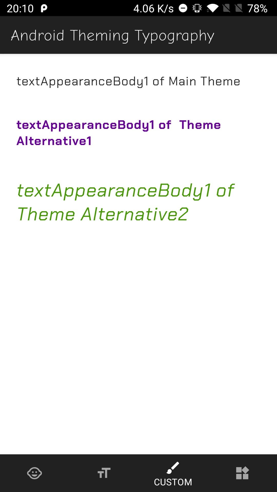
Another cool feature in the Android Theming System is theme overlays. A Theme Overlay is a technic to change the theme of a part of your view and its descendant in a simple easy way.
Android主题系统中的另一个很酷的功能是主题覆盖。 主题叠加是一种技术,可以通过一种简单的方法来更改视图的一部分及其后代的主题。
In any of your views, you can add the android:theme attribute and set it to a specific theme. The view and all its children will use the new theme.
在任何视图中,您都可以添加android:theme属性并将其设置为特定主题。 该视图及其所有子级将使用新主题。
<style name="TextAppearance.MaterialComponents.Body1.MyApp.Alternative">
    <item name="fontFamily">@font/chakra_petch_bold</item>
    <item name="android:textColor">#660099</item>
  </style>
<style name="Theme.MyApp.TypeScale.Alternative" parent="Theme.MyApp.TypeScale">
<item name="textAppearanceBody1">@style/TextAppearance.MaterialComponents.Body1.MyApp.Alternative</item>
</style><TextView
android:layout_width="match_parent"
android:layout_height="wrap_content"
android:layout_margin="16dp"
android:text="textAppearanceBody1 of Main Theme"
android:textAppearance="?attr/textAppearanceBody1" /> <!-- Uses the app themes textAppearanceBody1-->
<LinearLayout
android:layout_width="match_parent"
android:layout_height="wrap_content"
android:theme="@style/Theme.MyApp.TypeScale.Alternative">
<TextView
android:layout_width="match_parent"
android:layout_height="wrap_content"
android:layout_margin="16dp"
android:text="textAppearanceBody1 of Theme Alternative1"
android:textAppearance="?attr/textAppearanceBody1" /> <!-- Uses the alternative themes textAppearanceBody1-->
</LinearLayout>Check this in the companion app: fragment_custom.xml
在配套应用程序中检查以下内容: fragment_custom.xml
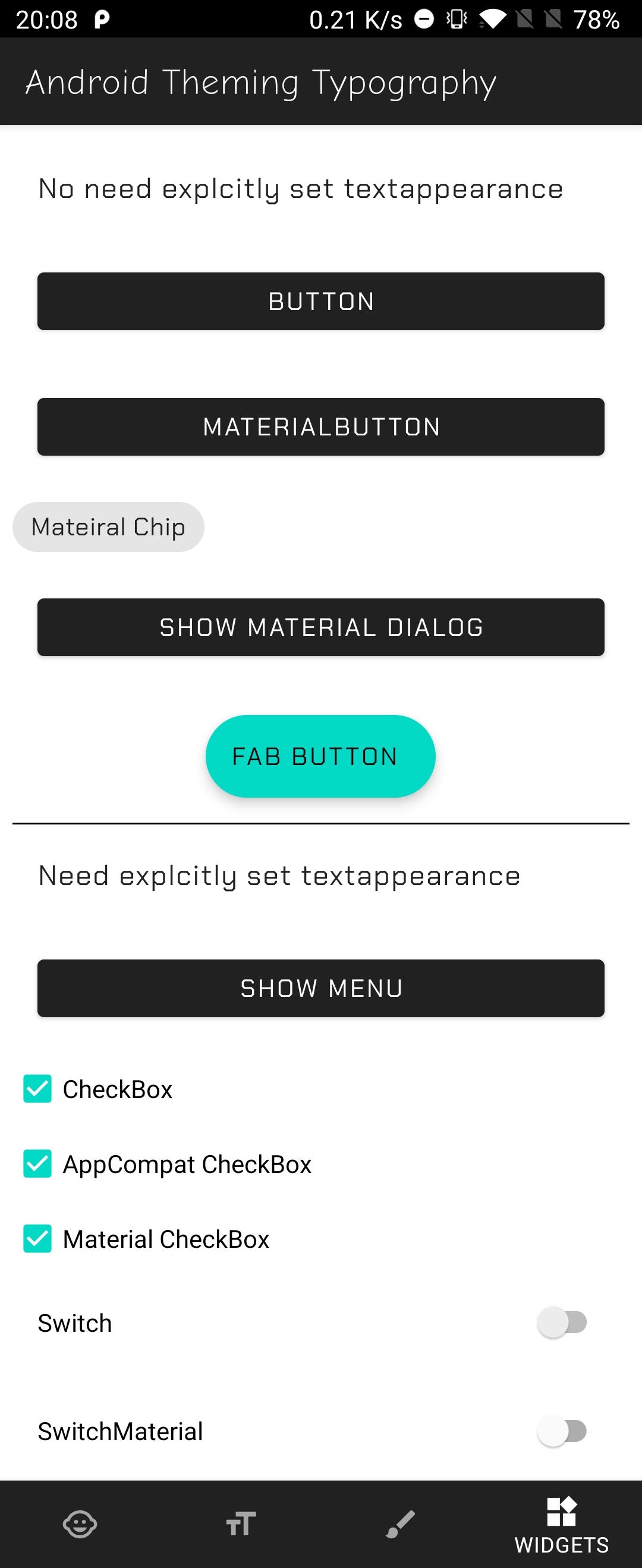
小部件 (Widgets)
Some widgets will use the Theme Attributes, so if you have all set you won’t need to change anything on the widget, the style will get it properly.
某些小部件将使用Theme Attributes ,因此,如果您已进行了全部设置,则无需更改小部件上的任何内容,样式便可以正确获取它。
Check this in the companions app fragment_widgets.xml
在随播应用程序fragment_widgets.xml中进行检查
As you can see in the Companion App in the Widgets Tab, the Button and the MaterialChip widgets do not set any textAppearance in its definition, and it shows the correct Type Style. But others like the CheckBox or the Switch do not have a default textAppearance. For these (and others) widgets, you would need to set it explicitly.
正如您在Widget标签的Companion App中看到的那样, Button和MaterialChip小部件在其定义中未设置任何textAppearance ,并且显示了正确的Type Style 。 但是其他诸如CheckBox或Switch都没有默认的textAppearance 。 对于这些(和其他)窗口小部件,您需要显式设置。
材质组件与AppCompat。 我应该使用哪个库? (Material Components vs AppCompat. Which library should I use?)
I would suggest going with the Material Components Library, the style is more aligned with the Material Documentation.
我建议使用材料组件库,其样式与材料文档更一致。
In case you can’t add the library, go with Appcompat but be aware that some theme attributes do not have the corresponding premade style. Like there is no TextAppearance.AppCompat.Subtitle1 or Headline,2,3,4 but instead Display1,2,3.
如果您无法添加库,请使用Appcompat,但要注意,某些主题属性没有相应的预制样式。 就像没有TextAppearance.AppCompat.Subtitle1或Headline,2,3,4而是Display1,2,3 。
8.回顾 (8. Recap)
There are 4 steps to have your custom type styles in your Android App using Theming:
使用主题在Android应用中使用自定义字体样式需要执行4个步骤:
- Add your fonts. 添加字体。
Create a Theme:
<style name="Base.Theme.MyApp" parent="Theme.MaterialComponents.DayNight...创建一个主题:
<style name="Base.Theme.MyApp" parent="Theme.MaterialComponents.DayNight...Add to the theme, the custom styles for every Text Appearance Theme Attribute:
textAppearanceBody1,textAppearanceHeadline1...将每个Text Appearance主题属性的自定义样式添加到主题中:
textAppearanceBody1,textAppearanceHeadline1...Apply them in your views:
android:textAppearance="?attr/textAppearanceBody1"在您的视图中应用它们:
android:textAppearance="?attr/textAppearanceBody1"
9.结论 (9. Conclusion)
Android Styling and Theming is a big topic but once you know how it works it can simplify your style definitions, and increase your development speed.
Android样式和主题化是一个大话题,但是一旦您知道它是如何工作的,它就可以简化样式定义并提高开发速度。
The Material Design library works pretty well with Android so you can benefit from it. And in case you need to add your custom Design System, it is very easy to create a theme and add your styles.
Material Design库在Android上运行良好,因此您可以从中受益。 而且,如果您需要添加自定义设计系统,创建主题和添加样式非常容易。
Many of the topics presented in this article can be applied not only to the typography but also to colors and shapes. (Let me know if you liked this article and want me to write about colors and shapes).
本文介绍的许多主题不仅可以应用于版式,而且可以应用于颜色和形状。 (让我知道您是否喜欢这篇文章,并希望我写一下颜色和形状)。
Before saying goodbye I recommend you checking this Android Dev Summit talk Developing Themes with Style by Nick Butcher and Chris Banes. There are also several posts in Medium by Nick Butcher covering all topics about theming and styling.
在说再见之前,我建议您检查一下Nick Butcher和Chris Banes撰写的 Android Dev Summit 主题“使用样式开发主题” 。 Nick Butcher 在Medium中也有几篇帖子,涵盖了有关主题和样式的所有主题。
Finally, I hope this article helps you to understand Android Theming and Styling a bit better.
最后,我希望本文能帮助您更好地理解Android主题和样式 。
Thank you for reading.
感谢您的阅读。
翻译自: https://proandroiddev.com/android-design-system-and-theming-typography-6260c37b1243
网格系统与版式设计pdf


 扫一扫
扫一扫


 被折叠的 条评论
为什么被折叠?
被折叠的 条评论
为什么被折叠?
 到【灌水乐园】发言


