


 本文探讨了演讲技巧如何能够帮助提升数据可视化设计的质量。通过借鉴演讲中的建立信任、教学、移动、愉悦等原则,文章提供了九个实用的建议,旨在帮助数据可视化设计师创造更具影响力和长久性的作品。
政府公开数据可视化
What do good speeches and good data visualisation have in common? More than you may think.
好的演讲和好的数据可视化有什么共同点? 超出您的想象。
Aristotle — the founding father of all things public speaking — believed that the job of an orator was to discover the best available means of persuasion. That includes, first, defining all the arguments that can be made for and against a given proposition, then selecting those that will hold most sway with the audience and communicating them in the best possible manner.
亚里斯多德(Aristotle)是所有公开演讲的奠基人,他认为演说家的工作是发现最佳的说服手段。 其中包括,首先,定义可以支持和反对给定命题的所有论据,然后选择最能与听众保持联系的论点,并以最佳方式进行交流。
Does this sound familiar? To me, an orator’s work seems very similar to that of data visualisation designer’s. We explore data to find patterns and insights that will be useful for the audience, and then communicate them in a visual way.
这听起来很熟悉吗? 在我看来,演说者的作品与数据可视化设计师的作品非常相似。 我们探索数据以找到对受众有用的模式和见解,然后以视觉方式进行交流。
How can this parallel improve our thinking about data design? In this article, I’ll explore nine foundational principles from speaking in public and explain how they can help you improve your data work.
这种并行方式如何改善我们对数据设计的思考? 在本文中,我将从公开演讲中探索九个基本原则,并解释它们如何帮助您改善数据工作。

1 /建立信任 (1/ Build Trust)
At the centre of Aristotle’s approach to speechmaking is the concept called ethos. Ethos is essentially answering the question, why should I trust you?
亚里斯多德演说方法的中心是名为ethos的概念。 Ethos本质上是在回答这个问题, 为什么我应该信任您?
If I were to give a talk on data visualisation, I’d start by introducing myself. I’d talk about my experience in the field and probably show some of my work. My posture, tone of voice and gestures would reflect confidence. All this would demonstrate that I have expertise on the matter. You’ll be more compelled to listen to me after I show you I know what I’m talking about.
如果我要谈数据可视化,我首先要自我介绍。 我将谈论自己在该领域的经验,并可能展示一些我的工作。 我的姿势,语气和手势会反映出自信。 所有这些都表明我对此事有专门知识。 在我告诉你我知道我在说什么之后,你会更被迫听我讲话。
See what I’m getting at? Ethos is the foundation on which your relationship with the audience is built.
明白我在说什么吗? 精神是您与听众建立关系的基础。
In data visualisation, trust is also crucial, although it’s created in a different manner. Andy Kirk dedicated an important part of his book to trustworthiness. As he discusses, one way to show the reader they can trust you is to link to the data sources and put forward any assumptions they should know about. A good example of this is Datawrapper’s coronavirus charts where all the caveats in the data are clearly stated.
在数据可视化中,信任也是至关重要的,尽管它是以不同的方式创建的。 安迪·柯克(Andy Kirk)将书中的重要部分献给了诚信。 正如他所讨论的那样,向读者表明他们可以信任您的一种方法是链接到数据源,并提出他们应该知道的所有假设。 Datawrapper的冠状病毒图表就是一个很好的例子,其中清楚说明了数据中的所有警告。

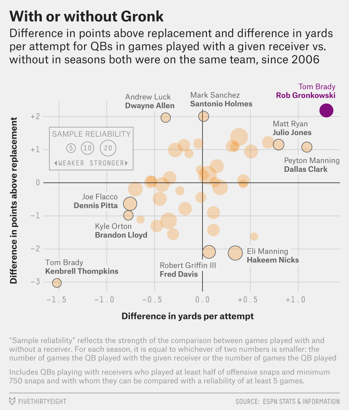
Another way to gain your audience’s trust is to pay (a lot of) attention to detail. That means you should consider every single word and dot in your chart: align all elements, remove unnecessary clutter, format the tooltips and much more. Take the graph from FiveThirtyEight below — isn’t it flawless? That’s what you should aim for, too.
获得听众信任的另一种方法是(非常)注重细节。 这意味着您应该考虑图表中的每个单词和点:对齐所有元素,消除不必要的混乱,设置工具提示的格式等等。 从下面的FiveThirtyEight中获取图表-完美无缺吗? 这也是您的目标。

If you design with ethos in mind, the audience will trust you. Do it consistently, and you will build a longstanding professional reputation.
如果你在考虑风气设计,观众会相信你。 始终如一地做,您将建立长期的专业声誉。
2 /示教,移动,愉悦 (2/ Teach, Move, Delight)
In public speaking, the presenter can have one of three objectives — to teach, to move or to delight. Sal Kahn taught about online education in his 2011 TED talk. Martin Luther King Jr. inspired the country to take action against racial injustice in his 1963 I Have a Dream speech. President Obama entertained in his 2016 White House Correspondents Dinner address, most famous for its mic drop moment.
在公开演讲中,演讲者可以实现三个目标之一:教学,移动或取悦。 萨尔·卡恩(Sal Kahn)在2011年的TED演讲中讲授了在线教育。 小马丁·路德·金(Martin Luther King Jr.)在1963年的《 我有一个梦想》演讲中,启发该国采取行动打击种族歧视。 奥巴马总统在2016年白宫记者晚宴上致辞,该讲话最著名的是麦克风掉落时刻。
In data visualisation, the same three objectives apply. You may be teaching the audience about a topic or a chart type that’s unfamiliar to them (see this chord diagram breakdown by Nadieh Bremer). You may be trying to move them to take action (see this visualisation by David Borczuk). Or you may purely want to entertain with a playful visual (see My Fallen Kingdom by Judit Bekker).
在数据可视化中,适用相同的三个目标。 您可能正在向听众讲授他们不熟悉的主题或图表类型(请参阅Nadieh Bremer的和弦图细目分类 )。 您可能正在尝试使它们采取行动(请参阅David Borczuk的可视化内容)。 或者,您可能纯粹是想以有趣的视觉效果来娱乐(请参见Judit Bekker的《 我堕落的王国》 )。
Why is this important? If you define the objective at the start of the design process, it can guide you in choosing content. For example, if your aim is to move the audience to action, how will you present the problem? How will you show it’s relevant to them? How will you frame the conclusion?
为什么这很重要? 如果您在设计过程开始时就定义了目标,那么它可以指导您选择内容。 例如,如果您的目标是使听众采取行动,那么您将如何提出问题? 您如何证明它与他们相关? 您将如何得出结论?
3 /连接点 (3/ Connect the Dots)
Once your objective is clear, you can define a through-line. If it’s the first time you’re hearing this term, you’re not the only one. The concept of a through-line is common in theatre plays, films and novels; I believe it was first introduced in public speaking by the team at TED.
明确目标后,即可定义一条直通路线 。 如果这是您第一次听到这个词,那您不是唯一的一个。 直通线的概念在戏剧,电影和小说中很常见。 我相信它是TED团队在公开演讲中首次引入的。
So what’s a through-line? It’s your core message, the take-away you’d like the audience to go home with. It’s the connecting theme that ties together each narrative element of your work. Chris Anderson — the head of TED — cites two examples in his book. The first one is the start of a talk without a through-line:
那么什么是直通电话? 这是您的核心信息,是观众希望带回家的外卖食品。 这是将您作品的每个叙事元素联系在一起的主题 。 TED的负责人克里斯安德森(Chris Anderson)在书中列举了两个例子。 第一个是没有直通电话的谈话的开始:
I want to share with you some experiences I had during my recent trip to Cape Town, and then make a few observations about life on the road…
我想与您分享我最近在开普敦旅行期间的一些经验,然后对旅途中的生活进行一些观察……
And the second one is the same opening, rephrased:
第二个是相同的开头,改写为:
On my recent trip to Cape Town, I learned something new about strangers–when you can trust them, and when you definitely can’t. Let me share with you two very different experiences I had. . .
在最近的开普敦旅行中,我了解了一些陌生人的新知识-什么时候可以信任他们,什么时候绝对不能信任他们。 让我与您分享我所经历的两种截然不同的经历。 。 。
The message is much clearer in the second opening, isn’t it?
在第二个开口中,该信息更加清晰了,不是吗?
What would a through-line look like in data visualisation? As an example, let’s look at Ludovic Tavernier’s visual called Two Years Late. What’s his through-line? I’d phrase it something like this:
数据可视化中的直通行是什么样的? 举例来说,让我们看一下Ludovic Tavernier的视觉作品《 两年后》 。 他的直通电话是什么? 我会这样说:
The human stories behind the US immigration policies.
美国移民政策背后的人间故事。
How can you craft a through-line for your own work? Define an objective first, as discussed in the previous section. Then, go deeper. What exactly are you trying to convey? What do you want your audience to remember after they’ve explored your work? Be as specific as possible, but keep the message to a single sentence.
您如何为自己的工作制作一条直通电话? 首先定义一个目标,如上一节所述。 然后,更深入。 您到底想传达什么? 您的听众在浏览您的作品后想记住什么? 尽可能具体,但将消息保持在一个句子中。
Now, when you add content to your visualisation, choose only those bits that relate to this core message. If you do so, it will be much easier for the audience to know where you’re headed. Your visual will be more focused and more impactful.
现在,当您在可视化中添加内容时,仅选择与该核心消息相关的那些位。 如果您这样做的话,听众将更容易知道您的去向。 您的视觉效果将更加集中且更具影响力。
4 /将零件放在正确的位置 (4/ Put the Parts in the Right Place)
I love this quote from Quintilian on the importance of structure:
我喜欢Quintilian所说的结构重要性:
<…> though all the limbs of a statue be cast, it is not a statue until they are united, and if, in our own bodies or those of any other animals, we were to displace or alter the position of any part, they would be but monsters, though they had the same number of parts.
<…>尽管雕像的所有四肢都被铸造,但直到它们团结起来才成为雕像,如果在我们自己或任何其他动物的身体中,我们要替换或改变任何部位的位置,尽管零件数量相同,但它们只是怪物。
He paints quite an image, doesn’t he!
他画的很漂亮,不是吗!
It’s customary to divide a speech into three parts: introduction, body and conclusion. I’m sure you already know this from school. What you may not have thought of is that you can (and often should!) apply this structure to data visualisation, too.
通常将演讲分为三个部分: 绪论 , 正文和结论 。 我确定您已经从学校知道这一点。 您可能没有想到的是,您也可以(而且经常应该!)将这种结构应用于数据可视化。
To understand how, let’s look at Ludovic Tavernier’s visualisation I introduced in the previous section.
要了解其方式,让我们看一下我在上一节中介绍的Ludovic Tavernier的可视化。
Introduction
介绍
The objective of an introduction is to hook the audience, to incite curiosity, and to show them what the story will be about.
简介的目的是吸引观众,激发好奇心,并向他们展示故事的内容。
An introduction in data visualisation can comprise the title and the subtitle, the explanatory paragraph, and perhaps the first chart that provides context in a dense visualisation or an infographic.
数据可视化的介绍可以包括标题和副标题,说明性段落,也可以包括在密集的可视化或信息图中提供上下文的第一个图表。

In Ludovic’s visualisation (excerpt on the left), the reader’s attention is immediately captured with the two brief stories in the map and the strong title. Then, the reader is drawn further into the topic through the touching human story in the first paragraph.
在Ludovic的可视化效果中(左侧摘录),通过地图中的两个简短故事和强标题立即抓住了读者的注意力。 然后,通过第一段中感人的人类故事进一步吸引读者进入该主题。
Body
身体
This is the meat of your visualisation, where you explain your message. In each part of the body, reveal something the audience doesn’t know yet, and then build on it, brick by brick.
这是您可视化的内容,您可以在其中解释您的信息。 在身体的每个部分中,揭示观众尚不知道的内容,然后在其上逐块建立。
Ludovic created three charts in the body of his visualisation (see below). He introduced three bits of information: the overall decrease in the number of accepted refugees, the situation by state and then its evolution over a longer period of time. Each of the graphs builds on the previous one, and once we’re done reading them, we understand the depth of the topic better.
Ludovic在其可视化主体中创建了三个图表(请参见下文)。 他介绍了三点信息:被接纳的难民人数总体减少,各州的情况,然后是较长时期的演变。 每个图都建立在前一个图的基础上,阅读完这些图后,我们会更好地理解主题的深度。

Conclusion
结论
This is where you summarise, provide a takeaway, add a call to action or open a bigger debate. In data design, the conclusion can take the form of a simple sentence, an action button, or even a visual.
在这里,您可以进行总结,提供总结,呼吁采取行动或展开更大的辩论。 在数据设计中,结论可以采取简单的句子,操作按钮甚至视觉效果的形式。
Ludovic chose to talk about the political situation in the US as a potential cause for the issues he described, leaving us with some food for thought.
卢多维奇选择谈论美国的政治局势,这是他所描述问题的潜在原因,这使我们有了一些思考的机会。

Structuring your visual well will make it easier for the reader to navigate it and will keep them engaged. Even if you’re not making a long infographic like Ludovic, you can still work with this structure. In a smaller visual, the introduction will be the title and the subtitle, the body will be the main chart area with its annotations, and the conclusion will be the biggest call-out, highlight or note at the end.
良好地构建视觉效果将使读者更轻松地进行导航,并使他们保持参与。 即使您没有制作像Ludovic这样的冗长的信息图,您仍然可以使用此结构。 在较小的外观中,简介将是标题和副标题,正文将是带有注释的主要图表区域,结论将是最后的最大标注,突出显示或注释。
As an example, see Alli Torban’s visualisation on real-estate below.
例如,请参见下面的Alli Torban房地产可视化。

5 /敲右声 (5/ Strike the Right Tone)
Imagine a scientist defending their PhD dissertation and a mother telling a bedtime story to her toddler. How will their speeches be different? The scientist will probably use complex terms and speak in a serious voice. The mother will be more creative and playful. The ancient Greek philosophers called this decorum — adapting the style of a speech to its audience and theme.
想象一下,一位科学家为自己的博士学位论文辩护,而一位母亲在给孩子讲睡前故事。 他们的演讲会有何不同? 科学家可能会使用复杂的术语并以严肃的态度说话。 母亲会变得更有创造力和顽皮。 古希腊哲学家称之为“ 礼节” ,使演讲风格适应听众和主题。

What’s decorum in data design? It covers your stylistic choices: colour, typefaces and illustrations. When reporting on a sensitive topic — the coronavirus pandemic, for example — it’s best to avoid rainbow colour palettes and fun fonts. You have much more freedom, though, when you work on a lighter topic with lower stakes. This is what Sarah Bartlett did with her European cities on a budget visualisation, shown at left. She used a creative typeface for the titles, many colours and icons.
数据设计中的什么礼节? 它涵盖了您的风格选择:颜色,字体和插图。 报告敏感主题时(例如,冠状病毒大流行),最好避免使用彩虹色调色板和有趣的字体。 但是,当您以较低的赌注从事较轻的话题时,您将拥有更多的自由。 这是莎拉·巴特利特(Sarah Bartlett) 在预算可视化中对欧洲城市所做的工作,如左图所示。 她为标题,许多颜色和图标使用了创新的字体。
Decorum is how your audience will decide if they can take you seriously, and if they want to engage with the visual. Don’t take it lightly!
观众可以通过Decorum决定他们是否可以认真对待您,以及他们是否希望与视觉互动。 不要掉以轻心!
6 /少即是多 (6/ Less is More)
As speech needs to be digested by the listener right away, short and simple words and sentences work best. You need to get your message across in as few words as possible, or, in other terms — less is more. A brilliant example is one of the most famous speeches in history, President Lincoln’s Gettysburg Address. With only 271 words, Lincoln inspired the audience and made them forget the hours of speech that came before him.
由于听众必须立即消化语音,因此简短的单词和句子效果最佳。 您需要用尽可能少的词来传达您的信息,或者换句话说, 少即是多 。 一个杰出的例子是历史上最著名的演讲之一, 林肯总统的《葛底斯堡演说》 。 林肯只有271个字,激发了听众的灵感,使他们忘记了面前的演讲时间。
In data visualisation, the less is more principle also applies. While orators remove unnecessary words from their speech, you should remove any design elements that do not add value. Antoine de Saint Exupéry said, “Perfection is achieved not when there is nothing more to add, but when there is nothing left to take away.”
在数据可视化中,越少越多的原则也适用。 当演说者从他们的演讲中删除不必要的单词时,您应该删除所有不会增加价值的设计元素。 Antoine de SaintExupéry说:“完美的实现不是在没有其他可添加的东西时,而是在没有其他东西可以拿走时实现的。”
Keep that in mind for your next project. When you think you’re ready to publish, go through the visual again and ask yourself: is there anything else I could remove?
请记住下一个项目。 当您认为准备发布时,请再次浏览视觉图并问自己: 还有什么我可以删除的?
7 /让它呼吸 (7/ Let It Breathe)
Think of the last time you were listening to someone who was speaking very, very fast. How did it feel? Was it difficult to follow, difficult to understand? Or was it confusing? Tiring? Now think about the opposite — the way President Obama speaks. It’s pleasant to the ear because he takes his time and pauses often.
想想您上次听某人说话的时间非常非常快。 感觉如何? 难以理解,难以理解吗? 还是令人困惑? 累吗 现在想想相反的事情-奥巴马总统的讲话方式。 耳朵令人愉悦,因为他会花费时间并经常停下来。
Pauses are a crucial part of any spoken expression. A speaker needs to pause so that the audience has time to digest what they’ve just heard. A pause can also give emphasis to an important part of the message.
暂停是任何口头表达的关键部分。 演讲者需要暂停一下,以便听众有时间消化自己刚才听到的内容。 停顿也可以强调消息的重要部分。
In a data visualisation, white space is a pause. Leaving enough white — or negative — space will allow the audience to go through the visual in a calm and pleasant fashion.
在数据可视化中, 空白是一个暂停。 留出足够的白色(或负性)空间将使观众以一种平静而愉悦的方式观看视觉效果。
Let’s illustrate this with an example. Below are two versions of the same visualisation. The version on the left is the equivalent of a fast-spoken-difficult-to-digest speech. The version on the right side, on the other hand, includes negative space that allows the visual to breathe.
让我们用一个例子来说明。 以下是相同可视化的两个版本。 左侧的版本相当于快速语音,难以消化的语音。 另一方面,右侧的版本包含负空间,可以使视觉呼吸。

It’s not easy to decide how much white space to add and where. If you need tips, graphic design techniques are your best shot. I suggest you start with this article from the Interaction Design Foundation.
决定要添加多少空白以及在何处是不容易的。 如果您需要技巧,图形设计技术是您的最佳选择。 我建议您从Interaction Design Foundation的这篇文章开始。
8 /大胆但不要尖叫 (8/ Be Bold, but Don’t Scream)
Think of the last time you were telling a story to a friend. Can you remember what your voice sounded like and how your body moved? You probably told most of the story in your natural voice. At a few occasions, you may have gotten excited, shouted something out, or added a swing of an arm. Those are the bold moments in the story: by changing your voice and body language, you show the listener that this is important. You can only do it sparingly, though, or you’ll overwhelm them.
想想您上一次向朋友讲故事的时候。 您还记得您的声音听起来像什么以及您的身体如何运动吗? 您可能以自然的声音讲述了大部分故事。 在某些情况下,您可能会感到兴奋,大声喊叫或增加了手臂的摆动。 这些就是故事中的大胆时刻:通过改变声音和肢体语言,您可以向听众表明这很重要 。 但是,您只能谨慎地这样做,否则您将不堪重负。
In a data story, you also create bold moments. One of the most common ways to do so is with colour. You use colour to make something important stand out, to draw the reader’s attention to key data points. However, the same way you don’t want to listen to a friend scream through an entire ten minute story, your data readers don’t want to be screamed at either.
在数据故事中,您还创建了大胆的时刻。 最常见的方法之一是使用颜色。 您可以使用颜色使重要的事物脱颖而出,以吸引读者注意关键数据点。 但是,就像您不想听整个十分钟故事中的朋友的尖叫一样,您的数据读取器也不想被任何一个尖叫。
So how can you moderate colour usage? I like the 60–30–10 rule from interior design: 60 percent of the space should be a dominant colour, 30 percent a secondary colour and only 10 percent the accent colour. Just like in the example from FiveThirtyEight on the left.
那么如何调节颜色使用率呢? 我喜欢室内设计的60–30–10规则:60%的空间应为主色调,30%为第二色,而仅10%为强调色。 就像左边的FiveThirtyEight中的示例一样。
9 /测试 (9/ Test It)
If you’ve ever made a speech or a presentation, you were probably told to practice in front of others. But what for? After working on the script on your own for a while, you get too used to it. Complicated sentences start to sound normal, and gaps in reasoning go unnoticed. Rehearsing in front of people helps fix that. You collect feedback, and then improve your speech.
如果您曾经做过演讲或演示,则可能被告知要在他人面前练习。 但是,为什么呢? 自行处理脚本一段时间后,您会逐渐习惯它。 复杂的句子开始听起来很正常,推理中的空白也没有引起注意。 在人们面前排练有助于解决这一问题。 您收集反馈,然后改进您的语音。
The same applies to data visualisations. You should collect at least one person’s feedback on how they perceive the visual. That person doesn’t need to be an expert — they can be your friend, your spouse or even your mom. Federica Fragapane, a famous Italian information designer, shares her creations with her mom over WhatsApp.
数据可视化也是如此。 您应该收集至少一个人对他们如何看待视觉的反馈。 该人不必是专家-他们可以是您的朋友,您的配偶甚至您的妈妈。 著名的意大利信息设计师Federica Fragapane通过WhatsApp与妈妈分享了她的创作。

The questions you ask to receive constructive criticism are important. I wrote a quick blog post that can help you get the most from that experience.
您要求接受建设性批评的问题很重要。 我写了一篇简短的博客文章 ,可以帮助您充分利用这种经验。
What’s your favourite speech of all time? One of mine is Martin Luther King Jr.’s I Have a Dream. This speech still resonates and inspires us to fight racism, even though it was delivered nearly sixty years ago. Data visualisation can have the same effect. We still talk about Florence Nightingale’s revolutionary work, for instance.
您最喜欢的演讲是什么? 我的一个人是马丁·路德·金(Martin Luther King Jr.)的《 我有一个梦想》 。 尽管这是将近六十年前的言论,但它仍然引起共鸣并激发我们与种族主义作斗争。 数据可视化可以具有相同的效果。 例如,我们仍然谈论佛罗伦萨·南丁格尔的革命性工作。
This year proved — once again—that data visuals can have a profound impact on our society. Washington Post’s coronavirus simulator was their most-read story of all time. It changed the way we understand the virus and the way we act.
今年再次证明了数据视觉可以对我们的社会产生深远的影响。 《华盛顿邮报》的冠状病毒模拟器是他们有史以来最受欢迎的故事。 它改变了我们了解病毒和行为的方式。
To create such impactful and long-lasting data visualisation work, imagine it as a speech. What will you teach the audience? How will you make sure your message remains memorable years from now?
要创建如此有影响力且持久的数据可视化工作,请将其想象为演讲。 您将教观众什么? 从现在开始,如何确保您的信息仍然令人难忘?

政府公开数据可视化


 2005
2005

 被折叠的 条评论
为什么被折叠?
被折叠的 条评论
为什么被折叠?
 到【灌水乐园】发言


