


机器学习集群
Clustering algorithms are a powerful technique for machine learning on unsupervised data. The most common algorithms in machine learning are hierarchical clustering and K-Means clustering. These two algorithms are incredibly powerful when applied to different machine learning problems.
聚类算法是用于在无监督数据上进行机器学习的强大技术。 机器学习中最常见的算法是层次聚类和K-Means聚类。 当将这两种算法应用于不同的机器学习问题时,它们的功能异常强大。
Cluster analysis can be a powerful data-mining tool for any organization that needs to identify discrete groups of customers, sales transactions, or other types of behaviors and things. For example, insurance providers use cluster analysis to detect fraudulent claims, and banks use it for credit scoring.
对于需要识别离散的客户组,销售交易或其他类型的行为和事物的组织, 群集分析可以是功能强大的数据挖掘工具。 例如,保险提供商使用聚类分析来检测欺诈性索赔,银行将其用于信用评分。
Algorithm mostly in →
算法主要在→
- Identification of fake news . 鉴定假新闻。
- Spam filter 垃圾邮件过滤器
- marketing sales 市场销售
- Classify network traffic. 分类网络流量。
- Identifying fraudulent or criminal activity 识别欺诈或犯罪活动
Here are the topics we will be covering in this clustering techniques.
这是我们将在此聚类技术中涵盖的主题。
* PCA Decomposition (Dimensionality Reduction)* K-Means Clustering (Centroid Based) Clustering* Hierarchical (Divisive and Agglomerative) Clustering* DBSCAN (Density Based) Clustering
* PCA分解(降维)* K均值聚类(基于中心)聚类*分层(除法和聚集)聚类* DBSCAN(基于密度)聚类
# Importing Data
#导入数据
import pandas as pddata = pd.read_csv(‘../input/unsupervised-learning-on-country-data/Country-data.csv’)
将pandas导入为pddata = pd.read_csv('../ input / unsupervised-learning-on-country-data / Country-data.csv')
Let’s check the contents of data
让我们检查数据的内容
data.head()
data.head()
#describtion of dataset
#描述数据集
data.describe()
data.describe()
What do the column headings mean? Let’s check the data dictionary.
列标题是什么意思? 让我们检查数据字典。
import pandas as pddata_dict = pd.read_csv(‘../input/unsupervised-learning-on-country-data/data-dictionary.csv’)data_dict.head(10)
将熊猫作为pddata_dict = pd.read_csv('../ input / unsupervised-learning-on-country-data / data-dictionary.csv')data_dict.head(10)导入
# Analyzing Data
#分析数据
#Data analysis baseline library!pip install dabl
#数据分析基准库!pip install dabl
We are using Data Analysis Baseline Library here. It will help us analyze the data with respect to the target column.
我们在这里使用数据分析基准库。 这将帮助我们分析有关目标列的数据。
import dablimport warningsimport matplotlib.pyplot as pltwarnings.filterwarnings(‘ignore’)plt.style.use(‘ggplot’)plt.rcParams[‘figure.figsize’] = (12, 6)dabl.plot(data, target_col = ‘gdpp’)
import dablimport warnings将matplotlib.pyplot导入为pltwarnings.filterwarnings('ignore')plt.style.use('ggplot')plt.rcParams ['figure.figsize'] =(12,6)dabl.plot(data,target_col =' gdpp')
We can observe very close positive correlation between “Income” and “GDPP”. Also, “Exports”, “Imports”, “Health” have sort of positive correlation with “GDPP”.
我们可以观察到“收入”与“ GDPP”之间非常紧密的正相关。 此外,“出口”,“进口”,“健康”与“ GDPP”具有正相关。
However, we will now drop the column “Country” not because it is the only categorical (object type) parameter, but because it is not a deciding parameter to keep/not-keep a particular record within a cluster. In short, “Country” is a feature which is not required here for unsupervised learning.
但是,我们现在将删除“国家/地区”列,不是因为它是唯一的分类(对象类型)参数,而是因为它不是保留/不保留集群中特定记录的决定性参数。 简而言之,“国家/地区”是一种无监督学习所不需要的功能。
# Exclude “Country” columndata = data.drop(‘country’, axis=1)
#排除“国家”列数据= data.drop('国家',轴= 1)
We will use simple profile reporting where we can get an easy overview of variables, and we can explore interactions (pair-wise scatter plots), correlations (Pearson’s, Spearman’s, Kendall’s, Phik), missing value information — all in one place. The output it produces is a bit long though, and we need to scroll down and toggle different tabs to view all the results, but the time you spend on it is worth it.
我们将使用简单的配置文件报告,从中可以轻松了解变量,并可以探索相互作用(成对散点图),相关性(皮尔逊氏,斯皮尔曼氏,肯德尔氏,菲克),价值缺失信息-全部集中在一个地方。 尽管它产生的输出有点长,我们需要向下滚动并切换不同的选项卡以查看所有结果,但是花在它上面的时间是值得的。
Gist of Overview:
概述要点:
- Average death of children under age 5 in every 100 people: 38.27 每100人中5岁以下儿童的平均死亡人数:38.27
- Average life expectancy: 70.56 (highly negatively skewed distribution) 平均寿命:70.56(高度负偏斜分布)
- Health has a perfectly symmetric distribution with mean 6.82 健康状况具有完美的对称分布,平均值为6.82
- Average exports of goods and services per capita: 41.11 人均商品和服务平均出口:41.11
- Average imports of goods and services per capita: 46.89 (which is > avg. exports) 人均商品和服务平均进口:46.89(平均出口>)
- Average net income per person: 17144.69 (highly positively skewed distribution) 人均纯收入:17144.69(高度正偏分布)
- Average inflation: 7.78 (has a wide spread ranging from min -4.21 till +104) 平均通货膨胀率:7.78(价差最低-4.21到+104)
- Average GDP per capita: 12964.15 (highly negatively skewed distribution) 人均国内生产总值:12964.15(高度负偏斜分布)
Gist of Interactions:
互动要点:
- Child Mortality has a perfect negative correlation with Life Expectancy 儿童死亡率与预期寿命具有完全负相关
- Total Fertility has somewhat positive correlation with Child Mortality 总生育率与儿童死亡率有些正相关
- Exports and Imports have rough positive correlation 进出口大致呈正相关
- Income and GDPP have fairly positive correlation 收入与GDPP呈正相关
Gist of Missing Values:
价值缺失要点:
- There is no missing value in data 数据中没有缺失值
We will discuss correlation coefficients in detail later.
稍后我们将详细讨论相关系数。
#More prominent correlation plotimport numpy as npimport seaborn as snscorr = data.corr()mask = np.triu(np.ones_like(corr, dtype=np.bool))f, ax = plt.subplots(figsize=(12, 12))cmap = sns.light_palette(‘black’, as_cmap=True)sns.heatmap(corr, mask=mask, cmap=cmap, vmax=None, center=0,square=True, annot=True, linewidths=.5, cbar_kws={“shrink”: .9})
#更多重要的相关图将numpy导入为np导入为snscorr = data.corr()掩码= np.triu(np.ones_like(corr,dtype = np.bool))f,ax = plt.subplots(figsize =(12,12 ))cmap = sns.light_palette('black',as_cmap = True)sns.heatmap(corr,mask = mask,cmap = cmap,vmax = None,center = 0,square = True,annot = True,线宽= .5 ,cbar_kws = {“收缩”:.9})
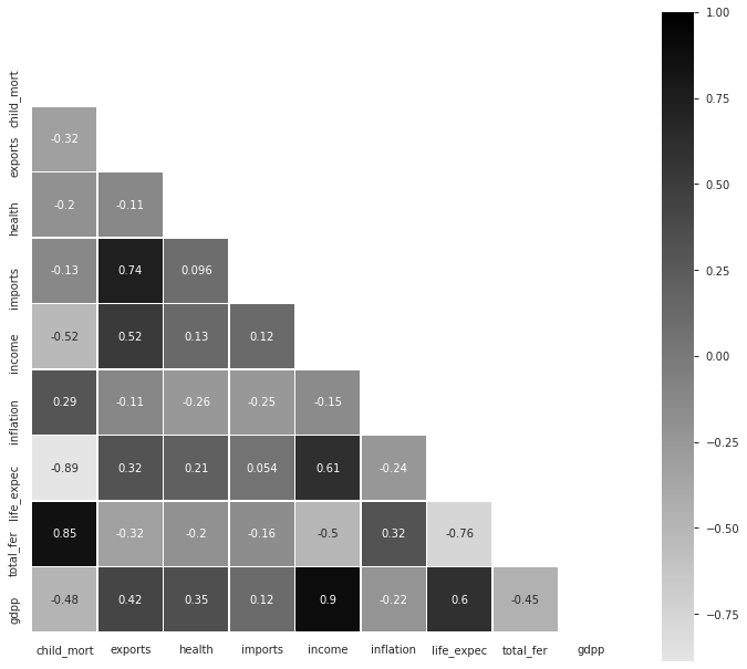
Insights from Pearson’s Correlation Coefficient Plot :
皮尔逊相关系数图的见解:
- Imports have high positive correlation with Exports (+0.74) 进口与出口呈高度正相关(+0.74)
- Income has fairly high positive correlation with Exports (+0.52) 收入与出口呈正相关(+0.52)
- Life Expectancy has fairly high positive correlation with Income (+0.61) 预期寿命与收入的正相关性很高(+0.61)
- Total Fertility has very high positive correlation with Child Mortality (+0.85) 总生育率与儿童死亡率有非常高的正相关性(+0.85)
- GDPP has very high positive correlation with Income (+0.90) GDPP与收入的正相关性非常高(+0.90)
- GDPP has fairly high positive correlation with Life Expectancy (+0.60) GDPP与预期寿命有较高的正相关(+0.60)
Total Fertility has fairly high negative correlation with Life Expectancy (-0.76) — Well, I found this particular thing as an interesting insight but let’s not forget “Correlation does not imply causation”!
总生育率与预期寿命(-0.76)具有相当高的负相关性-嗯,我发现这件事很有趣,但请不要忘记“相关性并不意味着因果关系”!
(1)主成分分析 ((1) Principal Component Analysis)
Principal Component Analysis (PCA) is a popular technique for deriving a set of low dimensional features from a large set of variables. Sometimes reduced dimensional set of features can represent distinct no. of groups with similar characteristics. Hence PCA can be an insightful clustering tool (or a preprocessing tool before applying clustering as well). We will standardize our data first and will use the scaled data for all clustering works in future.
主成分分析(PCA)是一种流行的技术,可以从大量变量中得出一组低维特征。 有时,特征的缩小维集可以表示不同的编号。 具有相似特征的群体。 因此,PCA可以是有见地的聚类工具(或在应用聚类之前也可以作为预处理工具)。 我们将首先对数据进行标准化,并在将来将缩放后的数据用于所有聚类工作。
from sklearn.preprocessing import StandardScalersc=StandardScaler()data_scaled=sc.fit_transform(data)
从sklearn.preprocessing导入StandardScalersc = StandardScaler()data_scaled = sc.fit_transform(data)
Here, I have used singular value decomposition solver “auto” to get the no. of principal components. You can also use solver “randomized” introducing a random state seed like “0” or “12345”.
在这里,我使用奇异值分解求解器“ auto”来获得否。 主要组成部分。 您还可以使用“随机化”的求解器,引入诸如“ 0”或“ 12345”之类的随机状态种子。
from sklearn.decomposition import PCApc = PCA(svd_solver=’auto’)pc.fit(data_scaled)print(‘Total no. of principal components =’,pc.n_components_)
从sklearn.decomposition导入PCApc = PCA(svd_solver ='auto')pc.fit(data_scaled)print('主组件总数=',pc.n_components_)
#Print Principal Componentsprint(‘Principal Component Matrix :\n’,pc.components_)
#Print主要组件print('主要组件矩阵:\ n',pc.components_)
Let us check the amount of variance explained by each principal component here. They will be arranged in decreasing order of their explained variance ratio.
让我们在这里检查每个主成分所解释的方差量。 它们将按其解释的方差比的降序排列。
#The amount of variance that each PC explainsvar = pc.explained_variance_ratio_print(var)
#每台PC解释的方差量var = pc.explained_variance_ratio_print(var)
#Plot explained variance ratio for each PCplt.bar([i for i, _ in enumerate(var)],var,color=’black’)plt.title(‘PCs and their Explained Variance Ratio’, fontsize=15)plt.xlabel(‘Number of components’,fontsize=12)plt.ylabel(‘Explained Variance Ratio’,fontsize=12)
#绘制每个PC的解释方差比率plt.bar([i代表i,_枚举(var)],var,color ='black')plt.title('PC及其解释方差比率',fontsize = 15) plt.xlabel('组件数',fontsize = 12)plt.ylabel('Explained Variance Ratio',fontsize = 12)
Using these cumulative variance ratios for all PCs, we will now draw a scree plot. It is used to determine the number of principal components to keep in this principal component analysis.
使用所有PC的这些累积方差比,我们现在将绘制一个scree图。 用于确定要保留在此主成分分析中的主成分数。
# Scree Plotplt.plot(cum_var, marker=’o’)plt.title(‘Scree Plot: PCs and their Cumulative Explained Variance Ratio’,fontsize=15)plt.xlabel(‘Number of components’,fontsize=12)plt.ylabel(‘Cumulative Explained Variance Ratio’,fontsize=12)
#Scree Plotplt.plot(cum_var,marker ='o')plt.title('Scree Plot:PC及其累积解释方差比',fontsize = 15)plt.xlabel('components',fontsize = 12)plt .ylabel('累积解释方差比',fontsize = 12)
The plot indicates the threshold of 90% is getting crossed at PC = 4. Ideally, we can keep 4 (or atmost 5) components here. Before PC = 5, the plot is following an upward trend. After crossing 5, it is almost steady. However, we have retailed all 9 PCs here to get the full data in results. And for visualization purpose in 2-D figure, we have plotted only PC1 vs PC2.
该图表明在PC = 4时超过了90%的阈值。理想情况下,此处可以保留4个(或最多5个)组件。 在PC = 5之前,该图遵循上升趋势。 越过5后,它几乎保持稳定。 但是,我们在这里零售了所有9台PC,以获取完整的数据结果。 并且出于二维图的可视化目的,我们仅绘制了PC1 vs PC2。
#Principal Component Data Decompositioncolnames = list(data.columns)pca_data = pd.DataFrame({ ‘Features’:colnames,’PC1':pc.components_[0],’PC2':pc.components_[1],’PC3':pc.components_[2], ‘PC4’:pc.components_[3],’PC5':pc.components_[4], ‘PC6’:pc.components_[5], ‘PC7’:pc.components_[6], ‘PC8’:pc.components_[7], ‘PC9’:pc.components_[8]})pca_data
#主组件数据分解colnames = list(data.columns)pca_data = pd.DataFrame({'Features':colnames,'PC1':pc.components_ [0],'PC2':pc.components_ [1],'PC3' :pc.components_ [2],'PC4':pc.components_ [3],'PC5':pc.components_ [4],'PC6':pc.components_ [5],'PC7':pc.components_ [6 ],“ PC8”:pc.components_ [7],“ PC9”:pc.components_ [8]})pca_data
we will se then
然后我们会
#Visualize 2 main PCsfig = plt.figure(figsize = (12,6))sns.scatterplot(pca_data.PC1, pca_data.PC2,hue=pca_data.Features,marker=’o’, s=500)plt.title(‘PC1 vs PC2’,fontsize=15)plt.xlabel(‘Principal Component 1’,fontsize=12)plt.ylabel(‘Principal Component 2’,fontsize=12)plt.show()
#可视化2个主要PCsfig = plt.figure(figsize =(12,6))sns.scatterplot(pca_data.PC1,pca_data.PC2,hue = pca_data.Features,marker ='o',s = 500)plt.title( 'PC1 vs PC2',fontsize = 15)plt.xlabel('主组件1',fontsize = 12)plt.ylabel('主组件2',fontsize = 12)plt.show()
We can see that 1st Principal Component (X-axis) is gravitated mainly towards features like: life expectancy, gdpp, income. 2nd Principal Component (Y-axis) is gravitated predominantly towards features like: imports, exports.
我们可以看到,第一主成分(X轴)主要受以下特征的影响:预期寿命,gdpp和收入。 第二主要组成部分(Y轴)主要具有以下特征:导入,导出。
#Export PCA results to filepca_data.to_csv(“PCA_results.csv”, index=False)
#将PCA结果导出到filepca_data.to_csv(“ PCA_results.csv”,index = False)
(2) K-Means Clustering
(2)K-均值聚类
This is the most popular method of clustering. It uses Euclidean distance between clusters in each iteration to decide a data point should belong to which cluster, and proceed accordingly. To decide how many no. of clusters to consider, we can employ several methods. The basic and most widely used method is **Elbow Curve**.
这是最流行的群集方法。 它在每次迭代中使用簇之间的欧式距离来确定数据点应属于哪个簇,然后进行相应处理。 决定多少不。 考虑集群,我们可以采用几种方法。 基本且使用最广泛的方法是“肘曲线”。
**Method-1: Plotting Elbow Curve**
**方法1:绘制肘曲线**
In this curve, wherever we observe a “knee” like bent, we can take that number as the ideal no. of clusters to consider in K-Means algorithm.
在此曲线中,无论何时我们观察到像弯曲一样的“膝盖”,我们都可以将该数字作为理想编号。 K-Means算法中要考虑的群集数量。
from yellowbrick.cluster import KElbowVisualizer
从yellowbrick.cluster导入KElbowVisualizer
#Plotting Elbow Curvefrom sklearn.cluster import KMeansfrom yellowbrick.cluster import KElbowVisualizerfrom sklearn import metrics
#从sklearn.cluster导入弯头曲线从yellowbrick.cluster导入KMeans从sklearn导入指标导入KElbowVisualizer
model = KMeans()visualizer = KElbowVisualizer(model, k=(1,10))visualizer.fit(data_scaled) visualizer.show()
模型= KMeans()可视化器= KElbowVisualizer(模型,k =(1,10))可视化器.fit(数据缩放)可视化器.show()
Here, along Y-axis, “distortion” is defined as “the sum of the squared differences between the observations and the corresponding centroid”. It is same as WCSS (Within-Cluster-Sum-of-Squares).
在此,沿Y轴的“变形”被定义为“观测值与对应的质心之间的平方差的和”。 它与WCSS(集群内平方和)相同。
Let’s see the centroids of the clusters. Afterwards, we will fit our scaled data into a K-Means model having 3 clusters, and then label each data point (each record) to one of these 3 clusters.
让我们看一下群集的质心。 然后,我们将缩放后的数据拟合到具有3个聚类的K-Means模型中,然后将每个数据点(每个记录)标记为这3个聚类之一。
#Fitting data into K-Means model with 3 clusterskm_3=KMeans(n_clusters=3,random_state=12345)km_3.fit(data_scaled)print(km_3.cluster_centers_)
#将数据拟合到具有3个簇的K-Means模型中km_3 = KMeans(n_clusters = 3,random_state = 12345)km_3.fit(data_scaled)print(km_3.cluster_centers_)
We can see each record has got a label among 0,1,2. This label is each of their cluster_id i.e. in which cluster they belong to. We can count the records in each cluster now.
我们可以看到每个记录在0,1,2之间都有一个标签。 该标签是它们的每个cluster_id,即它们所属的集群。 我们现在可以计算每个群集中的记录。
pd.Series(km_3.labels_).value_counts()
pd.Series(km_3.labels _)。value_counts()
We see, the highest no. of records belong to the first cluster.
我们看到,最高的没有。 的记录属于第一个群集。
Now, we are interested to check how good is our K-Means clustering model. Silhouette Coefficient is one such metric to check that. The **Silhouette Coefficient** is calculated using: * the mean intra-cluster distance ( a ) for each sample* the mean nearest-cluster distance ( b ) for each sample* The Silhouette Coefficient for a sample is (b — a) / max(a, b)
现在,我们有兴趣检查我们的K-Means聚类模型的性能如何。 轮廓系数就是一种用于检验这一指标的指标。 **剪影系数**使用以下公式计算:*每个样本的平均集群内距离(a)*每个样本的平均最近集群距离(b)*样本的剪影系数为(b — a) /最大(a,b)
# calculate Silhouette Coefficient for K=3from sklearn import metricsmetrics.silhouette_score(data_scaled, km_3.labels_)
#从sklearn导入指标metrics.silhouette_score(data_scaled,km_3.labels_)计算K = 3的轮廓系数
# calculate SC for K=2 through K=10k_range = range(2, 10)scores = []for k in k_range: km = KMeans(n_clusters=k, random_state=12345) km.fit(data_scaled) scores.append(metrics.silhouette_score(data_scaled, km.labels_))
#计算K = 2到K = 10的SC k_range = range(2,10)分数= [] k中k的k:km = KMeans(n_clusters = k,random_state = 12345)km.fit(data_scaled)scores.append(metrics) .silhouette_score(data_scaled,km.labels_))
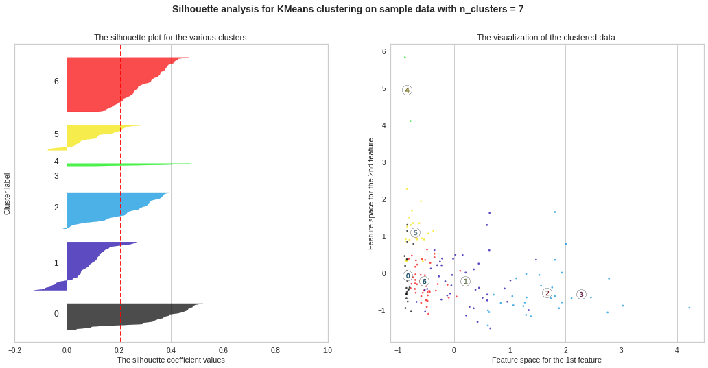
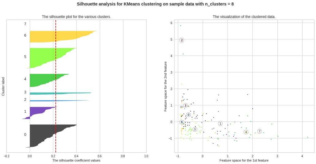
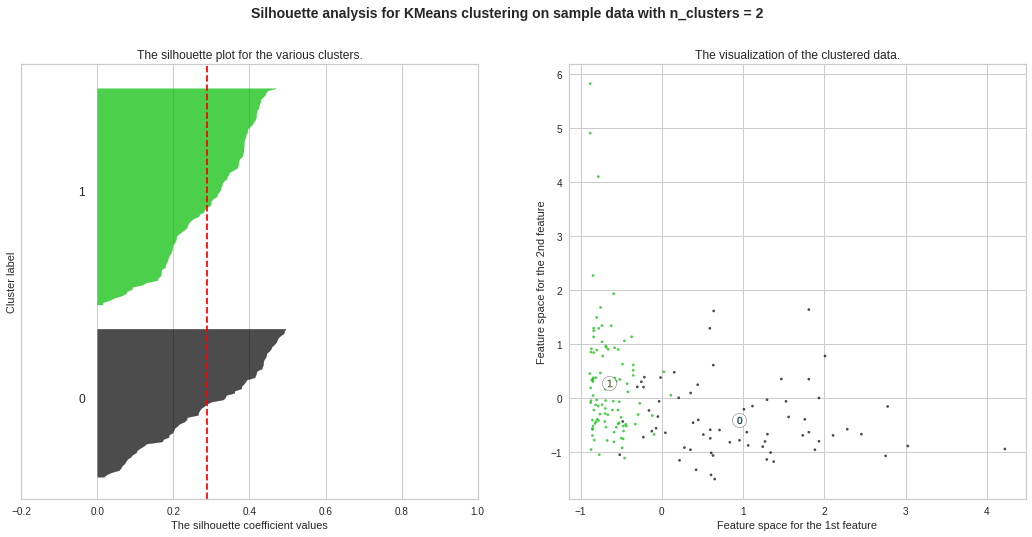
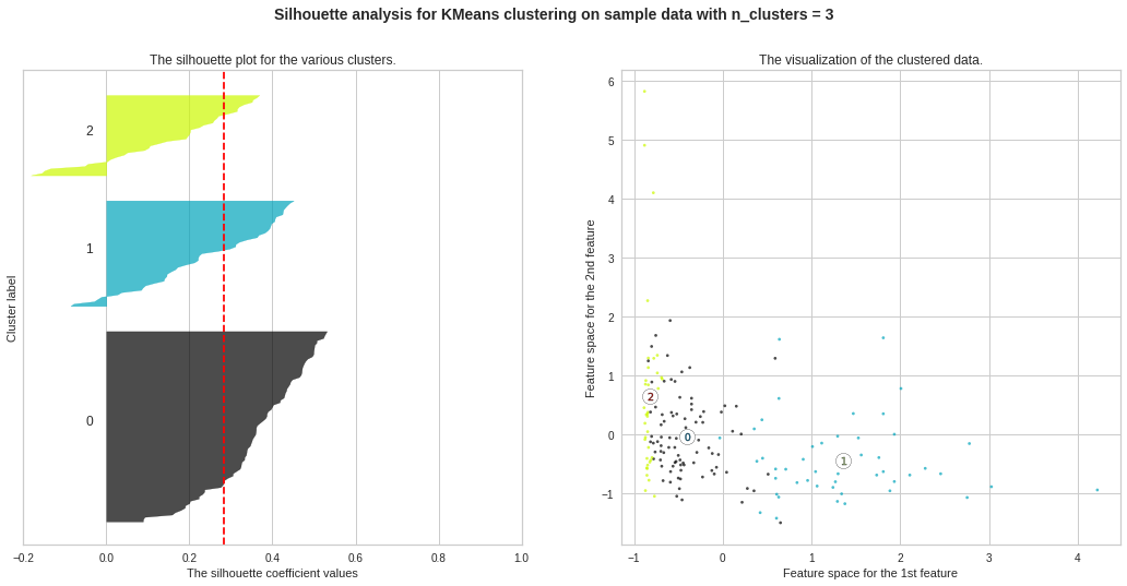
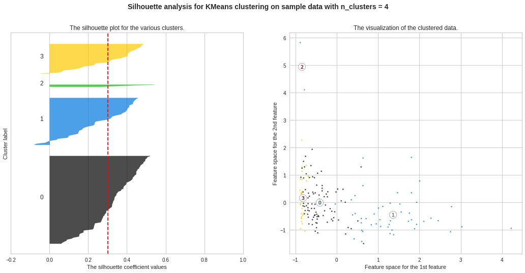
We observe the highest silhouette score with no. of clusters 3 and 4. However, from Elbow Curve, we got to see the “knee” like bent at no. of clusters 3. So we will do further analysis to choose the ideal no. of clusters between 3 and 4.
我们观察到最高的轮廓得分,没有。 图3和4中的曲线。但是,从肘弯曲线,我们可以看到“膝盖”像弯腰一样弯曲。 因此,我们将做进一步分析以选择理想编号。 在3到4之间的集群。
For further analysis, we will consider **Davies-Bouldin Score** apart from Silhouette Score. **Davies-Bouldin Score** is defined as the average similarity measure of each cluster with its most similar cluster, where similarity is the ratio of within-cluster distances to between-cluster distances. Thus, clusters which are farther apart and less dispersed will result in a better score.
为了进一步分析,我们将考虑“ Davies-Bouldin得分” **(除了“剪影得分”)。 戴维斯-布尔丁得分**定义为每个群集与其最相似群集的平均相似性度量,其中相似度是群集内距离与群集间距离之比。 因此,距离较远且分散程度较低的群集将获得更好的分数。
We will also analyze **SSE (Sum of Squared Errors)**. SSE is the sum of the squared differences between each observation and its cluster’s mean. It can be used as a measure of variation within a cluster. If all cases within a cluster are identical the SSE would then be equal to 0. The formula for SSE is: 1
我们还将分析** SSE(平方误差总和)**。 SSE是每个观察值与其簇的均值之间平方差的总和。 它可以用作衡量群集内变化的指标。 如果集群中的所有情况都相同,则SSE等于0。SSE的公式为:1
Method-2: Plotting of SSE, Davies-Bouldin Scores, Silhouette Scores to Decide Ideal No. of Clusters
方法2:绘制SSE,Davies-Bouldin分数,Silhouette分数以确定理想的聚类数
from sklearn.metrics import davies_bouldin_score, silhouette_score, silhouette_samplessse,db,slc = {}, {}, {}for k in range(2, 10): kmeans = KMeans(n_clusters=k, max_iter=1000,random_state=12345).fit(data_scaled) if k == 4: labels = kmeans.labels_ clusters = kmeans.labels_ sse[k] = kmeans.inertia_ # Inertia: Sum of distances of samples to their closest cluster center db[k] = davies_bouldin_score(data_scaled,clusters) slc[k] = silhouette_score(data_scaled,clusters)
从sklearn.metrics导入davies_bouldin_score,silhouette_score,silhouette_samplessse,db,slc = {},{},{}对于范围(2,10)中的k:kmeans = KMeans(n_clusters = k,max_iter = 1000,random_state = 12345)。如果k == 4,则拟合(data_scaled):标签= kmeans.labels_群集= kmeans.labels_ sse [k] = kmeans.inertia_#惯性:样本到其最近的群集中心的距离之和db [k] = davies_bouldin_score(data_scaled,群集)slc [k] = silhouette_score(data_scaled,clusters)
#Plotting SSEplt.figure(figsize=(12,6))plt.plot(list(sse.keys()), list(sse.values()))plt.xlabel(“Number of cluster”, fontsize=12)plt.ylabel(“SSE (Sum of Squared Errors)”, fontsize=12)plt.title(“Sum of Squared Errors vs No. of Clusters”, fontsize=15)plt.show()
#绘制SSEplt.figure(figsize =(12,6))plt.plot(list(sse.keys()),list(sse.values()))plt.xlabel(“簇数”,fontsize = 12) plt.ylabel(“ SSE(平方误差之和)”,fontsize = 12)plt.title(“平方误差之和与簇数”,fontsize = 15)plt.show()
We can see “knee” like bent at both 3 and 4, still considering no. of clusters = 4 seems a better choice, because after 4, there is no further “knee” like bent observed. Still, we will analyse further to decide between 3 and 4.
我们可以看到“膝盖”在第3和第4处都弯曲了,但仍不考虑。 簇= 4似乎是一个更好的选择,因为在4之后,不再观察到像弯曲一样的“膝盖”。 不过,我们将进一步分析以决定3到4。
#Plotting Davies-Bouldin Scoresplt.figure(figsize=(12,6))plt.plot(list(db.keys()), list(db.values()))plt.xlabel(“Number of cluster”, fontsize=12)plt.ylabel(“Davies-Bouldin values”, fontsize=12)plt.title(“Davies-Bouldin Scores vs No. of Clusters”, fontsize=15)plt.show()
#绘制Davies-Bouldin Scoresplt.figure(figsize =(12,6))plt.plot(list(db.keys()),list(db.values()))plt.xlabel(“簇数”,字体大小= 12)plt.ylabel(“ Davies-Bouldin值”,fontsize = 12)plt.title(“ Davies-Bouldin分数与簇数”,fontsize = 15)plt.show()
clearly no choice for =3 in best choice.
显然,最佳选择中没有选择= 3。
plt.figure(figsize=(12,6))plt.plot(list(slc.keys()), list(slc.values()))plt.xlabel(“Number of cluster”, fontsize=12)plt.ylabel(“Silhouette Score”, fontsize=12)plt.title(“Silhouette Score vs No. of Clusters”, fontsize=15)plt.show()
plt.figure(figsize =(12,6))plt.plot(list(slc.keys()),list(slc.values()))plt.xlabel(“簇数”,fontsize = 12)plt。 ylabel(“ Silhouette Score”,fontsize = 12)plt.title(“ Silhouette Score vs. No. of Clusters”,fontsize = 15)plt.show()
No. of clusters = 3 seems the best choice here as well. The silhouette score ranges from −1 to +1, where a high value indicates that the object is well matched to its own cluster and poorly matched to neighboring clusters. A score nearly 0.28 seems a good one.
簇数= 3似乎也是这里的最佳选择。 轮廓分数从-1到+1,其中较高的值表示对象与其自身的群集匹配良好,而与相邻群集的匹配较差。 接近0.28的分数似乎是一个不错的成绩。
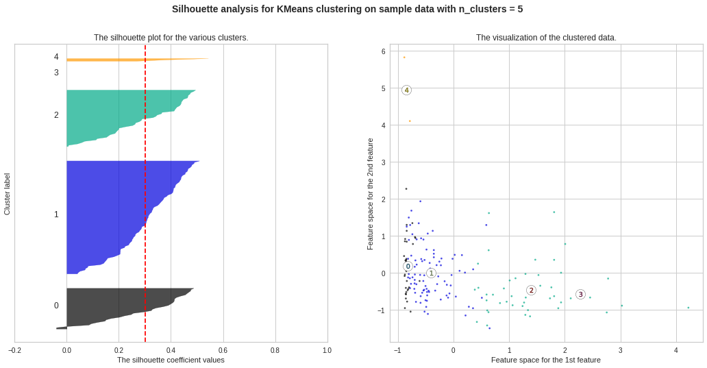
Silhouette Plots for Different No. of Clusters :**We will now draw Silhouette Plots for different no. of clusters for getting more insights. Side by side, we will observe the shape of the clusters in 2-dimensional figure.
不同数量簇的轮廓图:**我们现在将绘制不同数量簇的轮廓图。 以获得更多的见解。 并排,我们将在二维图中观察簇的形状。
#Silhouette Plots for Different No. of Clustersimport matplotlib.cm as cmimport numpy as npfor n_clusters in range(2, 10): fig, (ax1, ax2) = plt.subplots(1, 2) fig.set_size_inches(18, 8) # The 1st subplot is the silhouette plot # The silhouette coefficient can range from -1, 1 but here the range is from -0.2 till 1 ax1.set_xlim([-0.2, 1]) # The (n_clusters+1)*10 is for inserting blank space between silhouette plots of individual clusters, to demarcate them clearly. ax1.set_ylim([0, len(data_scaled) + (n_clusters + 1) * 10]) # Initialize the clusterer with n_clusters value and a random generator seed of 12345 for reproducibility. clusterer = KMeans(n_clusters=n_clusters,max_iter=1000, random_state=12345) cluster_labels = clusterer.fit_predict(data_scaled) # The silhouette_score gives the average value for all the samples # This gives a perspective into the density and separation of the formed clusters silhouette_avg = silhouette_score(data_scaled, cluster_labels) print(“For n_clusters =”, n_clusters, “The average silhouette_score is :”, silhouette_avg) # Compute the silhouette scores for each sample sample_silhouette_values = silhouette_samples(data_scaled, cluster_labels) y_lower = 10 for i in range(n_clusters): # Aggregate the silhouette scores for samples belonging to cluster i and sort them ith_cluster_silhouette_values = sample_silhouette_values[cluster_labels == i] ith_cluster_silhouette_values.sort() size_cluster_i = ith_cluster_silhouette_values.shape[0] y_upper = y_lower + size_cluster_i color = cm.nipy_spectral(float(i) / n_clusters) ax1.fill_betweenx(np.arange(y_lower, y_upper), 0, ith_cluster_silhouette_values, facecolor=color, edgecolor=color, alpha=0.7)
#不同簇数的剪影图将matplotlib.cm作为cmimport numpy作为np表示npclus在范围(2,10)中的n_clusters:fig,(ax1,ax2)= plt.subplots(1,2)图set_size_inches(18,8) #第一个子图是轮廓图#轮廓系数的范围可以是-1,1,但是这里的范围是-0.2到1 ax1.set_xlim([-0.2,1])#(n_clusters + 1)* 10是用于在各个群集的轮廓图之间插入空白,以清楚地对其进行划分。 ax1.set_ylim([0,len(data_scaled)+(n_clusters + 1)* 10])#使用n_clusters值和12345的随机生成器种子初始化集群器,以实现可重复性。 clusterer = KMeans(n_clusters = n_clusters,max_iter = 1000,random_state = 12345)cluster_labels = clusterer.fit_predict(data_scaled)#silhouette_score给出了所有样本的平均值#这是透视形成的簇的密度和分离度的轮廓silhouette_avg = silhouette_score(data_scaled,cluster_labels)print(“对于n_clusters =”,n_clusters,“平均silhouette_score为:”,silhouette_avg)#计算每个样本sample_silhouette_values的轮廓分数= Silhouette_samples(data_scaled,cluster_labels)y_lower = 10代表i (n_clusters):#汇总属于群集i的样本的轮廓分数,并对其进行排序。 (float(i)/ n_clusters)ax1.fill_betweenx(np.arange(y_lower,y_upper),0,ith_cluster_silhou ette_values,facecolor = color,edgecolor = color,alpha = 0.7)
# Label the silhouette plots with their cluster numbers at the middle ax1.text(-0.05, y_lower + 0.5 * size_cluster_i, str(i))
#在轮廓图的中间ax1.text(-0.05,y_lower + 0.5 * size_cluster_i,str(i))上标记轮廓图
# Compute the new y_lower for next plot y_lower = y_upper + 10
#计算下一个图的新y_lower y_lower = y_upper + 10
ax1.set_title(“The silhouette plot for the various clusters.”) ax1.set_xlabel(“The silhouette coefficient values”) ax1.set_ylabel(“Cluster label”)
ax1.set_title(“各个群集的轮廓图。”)ax1.set_xlabel(“轮廓系数值”)ax1.set_ylabel(“群集标签”)
# The vertical line for average silhouette score of all the values ax1.axvline(x=silhouette_avg, color=”red”, linestyle=” — “)
#所有值ax1.axvline(x = silhouette_avg,color =“ red”,linestyle =” —“)的平均轮廓分数的垂直线
ax1.set_yticks([]) # Clear the yaxis labels ax1.set_xticks([-0.2, 0, 0.2, 0.4, 0.6, 0.8, 1])
ax1.set_yticks([])#清除yaxis标签ax1.set_xticks([-0.2,0,0.2,0.4,0.6,0.8,1])
# 2nd Plot showing the actual clusters formed colors = cm.nipy_spectral(cluster_labels.astype(float) / n_clusters) ax2.scatter(data_scaled[:, 0], data_scaled[:, 1], marker=’.’, s=30, lw=0, alpha=0.7, c=colors, edgecolor=’k’)
#2nd图显示了实际的群集形成的颜色= cm.nipy_spectral(cluster_labels.astype(float)/ n_clusters)ax2.scatter(data_scaled [:, 0],data_scaled [:, 1],marker ='。',s = 30 ,lw = 0,alpha = 0.7,c =颜色,edgecolor ='k')
# Labeling the clusters centers = clusterer.cluster_centers_ # Draw white circles at cluster centers ax2.scatter(centers[:, 0], centers[:, 1], marker=’o’, c=”white”, alpha=1, s=200, edgecolor=’k’)
#标记聚类中心= clusterer.cluster_centers_#在聚类中心ax2.scatter(centers [:, 0],center [:, 1],marker ='o',c =“ white”,alpha = 1, s = 200,edgecolor ='k')
for i, c in enumerate(centers): ax2.scatter(c[0], c[1], marker=’$%d$’ % i, alpha=1, s=50, edgecolor=’k’)
对于i,enumerate(centers)中的c:ax2.scatter(c [0],c [1],marker ='$%d $'%i,alpha = 1,s = 50,edgecolor ='k')
ax2.set_title(“The visualization of the clustered data.”) ax2.set_xlabel(“Feature space for the 1st feature”) ax2.set_ylabel(“Feature space for the 2nd feature”)
ax2.set_title(“集群数据的可视化。”)ax2.set_xlabel(“第一个特征的特征空间”)ax2.set_ylabel(“第二个特征的特征空间”)
plt.suptitle((“Silhouette analysis for KMeans clustering on sample data with n_clusters = %d” % n_clusters), fontsize=14, fontweight=’bold’)
plt.suptitle((“使用n_clusters =%d”对样本数据进行KMeans聚类的剪影分析”%n_clusters),fontsize = 14,fontweight ='bold')
plt.show()
plt.show()

preds = km_3.labels_data_df = pd.DataFrame(data)data_df[‘KM_Clusters’] = predsdata_df.head(10)
preds = km_3.labels_data_df = pd.DataFrame(数据)data_df ['KM_Clusters'] = predsdata_df.head(10)
We will visualize 3 clusters now for various pairs of features. Initially, I chose the pairs randomly. Later, I chose the pairs including “GDPP”, “income”, “inflation” etc. important features. Since we are concerned about analyzing country profiles and “GDPP” is the main indicator to represent a country’s status, we are concerned with that mainly.
现在,我们将可视化3个群集,以显示各种功能对。 最初,我是随机选择的。 后来,我选择了包括“ GDPP”,“收入”,“通货膨胀”等重要特征的货币对。 由于我们关注分析国家概况,“ GDPP”是代表一个国家地位的主要指标,因此我们主要关注这一点。
#Visualize clusters: Feature Pair-1import matplotlib.pyplot as plt_1plt_1.rcParams[‘axes.facecolor’] = ‘lightblue’plt_1.figure(figsize=(12,6))plt_1.scatter(data_scaled[:,0],data_scaled[:,1],c=cluster_labels) #child mortality vs exportsplt_1.title(“Child Mortality vs Exports (Visualize KMeans Clusters)”, fontsize=15)plt_1.xlabel(“Child Mortality”, fontsize=12)plt_1.ylabel(“Exports”, fontsize=12)plt_1.rcParams[‘axes.facecolor’] = ‘lightblue’plt_1.show()
#Visualize clusters:Feature Pair-1import matplotlib.pyplot as plt_1plt_1.rcParams ['axes.facecolor'] ='lightblue'plt_1.figure(figsize =(12,6))plt_1.scatter(data_scaled [:,0],data_scaled [:,1],c = cluster_labels)#儿童死亡率vs出口plt_1.title(“儿童死亡率vs出口(可视化KMeans簇)”,字体大小= 15)plt_1.xlabel(“儿童死亡率”,fontsize = 12)plt_1.ylabel (“导出”,fontsize = 12)plt_1.rcParams ['axes.facecolor'] ='lightblue'plt_1.show()
层次聚类 (Hierarchical clustering)
There are two types of hierarchical clustering: **Divisive** and **Agglomerative**. In divisive (top-down) clustering method, all observations are assigned to a single cluster and then that cluster is partitioned to two least similar clusters, and then those two clusters are partitioned again to multiple clusters, and thus the process go on. In agglomerative (bottom-up), the opposite approach is followed. Here, the ideal no. of clusters is decided by **dendrogram**.
有两种类型的层次结构聚类:“分裂”和“聚集”。 在分裂(自上而下)的聚类方法中,所有观察值都分配给一个聚类,然后将该聚类划分为两个最不相似的聚类,然后将这两个聚类再次划分为多个聚类,因此过程继续进行。 在团聚(自下而上)中,采用相反的方法。 在这里,理想没有。 群集的数量由“树状图”决定。
Method-1: Dendrogram Plotting using Clustermap
方法1:使用Clustermap绘制树状图
import seaborn as snscmap = sns.cubehelix_palette(as_cmap=True, rot=-.3, light=1)g = sns.clustermap(data_scaled, cmap=cmap, linewidths=.5)
将seaborn导入为snscmap = sns.cubehelix_palette(as_cmap = True,rot =-。3,light = 1)g = sns.clustermap(data_scaled,cmap = cmap,线宽= .5)
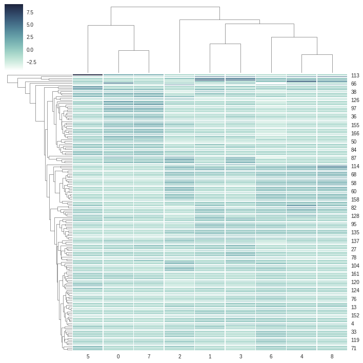
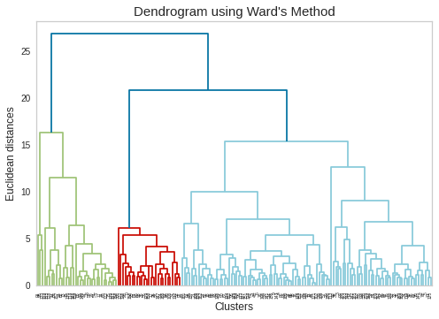
From above dendrogram, we can consider 2 clusters at minimum or 6 clusters at maximum. We will again cross-check the dendrogram using **Ward’s Method**. Ward’s method is an alternative to single-link clustering. This algorithm works for finding a partition with small sum of squares (to minimise the within-cluster-variance).
从上面的树状图中,我们可以考虑最少2个群集或最多6个群集。 我们将再次使用“沃德法”来交叉检查树状图。 Ward的方法是单链接群集的替代方法。 该算法用于查找平方和较小的分区(以最大程度地减少集群内方差)。
Method-2: Dendrogram Plotting using Ward’s Method
方法2:使用Ward方法绘制树状图
# Using the dendrogram to find the optimal number of clustersimport scipy.cluster.hierarchy as sch
#使用树状图找到最佳集群数,将scipy.cluster.hierarchy导入为sch
plt.rcParams[‘axes.facecolor’] = ‘white’plt.rcParams[‘axes.grid’] = Falsedendrogram = sch.dendrogram(sch.linkage(data_scaled, method=’ward’))plt.title(“Dendrogram using Ward’s Method”, fontsize=15)plt.xlabel(‘Clusters’, fontsize=12)plt.ylabel(‘Euclidean distances’, fontsize=12)plt.rcParams[‘axes.facecolor’] = ‘white’plt.rcParams[‘axes.grid’] = Falseplt.show()
plt.rcParams ['axes.facecolor'] ='white'plt.rcParams ['axes.grid'] = Falsedendrogram = sch.dendrogram(sch.linkage(data_scaled,method ='ward'))plt.title(“树状图使用Ward方法”,fontsize = 15)plt.xlabel(“簇”,fontsize = 12)plt.ylabel(“欧几里得距离”,fontsize = 12)plt.rcParams ['axes.facecolor'] ='white'plt。 rcParams ['axes.grid'] = Falseplt.show()
DBSCAN集群 (DBSCAN Clustering)
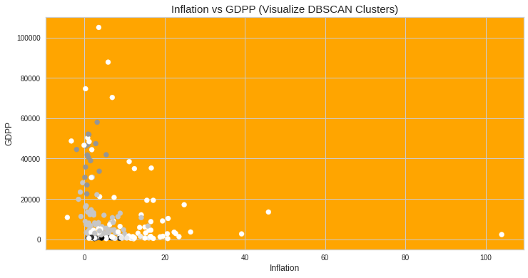
DBSCAN is an abbreviation of “Density-based spatial clustering of applications with noise”. This algorithm groups together points that are close to each other based on a distance measurement (usually Euclidean distance) and a minimum number of points. It also marks noise as outliers (noise means the points which are in low-density regions).
DBSCAN是“基于噪声的应用程序的基于密度的空间聚类”的缩写。 该算法基于距离测量(通常是欧几里得距离)和最少数量的点将彼此靠近的点组合在一起。 它还将噪声标记为离群值(噪声表示低密度区域中的点)。
I found an interesting result with DBSCAN when I used all features of country data. It gave me a single cluster.** I presume, that was very evident to happen because our data is almost evenly spread, so density wise, this algorithm could not bifurcate the datapoints into more than one cluster. Hence, I used only the features which have high correlation with “GDPP”. I also kept “Child Mortality” and “Total Fertility” in my working dataset since they have polarizations — some data points have extremely high values, some have extremely low values (ref. to corresponding scatter plots in data profiling section in the beginning).
使用国家/地区数据的所有功能时,使用DBSCAN发现了一个有趣的结果。 它给了我一个集群。**我想,这是很明显的,因为我们的数据几乎均匀地散布了,所以从密度的角度来看,该算法不能将数据点分为多个集群。 因此,我只使用了与“ GDPP”具有高度相关性的特征。 我也将“儿童死亡率”和“总生育率”保留在我的工作数据集中,因为它们存在两极分化-一些数据点具有极高的值,有些数据点具有极低的值(请参阅开头的数据分析部分中的相应散点图)。
from sklearn.cluster import DBSCANimport sklearn.utilsfrom sklearn.preprocessing import StandardScaler
从sklearn.cluster导入DBSCAN从sklearn.preprocessing导入sklearn.utils导入StandardScaler
Clus_dataSet = data[[‘child_mort’,’exports’,’health’,’imports’,’income’,’inflation’,’life_expec’,’total_fer’,’gdpp’]]Clus_dataSet = np.nan_to_num(Clus_dataSet)Clus_dataSet = np.array(Clus_dataSet, dtype=np.float64)Clus_dataSet = StandardScaler().fit_transform(Clus_dataSet)
Clus_dataSet = data [['child_mort','exports','health','imports','income','inflation','life_expec','total_fer','gdpp']] Clus_dataSet = np.nan_to_num(Clus_dataSet) Clus_dataSet = np.array(Clus_dataSet,dtype = np.float64)Clus_dataSet = StandardScaler()。fit_transform(Clus_dataSet)
# Compute DBSCANdb = DBSCAN(eps=1, min_samples=3).fit(Clus_dataSet)core_samples_mask = np.zeros_like(db.labels_)core_samples_mask[db.core_sample_indices_] = Truelabels = db.labels_#data[‘Clus_Db’]=labels
#计算DBSCANdb = DBSCAN(eps = 1,min_samples = 3).fit(Clus_dataSet)core_samples_mask = np.zeros_like(db.labels_)core_samples_mask [db.core_sample_indices_] = Truelabels = db.labels_#data ['Clus_Db'] =标签
realClusterNum=len(set(labels)) — (1 if -1 in labels else 0)clusterNum = len(set(labels))
realClusterNum = len(set(labels))—(如果标签中为-1,则为1,否则为0)clusterNum = len(set(labels))
# A sample of clustersprint(data[[‘child_mort’,’exports’,’health’,’imports’,’income’,’inflation’,’life_expec’,’total_fer’,’gdpp’]].head())
#clustersprint(data [['child_mort','exports','health','imports','income','inflation','life_expec','total_fer','gdpp']]。head()的样本)
# number of labelsprint(“number of labels: “, set(labels))
#标签数量print(“标签数量:”,set(标签))
We have got 7 clusters using density based clustering which is a distinct observation (7 is much higher than 3 which we got in all three different clustering algorithms we used earlier).
我们使用基于密度的聚类得到了7个聚类,这是一个明显的观察结果(其中7个远远高于我们之前使用的所有三种不同聚类算法中的3个)。
# save the cluster labels and sort by clusterdatacopy = data.copy()datacopy = datacopy.drop(‘KM_Clusters’, axis=1)datacopy[‘DB_cluster’] = db.labels_
#保存集群标签并按clusterdata进行排序datacopy = data.copy()datacopy = datacopy.drop('KM_Clusters',axis = 1)datacopy ['DB_cluster'] = db.labels_
#Visualize clusters: Random Feature Pair-1 (income vs gdpp)import matplotlib.pyplot as plt_3plt_3.rcParams[‘axes.facecolor’] = ‘orange’plt_3.figure(figsize=(12,6))plt_3.scatter(datacopy[‘income’],datacopy[‘gdpp’],c=db.labels_) plt_3.title(‘Income vs GDPP (Visualize DBSCAN Clusters)’, fontsize=15)plt_3.xlabel(“Income”, fontsize=12)plt_3.ylabel(“GDPP”, fontsize=12)plt_3.rcParams[‘axes.facecolor’] = ‘orange’plt_3.show()
#可视化群集:随机特征对1(收入vs gdpp)导入matplotlib.pyplot作为plt_3plt_3.rcParams ['axes.facecolor'] ='orange'plt_3.figure(figsize =(12,6))plt_3.scatter(datacopy ['income'],datacopy ['gdpp'],c = db.labels_)plt_3.title('Income vs GDPP(Visualize DBSCAN Clusters)',fontsize = 15)plt_3.xlabel(“ Income”,fontsize = 12) plt_3.ylabel(“ GDPP”,fontsize = 12)plt_3.rcParams ['axes.facecolor'] ='orange'plt_3.show()
#Visualize clusters: Random Feature Pair-2 (inflation vs gdpp)import matplotlib.pyplot as plt_3plt_3.figure(figsize=(12,6))plt_3.scatter(datacopy[‘inflation’],datacopy[‘gdpp’],c=db.labels_) plt_3.title(‘Inflation vs GDPP (Visualize DBSCAN Clusters)’, fontsize=15)plt_3.xlabel(“Inflation”, fontsize=12)plt_3.ylabel(“GDPP”, fontsize=12)plt_3.rcParams[‘axes.facecolor’] = ‘orange’plt_3.show()
#可视化群集:随机特征对2(通货膨胀与gdpp)将matplotlib.pyplot导入为plt_3plt_3.figure(figsize =(12,6))plt_3.scatter(datacopy ['inflation'],datacopy ['gdpp'],c = db.labels_)plt_3.title('通货膨胀与GDPP(可视化DBSCAN集群)',字体大小= 15)plt_3.xlabel(“通货膨胀”,字体大小= 12)plt_3.ylabel(“ GDPP”,字体大小= 12)plt_3。 rcParams ['axes.facecolor'] ='橙色'plt_3.show()
If you want to implement code from your hand then click the button and implement code end to end with explanation in brief.
如果您想用手执行代码,请单击按钮并以简短的说明从头到尾实现代码。
If u like to read this article and have common interest in similar projects then we can grow our network and can work for more real time projects.
如果您喜欢阅读本文并且对类似项目有共同的兴趣,那么我们可以扩大我们的网络并可以从事更多实时项目。
For more details connect with me on my Linkedin account!
有关更多详细信息,请通过我的Linkedin帐户与我联系!
THANKS!!!!
谢谢!!!!
机器学习集群


 1996
1996

 被折叠的 条评论
为什么被折叠?
被折叠的 条评论
为什么被折叠?
 到【灌水乐园】发言


