


大样品随机双盲测试
This post aims to explore a step-by-step approach to create a K-Nearest Neighbors Algorithm without the help of any third-party library. In practice, this Algorithm should be useful enough for us to classify our data whenever we have already made classifications (in this case, color), which will serve as a starting point to find neighbors.
这篇文章旨在探索逐步方法,以在无需任何第三方库的帮助下创建K最近邻居算法 。 在实践中,只要我们已经进行了分类(在这种情况下为颜色),该算法就足以对我们进行数据分类,这将成为寻找邻居的起点。
For this post, we will use a specific dataset which can be downloaded here. It contains 539 two dimensional data points, each with a specific color classification. Our goal will be to separate them into two groups (train and test) and try to guess our test sample colors based on our algorithm recommendation.
对于这篇文章,我们将使用一个特定的数据集,可以在此处下载 。 它包含539个二维数据点,每个数据点都有特定的颜色分类。 我们的目标是将它们分为两组(训练和测试),并根据算法建议尝试猜测测试样本的颜色。
训练和测试样品生成 (Train and test sample generation)
We will create two different sample sets:
我们将创建两个不同的样本集:
Training Set: This will contain 75% of our working data, selected randomly. This set will be used to generate our model.
训练集:这将包含我们75%的工作数据,是随机选择的。 该集合将用于生成我们的模型。
Test Set: Remaining 25% of our working data will be used to test the out-of-sample accuracy of our model. Once our predictions of this 25% are made, we will check the “percentage of correct classifications” by comparing predictions versus real values.
测试集:我们剩余的25%的工作数据将用于测试模型的样本外准确性。 一旦做出25%的预测,我们将通过比较预测值与实际值来检查“ 正确分类的百分比 ”。
# Load Data
library(readr)
RGB <- as.data.frame(read_csv("RGB.csv"))
RGB$x <- as.numeric(RGB$x)
RGB$y <- as.numeric(RGB$y)
print("Working data ready")# Training Dataset
smp_siz = floor(0.75*nrow(RGB))
train_ind = sample(seq_len(nrow(RGB)),size = smp_siz)
train =RGB[train_ind,]# Testting Dataset
test=RGB[-train_ind,]
OriginalTest <- test
paste("Training and test sets done")
训练数据 (Training Data)
We can observe that our train data is classified into 3 clusters based on colors.
我们可以观察到,我们的火车数据基于颜色分为3类。
# We plot test colored datapoints
library(ggplot2)
colsdot <- c("Blue" = "blue", "Red" = "darkred", "Green" = "darkgreen")
ggplot() +
  geom_tile(data=train,mapping=aes(x, y), alpha=0) +
  ##Ad tiles according to probabilities
  ##add points
  geom_point(data=train,mapping=aes(x,y, colour=Class),size=3 ) +
  scale_color_manual(values=colsdot) +
  #add the labels to the plots
  xlab('X') + ylab('Y') + ggtitle('Train Data')+
  #remove grey border from the tile
  scale_x_continuous(expand=c(0,.05))+scale_y_continuous(expand=c(0,.05))
测试数据 (Test Data)
Even though we know the original color classification of our test data, we will try to create a model that can guess its color based solely on an educated guess. For this, we will remove their original colors and save them only for testing purposes; once our model makes its prediction, we will be able to calculate our Model Accuracy by comparing the original versus our prediction.
即使我们知道测试数据的原始颜色分类,我们也将尝试创建一个仅可以根据有根据的猜测来猜测其颜色的模型。 为此,我们将删除其原始颜色,并仅将其保存以用于测试; 一旦我们的模型做出了预测,我们就可以通过比较原始预测和我们的预测来计算模型精度 。
# We plot test colored datapoints
colsdot <- c("Blue" = "blue", "Red" = "darkred", "Green" = "darkgreen")
ggplot() +
  geom_tile(data=test,mapping=aes(x, y), alpha=0) +
  ##Ad tiles according to probabilities
  ##add points
  geom_point(data=test,mapping=aes(x,y),size=3 ) +
  scale_color_manual(values=colsdot) +
  #add the labels to the plots
  xlab('X') + ylab('Y') + ggtitle('Test Data')+
  #remove grey border from the tile
  scale_x_continuous(expand=c(0,.05))+scale_y_continuous(expand=c(0,.05))
K最近邻居算法 (K-Nearest Neighbors Algorithm)
Below is a step-by-step example of an implementation of this algorithm. What we want to achieve is for each selected gray point above (our test values), where we allegedly do not know their actual color, find the nearest neighbor or nearest colored data point from our train values and assign the same color as this one.
下面是该算法实现的分步示例。 我们想要实现的是针对上面每个选定的灰点(我们的测试值),据称我们不知道它们的实际颜色,从我们的火车值中找到最近的邻居或最接近的彩色数据点,并为其分配相同的颜色。
In particular, we need to:
特别是,我们需要:
Normalize data: even though in this case is not needed, since all values are in the same scale (decimals between 0 and 1), it is recommended to normalize in order to have a “standard distance metric”.
归一化数据:即使在这种情况下不需要,由于所有值都在相同的标度(0到1之间的小数),建议进行归一化以具有“标准距离度量”。
Define how we measure distance: We can define the distance between two points in this two-dimensional data set as the Euclidean distance between them. We will calculate L1 (sum of absolute differences) and L2 (sum of squared differences) distances, though final results will be calculated using L2 since its more unforgiving than L1.
定义测量距离的方式:我们可以将此二维数据集中的两个点之间的距离定义为它们之间的欧式距离。 我们将计算L1(绝对差之和)和L2(平方差之和)的距离,尽管最终结果将使用L2来计算,因为它比L1更加不容忍。
Calculate Distances: we need to calculate the distance between each tested data point and every value within our train dataset. Normalization is critical here since, in the case of body structure, a distance in weight (1 KG) and height (1 M) is not comparable. We can anticipate a higher deviation in KG than it is on the Meters, leading to incorrect overall distances.
计算距离:我们需要计算每个测试数据点与火车数据集中每个值之间的距离。 归一化在这里至关重要,因为在身体结构的情况下,重量(1 KG)和高度(1 M)的距离不可比。 我们可以预期到KG的偏差要比仪表多,从而导致总距离不正确。
Sort Distances: Once we calculate the distance between every test and training points, we need to sort them in descending order.
距离排序:一旦我们计算出每个测试点与训练点之间的距离,就需要对它们进行降序排序。
Selecting top K nearest neighbors: We will select the top K nearest train data points to inspect which category (colors) they belong to in order also to assign this category to our tested point. Since we might use multiple neighbors, we might end up with multiple categories, in which case, we should calculate a probability.
选择最接近的K个最近的邻居:我们将选择最接近的K个火车数据点来检查它们属于哪个类别(颜色),以便将该类别分配给我们的测试点。 由于我们可能使用多个邻居,因此我们可能会得到多个类别,在这种情况下,我们应该计算一个概率。
# We define a function for prediction
KnnL2Prediction <- function(x,y,K) {

  # Train data
  Train <- train
  # This matrix will contain all X,Y values that we want test.
  Test <- data.frame(X=x,Y=y)

  # Data normalization
  Test$X <- (Test$X - min(Train$x))/(min(Train$x) - max(Train$x))
  Test$Y <- (Test$Y - min(Train$y))/(min(Train$y) - max(Train$y))
  Train$x <- (Train$x - min(Train$x))/(min(Train$x) - max(Train$x))
  Train$y <- (Train$y - min(Train$y))/(min(Train$y) - max(Train$y))  # We will calculate L1 and L2 distances between Test and Train values.
  VarNum <- ncol(Train)-1
  L1 <- 0
  L2 <- 0
  for (i in 1:VarNum) {
    L1 <- L1 + (Train[,i] - Test[,i])
    L2 <- L2 + (Train[,i] - Test[,i])^2
  }

  # We will use L2 Distance
  L2 <- sqrt(L2)

  # We add labels to distances and sort
  Result <- data.frame(Label=Train$Class,L1=L1,L2=L2)

  # We sort data based on score
  ResultL1 <-Result[order(Result$L1),]
  ResultL2 <-Result[order(Result$L2),]

  # Return Table of Possible classifications
  a <- prop.table(table(head(ResultL2$Label,K)))
  b <- as.data.frame(a)
  return(as.character(b$Var1[b$Freq == max(b$Freq)]))
}
使用交叉验证找到正确的K参数 (Finding the correct K parameter using Cross-Validation)
For this, we will use a method called “cross-validation”. What this means is that we will make predictions within the training data itself and iterate this on many different values of K for many different folds or permutations of the data. Once we are done, we will average our results and obtain the best K for our “K-Nearest” Neighbors algorithm.
为此,我们将使用一种称为“交叉验证”的方法。 这意味着我们将在训练数据本身中进行预测,并针对数据的许多不同折叠或排列对许多不同的K值进行迭代。 完成之后,我们将平均结果并为“ K最近”邻居算法获得最佳K。

# We will use 5 folds
FoldSize = floor(0.2*nrow(train)) # Fold1
piece1 = sample(seq_len(nrow(train)),size = FoldSize )
Fold1 = train[piece1,]
rest = train[-piece1,] # Fold2
piece2 = sample(seq_len(nrow(rest)),size = FoldSize)
Fold2 = rest[piece2,]
rest = rest[-piece2,] # Fold3
piece3 = sample(seq_len(nrow(rest)),size = FoldSize)
Fold3 = rest[piece3,]
rest = rest[-piece3,] # Fold4
piece4 = sample(seq_len(nrow(rest)),size = FoldSize)
Fold4 = rest[piece4,]
rest = rest[-piece4,] # Fold5
Fold5 <- rest# We make folds
Split1_Test <- rbind(Fold1,Fold2,Fold3,Fold4)
Split1_Train <- Fold5Split2_Test <- rbind(Fold1,Fold2,Fold3,Fold5)
Split2_Train <- Fold4Split3_Test <- rbind(Fold1,Fold2,Fold4,Fold5)
Split3_Train <- Fold3Split4_Test <- rbind(Fold1,Fold3,Fold4,Fold5)
Split4_Train <- Fold2Split5_Test <- rbind(Fold2,Fold3,Fold4,Fold5)
Split5_Train <- Fold1# We select best K
OptimumK <- data.frame(K=NA,Accuracy=NA,Fold=NA)
results <- trainfor (i in 1:5) {
  if(i == 1) {
    train <- Split1_Train
    test <- Split1_Test
  } else if(i == 2)  {
    train <- Split2_Train
    test <- Split2_Test
  } else if(i == 3)  {
    train <- Split3_Train
    test <- Split3_Test
  } else if(i == 4)  {
    train <- Split4_Train
    test <- Split4_Test
  } else if(i == 5)  {
    train <- Split5_Train
    test <- Split5_Test
  }
    for(j in 1:20) {
      results$Prediction <- mapply(KnnL2Prediction, results$x, results$y,j)
      # We calculate accuracy
      results$Match <- ifelse(results$Class == results$Prediction, 1, 0)
      Accuracy <- round(sum(results$Match)/nrow(results),4)
      OptimumK <- rbind(OptimumK,data.frame(K=j,Accuracy=Accuracy,Fold=paste("Fold",i)))

    }
}OptimumK <- OptimumK [-1,]
MeanK <- aggregate(Accuracy ~ K, OptimumK, mean)
ggplot() +
  geom_point(data=OptimumK,mapping=aes(K,Accuracy, colour=Fold),size=3 ) +
  geom_line(aes(K, Accuracy, colour="Moving Average"), linetype="twodash", MeanK) +
  scale_x_continuous(breaks=seq(1, max(OptimumK$K), 1))
As seen in the plot above, we can observe that our algorithm’s prediction accuracy is in the range of 88%-95% for all folds and decreasing from K=3 onwards. We can observe the highest consistent accuracy results on K=1 (3 is also a good alternative).
如上图所示,我们可以观察到我们算法的所有折叠的预测准确度都在88%-95%的范围内,并且从K = 3开始下降。 我们可以在K = 1上观察到最高的一致精度结果(3也是一个很好的选择)。
根据最近的1个邻居进行预测。 (Predicting based on Top 1 Nearest Neighbors.)
模型精度 (Model Accuracy)
# Predictions over our Test sample
test <- OriginalTest
K <- 1
test$Prediction <- mapply(KnnL2Prediction, test$x, test$y,K)
head(test,10)# We calculate accuracy
test$Match <- ifelse(test$Class == test$Prediction, 1, 0)
Accuracy <- round(sum(test$Match)/nrow(test),4)
print(paste("Accuracy of ",Accuracy*100,"%",sep=""))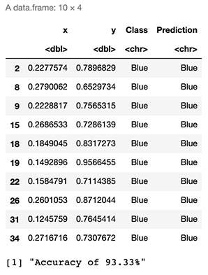
As seen by the results above, we can expect to “guess the correct class or color” 93% of the time.
从上面的结果可以看出,我们可以期望在93%的时间内“猜测正确的类别或颜色”。
原始色彩 (Original Colors)
Below we can observe the original colors or classes of our test sample.
下面我们可以观察测试样品的原始颜色或类别。
ggplot() +
  geom_tile(data=test,mapping=aes(x, y), alpha=0) +
  geom_point(data=test,mapping=aes(x,y,colour=Class),size=3 ) +
  scale_color_manual(values=colsdot) +
  xlab('X') + ylab('Y') + ggtitle('Test Data')+
  scale_x_continuous(expand=c(0,.05))+scale_y_continuous(expand=c(0,.05))
预测的颜色 (Predicted Colors)
Using our algorithm, we obtain the following colors for our initially colorless sample dataset.
使用我们的算法,我们为最初的无色样本数据集获得了以下颜色。
ggplot() +
  geom_tile(data=test,mapping=aes(x, y), alpha=0) +
  geom_point(data=test,mapping=aes(x,y,colour=Prediction),size=3 ) +
  scale_color_manual(values=colsdot) +
  xlab('X') + ylab('Y') + ggtitle('Test Data')+
  scale_x_continuous(expand=c(0,.05))+scale_y_continuous(expand=c(0,.05))
As seen in the plot above, it seems even though our algorithm correctly classified most of the data points, it failed with some of them (marked in red).
如上图所示,即使我们的算法正确地对大多数数据点进行了分类,但其中的某些数据点还是失败了(用红色标记)。
决策极限 (Decision Limits)
Finally, we can visualize our “decision limits” over our original Test Dataset. This provides an excellent visual approximation of how well our model is classifying our data and the limits of its classification space.
最后,我们可以可视化我们原始测试数据集上的“决策限制”。 这为模型对数据的分类及其分类空间的局限性提供了极好的视觉近似。
In simple words, we will simulate 160.000 data points (400x400 matrix) within the range of our original dataset, which, when later plotted, will fill most of the empty spaces with colors. This will help us express in detail how our model would classify this 2D space within it’s learned color classes. The more points we generate, the better our “resolution” will be, much like pixels on a TV.
简而言之,我们将在原始数据集范围内模拟160.000个数据点(400x400矩阵),当稍后绘制时,这些数据点将用颜色填充大部分空白空间。 这将帮助我们详细表达我们的模型如何在其学习的颜色类别中对该2D空间进行分类。 我们生成的点越多,我们的“分辨率”就越好,就像电视上的像素一样。
# We calculate background colors
x_coord = seq(min(train[,1]) - 0.02,max(train[,1]) + 0.02,length.out = 40)
y_coord = seq(min(train[,2]) - 0.02,max(train[,2]) + 0.02, length.out = 40)
coord = expand.grid(x = x_coord, y = y_coord)
coord[['prob']] = mapply(KnnL2Prediction, coord$x, coord$y,K)# We calculate predictions and plot decition area
colsdot <- c("Blue" = "blue", "Red" = "darkred", "Green" = "darkgreen")
colsfill <- c("Blue" = "#aaaaff", "Red" = "#ffaaaa", "Green" = "#aaffaa")
ggplot() +
  geom_tile(data=coord,mapping=aes(x, y, fill=prob), alpha=0.8) +
  geom_point(data=test,mapping=aes(x,y, colour=Class),size=3 ) +
  scale_color_manual(values=colsdot) +
  scale_fill_manual(values=colsfill) +
  xlab('X') + ylab('Y') + ggtitle('Decision Limits')+
  scale_x_continuous(expand=c(0,0))+scale_y_continuous(expand=c(0,0))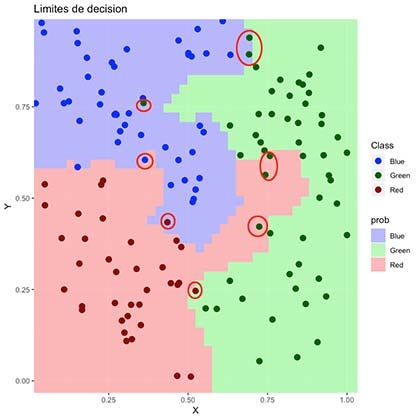
As seen above, the colored region represents which areas our algorithm would define as a “colored data point”. It is visible why it failed to classify some of them correctly.
如上所示,彩色区域表示我们的算法将哪些区域定义为“彩色数据点”。 可见为什么无法正确分类其中一些。
最后的想法 (Final Thoughts)
K-Nearest Neighbors is a straightforward algorithm that seems to provide excellent results. Even though we can classify items by eye here, this model also works in cases of higher dimensions where we cannot merely observe them by the naked eye. For this to work, we need to have a training dataset with existing classifications, which we will later use to classify data around it, meaning it is a supervised machine learning algorithm.
K最近邻居是一种简单的算法,似乎可以提供出色的结果。 即使我们可以在这里按肉眼对项目进行分类,该模型也可以在无法仅用肉眼观察它们的较高维度的情况下使用。 为此,我们需要有一个带有现有分类的训练数据集,稍后我们将使用它来对周围的数据进行分类 ,这意味着它是一种监督式机器学习算法 。
Sadly, this method presents difficulties in scenarios such as in the presence of intricate patterns that cannot be represented by simple straight distance, like in the cases of radial or nested clusters. It also has the problem of performance since, for every classification of a new data point, we need to compare it to every single point in our training dataset, which is resource and time intensive since it requires replication and iteration of the complete set.
可悲的是,这种方法在诸如无法以简单直线距离表示的复杂图案的情况下(例如在径向或嵌套簇的情况下)会遇到困难。 它也存在性能问题,因为对于新数据点的每个分类,我们都需要将其与训练数据集中的每个点进行比较,这是资源和时间密集的,因为它需要复制和迭代整个集合。
翻译自: https://towardsdatascience.com/k-nearest-neighbors-classification-from-scratch-6b31751bed9b
大样品随机双盲测试


 620
620

 被折叠的 条评论
为什么被折叠?
被折叠的 条评论
为什么被折叠?
 到【灌水乐园】发言


