


Gradients have been a universal trend during the Web 2.0 time (early 2000's). Partially because they helped achieve the Skeuomorphism look of 3d, realistic buttons. After a while, however, many designers got bored with them and declared gradients outmoded and a bad-taste design. It all came back to fame after iOS7, and later Modern Design brought gradients back into the spotlight.
在Web 2.0时代(2000年代初期), 渐变已成为普遍趋势。 部分是因为它们帮助实现了3d逼真的按钮的拟态外观。 然而,过了一会儿,许多设计师对它们感到厌烦,并宣布渐变已过时且品味不好。 在iOS7之后,这一切都广为人知,后来,“现代设计”(Modern Design)将渐变重新引起了人们的关注。
Because of their increasing popularity, many designers started calling gradients “the new colors.”
由于越来越受欢迎,许多设计师开始将渐变称为“ 新颜色” 。
A skeuomorphic button from the first iPhone era had a strong gradient, a thick border, hard shadow, and typical to that style highlight at the top.
第一个iPhone时代的拟人化按钮具有很强的渐变感,厚实的边框,硬阴影,并且在顶部突出显示了该样式的典型特征。
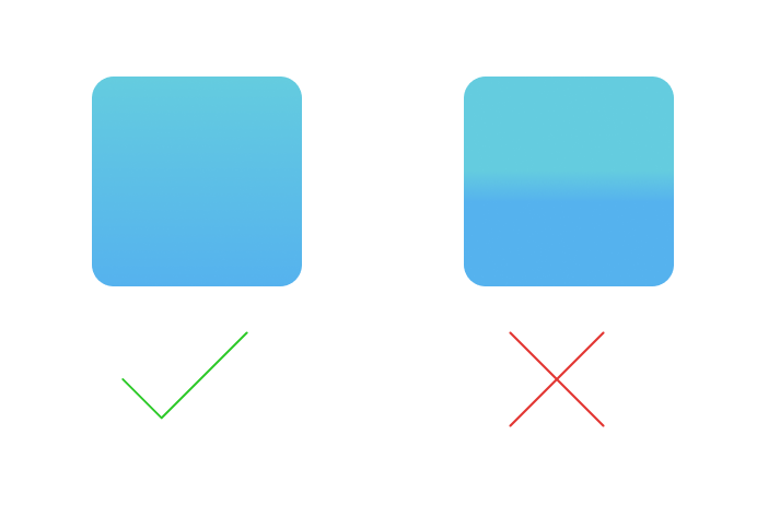
Modern gradient, without any extra decoration, can work with a soft shadow made from the same color, creating a beautiful, semi-realistic look.
无需任何额外装饰的现代渐变色就可以与由相同颜色制成的柔和阴影配合使用,从而创造出美丽,逼真的外观。

We like natural things, particularly if they exist in nature. Need evidence? What do you see around you every day? Sky!. The sky is not just one solid color, but a gradient, that depends on weather and lighting.
我们喜欢自然的事物,特别是如果它们存在于自然中。 需要证据吗? 您每天在周围看到什么? 天空!。 天空不仅是纯色,而且是取决于天气和光照的渐变。

Most objects we see are three-dimensional, returning light and casting shadows. Because the light is rarely uniform, the resulting colors and shadows are never fully flat or filled with just one color. They are gradient in nature, which makes this particular tonal mix more natural than solid colors.
我们看到的大多数对象都是三维的,返回光并投射阴影。 由于光线很少均匀,因此所得的颜色和阴影永远不会完全平坦或仅填充一种颜色。 它们本质上是渐变色,这使得这种特定的色调混合比纯色更自然。
Look at the everyday objects that surround you. All of them are gradient in nature, and they also change with the change of external light sources.
查看周围的日常物品。 所有这些本质上都是渐变的,并且它们也随着外部光源的变化而变化。
“Look around. Nearly everything you see is actually a gradient”
“看看周围。 您几乎看到的所有东西实际上都是一个梯度”
When we start choosing our gradients, it’s essential to spot their two main qualities.
当我们开始选择渐变时,必须找出它们的两个主要特质。
One is the ability to create depth and a more defined shape.
一种是创建深度和更定义形状的能力。
The other is about catching the eye and guiding it to certain parts of the shape. Our eyes prefer bright, warm hues, with pretty high saturation.
另一个是吸引眼球并将其引导至形状的某些部分。 我们的眼睛喜欢明亮,温暖的色相,并且饱和度很高。
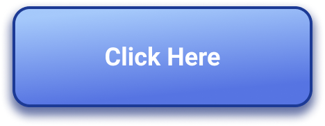
Even a subtle gradient will make your buttons more friendly and “clickable.”
即使是细微的渐变也会使您的按钮更加友好和“可点击”。
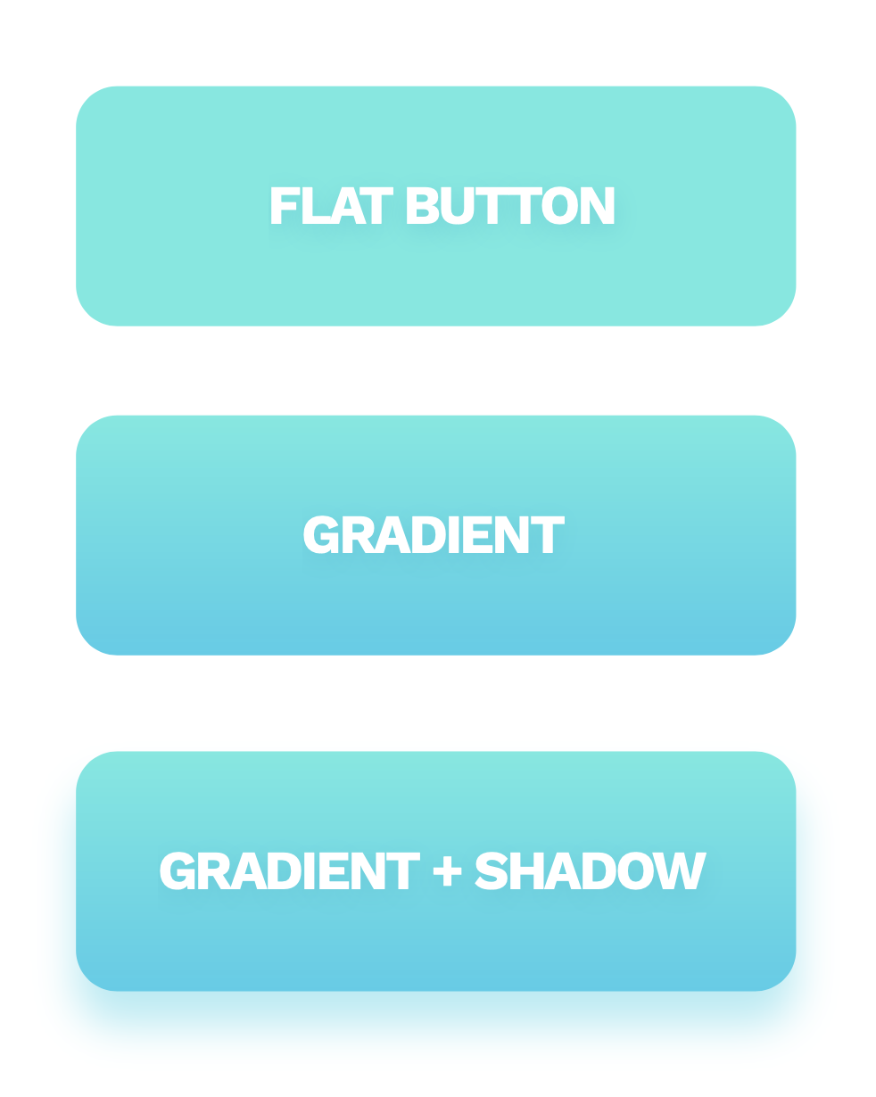
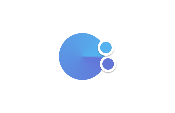
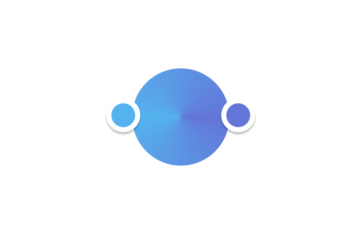
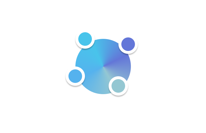
Depth allows gradient + shadow combinations to appear a bit closer to the eye — which helps in understanding the interactions behind them.
深度可使渐变+阴影组合看起来更贴近眼睛,这有助于理解它们背后的相互作用。
That doesn’t mean we should entirely discard flat design and come back to skeuomorphic buttons of the previous decade. Both methods have their benefits and downsides, so it may be useful to create a healthy mix of the two.
这并不意味着我们应该完全放弃平面设计,而应回到前十年的拟态按钮。 两种方法都有其优点和缺点,因此创建两者的健康组合可能很有用。
The flat design style allows for a less cluttered, more minimal design that focuses on functionality over form.
平面设计风格使设计更简洁,更简洁,而侧重于功能而非形式。
Skeuomorphic, or simply a more natural design, reminds us that we’re designing for real people, who prefer things they already know and understand. Realistic gradients can add that “human factor” to an otherwise minimal project and make it more user-friendly.
Skeuomorphic(或更简单的自然设计)提醒我们,我们是为真实的人设计的,他们更喜欢他们已经知道和了解的东西。 逼真的渐变可以将该“人为因素”添加到其他项目中,而使项目变得更人性化。
A gradient is a transition between two or more colors. The colors can also have a transparency value. You can use that to achieve the fade-out effect of an object relative to its background
渐变是两种或多种颜色之间的过渡。 颜色也可以具有透明度值。 您可以使用它来实现对象相对于其背景的淡出效果
There are three main types of gradients:
渐变主要有三种类型:
LINEAR
线性
Linear is the most popular gradient type. As its name states, it’s a linear transition of two or more colors. We can modify the colors themselves, their transparency, and the gradient angle.
线性是最受欢迎的渐变类型。 顾名思义,它是两种或更多种颜色的线性过渡。 我们可以修改颜色本身,它们的透明度和渐变角度。
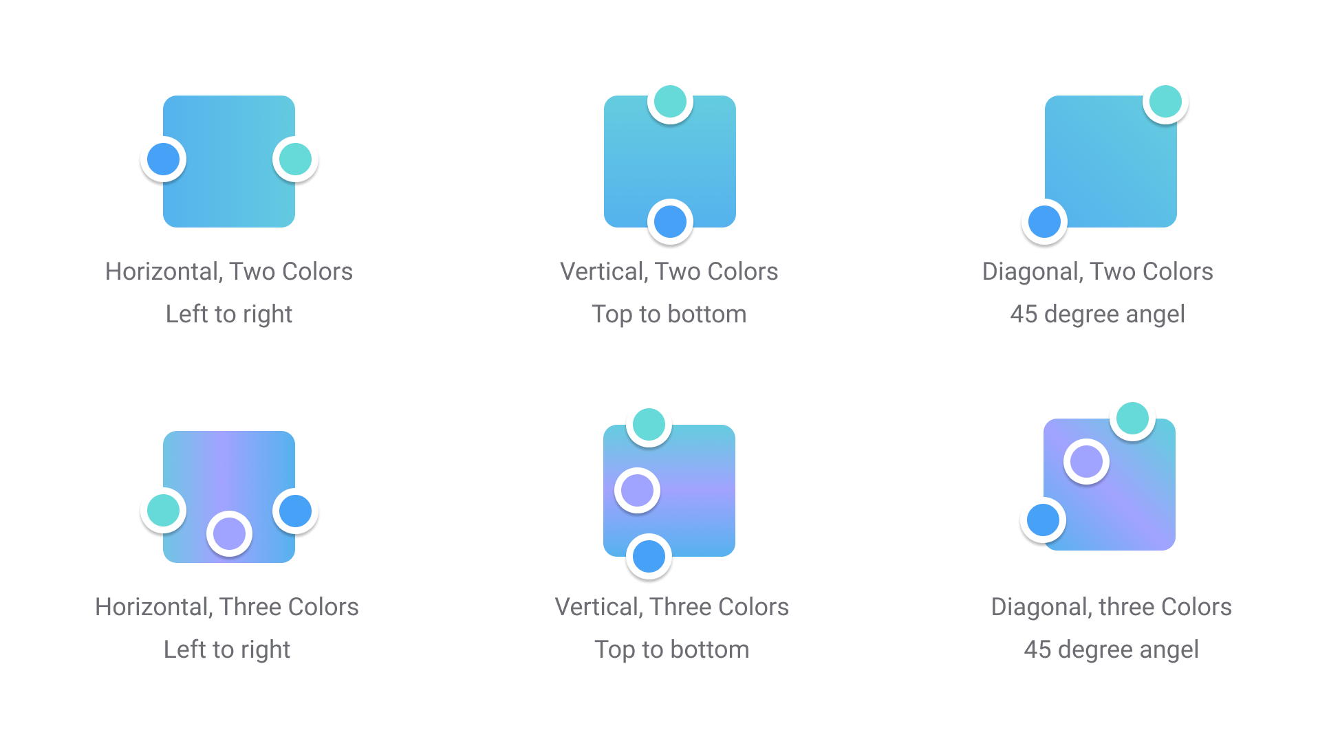
RADIAL
径向
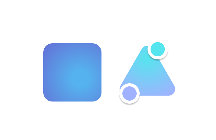
A radial gradient starts with one color in the middle of the gradient ring, while the other ends up being on its edge. The most common type of this gradient is the circular one, where the transition is distributed evenly along the circle.
径向渐变从渐变环中间的一种颜色开始,而另一种最终位于其边缘。 这种渐变最常见的类型是圆形,渐变沿圆形均匀分布。
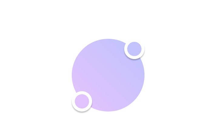
Two colors with no transparency can create a 3d look in circles by adding a highlight and shading.
不透明的两种颜色可以通过添加高光和底纹来创建3d圆形外观。

If both ends of the gradient are the same color, with one at full transparency, we end up with a blur or fade-out effect.
如果渐变的两端是相同的颜色,且其中一个具有完全透明的颜色,则最终会产生模糊或淡入淡出的效果。

A radial gradient works well on non-circular shapes by adding a bit of an organic, realistic style to them.
通过在非圆形形状上添加一些自然逼真的样式,径向渐变效果很好。
ANGULAR
角度
An angular gradient goes around in a counter-clockwise circle. The angle between the colors defines whether the transition goes both ways (180-degree angle) or has one sharp dividing line in the middle (at 0-degrees).
角度梯度沿逆时针方向旋转。 颜色之间的角度定义过渡是双向的(180度角)还是中间有一条尖锐的分界线(0度)。
This type of gradient is rarely a good choice for interfaces.
对于接口,这种梯度很少是一个好的选择。
Two colors set in the same spot will have a sharp edge between them, while the gradient goes around the other way.
设置在同一位置的两种颜色之间将具有鲜明的边缘,而渐变则以相反的方式进行。
Two colors at 180-degrees will have a fluid transition between the colors going both ways.
两种180度的颜色会在两种颜色之间产生流畅的过渡。
You can add more colors and play around with the angle to achieve some interesting results.
您可以添加更多颜色并随角度移动以达到一些有趣的效果。
最佳实践 (Best Practices)
How to design a gradient that both looks good, and makes sense for great interface design? There are a few basic rules to follow to accomplish that.
如何设计既好看又对伟大的界面设计有意义的渐变? 要完成此任务,需要遵循一些基本规则。
TWO COLORS
两种颜色
Two-color gradients are the best choice for most designs. With more colors, the gradient can become visually busy.
对于大多数设计,两种颜色的渐变是最佳选择。 使用更多颜色,渐变会变得视觉上很忙。

CHOOSING THE RIGHT COLORS
选择正确的颜色
Try to match similar colors, warm hues with warm ones, and cold with cold.
尝试匹配相似的颜色,将暖色与暖色匹配,将冷色与冷色匹配。
That will help you avoid bad mixes (with the most extreme one being red and green)
这将帮助您避免不良混合(最极端的混合是红色和绿色)
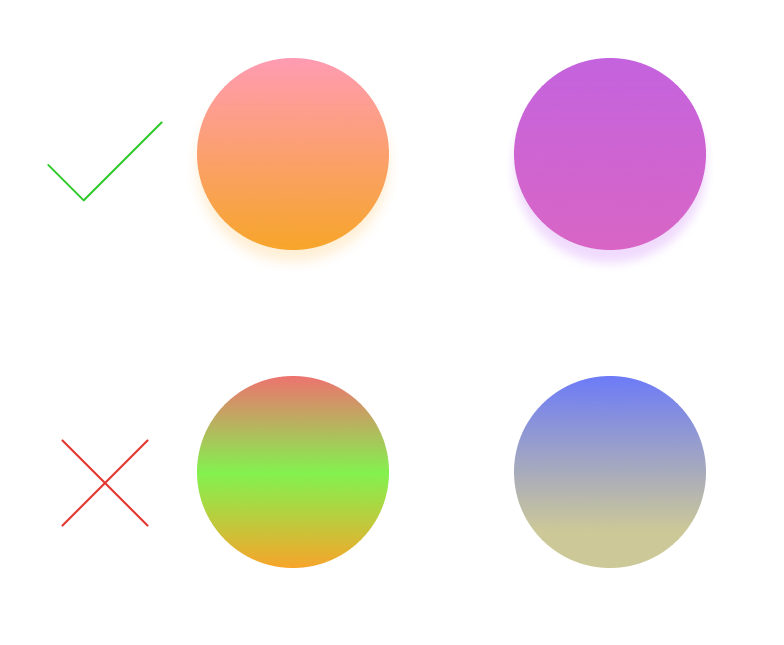
SUBTLE GRADIENTS
字幕渐变
The best gradients are often very subtle, with not a lot of difference between the colors. It makes them look more natural and easier on the eyes.
最佳的渐变通常非常微妙,颜色之间的差异不大。 它使它们看起来更自然,更轻松。
Gradients are a popular choice for buttons and other interactive elements. Here are some tips on how to make them shine.
渐变是按钮和其他交互元素的流行选择。 以下是一些有关如何使它们发光的提示。
You can pick nearly any color and create a beautiful looking gradient out of it. If you’re starting your gradient journey, however, it’s best to use the safe method that works every time.
您几乎可以选择任何颜色,并从中创建漂亮的渐变色。 但是,如果您要开始渐变之旅,则最好使用每次都有效的安全方法。
STEP ONE
步骤1
Create a linear gradient and use the same color on both ends. In our case, it’s simply a transition from #E0C3FC to #C3C3FC.
创建线性渐变,并在两端使用相同的颜色。 在我们的案例中,这只是从#E0C3FC到#C3C3FC的过渡。

STEP TWO
第二步
Check if your color palette is in HSBmode (Hue, Saturation, Brightness) and decrease or increase the Hue value of one of the gradient endings by 15–30. In our case, the color on top has the Hue value reduced by 30.
检查您的调色板是否处于HSB模式(色相,饱和度,亮度),并将其中一种渐变色的色相值降低或增加15–30。 在我们的示例中,顶部的颜色将色相值降低了30。

STEP THREE
第三步
For a more organic, friendly effect, you can try rotating the gradient (here it’s at 45 degrees) or decreasing the Saturation by 10–15 points.
要获得更有机,更友好的效果,您可以尝试旋转渐变(此处为45度)或将饱和度降低10–15点。
I hope you enjoyed it.
我希望你喜欢它。
here are some useful tools that help you to create your own fantastic gradient.
这里有一些有用的工具,可帮助您创建自己的梦幻渐变。
翻译自: https://uxdesign.cc/playing-with-gradients-3b3697f0e30f


 449
449


 被折叠的 条评论
为什么被折叠?
被折叠的 条评论
为什么被折叠?
 到【灌水乐园】发言


