


react图表渲染
什么是D3? (What is D3?)
D3 stands for Data-Driven Documents. It is a JavaScript library for manipulating documents based on data. D3 is a dynamic, interactive, online data visualizations framework used in a large number of websites. The visualized data are called charts. Commonly, there are line charts, bar charts, pie charts, etc.
D3代表数据驱动的文档。 这是一个JavaScript库,用于根据数据处理文档。 D3是动态的,交互式的,在线数据可视化框架,已在许多网站中使用。 可视化的数据称为图表。 通常,有折线图,条形图,饼图等。
什么是C3? (What is C3?)
C3 stands for Comfortable, Customizable, and Controllable. C3 is a JavaScript library that builds on top of D3. C3 allows us to build charts quickly without knowing all the complexity of D3. C3 provides a variety of APIs and callbacks to access the state of the chart.
C3代表舒适,可定制和可控制。 C3是一个基于D3JavaScript库。 C3使我们能够快速构建图表,而无需了解D3的所有复杂性。 C3提供了各种API和回调来访问图表状态。
In this article, we are going to show how to build C3 charts using React functional components.
在本文中,我们将展示如何使用React功能组件构建C3图表。
静态C3图表 (Static C3 Charts)
We will use the Create React App as a starting point. Since C3 is a wrapper of D3, both c3 and d3 packages are needed.
我们将使用Create React App作为起点。 由于C3是D3的包装,因此需要c3和d3包。
npm i c3
npm i d3
Then the following packages become part of dependencies in package.json.
然后,以下软件包成为package.json中dependencies一部分。
"dependencies": {
  "c3": "^0.7.20",
  "d3": "^5.16.0",
}
Change src/index.css to this for minimal styling:
将src/index.css更改为此,以最小化样式:
#chart {
  background: #fff;
  width: 90%;
  margin: 1em auto;
}
C3 generates a chart by calling generate() with a config object. The chart will be inserted into the element specified by the bindto selector in the config object.
C3通过使用config对象调用generate()生成图表。 图表将插入到config对象中bindto选择器指定的元素中。
We create src/Chart.js where the official C3 example is rendered by a React component:
我们创建src/Chart.js ,其中官方的C3示例由React组件呈现:
import React from "react";
import c3 from "c3";


export const Chart = () => {
  React.useEffect(() => {
    c3.generate({
      bindto: "#chart",
      data: {
        columns: [
          ["data1", 30, 200, 100, 400, 150, 250],
          ["data2", 50, 20, 10, 40, 15, 25],
        ],
        type: "line",
      },
    });
  }, []);

  return <div id="chart" />;
};
In the above code, the functional component, Chart, generates an element, <div id=”chart” /> (line 18).
在上面的代码中,功能组件Chart生成一个元素<div id=”chart” /> (第18行)。
The config object for the generate API is defined in lines 6-15. Line 7 instructs to insert the chart into the element whose id is chart. Lines 9-12 hardcode two data series: data1 and data2. Line 13 defines the chart type to be line. Lines 5-16 generate the C3 chart in useEffect. This chart will not be updated since the dependency list is an empty array (line 16).
在第6-15行中定义了generate API的配置对象。 第7行指示将图表插入ID为chart的元素中。 第9-12行对两个数据系列进行硬编码: data1和data2 。 第13 line图表类型定义为line 。 5-16 useEffect生成C3图表。 由于依赖关系列表是一个空数组(第16行),因此不会更新此图表。
In src/App.js, we invoke this chart component in line 5:
在src/App.js ,我们在第5行中调用此chart组件:
import React from "react";
import { Chart } from "./Chart";


function App() {
  return <Chart />;
}


export default App;
Run npm start, and we see the following chart:
运行npm start ,我们看到以下图表:

What happened? This chart has no styles. The C3 styles need to be included in the index.html (line 28):
发生了什么? 该图表没有样式。 C3样式需要包含在index.html (第28行):
<!DOCTYPE html>
<html lang="en">
  <head>
    <meta charset="utf-8" />
    <link rel="icon" href="%PUBLIC_URL%/favicon.ico" />
    <meta name="viewport" content="width=device-width, initial-scale=1" />
    <meta name="theme-color" content="#000000" />
    <meta
      name="description"
      content="Web site created using create-react-app"
    />
    <link rel="apple-touch-icon" href="%PUBLIC_URL%/logo192.png" />
    <!--
      manifest.json provides metadata used when your web app is installed on a
      user's mobile device or desktop. See https://developers.google.com/web/fundamentals/web-app-manifest/
    -->
    <link rel="manifest" href="%PUBLIC_URL%/manifest.json" />
    <!--
      Notice the use of %PUBLIC_URL% in the tags above.
      It will be replaced with the URL of the `public` folder during the build.
      Only files inside the `public` folder can be referenced from the HTML.

      Unlike "/favicon.ico" or "favicon.ico", "%PUBLIC_URL%/favicon.ico" will
      work correctly both with client-side routing and a non-root public URL.
      Learn how to configure a non-root public URL by running `npm run build`.
    -->
    <title>React App</title>
    <link rel="stylesheet" href="https://cdnjs.cloudflare.com/ajax/libs/c3/0.7.20/c3.min.css" />
  </head>
  <body>
    <noscript>You need to enable JavaScript to run this app.</noscript>
    <div id="root"></div>
    <!--
      This HTML file is a template.
      If you open it directly in the browser, you will see an empty page.

      You can add webfonts, meta tags, or analytics to this file.
      The build step will place the bundled scripts into the <body> tag.

      To begin the development, run `npm start` or `yarn start`.
      To create a production bundle, use `npm run build` or `yarn build`.
    -->
  </body>
</html>
With styles, the chart looks the same as it does in the official C3 document.
使用样式时,图表看起来与C3官方文档中的图表相同。
You can hover over the lines to view data in detail. Each line can be showed or hidden by hovering or clicking the data series name on the x-axis.
您可以将鼠标悬停在各行上以查看详细数据。 通过悬停或单击x轴上的数据系列名称,可以显示或隐藏每行。
动态C3图表 (Dynamic C3 Charts)
The previous chart is static. How can we draw a dynamic chart? Usually, chart data are fetched by promises. To simplify the code, we create getData in src/getData.js to generate dynamic data.
上一张图表是静态的。 我们如何绘制动态图表? 通常,图表数据是通过promise获取的。 为了简化代码,我们在src/getData.js创建getData来生成动态数据。
/**
 * This function takes an array of plot config and generates data to be supplied to C3 charts.
 * @param { plotConfigProps[] } plotConfig
 * interface plotConfigProps {
 *   length: number // length of the plot
 *   maxValue: number // max value of the plot
 * }
 */
export const getData = (plotConfig) => {
  if (Array.isArray(plotConfig)) {
    return plotConfig.reduce((sum, { length, maxValue }, index) => {
      const data = [`data${index}`];
      for (let i = 0; i < length; i++) {
        data.push(Math.floor(Math.random() * maxValue));
      }
      sum.push(data);
      return sum;
    }, []);
  }


  return [];
};
This getData function takes an array of plotconfig (line 9) and then uses a reduce function (lines 11-18) to transform the config to chart data that can be rendered by C3.
此getData函数采用plotconfig的数组(第9行),然后使用reduce函数(第11-18行)将配置转换为C3可以呈现的图表数据。
We modify src/Chart.js to call getData.
我们修改src/Chart.js来调用getData 。
import React from "react";
import c3 from "c3";
import { getData } from "./getData";


export const Chart = () => {
  const [data, setData] = React.useState([]);
  React.useEffect(() => {
    const interval = setInterval(() => {
      setData(
        getData([
          { length: 20, maxValue: 400 },
          { length: 20, maxValue: 200 },
          { length: 20, maxValue: 100 },
          { length: 20, maxValue: 20 },
          { length: 20, maxValue: 300 },
        ])
      );
    }, 1000);
    return () => clearInterval(interval);
  }, []);


  React.useEffect(() => {
    c3.generate({
      bindto: "#chart",
      data: {
        columns: data,
        type: "line",
      },
    });
  }, [data]);
  return <div id="chart" />;
};
Here, data is a state (line 6), The useEffect (line 22-30) will regenerate the chart if the data object is changed. Another useEffect (line 7-20) is called to set new data every second. The config (lines 10-16) creates five dynamically updating data series in the following video:
这里, data是状态(第6行),如果更改了data对象,则useEffect (第22-30行)将重新生成图表。 另一个useEffect (第7-20行)被调用来每秒设置新数据。 配置(第10-16行)在以下视频中创建了五个动态更新的数据系列:
Alternatively, we create src/DataSource.js to make fetching data a component.
另外,我们创建src/DataSource.js来使获取数据成为一个组件。
import React from "react";
import { getData } from "./getData";


export const DataSource = ({ setData, plotConfig }) => {
  React.useEffect(() => {
    const interval = setInterval(() => {
      setData(getData(plotConfig));
    }, 1000);
    return () => clearInterval(interval);
  }, [plotConfig, setData]);


  return null;
};
At line 12, we return null. For the cases not to render anything intentionally, returning null is a good practice.
在第12行,我们返回null 。 对于不故意渲染任何东西的情况,返回null是一个好习惯。
In src/Chart.js, the DataSource component is used, as a replacement of the useEffect fetch block.
在src/Chart.js ,使用DataSource组件代替了useEffect获取块。
import React from "react";
import c3 from "c3";
import { DataSource } from "./DataSource";


export const Chart = () => {
  const [data, setData] = React.useState([]);


  React.useEffect(() => {
    c3.generate({
      bindto: "#chart",
      data: {
        columns: data,
        type: "line",
      },
    });
  }, [data]);


  return (
    <div id="chart">
      <DataSource
        setData={setData}
        plotConfig={[
          { length: 20, maxValue: 400 },
          { length: 20, maxValue: 200 },
          { length: 20, maxValue: 100 },
          { length: 20, maxValue: 20 },
          { length: 20, maxValue: 300 },
        ]}
      />
    </div>
  );
};
Does the above componentized code look neater?
上面的组成代码看起来更整洁吗?
For C3 charts, different data series can have different numbers of points. We modify plotConfig (lines 22-28) to make data of various lengths in src/Chart.js:
对于C3图表,不同的数据系列可以具有不同数量的点。 我们修改plotConfig (第22-28行)以在src/Chart.js制作各种长度的数据:
import React from "react";
import c3 from "c3";
import { DataSource } from "./DataSource";


export const Chart = () => {
  const [data, setData] = React.useState([]);


  React.useEffect(() => {
    c3.generate({
      bindto: "#chart",
      data: {
        columns: data,
        type: "line",
      },
    });
  }, [data]);


  return (
    <div id="chart">
      <DataSource
        setData={setData}
        plotConfig={[
          { length: 10, maxValue: 400 },
          { length: 5, maxValue: 200 },
          { length: 8, maxValue: 100 },
          { length: 20, maxValue: 20 },
          { length: 15, maxValue: 300 },
        ]}
      />
    </div>
  );
};
The following is a chart with different length data series:
以下是具有不同长度数据系列的图表:
各种图表类型 (Various Chart Types)
C3 charts support many types. In the previous examples, the type has been set to line.
C3图表支持多种类型。 在前面的示例中,类型已设置为line 。
折线图 (Line charts)
Display how numbers have changed over time. They are ideal to show changing time series as well as trends and developments over time.
显示数字随着时间的变化。 它们是显示不断变化的时间序列以及随着时间变化的趋势和发展的理想选择。
We will explore more chart types, using the same code but setting to different types.
我们将使用相同的代码,但设置为不同的类型,探索更多图表类型。
步骤图 (Step charts)
Line charts that do not use the shortest distance to connect two data points. Instead, they use vertical and horizontal lines to connect the data points in a plot forming a step-like progression. The vertical parts of a step chart denote changes in the data and their magnitude. The horizontal parts of a step chart denote the constancy of the data. For step charts, the type is set to step.
不使用最短距离连接两个数据点的折线图。 取而代之的是,它们使用垂直线和水平线来连接图中的数据点,从而形成阶梯状的进度。 步骤图的垂直部分表示数据及其大小的变化。 步骤图的水平部分表示数据的恒定性。 对于步骤表,类型设置为step 。
The following is a step chart:
以下是一个步骤图:
样条图 (Spline charts)
Line charts that do not use a straight line to connect two data points. Instead, they draw a curved line between the points in a data series. For spline charts, the type is set to spline.
不使用直线连接两个数据点的折线图。 相反,它们在数据序列中的点之间绘制一条曲线。 对于样条图,类型设置为spline 。
This is a spline chart:
这是一个样条图:
条形图 (Bar charts)
Used for comparing size. They present categorical data using rectangular bars with heights or lengths proportional to the values that they represent. For bar charts, the type is set to bar.
用于比较大小。 他们使用高度或长度与其所代表的值成比例的矩形条来显示分类数据。 对于条形图,类型设置为bar 。
The following is a bar chart:
以下是条形图:
In addition, different bars can be grouped together to make stacked bar charts. In the following config, all five groups of data are stacked into one bar.
此外,可以将不同的条形组合在一起以制作堆叠的条形图。 在以下配置中,所有五组数据都堆叠到一个栏中。
data: {
  columns: data,
  type: "bar",
  groups: [
    ["data0", "data1", "data2", "data3", "data4"],
  ],
}
This is a stacked bar chart:
这是堆积的条形图:
面积图 (Area charts)
Line charts with the areas between the line and the x-axis filled. For area charts, the type is set to area.
折线图,其中折线和x轴之间的区域填充。 对于面积图,类型设置为area 。
The following is an area chart:
以下是面积图:
In addition, different areas can be grouped together to make stacked area charts. In the following config, all five groups of data are stacked to one group.
此外,可以将不同区域组合在一起以制作堆叠的区域图。 在以下配置中,所有五组数据都堆叠为一组。
data: {
  columns: data,
  type: "area",
  groups: [
    ["data0", "data1", "data2", "data3", "data4"],
  ],
}
This is a stacked area chart:
这是一个堆积的面积图:
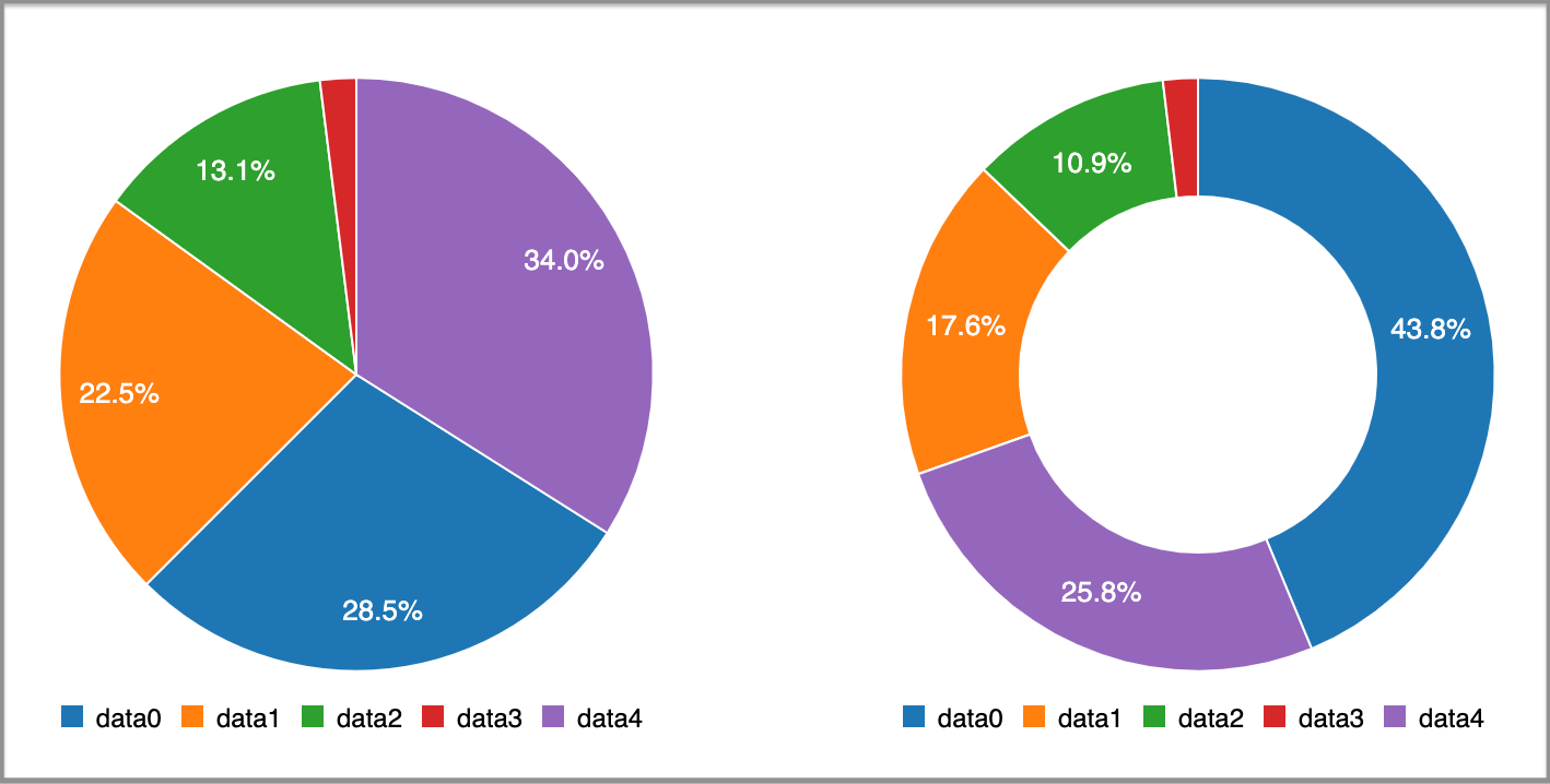
饼状图 (Pie charts)
Display a circular chart divided into sectors which are proportional to the quantity it represents. For pie charts, the type is set to pie.
显示 将圆形图表划分为多个扇区,这些扇区与其代表的数量成比例。 对于饼图,类型设置为pie 。
甜甜圈图 (Donut charts)
Essentially pie charts, with an area of the center cut out. For donut charts, the type is set to donut.
本质上是饼图,中心区域被切掉。 对于甜甜圈图,类型设置为donut 。
Multiple charts can be put into one component:
多个图表可以放入一个组件中:
We can also put different data series into one chart:
我们还可以将不同的数据系列放入一张图表中:
import React from "react";
import c3 from "c3";


export const Chart = () => {
  React.useEffect(() => {
    c3.generate({
      bindto: "#chart",
      data: {
        columns: [
          ["data0", 30, 200, 100, 400, 150, 250],
          ["data1", 350, 120, 40, 40, 5, 75],
          ["data2", 50, 20, 10, 40, 15, 25],
          ["data3", 80, 20, 100, 400, 150, 250],
          ["data4", 500, 200, 30, 60, 300, 200],
        ],
        type: "bar",
        types: {
          data2: "area",
          data3: "area",
          data4: "spline",
        },
        groups: [
          ['data0','data1'], ['data2','data3']
      ]
      },
    });
  }, []);


  return <div id="chart" />;
};
At line 16, it specifies that the default type is bar. Lines 18-20 specify each individual data series type. Line 23 makes two groups: data0&data1 and data2&data3.
在第16行,它指定默认类型为bar 。 第18-20行指定每个单独的数据系列类型。 第23行分为两组: data0 & data1和data2 & data3 。
We have the following combined chart:
我们有以下组合图:

结论 (Conclusion)
C3 charts bring charting power with an easy learning curve. Let’s reiterate its advantages:
C3图表通过易于学习的曲线带来图表功能。 让我们重申其优势:
- Comfortable: C3 makes it easy to generate D3-based charts by wrapping the code required to construct the entire chart. We do not need to write D3 code any more. 舒适:C3通过包装构造整个图表所需的代码,可以轻松生成基于D3的图表。 我们不再需要编写D3代码。
- Customizable: C3 gives some classes to each element when generating, so we can define a custom style by the class and it is possible to extend the structure directly by D3. 可定制的:C3在生成时为每个元素提供一些类,因此我们可以通过该类定义自定义样式,并且可以通过D3直接扩展结构。
- Controllable: C3 provides a variety of APIs and callbacks to access the state of the chart. By using them, we can update the chart even after it is rendered. 可控制:C3提供了各种API和回调来访问图表状态。 通过使用它们,即使在渲染图表之后,我们也可以对其进行更新。
Thanks for reading. I hope this was helpful. You can see my other Medium publications here.
谢谢阅读。 我希望这可以帮到你。 您可以在这里查看我的其他Medium出版物。
react图表渲染


 4030
4030

 被折叠的 条评论
为什么被折叠?
被折叠的 条评论
为什么被折叠?
 到【灌水乐园】发言


