


实习期的第一份活,自己看Ant Design的官网学习,然后用Ant Design写一个仿微软ToDo。
不做教学目的,只是记录一下。
1、学习
Ant Design 是个组件库,想要会用,至少要知道React和ES6。
Ant Design 官网:https://ant.design/index-cn
可以看看官网的实战教学:https://www.yuque.com/ant-design/course
Ant Design Pro 一个比较完整的开源项目,看里面的东西可以学习挺多的:https://pro.ant.design/index-cn
说实话,第一次接触 Ant Design 真的是一脸懵逼。
那时候我才知道原来前端已经不再是学习学的 html+css+javascript。
第一次见到 NodeJS、React...(啊,原来我菜的这么真实嘛)
自己的学习过程其实就是看实战教学,照着把教学里的东西写一遍,理解里面几个比较关键的点。
布局与路由,model,props和states。
2、任务
仿写微软ToDo:http://www.gxtodo.com/web/
理想是这个样子的:
2.1 微软ToDo任务界面
现实是这个样子的:

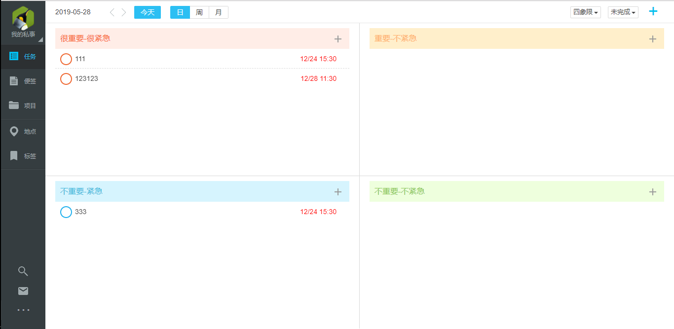
2.2 自己写的仿微软ToDo任务界面
有些功能并没有实现,例如登录,还有超时,地图接口。其实挺多(cai)的。
3、分析
思路:
主要先把布局和路由写了,然后就可以实现具体内容。
整个项目需要用到的数据都是用mock的。
1)布局
左边是窄窄的导航栏,主要就是头像、任务、便签、项目、地点、标签、搜索(邮件和...并没有写)
右边就是内容。内容的分布格式是,上面标题或时间,下面内容。
2)功能
任务功能:
①上部分是任务时间(根据时间展示任务)、任务展示方式(四象限或时间轴)、任务完成(已完成、未完成、全部)、添加新任务(就是那个 +)
②下部分默认四象限展示4种不同紧急程度的任务、点击任务前面的圆圈可以完成任务、单击任务名右边弹出任务详细,可修改删除。
③新增表单中项目、标签、位置提供已有的。
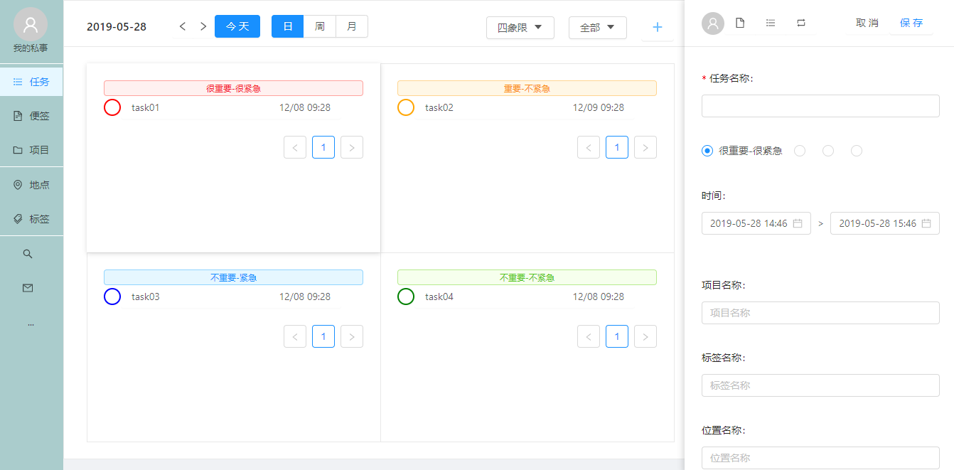
3.1 任务界面新增功能
便签功能:
①上部分标题
②下部分输入内容然后组合键生成右边的小便签
③小便签提供一个删除按钮

3.2 便签界面
项目功能:
①上部分一个tab和添加项目功能
②下部分列出已有项目(项目里的任务数和完成数),点击项目会从右边弹出项目中的任务。
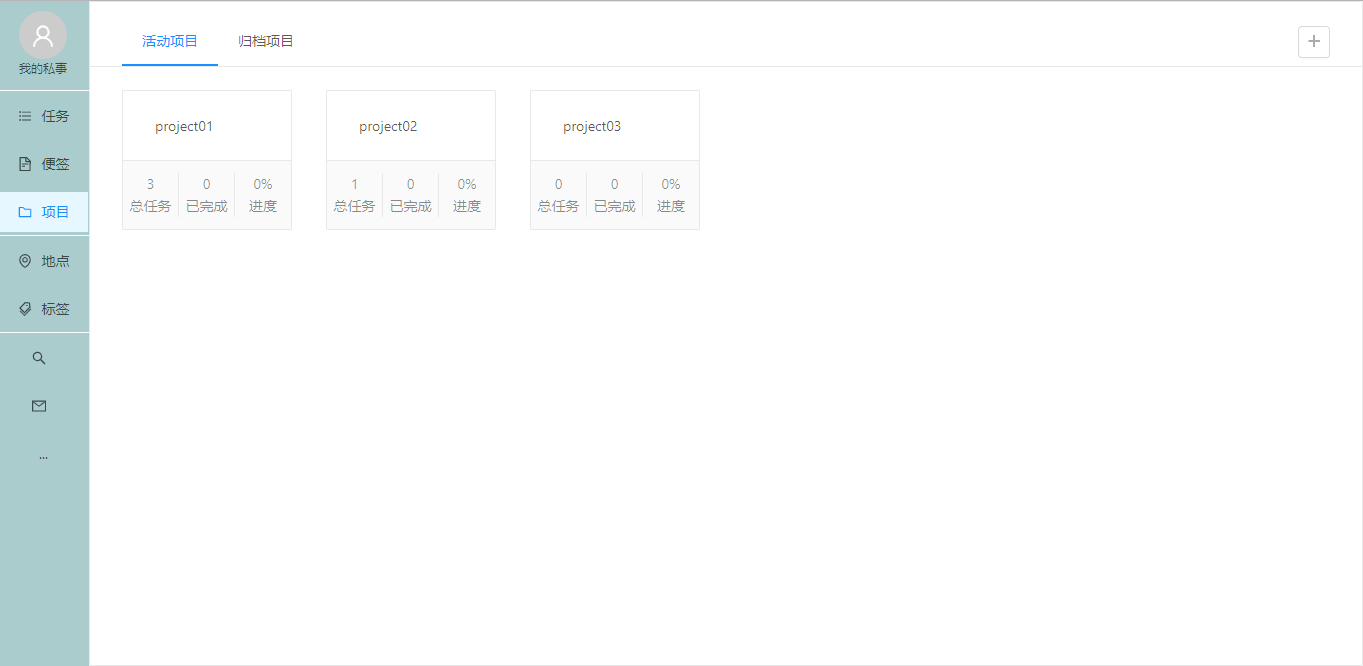
3.3 项目界面
地点、标签功能与项目类似,但是比项目简单一些。
搜索功能只做了简单的根据任务名搜索。
4、实现
由于代码比较多,而且我写的挺乱的,所以取部分功能的代码贴出来。
贴的代码中,主要是组件的使用方式,方法没有贴上去。
1)配置布局和路由
const plugins = [
    ['umi-plugin-react', {
        antd: true,
        dva: true,
    }],
];

export default {
    plugins,
    routes: [
        {
            path: '/',
            component: '../layouts/BaseLayout',
            routes: [
                { path: '/', component: './task/Task' },
                { path: '/task', component: './task/Task' },
                { path: '/note', component: './note/Note' },
                { path: '/project', component: './project/Project' },
                { path: '/tag', component: './tag/Tag' },
                { path: '/position', component: './position/Position' },
                { path: '/search', component: './search/SearchText' },
            ]
        }
    ],
};
布局方面:
SiderMenu是自己写的侧边栏组件,这里children会默认加载路由里component中的内容。
render() {
        const { children } = this.props;

        return (
            <div>
                <Layout>
                    <SiderMenu />
                    <Layout>
                        <Content>{children}</Content>
                    </Layout>
                </Layout>
            </div>
        );
    };
2)任务功能
这个功能,本来是写在一个js文件中的,但是参考了 Ant Design Pro 后,把一个js拆开了,写了几个组件。
render() {
        const { cardWidth, visible, buttonType, showType, radioChecked, showDate, } = this.state;
        const { taskAll, position, tag, project, form } = this.props;
        const { level1, level2, level3, level4, task, taskChoice } = taskAll;
        const task_level = [level1, level2, level3, level4];
        const otherField = {
            project: project,
            tag: tag,
            position: position,
            radioChecked: radioChecked,
        };
        // 头部标题
        const cardTitle = (
            <Suspense fallback={null}>
                <CardTitle
                    showDate={showDate}
                    buttonType={buttonType}
                    handleChangeButton={this.handleChangeButton}
                />
            </Suspense>
        );
        // 陈列方式菜单
        const Menu_how = (
            <Menu>
                <Menu.Item key='四象限' onClick={this.handleShow}>四象限{showType === '四象限' ? <Icon type='check' /> : null}</Menu.Item>
                <Menu.Item key='时间轴' onClick={this.handleShow}>时间轴{showType === '时间轴' ? <Icon type='check' /> : null}</Menu.Item>
            </Menu>
        );
        // 陈列类型菜单
        const Menu_show = (
            <Menu>
                <Menu.Item key='全部'>全部<Icon type='check' /></Menu.Item>
                <Menu.Item key='已完成'>已完成<Icon type='null' /></Menu.Item>
                <Menu.Item key='未完成'>未完成<Icon type='null' /></Menu.Item>
            </Menu>
        );
        // 右侧按钮组件
        const cardExtra = (
            <Fragment>
                <Dropdown overlay={Menu_how} trigger={['click']} style={{ padding: '0' }}>
                    <Button>{showType}<Icon type='caret-down' /></Button>
                </Dropdown>
                <Space></Space>
                <Dropdown overlay={Menu_show} trigger={['click']}>
                    <Button>全部<Icon type='caret-down' /></Button>
                </Dropdown>
                <Space></Space>
                <Button style={buttonBorderStyle}
                    type='primary' ghost size='large'
                    onClick={() => this.showDrawer()}><Icon type='plus' /></Button>
            </Fragment>
        );
        //抽屉按钮
        const DrawerButton = ({ button1_Click, button1_text, button2_Click, button2_text }) => (
            <Fragment>
                <Avatar icon='user'></Avatar>
                <Button.Group>
                    <Button style={buttonBorderStyle}><Icon type='file' /></Button>
                    <Button style={buttonBorderStyle}><Icon type='bars' /></Button>
                    <Button style={buttonBorderStyle}><Icon type='retweet' /></Button>
                </Button.Group>
                <Space /><Space />
                <Button style={buttonBorderStyle} onClick={button1_Click}>{button1_text}</Button>
                <Button style={buttonBorderStyle} ghost type='primary' onClick={button2_Click}>{button2_text}</Button>
            </Fragment>
        );
        // 抽屉标题按钮
        const drawerTitle = taskChoice && (taskChoice.taskId === null) ?
            (
                <DrawerButton
                    button1_Click={this.onClose}
                    button1_text={'取消'}
                    button2_Click={this.handleSave}
                    button2_text={'保存'}
                ></DrawerButton>
            ) : (
                <DrawerButton
                    button1_Click={this.handleRemove}
                    button1_text={'删除'}
                    button2_Click={this.onClose}
                    button2_text={'关闭'}
                ></DrawerButton>
            );
        return (
            <div>
                <Card
                    headStyle={{ height: '65px' }}
                    title={cardTitle}
                    extra={cardExtra}
                    style={cardWidth}
                >
                    <Suspense fallback={null}>
                        {showType === '四象限' ?
                            <CardList
                                dataSource={task_level}
                                showDrawer={this.showDrawer}
                                finished={this.handleFinished} />
                            :
                            <TimelineList
                                dataSource={task}
                                showDrawer={this.showDrawer}
                                finished={this.handleFinished} />
                        }
                    </Suspense>
                </Card>
                <Drawer
                    title={drawerTitle}
                    placement='right'
                    mask={false}
                    width={400}
                    closable={false}
                    visible={visible}
                >
                    <Suspense fallback={null}>
                        <TaskForm
                            {...otherField}
                            onChange={this.onChangeRadio}
                            form={form}
                            taskC={taskChoice}
                            handleSubmit={this.handleSave}
                        ></TaskForm>
                    </Suspense>
                </Drawer>
            </div>
        );
    }
头部标题:
const CardTitle = ({ handleChangeButton, buttonType, showDate }) => (
    <Fragment>
        <Row type='flex' align='middle' gutter={8} justify='start' style={{ width: '480px' }}>
            <Col span={6}>
                {showDate}
            </Col>
            <Col span={3}>
                <Button.Group>
                    <Button icon='left' style={buttonBorderStyle} ></Button>
                    <Button icon='right' style={buttonBorderStyle} ></Button>
                </Button.Group>
            </Col>
            <Col span={4}>
                <Button value='day'
                    type={buttonType === 'day' ? 'primary' : 'default'}
                    onClick={handleChangeButton}>今天</Button>
            </Col>
            <Col span={11}>
                <Button.Group onClick={handleChangeButton}>
                    <Button value='day' type={buttonType === 'day' ? 'primary' : 'default'}>日</Button>
                    <Button value='week' type={buttonType === 'week' ? 'primary' : 'default'}>周</Button>
                    <Button value='month' type={buttonType === 'month' ? 'primary' : 'default'}>月</Button>
                </Button.Group>
            </Col>
        </Row>
    </Fragment>
);
5、总结
哇,这人贼懒,写个东西都不好好写,代码也就贴一丢丢。
emmm。。
等我把项目代码传到github上后给个链接吧。
写完这个其实收获挺多的,但是要我说出来,又一时语塞。
有很多想要表达的东西,通篇写下来发现并没有表达到,自己第一次写博客,也是太菜了。。
嗯。。如果有人一不小心浪费时间翻到这里,给你说个抱歉,哈哈哈。
以后尽量提高自己的博客质量。
诺~链接:https://github.com/Lighter1187/todo


 720
720


 被折叠的 条评论
为什么被折叠?
被折叠的 条评论
为什么被折叠?
 到【灌水乐园】发言


