


前言
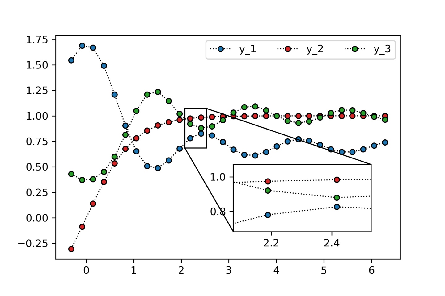
在数据可视化中,很多时候需要对某一区间的数据进行局部放大,以获得对比度更高的可视化效果。下面利用Python语言的Matplotlib库实现一个简单的局部放大图效果。
依赖库
- matplotlib:绘图库
- numpy:支持大量的维度数组、矩阵运算和数学函数的扩展库
步骤
1. 导入依赖库
import numpy as np
import matplotlib.pyplot as plt
from mpl_toolkits.axes_grid1.inset_locator import mark_inset
from mpl_toolkits.axes_grid1.inset_locator import inset_axes
2. 准备数据
x = np.linspace(-0.1*np.pi, 2*np.pi, 30)
y_1 = np.sinc(x)+0.7
y_2 = np.tanh(x)
y_3 = np.exp(-np.sinc(x))
3. 绘图
fig, ax = plt.subplots(1, 1, figsize=(6, 4))
ax.plot(x, y_1, color='k', linestyle=':', linewidth=1,
        marker='o', markersize=5,
        markeredgecolor='black', markerfacecolor='C0')

ax.plot(x, y_2, color='k', linestyle=':', linewidth=1,
        marker='o', markersize=5,
        markeredgecolor='black', markerfacecolor='C3')

ax.plot(x, y_3, color='k', linestyle=':', linewidth=1,
        marker='o', markersize=5,
        markeredgecolor='black', markerfacecolor='C2')

ax.legend(labels=["y_1", "y_2","y_3"], ncol=3)
效果图如下:

 最低0.47元/天 解锁文章


 4604
4604


 被折叠的 条评论
为什么被折叠?
被折叠的 条评论
为什么被折叠?
 到【灌水乐园】发言


