


Seaborn Tutorial
Introduction
在数据分析中,画图极为重要。在分析过程中以及最后的分析结果中都需要利用直观的图表去分析,展示数据特点,以便挖掘出有价值的信息。
因为我是用Python分析数据,那么matplotlib必不可少,然而自己太懒,matplotlib细节太多,一时没法完全掌握。Seaborn看起来是个不错的选择,它基于matplotlib,
但是做了更高层次的封装,学起来会简单很多,所以我把它当做绘图入门的工具。
我打算做一个Seaborn文档的笔记,然后再附一两篇实际应用的案例来完成我的Seaborn入门之旅。
import numpy as np
import matplotlib.pyplot as plt
import seaborn as sns
%matplotlib inline
plt.style.use({'figure.figsize':(12, 8)})
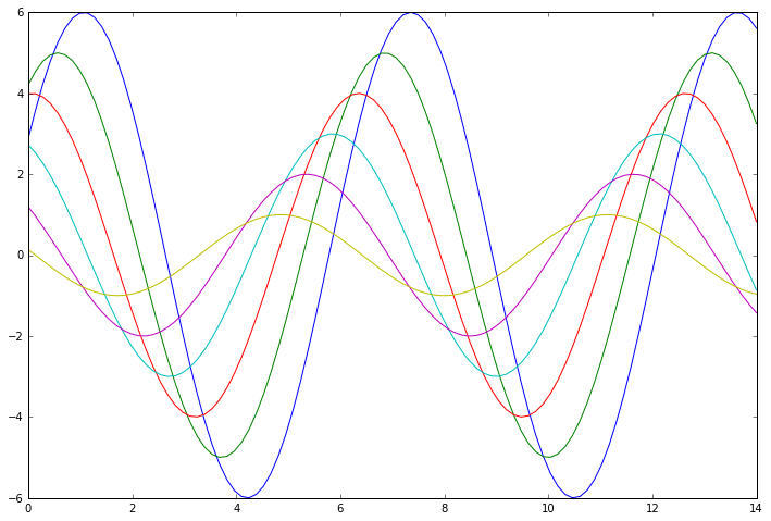
接下来画一些正弦函数来看一下Seaborn的基本参数:
def sinplot(flip=1):
x = np.linspace(0, 14, 100)
for i in range(1, 7):
plt.plot(x, np.sin(x + i * .5) * (7 - i) * flip)
sinplot()
看看matplotlib的样式:
print(plt.style.available)
['bmh', 'classic', 'dark_background', 'fivethirtyeight', 'ggplot', 'grayscale', 'seaborn-bright', 'seaborn-colorblind', 'seaborn-dark-palette', 'seaborn-dark', 'seaborn-darkgrid', 'seaborn-deep', 'seaborn-muted', 'seaborn-notebook', 'seaborn-paper', 'seaborn-pastel', 'seaborn-poster', 'seaborn-talk', 'seaborn-ticks', 'seaborn-white', 'seaborn-whitegrid', 'seaborn', '_classic_test']
可以看到,Seaborn的样式已经嵌入其中。我们将样式设置为Seaborn:
sns.set()
sinplot()
 最低0.47元/天 解锁文章


 2万+
2万+


 被折叠的 条评论
为什么被折叠?
被折叠的 条评论
为什么被折叠?
 到【灌水乐园】发言


