


网页开发中,经常会使用到 下拉箭头

,右侧箭头

这样的箭头。 一般用css来实现:
{
display: inline-block;
margin: 72px;
border-top: 24px solid;
border-right: 24px solid;
width: 120px;
height: 120px;
transform: rotate(45deg);
}
因为这是利用div的border-top, border-right,然后通过旋转div来实现的。
任意角度的箭头
这里有个问题: 假如需要一个角度为120度的箭头怎么办呢? 由于border-top, border-right一直是90度, 所以仅仅通过旋转不行。 我们可以先把div 旋转45度, 让它成为一个 菱形 然后再伸缩,达到任意的角度, 这样就可以得到一个 任意角度的箭头。由于用到了旋转和伸缩两种变换,所以需要使用 transform: matrix(a,b,c,d,e,f) 这个变换矩阵。 这里的6个变量组成了一个3介的变换矩阵
任意点p(x,y)的平移, 旋转, 伸缩变换以及他们的各种组合都可以通过这个变换矩阵做到:
注:这里用齐次坐标 来表达一个点。 简单说就是p(x, y) 表示为p'(x', y', 1)
平移矩阵
v(x, y) 沿着x轴平移tx, 沿着y轴平移ty。 则有:
x' = x + tx
y' = y + ty
所以平移矩阵:
旋转矩阵
v(x, y) 点绕原点旋转θ到v'(x', y')
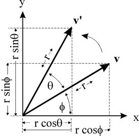
则有:
x = r * cos(ϕ )
y = r * sin(ϕ )
x' = r * cos(θ + ϕ) = r * cos(θ) * cos(ϕ) - r * sin(θ) * sin(ϕ ) // 余弦公式
y' = r * sin(θ + ϕ) = r * sin(θ) * cos(ϕ) + r * cos(θ) * sin(ϕ ) // 正弦公式
所以:
x' = x * cos(θ) - y * sin(θ)
y' = x * sin(θ) + y * cos(θ)
所以旋转矩阵:
伸缩矩阵
假设x轴,y轴的伸缩率分别是kx, ky。 则有:
x' = x * kx
y' = y * ky
所以:
复合变换
如果是对p(x, y)先平移(变换矩阵A), 然后旋转(变换矩阵B), 然后伸缩(变换矩阵C)呢?
p' =C(B(Ap)) ==> p' = (CBA)p //矩阵乘法结合率
现在任意角度o的箭头就很简单了:
先把div旋转45度 成为 菱形, 变换为 M1 伸缩x轴, y轴 :
x' = size * cos(o/2) = x * √2 * cos(o/2)
y' = size * sin(o/2) = y * √2 * sin(o/2)
即: kx = √2 * cos(o/2); ky = √2 * sin(o/2) 这样就得到了任意角度的箭头。 变换为 M2
如果箭头的方向不是指向右侧, 在进行一次旋转就可以得到任意方向的箭头。变换为 M3
那么由于 p' =C(B(Ap)) ==> p' = (CBA)p , 我们就可以先计算出 M3 M2 M1,然后对div进行相应的变换,就可以得到任意角度, 任意方向的箭头了。
div的width和height就是箭头的边长, 通过调整可以获取任意边长的箭头。
React组件
为了方便使用, 这个箭头被封装为了一个 React组件。
示例
简单箭头

模拟select
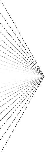
发散箭头
props
name
type
default
description
degree
number
90
箭头的张角, 角度制
offsetDegree
number
0
箭头的方向,默认指向右边
color
string
-
箭头的颜色
size
string
10px
箭头边长
安装使用
npm install rc-arrow --save
import Arrow from 'rc-arrow'
class Hw extends Component {
render() {
return (
)
}
}
以上就是本文的全部内容,希望对大家的学习有所帮助,也希望大家多多支持脚本之家。


 7699
7699


 被折叠的 条评论
为什么被折叠?
被折叠的 条评论
为什么被折叠?
 到【灌水乐园】发言


