


Echarts2.0版本
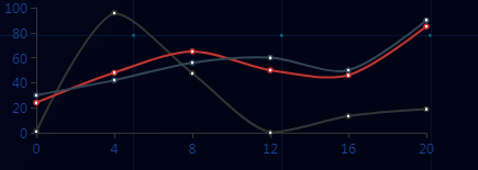
正常我们设置的折线图,一般都是线性的,在series中设置折线数据的时候,可以设置smooth:true 去设置当前的折线为平滑折线。
option = {
        tooltip : {
            trigger: 'axis'
        },
        grid: {
            left: 30,
            right:20,
            top:30,
            bottom:30

        },
        legend: {
           /* y: 'bottom',*/
           x:"right",
            data:['黄岩区','路桥区','渡江区'],
            textStyle:{    //图例文字的样式
                color:'#194296',
                fontSize:12
            }
        },
        calculable : true,
        xAxis : [
            {
                type : 'category',
                axisLabel: {
                    color: "#194296"  //刻度线标签颜色
                },
                boundaryGap : false,
                data : ['0','4','8','12','16','20']
            }
        ],
        yAxis : [
            {
                type : 'value',
                splitLine:false,
                axisLabel: {
                    color: "#194296"  //刻度线标签颜色
                },

                /*data : ['0','20','40','60','80','100']*/
            }
        ],
        series : [
            {
                name:'黄岩区',
                type:'line',
                color:'#d5d073',
                smooth:true,//设置折线图平滑
                data:[20, 40, 70, 50, 40, 80]
            },
            {
                name:'路桥区',
                type:'line',
                smooth:true,//设置折线图平滑
                data:[24, 48, 65, 50, 46,  85]
            },
            {
                name:'渡江区',
                type:'line',
                smooth:true,//设置折线图平滑
                data:[30, 42, 56, 60, 50, 90]
            }
        ]
    };
效果图如下:
symbol:'none', //这句就是去掉点的


 1881
1881

 被折叠的 条评论
为什么被折叠?
被折叠的 条评论
为什么被折叠?
 到【灌水乐园】发言


