


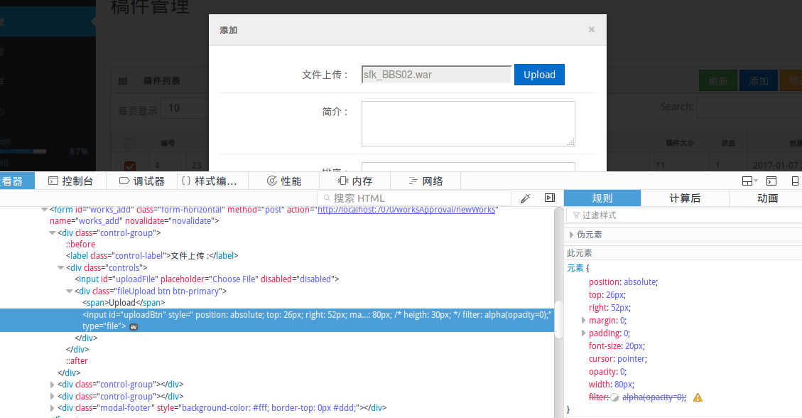
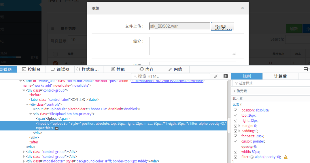
核心就是一段css遮住了原生的input框,然后用js将文件的值传入到另一个指定的input框中
原文链接
http://geniuscarrier.com/how-to-style-a-html-file-upload-button-in-pure-css/?utm_source=ourjs.com
How to Style a HTML file upload button in Pure CSS
12 June 2013 on css
Styling a html file upload button in pure css could be cumbersome if you've ever tried. Take a look at the following screenshot about how different browsers deal with the upload button. It's pretty obvious that there is a fair amount of variation.

We are aiming for creating a neat file upload button which behaves finely and consistently in pure css cross browsers. And here we go:
Step 1. Create a simple html markup
<div class="fileUpload btn btn-primary">
    <span>Upload</span>
    <input type="file" class="upload" />
</div>
Step 2. CSS: Tricky Part
.fileUpload {
    position: relative;
    overflow: hidden;
    margin: 10px;
}
.fileUpload input.upload {
    position: absolute;
    top: 0;
    right: 0;
    margin: 0;
    padding: 0;
    font-size: 20px;
    cursor: pointer;
    opacity: 0;
    filter: alpha(opacity=0);
}
For simplicity, I am using Bootstrap CSS to style the button (div.file-upload).
Demo:
Upload button with selected file
Unfortunately there is no PURE CSS way to do it. However, if you really want to display the selected file, the following JavaScript snippet could help for this case.
JavaScript:
document.getElementById("uploadBtn").onchange = function () {
    document.getElementById("uploadFile").value = this.value;
};
DOM change
<input id="uploadFile" placeholder="Choose File" disabled="disabled" />
<div class="fileUpload btn btn-primary">
    <span>Upload</span>
    <input id="uploadBtn" type="file" class="upload" />
</div>
Demo:


 1357
1357


 被折叠的 条评论
为什么被折叠?
被折叠的 条评论
为什么被折叠?
 到【灌水乐园】发言


