


用CSS纯代码画一个旋转的太极图的方法
发布时间:2020-09-14 14:57:21
来源:亿速云
阅读:129
作者:小新
小编给大家分享一下用CSS纯代码画一个旋转的太极图的方法,相信大部分人都还不怎么了解,因此分享这篇文章给大家参考一下,希望大家阅读完这篇文章后大有收获,下面让我们一起去了解一下吧!
HTML部分:
CSS部分:
.square {
width: 400px;
height: 400px;
position: relative;
transform: rotate(45deg);
-webkit-transform: rotate(45deg);
-moz-transform: rotate(45deg);
animation: rotate infinite linear 5s;
margin: 10% auto;
-webkit-animation: rotate infinite linear 5s;
margin: 10% auto;
-moz-animation: rotate infinite linear 5s;
margin: 10% auto;
}
.rect {
width: 400px;
height: 200px;
position: relative;
border: 1px #d2d2d2 solid;
border-bottom: none;
}
.inner_circle {
width: 200px;
height: 200px;
border-radius: 200px;
position: absolute;
z-index: 1;
}
.dot {
width: 50px;
height: 50px;
position: absolute;
left: 0;
right: 0;
top: 0;
bottom: 0;
margin: auto;
border-radius: 50%;
}
.rect_one {
border-radius: 200px 200px 0 0;
background: white;
}
.rect_one_one {
bottom: -100px;
left: 0;
background: black;
}
.rect_one_two {
background: white;
}
.rect_two {
border-radius: 0 0 200px 200px;
background: black;
}
.rect_two_one {
bottom: 100px;
right: 0;
background: white;
}
.rect_two_two {
background: black;
}
@keyframes rotate {
from {
transform: rotate(0deg);
-webkit-transform: rotate(0deg);
}
to {
transform: rotate(360deg);
-webkit-transform: rotate(360deg);
}
}
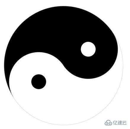
看图看效果:
以上是用CSS纯代码画一个旋转的太极图的方法的所有内容,感谢各位的阅读!相信大家都有了一定的了解,希望分享的内容对大家有所帮助,如果还想学习更多知识,欢迎关注亿速云行业资讯频道!


 1216
1216


 被折叠的 条评论
为什么被折叠?
被折叠的 条评论
为什么被折叠?
 到【灌水乐园】发言


