


 材料整理自《python数据科学手册》1.简单散点图1.1经典点线图import matplotlib.pyplot as plt%matplotlib inline #魔法函数,用于在jupyter显示图像,不然没法显示import numpy as npx=np.linspace(1,10,100)fig1_1=plt.figure() #一个Figure一个窗口plt.plot...
材料整理自《python数据科学手册》
1.简单散点图
1.1经典点线图
import matplotlib.pyplot as plt
%matplotlib inline   #魔法函数,用于在jupyter显示图像,不然没法显示
import numpy as np
x=np.linspace(1,10,100)
fig1_1=plt.figure() #一个Figure一个窗口
plt.plot(x,np.sin(x),'-o')
plt.plot(x,np.cos(x),'--ok',label='cos')   #可以像matlab一样通过参数设置点样子、线条样子、颜色,和图例,不过图例需要通过legend方法才能显示
plt.legend()  #只会显示上面定义的label(图例)
fig1_1 #输入fig对象即可重现之前的图1.2一种美观的点图设计(与后面的图例设计能画出三维数据可视化)
rng=np.random.RandomState(0) #np.random.RandomState和np.random.seed()差不多,只要重复调用np.random.RandomState就能固定随机数
x=rng.randn(100) #从标准正态分布中返回一个或多个样本值
y=rng.randn(100)
colors=rng.rand(100) #从[0,1]产生随机数
sizes=1000*rng.rand(100)
fig,ax=plt.subplots()
ax.scatter(x,y,c=colors,s=sizes,alpha=0.5,cmap='viridis') #默认的颜色和大小是所有点一样的,面对大数据集的话plot函数会比scatter要高效率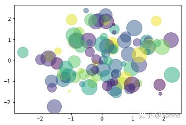
2.面向对象的画图风格
matplotlib有两种画图风格,一个是上面的matlab风格,一个是
 最低0.47元/天 解锁文章


 3317
3317


 被折叠的 条评论
为什么被折叠?
被折叠的 条评论
为什么被折叠?
 到【灌水乐园】发言


