


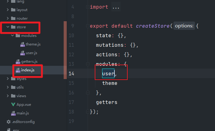
首页在哪里?
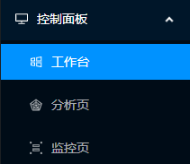
首页的网页布局
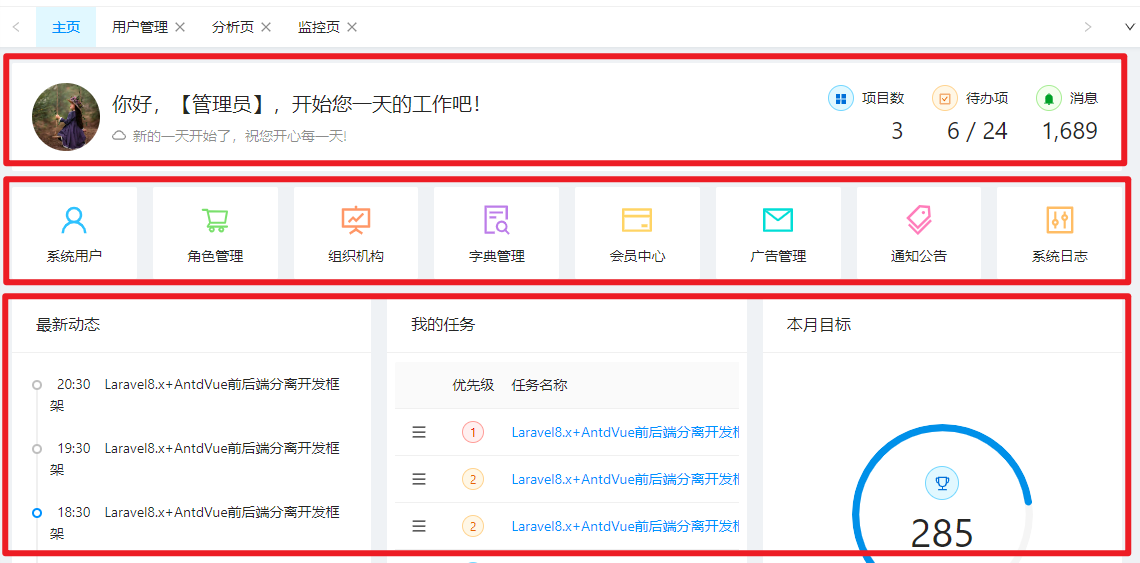
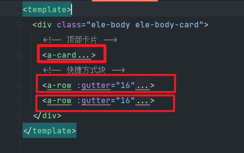
快捷方式块如何布局?

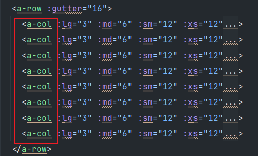
什么时候有lg md sm xs的设置?:
当设置列 a-col 的时候
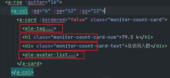
<a-row :gutter="16"> 这里的 gutter是什么意思?
这里的gutter是间隔的意思。
16间隔:
1间隔:


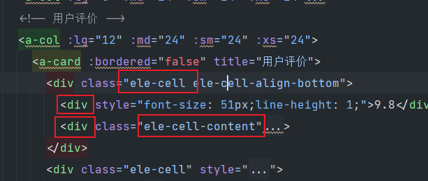
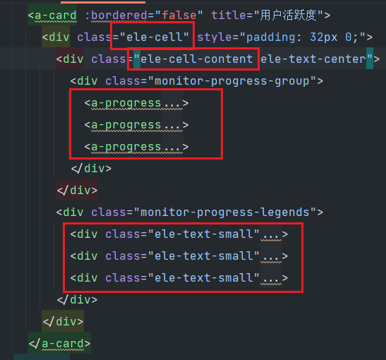
如何理解<a-card****> ?
每一个白色底部的区域都是 <a-card>包裹
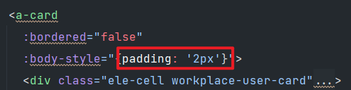
a-card中的padding如何理解?
如果padding是20:
如果padding是2:


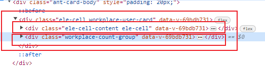
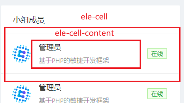
ele-cell和ele-cell-content的区别
ele-cell 用于设置flexbox布局。
ele-cell-content 撑满子元素
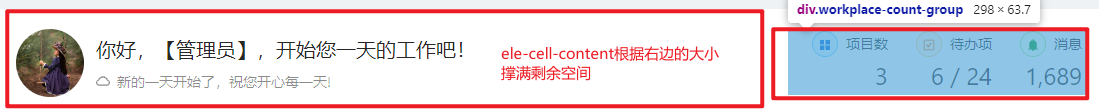
顶部卡片如何布局:(ele-cell-content 根据右边的实际大小撑满剩余空间)
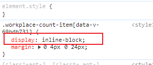
三个div放在同一行:(display:inline-block)

上下两行如何布局?(直接div和h2默认宽度100%)

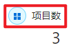
标签图标的写法:(ele-tag的配置+图标)
 <ele-tag
                color="blue"
                shape="circle"
                size="small">
                <appstore-filled/>
              </ele-tag>
为什么图标和文字能在同一行 (两个都是用了span,span行级元素)
这是因为两个都是用了<span>,ele-tag转义后是放在span中。
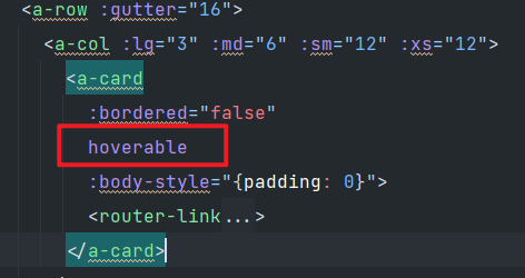
鼠标经过有阴影效果如何设置?(hoverable)
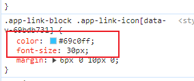
如何将默认的图标进行美化?(设置color和font-size)
设置color和font-size
图标+样式怎么写?(图标+class)
<user-outlined class="app-link-icon"/>
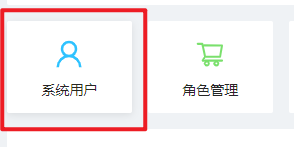
导航标签的步骤:
1 router-link
2 to 对应的路由地址
3 class 样式:图片的颜色和大小。子元素的居中显示
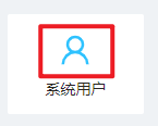
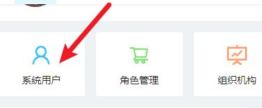
  <router-link
            to="/system/user"
            class="app-link-block">
            <user-outlined class="app-link-icon"/>
            <div class="app-link-title">系统用户</div>
          </router-link>
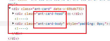
ant-card的head和body的写法:
ant-card中分为 ant-card-head和 ant-card-body
head和body在转义前的写法:head写在配置中,body写在自定义div中
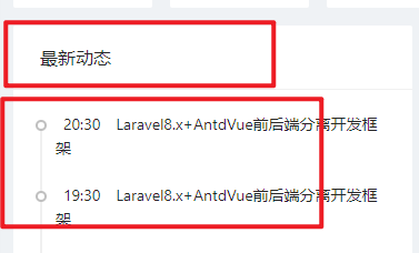
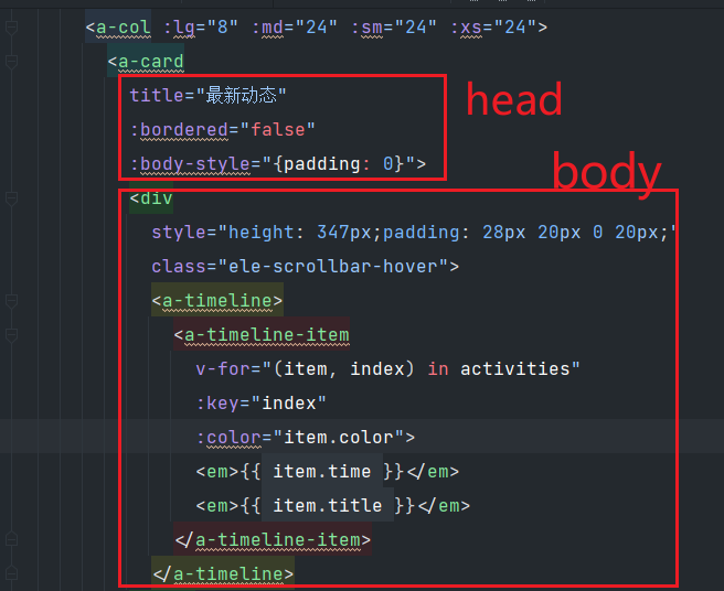
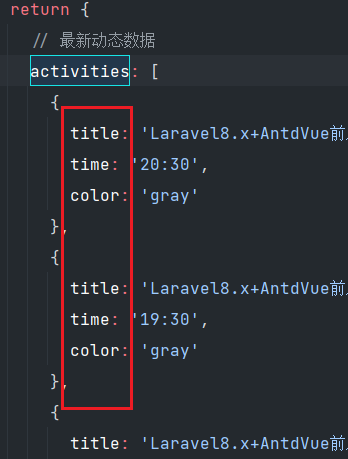
时间轴怎么写?
 <a-timeline>
              <a-timeline-item
                v-for="(item, index) in activities"
                :key="index"
                :color="item.color">
                <em>{{ item.time }}</em>
                <em>{{ item.title }}</em>
              </a-timeline-item>
            </a-timeline>
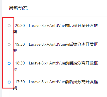
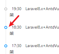
如何理解时间轴中的 :color="item.color"
时间轴的样式,有冒号说明不是明值,而是暗值。
如何获取循环的数据?
v-for="(item, index) in activities"
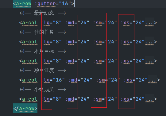
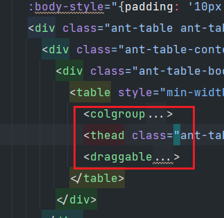
我的任务 --布局:
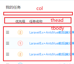
理解标签中的冒号的情况:
<draggable
  tag="tbody" <!-- 普通字符串,不需要冒号 -->
  item-key="id" <!-- 普通字符串,不需要冒号 -->
  v-model="taskList" <!-- Vue 的双向绑定指令 -->
  :component-data="{class: 'ant-table-tbody'}" <!-- 动态绑定,值是一个对象 -->
  handle=".anticon-menu" <!-- 普通字符串,不需要冒号 -->
  :animation="300"> <!-- 动态绑定,值是一个数值 -->
</draggable>
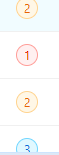
颜色三选一的写法:
使用 数组+下标
   <ele-tag
                            :color="['red', 'orange', 'blue'][element.priority - 1]"
                            shape="circle">
                            {{ element.priority }}
                          </ele-tag>
设置鼠标经过的样式;
cursor:***
<menu-outlined style="cursor: move;"/>
如何理解dragable中的#item="{ element }":
这是具名插槽中的名字。
如何布局本月目标:
1最外层 相对定位
2 顺序定位两个
3 绝对定位一个
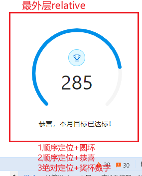
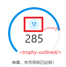
如何画一个圆环奖杯:
1圆圈
2蓝色
3图标
4大小
 <ele-tag
                color="blue"
                size="large"
                shape="circle">
                <trophy-outlined/>
              </ele-tag>

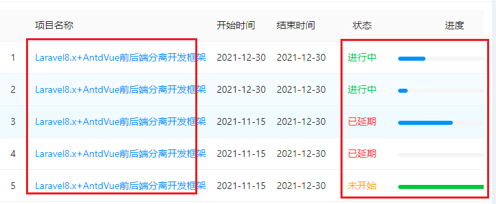
table数据再加工怎么写?
红色框中的都是需要再加工的:
template为再加工的数据:
项目名称:
 <a-table-column
              title="项目名称"
              data-index="projectName">
              <template #default="{text}">
                <a>{{ text }}</a>
              </template>
            </a-table-column>
状态:
<a-table-column
              title="状态"
              data-index="state"
              align="center"
              :width="90">
              <template #default="{text}">
                <span
                  :class="['ele-text-success', 'ele-text-danger', 'ele-text-warning', 'ele-text-info ele-text-delete'][text]">
                  {{ ['进行中', '已延期', '未开始', '已结束'][text] }}
                </span>
              </template>
            </a-table-column>
进度:
  <a-table-column
              title="进度"
              data-index="progress"
              align="center"
              :width="180">
              <template #default="{text}">
                <a-progress
                  :percent="text"
                  size="small"/>
              </template>
            </a-table-column>
a-card内不放table,不放时间轴,不放路由,那还能放什么?
放自定义div

自定义div如何布白均匀?(使用ele-cell ele-cell-content)
人像 图标和标签的区别:
人像:
图标:
标签:
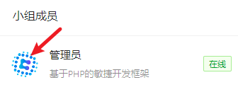
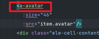
图片和图标的区别?
图片是使用a-avatar 并引入src的图片地址
图标是使用原生ant-design自带的图标,比如<trophy-outlined>
如何导入图标?
<script>
import {
  CloudOutlined,
  AppstoreFilled,
  CheckSquareOutlined,
  BellFilled,
  UserOutlined,
  ShoppingCartOutlined,
  FundProjectionScreenOutlined,
  FileSearchOutlined,
  CreditCardOutlined,
  MailOutlined,
  TagsOutlined,
  ControlOutlined,
  MenuOutlined,
  TrophyOutlined
} from '@ant-design/icons-vue';
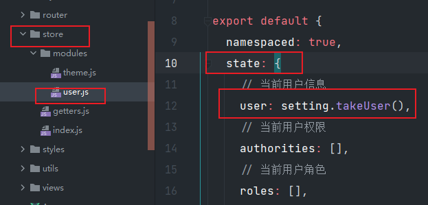
首页用到的Vuex:
获取的用户信息:
computed: {
    // 当前登录用户信息
    loginUser() {
      return this.$store.state.user.user;
    }
  },
插值语法显示:
<h4 class="ele-elip">你好,【{{ loginUser.nickname }}】,开始您一天的工作吧!</h4>
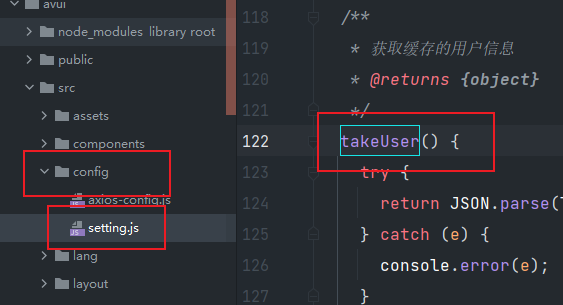
如何找到Vuex中的 $store.state.user.user
这里获取的是setteing中的takeUser
分析页:
顶部统计块如何布局:

a-tooltip 的解释:
这个是悬停显示名称的组件,类似于title
<a-tooltip title="指标说明">
  <question-circle-outlined/>
</a-tooltip>
a-space 的解释:
这是ant-design的一个布局组件,元素之间的间距。size=middle就是中等间距
<a-space size="middle">
  <span>周同比12% <caret-up-outlined class="ele-text-danger"/></span>
  <span>日同比11% <caret-down-outlined class="ele-text-success"/></span>
</a-space>
画一根灰色的线:
<a-divider/>
ant-design中的波形图:
设置高度(analysis-chart-card-content)
 <ele-chart
            ref="visitChart"
            :options="visitChartOption"
            class="analysis-chart-card-content"/>
折线图配置:
 computed: {
    // 访问量折线图配置
    visitChartOption() {
      /*if (!this.payNumData.length) {
        return null;
      }*/
      return {
        color: '#975fe5',
        tooltip: {
          trigger: 'axis',
          formatter: '<i class="ele-chart-dot" style="background: #975fe5;"></i>{b0}: {c0}'
        },
        grid: {
          top: 10,
          bottom: 0,
          left: 0,
          right: 0
        },
        xAxis: [
          {
            show: false,
            type: 'category',
            boundaryGap: false,
            data: this.payNumData.map(d => d.date)
          }
        ],
        yAxis: [
          {
            show: false,
            type: 'value',
            splitLine: {
              show: false
            }
          }
        ],
        series: [
          {
            type: 'line',
            smooth: true,
            symbol: 'none',
            areaStyle: {
              opacity: 0.5
            },
            data: this.payNumData.map(d => d.value)
          }
        ]
      };
    },
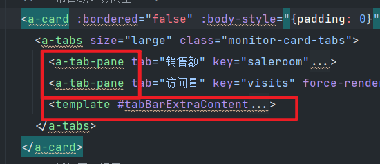
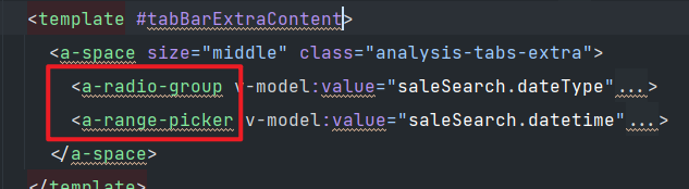
切换标签页布局:(一个标签页一个内容,template是右上角的其他切换。)
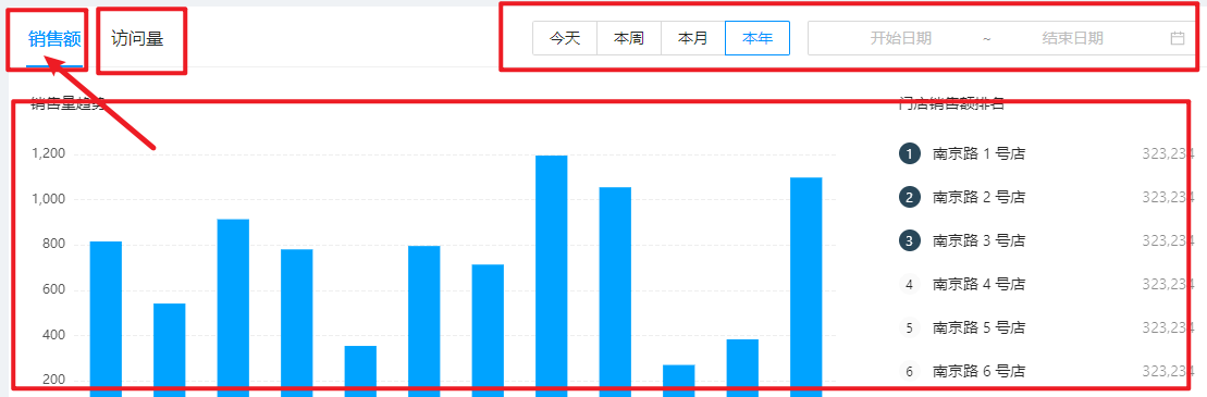
设置ele-chart 四步骤:
 <ele-chart
                ref="saleChart"
                style="height: 320px;"
                :options="saleChartOption"/>
1 ele-chart
2 ref
3height高度
4 数据 saleChartOption
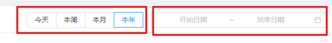
单选按钮组 和 时间选择器:
  <a-radio-group v-model:value="saleSearch.dateType">
              <a-radio-button value="1">今天</a-radio-button>
              <a-radio-button value="2">本周</a-radio-button>
              <a-radio-button value="3">本月</a-radio-button>
              <a-radio-button value="4">本年</a-radio-button>
            </a-radio-group>
<a-range-picker v-model:value="saleSearch.datetime"> <template #suffixIcon> <calendar-outlined/> </template> </a-range-picker>
如何理解activated?
activated() {
    ['visitChart', 'payNumChart', 'saleChart', 'visitsChart', 'visitHourChart', 'hotSearchChart'].forEach((name) => {
      this.$refs[name].resize();
    });
  }
这段代码是一个 JavaScript 方法
activated,用于在组件被激活时调整图表的大小。
设计一个card
图标:
//放在tag中!!
 <ele-tag
            color="blue"
            shape="circle"
            size="large">
            <eye-filled/>
          </ele-tag>
头像组图片组
 <ele-avatar-list
            :data="visitUsers"
            size="small"
            :max="4"/>

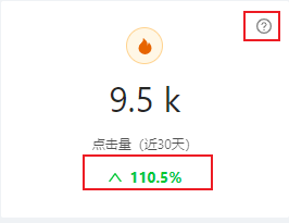
图标+文字 如何保持放在同一行?
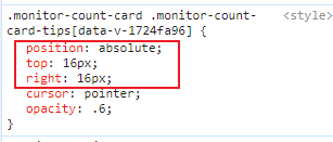
右上角的图标说明如何是绝对定位的放置?
图标+文字:不用特别设置同一行,因为图标是行级元素,在<span>中,只要文字也是<span>即可:
 <div class="monitor-count-card-trend ele-text-success">
            <up-outlined/>
            <span>110.5%</span>
          </div>
右上角图标说明: 说明组件是a-tooltip(效果是鼠标经过显示文字),图标是图标,在图标上设置绝对定位:
    <a-tooltip title="指标说明">
            <question-circle-outlined class="monitor-count-card-tips"/>
          </a-tooltip>
左一右二如何布局?

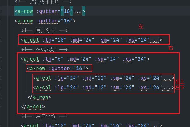
横和竖的代码示例:
横:
  <a-row :gutter="16">
  </a-row>
竖:
   <a-col :lg="24" :md="12" :sm="24" :xs="24">
   </a-col>
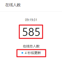
实时显示当前时间:
html:
<div>{{ currentTime }}</div>data初始化:
 data() {
    return {

      // 当前时间
      currentTime: '20:58:22',
生命周期mounted:加载组件的时候调用:
 mounted() {
    this.doUpdateOnlineNum();

  },
methods: mounted调用具体的方法:
第一次调用显示当前时间,之后是定时器每秒一次调用显示当前时间。
methods: {
    /* 在线人数更新倒计时 */
    doUpdateOnlineNum() {
      this.currentTime = this.$util.toDateString(new Date(), 'HH:mm:ss');
      this.onlineNumTimer = setInterval(() => {
        this.currentTime = this.$util.toDateString(new Date(), 'HH:mm:ss');

      }, 1000);
    },

每5秒更新一次数字:
html: 数字是有动画效果的:(使用ele-count-up, a-badge)
   <div class="monitor-online-num-title">
                  <ele-count-up
                    :end-val="228"
                    @ready="(ins) => { onlineNumAnimIns = ins; }"/>
                </div>
                <div class="monitor-online-num-text">在线总人数</div>
                <a-badge status="processing" :text="updateTimeText"/>
因为 4秒后更新 :这个数字是每次计算后都要改变的,所以使用computecd:
 computed: {
    // 在线人数倒计时文字
    updateTimeText() {
      return this.updateTime + ' 秒后更新';
    },
data初始化时间:
data() {
    return {

      // 在线总人数倒计时
      updateTime: 5,
功能逻辑:5秒更新一次,如果 ==1就重新从5计时,否则每次减1
 doUpdateOnlineNum() {

      this.onlineNumTimer = setInterval(() => {

        if (this.updateTime === 1) {
          this.updateTime = 5;
          if (this.onlineNumAnimIns) { //更新数字
            this.onlineNumAnimIns.update(100 + Math.round(Math.random() * 900));
          }
        } else {
          this.updateTime--;
        }
      }, 1000);
    },
如何让div中的两个子div在同一行显示?
ele-cell 中可以包含两个div. 子div中的ele-cell-content可以撑满剩余空间
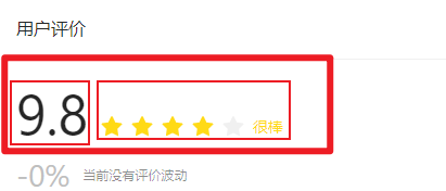
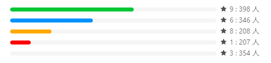
进度条如何展示?
这个进度条不是包含全部的效果,而是左边进度条+右侧的星星+人数
进度条的撑满效果 是采用ele-cell-content
  <div class="ele-cell">
            <div class="ele-cell-content">
              <a-progress
                :percent="60"
                stroke-color="#52c41a"
                :show-info="false"/>
            </div>
            <div class="monitor-evaluate-text">
              <star-filled/>
              <span>9 : 398 人</span>
            </div>
          </div>
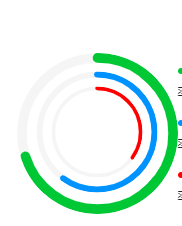
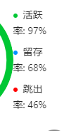
用户活跃度如何布局?
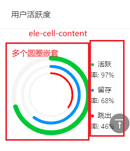
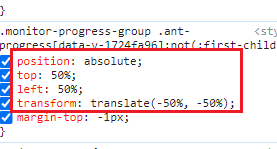
绝对定位的居中怎么写?
多层嵌套要用到绝对定位:
四个步骤:
1 absolute
2 top50
3 left50
4 transform:translate(-50 -50)
一个点一个文字怎么写?
<a-badge color="green" text="活跃率: 97%"/>
有定时器的页面要注意什么?
要加入销毁定时器:
beforeUnmount() {
    // 销毁定时器
    if (this.onlineNumTimer) {
      clearInterval(this.onlineNumTimer);
    }
  }
ele-body和ant-card的区别
ele-body是padding 像素,留出灰色区域
ant-card 是 白色背景

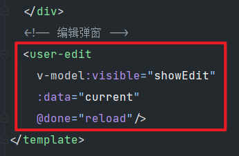
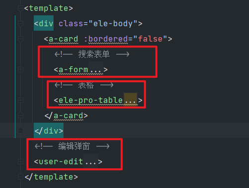
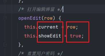
主页面如何引入“编辑”组件
1 引入import
2对外暴露export
3使用 <user-edit>

如何使用vuex:
import { mapGetters } from "vuex";

computed: {
    ...mapGetters(["permission"]),
  },
使用permission来应用在指令语法中:
<a-button type="primary" @click="openEdit()" v-if="permission.includes('sys:user:add')">
列表页的布局:
搜索表单+表格+子组件
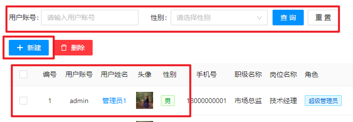
搜素表单的布局:

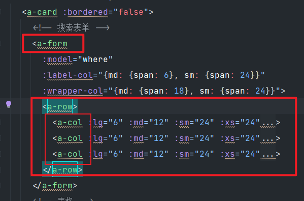
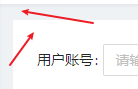
搜索表单中的输入框和下拉框怎么写?
输入框:a-form-item+a-input
  <a-form-item label="用户账号:">
              <a-input
                v-model:value.trim="where.username"
                placeholder="请输入用户账号"
                allow-clear/>
            </a-form-item>
下拉框:
 <a-form-item label="性别:">
              <a-select
                v-model:value="where.gender"
                placeholder="请选择性别"
                allow-clear>
                <a-select-option :value="1">男</a-select-option>
                <a-select-option :value="2">女</a-select-option>
                <a-select-option :value="3">保密</a-select-option>
              </a-select>
            </a-form-item>
搜索表单中的查询和重置按钮:
  <a-form-item style="padding-left:10px;" class="ele-text-left" :wrapper-col="{span: 24}">
              <a-space>
                <a-button type="primary" @click="reload">查询</a-button>
                <a-button @click="reset">重置</a-button>
              </a-space>
            </a-form-item>
表格如何获取数据?
  <ele-pro-table
        ref="table"
        row-key="id"
        :datasource="url"
        :columns="columns"
        :where="where"
        v-model:selection="selection"
        :scroll="{x: 'max-content'}">
其中的url 是获取数据:
data() {
    return {
      // 表格数据接口
      url: '/user/index',
#toolbar如何理解?
 <template #toolbar>
          <a-space>
            <a-button type="primary" @click="openEdit()" v-if="permission.includes('sys:user:add')">
              <template #icon>
                <plus-outlined/>
              </template>
              <span>新建</span>
            </a-button>
            <a-button type="primary" danger @click="removeBatch" v-if="permission.includes('sys:user:dall')">
              <template #icon>
                <delete-outlined/>
              </template>
              <span>删除</span>
            </a-button>
          </a-space>
        </template>
这是具名插槽的意思。
本初的代码是自定义的内容补充占位符内容。
具名插槽在表格中的应用:(具名插槽:对字段的再改造)

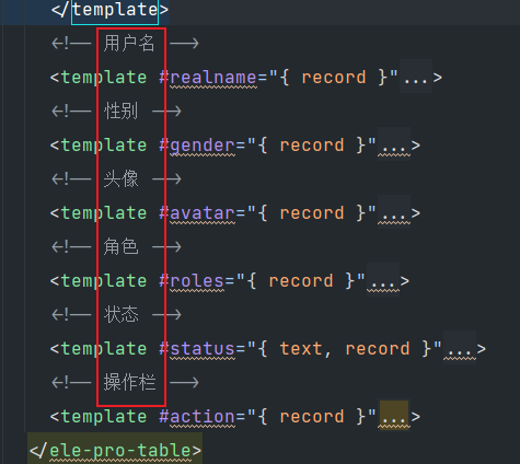
具名插槽----加链接:
 <!-- 用户名 -->
        <template #realname="{ record }">
          <router-link :to="'/system/user/info?id=' + record.id">
            {{ record.realname }}
          </router-link>
        </template>
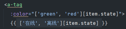
具名插槽----标签:
  <!-- 性别 -->
        <template #gender="{ record }">
          <a-tag :color="['green', 'orange', 'red'][record.gender-1]">
            {{ ['男', '女', '未知'][record.gender-1] }}
          </a-tag>
        </template>
具名插槽----图片:
 <!-- 头像 -->
        <template #avatar="{ record }">
          <a-image :width="35" :src="record.avatar" />
        </template>
单选按钮:
  <!-- 状态 -->
        <template #status="{ text, record }">
          <a-switch
            :checked="text===1"
            @change="(checked) => editStatus(checked, record)"/>
        </template>
具名插槽----文本:
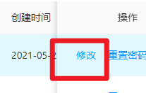
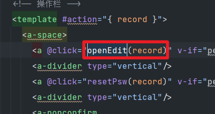
   <template #action="{ record }">
          <a-space>
            <a @click="openEdit(record)" v-if="permission.includes('sys:user:edit')">修改</a>
            <a-divider type="vertical"/>
            <a @click="resetPsw(record)" v-if="permission.includes('sys:user:resetPwd')">重置密码</a>
            <a-divider type="vertical"/>
            <a-popconfirm
              title="确定要删除此用户吗?"
              @confirm="remove(record)">
              <a class="ele-text-danger" v-if="permission.includes('sys:user:delete')">删除</a>
            </a-popconfirm>
          </a-space>
        </template>
reload的用途:查看表格,查询表格,刷新表:
搜索表单:搜索:
<a-button type="primary" @click="reload">查询</a-button>自定义事件触发reload:
 <user-edit
    v-model:visible="showEdit"
    :data="current"
    @done="reload"/>
reload方法: ($refs.table的意思是 ref=table)
  /* 搜索 */
    reload() {
      this.selection = [];
      this.$refs.table.reload({where: this.where});
    },
注意:this.$refs.table.reload 这里的reload是表格自带的功能。
Ant-design的消息框:
全局UI变量: this.$message
const hide = this.$message.loading('请求中..', 0);
有几种的消息提示框:加载,成功,失败。
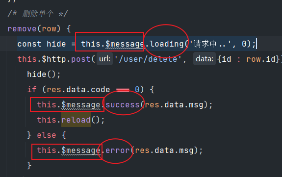
发送ajax请求: ( this.$http.post)
 const hide = this.$message.loading('请求中..', 0);
      this.$http.post('/user/delete', {id : row.id}).then(res => {
        hide();
        if (res.data.code === 0) {
          this.$message.success(res.data.msg);
          this.reload();
        } else {
          this.$message.error(res.data.msg);
        }
      }).catch(e => {
        hide();
        this.$message.error(e.message);
      });
确认框+ajax:
   this.$confirm({
        title: '提示',
        content: '确定要删除选中的用户吗?',
        icon: createVNode(ExclamationCircleOutlined),
        maskClosable: true,
        onOk: () => {
          const hide = this.$message.loading('请求中..', 0);
          this.$http.post('/user/delete', {
            id: this.selection.map(d => d.id)
          }).then(res => {
            hide();
            if (res.data.code === 0) {
              this.$message.success(res.data.msg);
              this.reload();
            } else {
              this.$message.error(res.data.msg);
            }
          }).catch(e => {
            hide();
            this.$message.error(e.message);
          });
        }
      });
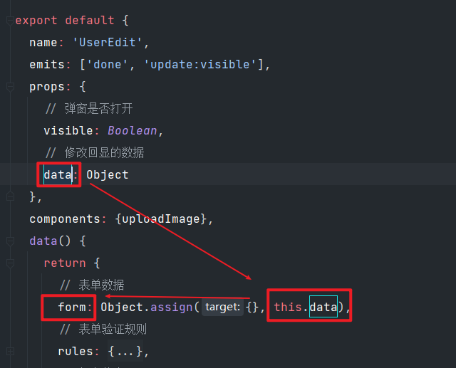
父子组件的数据传输解释:
父组件一个点击弹框按钮:
弹框之后,将详情数据给了current,将是否显示给了showEdit
之后 子组件框中写明将收集到的 showEdit current给到 子组件
<!-- 父组件模板 -->
<user-edit
  v-model:visible="showEdit"
  :data="current"
  @done="reloadData"/>
这里 v-model:visible=====>传送了 visible的数据
这里 :data======> 传送了data的数据。
在子组件的接收:(visible和data)
  props: {
    // 弹窗是否打开
    visible: Boolean,
    // 修改回显的数据
    data: Object
  },
为什么visible需要双向数据绑定的v-model?
因为visible和弹出来的modal是否显示隐藏关联。
此处的子组件如何和父组件通信?
emits: ['done', 'update:visible'],子组件将done自定义事件,===》对应父组件的@done
update:visible是自定义事件,===》对应父组件的 v-model:visible
子组件modal和form的关系:
modal是外层的模态框,form是数据体的数据展示

子组件中的form数据展示流程:
从props获取后,放到data中,最后在a-form中展示。
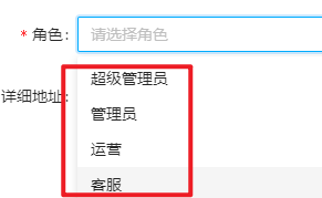
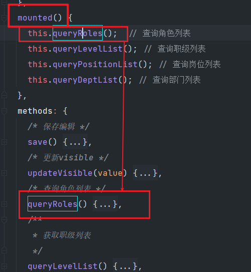
子组件中的预设数组:
 queryRoles() {
      this.$http.get('/role/getRoleList').then(res => {
        if (res.data.code === 0) {
          this.roleList = res.data.data;
        } else {
          this.$message.error(res.data.msg);
        }
      }).catch(e => {
        this.$message.error(e.message);
      });
    },
roleList:
   <a-select-option
                v-for="(item, index) in roleList"
                :key="index"
                :value="item.id">
                {{ item.name }}
              </a-select-option>
如何理解role_ids:
 this.form = Object.assign({}, this.data, {
          role_ids: this.data.roles.map(d => d.id)
        });
这里的role_ids是新增字段的意思:
原来:
this.data = {
  username: 'john_doe',
  email: 'john@example.com',
  gender: 1,
  dept_id: 3,
  roles: [
    { id: 101, name: 'Admin' },
    { id: 102, name: 'Editor' }
  ]
};
新:
this.form = {
  username: 'john_doe',
  email: 'john@example.com',
  gender: 1,
  dept_id: 3,
  roles: [
    { id: 101, name: 'Admin' },
    { id: 102, name: 'Editor' }
  ],
  role_ids: [101, 102]  // 提取出的角色ID数组 !!!!!!!
};


 5848
5848

 被折叠的 条评论
为什么被折叠?
被折叠的 条评论
为什么被折叠?
 到【灌水乐园】发言


