


 摘要:这篇Python开发技术栏目下的“Python+matplotlib绘制不同大小和颜色散点图实例”,介绍的技术点是“matplotlib、Python、_和__、散点图、实例、颜色”,希望对大家开发技术学习和问题解决有帮助。这篇文章主要介绍了Python+matplotlib绘制不同大小和颜色散点图实例,matplotlib的用法是比较多种多样的,下面一起看看其中的一个实例吧具有不同标记颜色...
摘要:这篇Python开发技术栏目下的“Python+matplotlib绘制不同大小和颜色散点图实例”,介绍的技术点是“matplotlib、Python、_和__、散点图、实例、颜色”,希望对大家开发技术学习和问题解决有帮助。这篇文章主要介绍了Python+matplotlib绘制不同大小和颜色散点图实例,matplotlib的用法是比较多种多样的,下面一起看看其中的一个实例吧
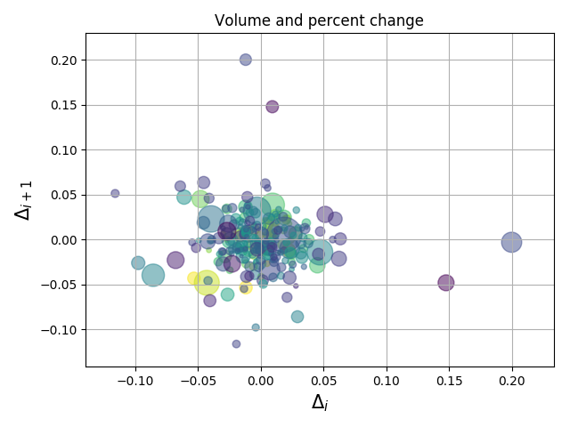
具有不同标记颜色和大小的散点图演示。
演示结果:
实现代码:
import numpy as np
import matplotlib.pyplot as plt
import matplotlib.cbook as cbook
# Load a numpy record array from yahoo csv data with fields date, open, close,
# volume, adj_close from the mpl-data/example directory. The record array
# stores the date as an np.datetime64 with a day unit ('D') in the date column.
with cbook.get_sample_data('goog.npz') as datafile:
price_data = np.load(datafile)['pr
 最低0.47元/天 解锁文章


 1211
1211


 被折叠的 条评论
为什么被折叠?
被折叠的 条评论
为什么被折叠?
 到【灌水乐园】发言


