


一、抽屉慨述
1、整体布局
首先左侧抽屉布局上我门使用绝对定位「 absolute 」 默认left是(0 - 屏幕宽度),而抽屉宽度是根据小程序右上角胶囊布局信息计算出来的,计算逻辑使用屏幕宽度 「 减去 」 胶囊的的宽度再「 减去 」箭囊与屏幕最右边距离「 两倍 」 的宽度。
2、底部布局
抽屉底部按钮组布局上高度需要和「 tabbar 」默认高度保持一致,css高度计算逻辑calc({{tabbarHeight}}px + env(safe-area-inset-bottom)),注意加上设备底部安全高度。
3、头部布局与列表渲染
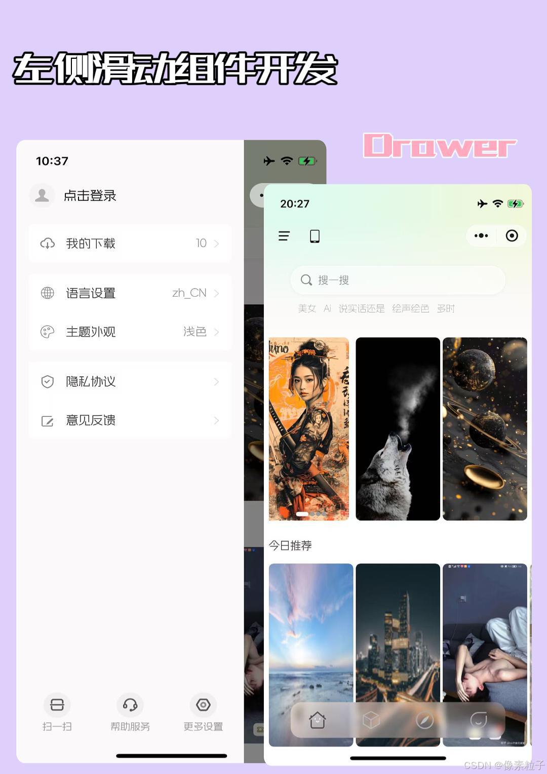
抽屉头部用户登录布局使用的是「 appbar 」的高度。中间列表布局高度是屏幕高度 「 减去 」 appbar和tabbar的高度和。中间列表数据使用scroll-view 组件,使用自定义模式,type必须使用 「 custom 」这样只会渲染在屏节点。我们使用的 list-builder 组件渲染列表数据。
4、worklet动画
为了进一步提高用户使用体验,抽屉显示隐藏动画上我们使用 worklet动画,workletUI 」 线程,减少逻辑层和视图层的通信,直接在视图层处理动画,利用原生组件的硬件加速,优化渲染性能,动画的帧率更高,运行更流畅,没有「 JS 」线程的阻塞。
5、手势系统
最后我们还需要使用手势系统处理用户拖拽显示或隐藏抽屉。手势系统免去开发者监听 「 touch 」事件,自行计算手势逻辑的复杂步骤,手势组件也是直接在 「 UI 」 线程响应,避免了传递到 「 JS 」 线程带来的延迟、
二、iColom组件
1、 iColom组件概述
icolom组件是垂直列表的每一项,是一个公用组件该组件会在左侧抽屉、个人中心、设置中心等模块都有使用,基本的布局逻辑可以配置,上右下左的圆角、底部分割线、下边距、路由、事件类型、路由类型、图标以及字体大小等。
2、 iColom配置数据结构
interface iColonType {
    title: string, // 标题名称
    type: string, // 路由调转或自定义事件
    openType: string, // button微信开放能力
    navigateTo: string, // 路由路径
    routerType: string, // 路由类型
    subTitle: string | number, // 子标题也是每一项右侧值
    icon: string, // iconfot 图标
    iconSize: string, // 图标大小
    borderButtom: boolean, // 是否显示底部线
    marginButtom: boolean, // 底部外边距
    borderRadiusTopLeft: boolean, // 左上 角圆角
    borderRadiusTopRight: boolean,  // 右上 角圆角
    borderRadiusBottomLeft: boolean,  // 右下 角圆角
    borderRadiusBottomRight: boolean  // 左下 角圆角
}
3、 iColom组件.js
组件要使用图标(iconfont)需要配置addGlobalClass: true。组件接手两个叁数分别是 当前下标以及配置项对象 还要触发一个自定义事件。
/**
 * 菜单列表项
 * @param { Object } item 配置
 * @param { Number } index 下标
*/
Component({
  options: {
    addGlobalClass: true // 使用全局样式
  },
  behaviors: [],
  properties: {
    item: {
      type: Object,
      value: null
    },
    index: {
      type: Number,
      value: 0
    }
  },
  observers: {

  },
  data: {
    skin: 'light', // 主题切换 待后面开发
  },
  methods: {
    onColom(e) {
      const option = e.currentTarget.dataset.item
      const index = e.currentTarget.dataset.index
      this.triggerEvent('colom', { option, index })
    }
  }
})
4、 iColom组件.wxml
<view style="margin-bottom: {{item.marginButtom? 30: 0}}rpx">
  <button style="background-color: transparent; margin: 0; padding: 0; width: 100%; height: 100%; border-top-left-radius: {{item.borderRadiusTopLeft? 15: 0}}rpx;border-top-right-radius: {{item.borderRadiusTopRight? 15: 0}}rpx; border-bottom-left-radius: {{item.borderRadiusBottomLeft? 15: 0}}rpx;border-bottom-right-radius: {{item.borderRadiusBottomRight? 15: 0}}rpx" open-type="{{item.openType}}" catch:tap="onGo" data-item="{{item}}">
    <view class="item" style="background-color: {{skin === 'light'? '#fff':'#191919'}}">
      <view class="icon">
        <text class="iconfont {{item.icon}}" style="font-size: {{item.iconSize}}; color: {{skin === 'light'? '#858585':'#f6f0f2'}}"></text>
      </view>
      <view class="content" style="border-bottom: {{item.borderButtom? 1: 0}}rpx solid {{skin === 'light'? '#fefefe':'#121212'}};">
        <view class="title">
          <text style="color: {{skin === 'light'? '#404040':'#fafafa'}}" class="one-line">
            {{item.title}}
          </text>
        </view>
        <view class="more">
          <text class="one-line" style="margin-right: 8rpx; font-family: wfy; font-size: 28rpx; color: #999;">
            {{item.subTitle}}
          </text>
          <text class="iconfont i-youjiantou" style="color: {{skin === 'light'? '#e0e0e0':'#585858'}}; font-weight: 200;"></text>
        </view>
      </view>
    </view>
  </button>
</view>
5、 iColom组件.wxss
@import '../../app.wxss';

.item {
  width: 100%;
  height: 100rpx;
  box-sizing: border-box;
  display: flex;
}

.icon {
  flex: 90rpx 0 0;
  height: 100%;
  display: flex;
  align-items: center;
  justify-content: center;
}

.icon>text {
  font-weight: 300;
}

.content {
  flex: 1;
  height: 100%;
  display: flex;
}

.title {
  flex: 1;
  display: flex;
  align-items: center;
  font-size: 30rpx;
  font-family: wfy, 'Segoe UI', Tahoma, Geneva, Verdana, sans-serif;
  font-weight: 800;
}

.more {
  height: 100%;
  flex: 200rpx 0 0;
  display: flex;
  align-items: center;
  justify-content: flex-end;
  padding-right: 20rpx;
  color: var(--text-font-color-3);
}
三、iDrawer组件
1、iDrawer组件慨述
idrawer组件就是我们这里最终需要开发的抽屉组件,这个组件需要在「 首页模块 」、「 分类模块 」、「 探索模块 」使用。手势系统我们在使用组件的地方添加。所以组件内部不需要处理手势系统相关的逻辑。
2、抽屉列表数据
 const list = [
        {
          title: '我的下载',
          type: 'page',
          openType: '',
          navigateTo: `/pages/classlis/index?title=我的下载`,
          subTitle: '10',
          icon: 'i-icon_386',
          iconSize: '40rpx',
          borderButtom: false,
          marginButtom: true,
          borderRadiusTopLeft: true,
          borderRadiusTopRight: true,
          borderRadiusBottomLeft: true,
          borderRadiusBottomRight: true
        },
        {
          title:'语言设置',
          type: 'language',
          openType: '',
          navigateTo: '',
          subTitle: app.globalData.lang,
          icon: 'i-duoyuyan',
          iconSize: '36rpx',
          borderButtom: true,
          marginButtom: false,
          borderRadiusTopLeft: true,
          borderRadiusTopRight: true,
          borderRadiusBottomLeft: false,
          borderRadiusBottomRight: false
        },
        {
          title: '主题外观',
          type: 'theme',
          openType: '',
          navigateTo: '',
          subTitle: this.data.theme === 'dark' ? '深色' : '浅色',
          icon: 'i-zhutise',
          iconSize: '38rpx',
          borderButtom: false,
          marginButtom: true,
          borderRadiusTopLeft: false,
          borderRadiusTopRight: false,
          borderRadiusBottomLeft: true,
          borderRadiusBottomRight: true
        },
        {
          title: '隐私协议',
          type: 'agreement',
          openType: '',
          navigateTo: '',
          subTitle: '',
          icon: 'i-anquanyinsi',
          iconSize: '40rpx',
          borderButtom: true,
          marginButtom: false,
          borderRadiusTopLeft: false,
          borderRadiusTopRight: false,
          borderRadiusBottomLeft: false,
          borderRadiusBottomRight: false
        },
        {
          title: '意见反馈',
          type: 'page',
          openType: 'feedback',
          navigateTo: '/pages/opinion/index',
          subTitle: '',
          icon: 'i-fankui',
          iconSize: '46rpx',
          borderButtom: false,
          marginButtom: false,
          borderRadiusTopLeft: false,
          borderRadiusTopRight: false,
          borderRadiusBottomLeft: true,
          borderRadiusBottomRight: true
        }
      ]
3、Behavior 代码复用
“Behavior”是一种用于实现组件间代码共享的机制,其概念类似于其他编程语言中的“mixins”或“traits”。通过使用Behavior,开发者可以定义一组属性、数据、生命周期函数和方法,然后在多个组件中引用这些Behavior,从而实现代码的复用和模块化
我们把抽屉组件获取宽度以及底部高度的逻辑放在Behavior 中方便多个地方调用,现在根目录下创建behaviors文件夹,里面的drawer.js就是我们处理抽屉组件公共逻辑的地方, 以及tabbar.js 是处理tabbat公共逻辑的代码。
3.1、首页在 「 custom-tab-bar 」的 「 methods 」中添加一个获取底部导航高度的方法
   // 获取tabbat高度
    getTabbarHeight(callback) {
      this.createSelectorQuery().select(`#tabbar`).boundingClientRect((rect) => {
        if (rect) callback(rect.height)
        else callback(0)
      }).exec()
    },
3.2、tabar.js
import { switchPxRx } from '../utils/util'
const app = getApp()
const wininfo = app.globalData.windowInfo // 基础信息
module.exports = Behavior({
  behaviors: [],
  properties: {
    // index 会混合到页面中 请不要在页面上使用 index
    index: {
      type: Number,
      index: 0
    }
  },
  observers: {

  },
  data: {
    tabbarHeight: switchPxRx('100rpx') + 10, // 底部默认高度
  },

  lifetimes: {
    // 在组件实例刚刚被创建时执行
    created: function () {

    },
    // 在组件实例进入页面节点树时执行
    attached: function () {

    },
    // 在渲染线程被初始化已经完成
    ready: function () {
      // 获取tabbar高度
      this.getTabbarHeight()
    },
    // 在组件实例被从页面节点树移除时执行
    detached: function () {

    }
  },

  pageLifetimes: {
    // 页面显示
    show: function () {

    },
    // 页面隐藏
    hide: function () {

    },
    // 页面尺寸变化
    resize: function (_size) {

    }
  },

  methods: {
    // 获取tabbar高度
    getTabbarHeight() {
      if (typeof this.getTabBar === 'function') {
        this.getTabBar((tabBar) => tabBar.getTabbarHeight((tabbarHeight) => {
          this.setData({ tabbarHeight: tabbarHeight + 10 })
        }))
      }
    },
    // tabbat显示隐藏
    appbarShowHide(bool = true) {
      if (typeof this.getTabBar === 'function') {
        this.getTabBar((tabBar) => tabBar.onShowHide(bool))
      }
    },
  }
})
3.3、drawer.js
import { switchPxRx } from '../utils/util'
import { drawerHaviors } from './tabar'
const wininfo = getApp().globalData.windowInfo // 设备基础信息
const menuWidth = wininfo.screenWidth - (wininfo.padding * 2 + wininfo.clientRect.width) // 左边菜单宽度
module.exports = Behavior({
  behaviors: [drawerHaviors],
  properties: {

  },
  observers: {

  },
  data: {
    menuWidth
  },

  lifetimes: {
    // 在组件实例刚刚被创建时执行
    created: function () {

    },
    // 在组件实例进入页面节点树时执行
    attached: function () {

    },
    // 在渲染线程被初始化已经完成
    ready: function () {

    },
    // 在组件实例被从页面节点树移除时执行
    detached: function () {

    }
  },

  pageLifetimes: {
    show: function () {

    },
    hide: function () {

    },
    resize: function (_size) {

    }
  },

  methods: {

  }
})
4、 kutil.js工具方法
我们在utils下创建kutil.js 存放worklet函数的工具类方法
/**
 * @Description 获取边界值内的变化值
 * @param { Number } current 当前滚动值
 * @param { Number } lowerBound 下边界
 * @param { Number } upperBound 上边界
 * @return { Number } 等钱滚动或上下边界值
 */
export const intervalBound = (current, lowerBound, upperBound) => {
  'worklet'
  if (current > upperBound) return upperBound
  if (current < lowerBound) return lowerBound
  return current
}

/**
 * @Description 手势状态
 * @property { Number } POSSIBLE 此时手势未识别
 * @property { Number } BEGIN 此时手势已识别
 * @property { Number} ACTIVE 连续手势活跃状态
 * @property { Number} END 手势终止
 * @property { Number } CANCELLED 手势取消
 * @return { undefined }
 */
export const GestureState = {
  POSSIBLE: 0,
  BEGIN: 1,
  ACTIVE: 2,
  END: 3,
  CANCELLED: 4
}
5、iDrawer组件数据
  const list =  [
      {
        title: '我的下载',
        type: 'page',
        openType: '',
        navigateTo: `/pages/classlis/index?title=我的下载`,
        subTitle: '10',
        icon: 'i-icon_386',
        iconSize: '40rpx',
        borderButtom: false,
        marginButtom: true,
        borderRadiusTopLeft: true,
        borderRadiusTopRight: true,
        borderRadiusBottomLeft: true,
        borderRadiusBottomRight: true
      },
      {
        title: '语言设置',
        type: 'language',
        openType: '',
        navigateTo: '',
        subTitle: app.globalData.lang,
        icon: 'i-duoyuyan',
        iconSize: '36rpx',
        borderButtom: true,
        marginButtom: false,
        borderRadiusTopLeft: true,
        borderRadiusTopRight: true,
        borderRadiusBottomLeft: false,
        borderRadiusBottomRight: false
      },
      {
        title: '主题外观',
        type: 'theme',
        openType: '',
        navigateTo: '',
        subTitle: app.globalData.theme === 'dark' ? '深色' : '浅色',
        icon: 'i-zhutise',
        iconSize: '38rpx',
        borderButtom: false,
        marginButtom: true,
        borderRadiusTopLeft: false,
        borderRadiusTopRight: false,
        borderRadiusBottomLeft: true,
        borderRadiusBottomRight: true
      },
      {
        title: '隐私协议',
        type: 'agreement',
        openType: '',
        navigateTo: '',
        subTitle: '',
        icon: 'i-anquanyinsi',
        iconSize: '40rpx',
        borderButtom: true,
        marginButtom: false,
        borderRadiusTopLeft: false,
        borderRadiusTopRight: false,
        borderRadiusBottomLeft: false,
        borderRadiusBottomRight: false
      },
      {
        title: '意见反馈',
        type: 'page',
        openType: 'feedback',
        navigateTo: '/pages/opinion/index',
        subTitle: '',
        icon: 'i-fankui',
        iconSize: '46rpx',
        borderButtom: false,
        marginButtom: false,
        borderRadiusTopLeft: false,
        borderRadiusTopRight: false,
        borderRadiusBottomLeft: true,
        borderRadiusBottomRight: true
      }
    ],
    const footer = [
      {
        title: '扫一扫',
        openType: '',
        icon: 'i-saoyisao'
      },
      {
        title: '帮助与服务',
        openType: 'contact',
        icon: 'i-kefu'
      },
      {
        title: '更多设置',
        openType: '',
        icon: 'i-shezhi'
      }
    ]
6、iDrawer组件.js
首先需要引入behaviors文件夹下的drawer.js iDrawer组件的公用逻辑文件,你里面有抽屉宽度,再加上drawer.js又引入了tabbar.js所以当前iDrawer组件需要宽度以及底部高度都已经拥有。后续我们也会把用户滑动的逻辑也放着drawer.js中,以达到代码复用的能力。
import useDrawer from '../../behaviors/drawer'
const app = getApp()
const wininfo = app.globalData.windowInfo
Component({
  options: {
    addGlobalClass: true, // 使用全局css
  },
  behaviors: [useDrawer],
  properties: {
    theme: {
      type: String,
      value: app.globalData.theme
    },
  },
  lifetimes: {
    created: function () {

    },
    attached: function () {

    },
    detached: function () {

    }
  },
  pageLifetimes: {
    show: function () {

    },
    hide: function () {

    },
    resize: function () {

    }
  },
  observers: {

  },
  data: {
    wininfo,
    skin: app.globalData.theme,
    list: [
      {
        title: '我的下载',
        type: 'page',
        openType: '',
        navigateTo: `/pages/classlis/index?title=我的下载`,
        subTitle: '10',
        icon: 'i-icon_386',
        iconSize: '40rpx',
        borderButtom: false,
        marginButtom: true,
        borderRadiusTopLeft: true,
        borderRadiusTopRight: true,
        borderRadiusBottomLeft: true,
        borderRadiusBottomRight: true
      },
      {
        title: '语言设置',
        type: 'language',
        openType: '',
        navigateTo: '',
        subTitle: app.globalData.lang,
        icon: 'i-duoyuyan',
        iconSize: '36rpx',
        borderButtom: true,
        marginButtom: false,
        borderRadiusTopLeft: true,
        borderRadiusTopRight: true,
        borderRadiusBottomLeft: false,
        borderRadiusBottomRight: false
      },
      {
        title: '主题外观',
        type: 'theme',
        openType: '',
        navigateTo: '',
        subTitle: app.globalData.theme === 'dark' ? '深色' : '浅色',
        icon: 'i-zhutise',
        iconSize: '38rpx',
        borderButtom: false,
        marginButtom: true,
        borderRadiusTopLeft: false,
        borderRadiusTopRight: false,
        borderRadiusBottomLeft: true,
        borderRadiusBottomRight: true
      },
      {
        title: '隐私协议',
        type: 'agreement',
        openType: '',
        navigateTo: '',
        subTitle: '',
        icon: 'i-anquanyinsi',
        iconSize: '40rpx',
        borderButtom: true,
        marginButtom: false,
        borderRadiusTopLeft: false,
        borderRadiusTopRight: false,
        borderRadiusBottomLeft: false,
        borderRadiusBottomRight: false
      },
      {
        title: '意见反馈',
        type: 'page',
        openType: 'feedback',
        navigateTo: '/pages/opinion/index',
        subTitle: '',
        icon: 'i-fankui',
        iconSize: '46rpx',
        borderButtom: false,
        marginButtom: false,
        borderRadiusTopLeft: false,
        borderRadiusTopRight: false,
        borderRadiusBottomLeft: true,
        borderRadiusBottomRight: true
      }
    ],
    footer: [
      {
        title: '扫一扫',
        openType: '',
        icon: 'i-saoyisao'
      },
      {
        title: '帮助与服务',
        openType: 'contact',
        icon: 'i-kefu'
      },
      {
        title: '更多设置',
        openType: '',
        icon: 'i-shezhi'
      }
    ]
  },

  methods: {
    onColom(e) {
      console.log(e)
    },
    // 底部事件
    onFooter(e) {
      const index = +e.currentTarget.dataset.index
      if (index === 0) { // 微信扫一扫
        wx.scanCode({
          onlyFromCamera: true,
          success(res) {
            console.log(res)
          },
          fail: err => {
            console.log(err)
          }
        })
      }
      if (index === 2) {  // 菜单跳转
        wx.navigateTo({
          url: '/pages/setting/index',
          routeType: 'wx://modal'
        })
      }
    },
    // 壁纸列表
    onClassLis() {
      wx.navigateTo({
        url: '/pages/classlis/index?title=我的下载',
      })
    }
  }
})
7、iDrawer组件.json
{
  "component": true,
  "usingComponents": {
    "i-colom": "../iColom/index"
  }
}
8、iDrawer组件.wxml
<view class="wrap" style="width: {{menuWidth}}px;height: 100vh; background: {{skin == 'light'? '#fbfafa':'#141414'}}">
  <view class="status" style="width: 100%; height: {{wininfo.statusBarHeight}}px;"></view>
  <view class="header" style="width: 100%; flex: {{wininfo.headerHeight}}px 0 0;">
    <view class="avatar" style="width: {{wininfo.clientRect.height}}px; height: {{wininfo.clientRect.height}}px; border-radius: {{wininfo.clientRect.height * 0.5}}px">
      <image src="../../static/0.png" />
    </view>
    <view class="nick-name" style="color: {{skin == 'light'? '#000':'#fff'}}">点击登录</view>
  </view>
  <scroll-view class="mune-scroll" type="custom" scroll-y="{{true}}" scroll-into-view-within-extent="{{true}}" enhanced="{{true}}" show-scrollbar="{{false}}" scroll-with-animation="{{true}}" enable-back-to-top="{{true}}" enable-passive="{{true}}" style="flex: 1; box-sizing: border-box;">
    <list-builder list="{{list}}" type="dynamic" child-count="{{list.length}}">
      <block slot:item slot:index>
        <i-colom theme="{{theme}}" item="{{item}}" index="{{index}}" bind:colom="onColom" />
      </block>
    </list-builder>
  </scroll-view>
  <view class="footer" style="flex: calc({{tabbarHeight}}px + env(safe-area-inset-bottom)) 0 0">
    <button class="item" wx:for="{{footer}}" wx:key="icon" data-index="{{index}}" catch:tap="onFooter" open-type="{{item.openType}}" style="width: 100%; height: 100%; background-color: transparent;" bindcontact="handleContact">
      <view class="icon">
        <view>
          <text class="iconfont {{item.icon}}"></text>
        </view>
      </view>
      <view class="text">
        <text>{{item.title}}</text>
      </view>
    </button>
  </view>
</view>
9、iDrawer组件.wxss
.wrap {
  position: absolute;
  left: 0;
  top: 0;
  z-index: 100;
  width: 100%;
  height: 100vh;
  display: flex;
  flex-direction: column;
}

.status {
  width: 100%;
}

.header {
  display: flex;
  align-items: center;
  box-sizing: border-box;
  width: 100%;
  padding: 0 30rpx;
}

.avatar {
  overflow: hidden;
  background-color: #f0f0f0;
}

.avatar>image {
  width: 100%;
  height: 100%;
  border-radius: 50%;
}

.nick-name {
  box-sizing: border-box;
  font-size: 32rpx;
  padding-left: 20rpx;
  font-family: 'wfy' ,'Segoe UI', Tahoma, Geneva, Verdana, sans-serif;
  font-weight: 800;
}

.mune-scroll {
  box-sizing: border-box;
  padding: 30rpx;
  width: 100%;
  height: 100%;
}

.footer {
  width: 100%;
  height: 120px;
  padding-bottom: env(safe-area-inset-bottom);
  display: flex;
  box-sizing: border-box;
  align-items: center;
  box-sizing: border-box;
  padding-left: 10rpx;
  padding-right: 10rpx;
  font-family: 'wfy' ,'Segoe UI', Tahoma, Geneva, Verdana, sans-serif;
  font-weight: 800;
}

.footer>.item {
  height: 100%;
  flex: 1;
  display: flex;
  flex-direction: column;
  align-items: center;
	justify-content: center;
}

.footer>.item>.icon {
  height: 60%;
  width: 100%;
  display: flex;
  align-items: center;
	justify-content: center;
}

.footer>.item>.icon>view {
  width: 60rpx;
  height: 60rpx;
  border-radius: 50%;
  display: flex;
  align-items: center;
  justify-content: center;
  background-color: #f0f0f0;
}

.footer>.item>view>text {
  font-size: 34rpx;
}

.footer>.item>text {
  width: 100%;
  height: 40%;
  display: flex;
  align-items: center;
	justify-content: center;
}

.footer>.item>.text>text {
  color: #8f8f8f;
  font-size: 25rpx;
}
四、iDrawer使用及手势系统
1、概述
iDrawer组件是一个抽屉组件,为了进一步提高用户体验,我们需要在组件上使用手势系统,以便用户可以水平滑动,实现关闭或取消关闭抽屉的功能那个。
2、基本使用
iDrawer组件我们需要在首页、分类、探索页面使用
"i-drawer":"../../components/iDrawer"在项目根目录创建common.wxss
/* 抽屉 */
.drawer {
  position: fixed;
  left: 0;
  top: 0;
  z-index: 200;
  width: 100vw;
  height: 100vh;
  background-color: transparent;
}
app.wxss引入公告样式文件common.wxss
@import './common.wxss';
@import './iconfont.wxss';
page {
  width: 100%;
  height: 100%;
  margin: 0;
  padding: 0;
  font-size: 28rpx;
  color: #030303;
  background-color: transparent;
}使用iDrawer组件,我们使用horizontal-drag-gesture-handler 这个是微信小程序的横向滑动时触发手势组件。其中的worklet:ongesture 是手势识别成功的回调。
| state | 手势状态 |
| absoluteX | 相对于全局的 X 坐标 |
| absoluteY | 相对于全局的 Y 坐标 |
| deltaX | 相对上一次,X 轴方向移动的坐标 |
| deltaY | 相对上一次,Y 轴方向移动的坐标 |
| velocityX | 手指离开屏幕时的横向速度(pixel per second) |
| velocityY | 手指离开屏幕时的纵向速度(pixel per second) |
<!-- 抽屉 -->
<view class="drawer" bind:tap="onDrawer">
  <horizontal-drag-gesture-handler worklet:ongesture="handlePanGesture">
    <i-drawer class="drawers"></i-drawer>
  </horizontal-drag-gesture-handler>
</view>
3、onRrawer()
这个方法控制抽屉显示与隐藏 需要在之前iHeader组件上的触发事件上调用,方法实现放在抽屉公用逻辑drawer.js中。
// 菜单事件
onDrawer(e) {
  this.triggerEvent('drawer', e)
},
<i-header bind:drawer="onDrawer"></i-header>4、手势系统
我们会结合worklet动画以及手势系统实现用户横向滑动关闭或取消关闭抽屉组件,实现逻辑放在抽屉公用逻辑drawer.js中
import { switchPxRx } from '../utils/util'
import { intervalBound, GestureState } from '../utils/kutil'
import useTabber from './tabbar'
const { runOnJS, shared, timing, Easing, decay, spring } = wx.worklet
const wininfo = getApp().globalData.windowInfo // 设备基础信息
const drawerWidth = wininfo.screenWidth - (wininfo.padding * 2 + wininfo.clientRect.width) // 左边菜单宽度
module.exports = Behavior({
  behaviors: [useTabber],
  properties: {

  },
  observers: {

  },
  data: {
    drawerWidth // 抽屉宽度
  },

  lifetimes: {
    // 在组件实例刚刚被创建时执行
    created: function () {
      // 抽屉动画
      this.drawerLeft = shared(-drawerWidth)
      // 抽屉当前X轴滑动相对屏幕距离
      this.drawerLeftStratAbsolute = shared(0)
      // 抽屉当前X轴滑动距离
      this.drawerMoveDeltaX = shared(0)
    },
    // 在组件实例进入页面节点树时执行
    attached: function () {
      // 抽屉外层
      this.applyAnimatedStyle('.drawer', () => {
        'worklet'
        const cheng = intervalBound(this.drawerLeft.value, -drawerWidth, 0)
        const progress = (1 - Math.abs((cheng / drawerWidth))) * 0.5
        return {
          width: `${this.drawerLeft.value === 0 ? 100 : this.drawerLeft.value === -drawerWidth ? 0 : 100}vw`,
          backgroundColor: `rgba(0, 0, 0, ${progress})`
        }
      })
      //  抽屉内层
      this.applyAnimatedStyle('.drawers', () => {
        'worklet'
        return {
          left: `${this.drawerLeft.value}px`
        }
      })
    },
    // 在渲染线程被初始化已经完成
    ready: function () {

    },
    // 在组件实例被从页面节点树移除时执行
    detached: function () {

    }
  },

  pageLifetimes: {
    show: function () {

    },
    hide: function () {

    },
    resize: function (_size) {

    }
  },

  methods: {
    // 显示隐藏菜单
    onDrawer() {
      if (this.drawerLeft.value === -drawerWidth) {
        this.drawerLeft.value = timing(0)
        this.appbarShowHide(false)
      } else {
        this.drawerLeft.value = timing(-drawerWidth)
        this.appbarShowHide(true)
      }
    },
    // drawer横向滑动
    handlePanGesture(e) {
      'worklet'
      if (e.deltaX !== 0) this.drawerMoveDeltaX.value = e.deltaX // 相对上一次,X 轴方向移动的坐标
      if (e.state === GestureState.BEGIN) { // 手势已识别
        this.drawerLeftStratAbsolute.value = e.absoluteX // 手势已识别对于全局的 X 坐标
      } else if (e.state === GestureState.ACTIVE) { // 连续手势活跃状态
        const move = e.absoluteX - this.drawerLeftStratAbsolute.value // 滑动距离 【正数(右滑)、负数(左滑)】
        if (move >= -drawerWidth && move <= 0) { // 检查`move`的值是否在`-drawerWidth`和0之间
          this.drawerLeft.value = move // 左菜单滑动值
        }
      } else if (e.state === GestureState.END || e.state === GestureState.CANCELLED) { // 手势终止/取消
        if (this.drawerMoveDeltaX.value < 0) {
          // 菜单关闭
          this.drawerLeft.value = timing(-drawerWidth, { duration: 200, easing: Easing.inOut(Easing.quad) })
          runOnJS(this.appbarShowHide.bind(this))(true)
        }
        // 菜单显示
        if (this.drawerMoveDeltaX.value > 0) {
          this.drawerLeft.value = timing(0, { duration: 100, easing: Easing.inOut(Easing.quad) })
          runOnJS(this.appbarShowHide.bind(this))(false)
        }
      }
    }
  }
})


 扫一扫
扫一扫


 4911
4911

 被折叠的 条评论
为什么被折叠?
被折叠的 条评论
为什么被折叠?
 到【灌水乐园】发言


