


一、主题概述
小程序中主题外观的切换主要采取切换css的方法。再全局数据(globalData)上使用theme标识当前主题类型,这里我们有深色(dark)和浅色(light)两种。主题默认我们会在本地缓冲中查看是否存在,如果有使用用户选择的主题,没有默认使用appBase下的跟随系统的主题。主题切换时我们会使用发布订阅模式通知页面及组件监听主题切换。主题切换监听逻辑会抽离再behaviors文件夹下的theme.js中。
app.json中声明了"darkmode": true,wx.getSystemInfo或wx.getSystemInfoSync的返回结果中会包含theme属性,值为light或dark。
如果app.json未声明"darkmode": true,则无法获取到theme属性(即theme为undefined)。
二、iTheme组件实现
1、概述
iPopup底部容器组件,是一个底部弹窗组件是一个公用组件。主题切换、语言切换、用户登录、下载提示、壁纸信息等模块都有使用。
2、iPopup组件.js
先在kutil.js中添加一个线性插值的方法,这里我们用来计算iPopup组件滑动是背景透明色变化。
线性插值是一种常用的数学方法,用于在给定一些已知数据点的情况下,通过构造一条直线来估计未知数据点的值
/**
 * @Description 线性插值
 * @param { Number} begin 起始值
 * @param { Number } end  结束值
 * @param { Number } t 插值系数【0-1】
 * @return { Number } 返回两个变量之间的线性插值
 */

export const lerp = (begin, end, t) => {
  'worklet'
  return begin + (end - begin) * t
}
import { GestureState, lerp } from '../../utils/kutil'
const { runOnJS, shared, timing, Easing } = wx.worklet
const app = getApp()
const wininfo = app.globalData.windowInfo
let time = null
Component({
  properties: {

  },
  behaviors: [],
  lifetimes: {
    created: function () {
      this._offset_top = shared(wininfo.screenHeight) // top距离
      this._popupStratAbsolute = shared(0) // 当前Y轴滑动相对屏幕距离
      this._popupMoveDeltaY = shared(0) // 当前Y轴滑动距离
    },
    attached: function () {
      // 确认框动画
      this.applyAnimatedStyle('.ipopup', () => {
        'worklet';
        const progress = this._offset_top.value / wininfo.screenHeight
        const opacity1 = lerp(0.02, 0, progress)
        const opacity2 = lerp(0.6, 0, progress)
        return {
          top: `${this._offset_top.value}px`,
          background: `linear-gradient(to bottom, rgba(0, 0, 0, ${opacity1}), rgba(0, 0, 0, ${opacity2}))`,
        }
      })
    },
    ready() {
      this._offset_top.value = timing(0)
    },
    detached: function () {
      this._offset_top.value = wininfo.screenHeight
      if (time) clearTimeout(time)
    },
  },
  observers: {

  },
  data: {

  },
  methods: {
    // 获取content高度头部透明局域可点
    getContentHeight(e) {
      this.createSelectorQuery().select(`.content`).boundingClientRect((rect) => {
        if (rect) {
          const active = wininfo.screenHeight - rect.height
          if (e.absoluteY < active) this.onExie()
        }
      }).exec()
    },
    // 点击关闭
    onTap(e) {
      'worklet'
      if (e.state === GestureState.BEGIN) {
        runOnJS(this.getContentHeight.bind(this))(e)
      }
    },
    // 关闭
    onExie(type = 0) {
      if (type === 0) this._offset_top.value = timing(wininfo.screenHeight, { duration: 200, easing: Easing.inOut(Easing.quad) })
      time = setTimeout(() => this.triggerEvent('exit', false), 200)
    },
    // 滑动事件
    handleVerticalDrag(e) {
      'worklet'
      if (e.deltaY !== 0) this._popupMoveDeltaY.value = e.deltaY // 相对上一次,Y轴方向移动的坐标
      if (e.state === GestureState.BEGIN) {
        this._popupStratAbsolute.value = e.absoluteY // 首次相对于全局的 Y 坐标
      } else if (e.state === GestureState.ACTIVE) {
        const move = e.absoluteY - this._popupStratAbsolute.value
        if (move <= wininfo.screenHeight && move >= 0) {
          this._offset_top.value = move
        }
      } else if (e.state === GestureState.END || e.state === GestureState.CANCELLED) {
        if (this._popupMoveDeltaY.value > 0) {
          this._offset_top.value = timing(wininfo.screenHeight, { duration: 200, easing: Easing.inOut(Easing.quad) })
          runOnJS(this.onExie.bind(this))(1)
        }
        if (this._popupMoveDeltaY.value < 0) {
          this._offset_top.value = timing(0, { duration: 200, easing: Easing.inOut(Easing.quad) })
        }
      }
    }
  }
})
3、iPopup组件.wxml
<tap-gesture-handler worklet:ongesture="onTap">
  <vertical-drag-gesture-handler worklet:ongesture="handleVerticalDrag">
    <view class="ipopup">
      <view class="content">
        <slot></slot>
      </view>
    </view>
  </vertical-drag-gesture-handler>
</tap-gesture-handler>
4、iPopup组件.wxss
.ipopup {
  width: 100vw;
  height: 100vh;
  position: absolute;
  left: 0;
  top: 0;
  z-index: 1000;
  overflow: hidden;
}

.content {
  width: 100vw;
  min-height: 200rpx;
  position: absolute;
  border-top-left-radius: 30rpx;
  border-top-right-radius: 30rpx;
  overflow: hidden;
  left: 0;
  bottom: 0;
  background-color: white;
}
5、iTheme组件.js
import '../../bus'
const app = getApp()
Component({
  options: {
    addGlobalClass: true // 使用全局样式
  },
  lifetimes: {
    created() {

    },
    attached() {
      this.setData({
        curentTheme: app.globalData.theme
      })
    }
  },
  properties: {
    title: {
      type: String,
      value: ''
    }
  },
  // 监听主题更新
  observers: {

  },
  data: {
    curentTheme: app.globalData.theme
  },

  methods: {
    onTheme(event) {
      let theme = event.currentTarget.dataset.theme
      if (theme == app.globalData.theme) return
      this.setData({
        curentTheme: theme
      }, () => {
        app.globalData.theme = theme // 更新全局数据
        wx.setStorageSync('theme', theme) // 更新本地缓冲
        wx.$event.emit('theme', theme) // 发布更新主题事件
        this.triggerEvent('theme', theme) // 触发一个事件
        if (typeof this.getTabBar === 'function') { // 更新tabbar主题
          this.getTabBar((tabBar) => tabBar.switchBackgroundColor(theme))
        }
        // 更新头部状态
        const color = theme == 'dark' ? '#ffffff' : '#000000'
        wx.setNavigationBarColor({
          frontColor: color,
          backgroundColor: color
        })
      })

    }
  }
})
6、iTheme组件.wxml
<view class="wrap default-{{curentTheme}}">
  <view class="title">{{title}}</view>
  <view class="lists">
    <view class="lists-item {{curentTheme == 'light'? 'active-' + curentTheme :''}}" catch:tap="onTheme" data-theme="light">
      <text>浅色主题</text>
    </view>
    <view class="lists-item {{curentTheme == 'dark'? 'active-' + curentTheme :''}}" catch:tap="onTheme" data-theme="dark">
      <text>深色主题</text>
    </view>
  </view>
  <view style="width: 100vw; height: env(safe-area-inset-bottom)"></view>
</view>
7、iTheme组件.wxss
.wrap {
  width: 100vw;
  border-top-left-radius: 20rpx;
  border-top-right-radius: 20rpx;
  box-sizing: border-box;
  padding: 40rpx;
  font-family: wfy, 'Gill Sans', 'Gill Sans MT', Calibri, 'Trebuchet MS', sans-serif;
}

.title {
  font-size: 34rpx;
  font-weight: 800;
}

.lists {
  box-sizing: border-box;
  padding: 50rpx 0 30rpx 0;
}

.lists-item {
  height: 90rpx;
  box-sizing: border-box;
  display: flex;
  align-items: center;
  justify-content: space-between;
  border: 1rpx solid #e0e0e0;
  border-radius: 20rpx;
  margin-bottom: 30rpx;
  padding: 0 20rpx;
}
三、跨组件通信
发布订阅模式是一种常用的设计模式,它定义了一种一对多的关系,让多个订阅者对象同时监听某一个主题对象,当主题对象发生变化时,它会通知所有订阅者对象,使它们能够自动更新 。
const events = {}
// 订阅
const on = (name, _this, callback) => {
  if (events[name]) {
    events[name] = events[name].filter(tuple => tuple[0] !== _this)
  } else {
    events[name] = []
  }
  events[name].push([_this, callback])
}

// 取消订阅
const remove = (name, _this) => {
  if (!events[name]) return
  events[name] = events[name].filter(tuple => tuple[0] !== _this)
}

// 发布
const emit = (name, data) => {
  const callbacks = events[name]
  if (!Array.isArray(callbacks)) return
  callbacks.slice().forEach(tuple => {
    const [self, callback] = tuple
    callback.call(self, data)
  })
}

wx.$event = { on, remove, emit }
exports = wx.$event
四、主题逻辑
我们现在跟目录下创建theme.wxss 再在app.wxss中引入,主题切换逻辑我们放在behaviors文件夹下的theme.js 抽离公用逻辑,使用的页面或组件引入, 主题切换时使用发布订阅发布一个theme事件:wx.$event.emit('theme', theme), 在主题公用逻辑中监听theme自定义事件:wx.$event.on('theme', this, curentTheme => {this.setData({ curentTheme })}),注意要在组件或页面卸载时 取消订阅:wx.$event.remove('theme', this)。
import useTheme from '../../behaviors/theme'

behaviors: useTheme]
/* 主题页面背景色以及字体颜色 */
.default-light {
background-color: #f9f7f9;
color: #303030;
}
.default-dark {
background-color: #141414;
color: white;
}
.active-light {
background-color: #e0e0e0;
}
.active-dark {
background-color: #e0e0e0;
color: #585858;
}
/* 抽屉页面 */
.tab-page-light {
position: absolute;
top: 0;
left: 0;
width: 100vw;
height: 100vh;
background-color: transparent;
background: linear-gradient(to right, #e5f2f0 20%, #fcfaf4);
color: #303030;
}
.tab-page-light::after {
content: '';
z-index: -1;
position: absolute;
left: 0;
top: 0;
width: 100%;
height: 100%;
background: linear-gradient(to bottom, transparent, #fcfaf9, #ffffff 30%)
}
.tab-page-dark {
position: absolute;
top: 0;
left: 0;
width: 100vw;
height: 100vh;
background-color: transparent;
background-color: #141414;
color: white;
}theme.js
import useTabber from './tabbar'
import useDrawer from './drawer'
import { setNavigationBarColor } from '../utils/util'
import '../bus'
const app = getApp()
module.exports = Behavior({
  behaviors: [useTabber, useDrawer],
  properties: {

  },
  observers: {

  },
  data: {
    showHideTheme: false,
    curentTheme: app.globalData.theme
  },

  lifetimes: {
    // 在组件实例刚刚被创建时执行
    created: function () {
    },
    // 在组件实例进入页面节点树时执行
    attached: function () {
      // 设置头部状态栏字体颜色
      setNavigationBarColor(app.globalData.theme)
      // 更新tabbar主题
      if (typeof this.getTabBar === 'function') { // 更新tabbar主题
        this.getTabBar((tabBar) => tabBar.switchBackgroundColor(app.globalData.theme))
      }
      this.setData({
        curentTheme: app.globalData.theme
      }, () => this.onWatchTheme())
    },
    // 在渲染线程被初始化已经完成
    ready: function () {
      // 获取tabbar高度
      this.getTabbarHeight()
    },
    // 在组件实例被从页面节点树移除时执行
    detached: function () {
      this.onExitWatchTheme()
    }
  },

  pageLifetimes: {
    // 页面显示
    show: function () {
      this.setData({
        curentTheme: app.globalData.theme
      })
      this.onWatchTheme()
    },
    // 页面隐藏
    hide: function () {
      this.onExitWatchTheme()
    },
    // 页面尺寸变化
    resize: function (_size) {

    }
  },

  methods: {
    // 显示隐私主题切换
    setShowHideTheme(event = false) {
      const showHideTheme = typeof event == 'boolean' ? event : event.detail
      this.setData({ showHideTheme }, () => {
        this.onDrawer() // 显示隐藏drawer组件
        this.appbarShowHide(false) // 隐藏tabbar组件
      })
    },
    // 监听主题变化
    onWatchTheme() {
      wx.$event.on('theme', this, curentTheme => {
        this.setData({ curentTheme })
      })
    },
    // 取消监听
    onExitWatchTheme() {
      wx.$event.remove('theme', this)
    }
  }
})
在首页、探索、分类、我的中使用,
  "i-popup": "../../components/iPopup",
  "i-theme":"../../components/iThmem"
import useDrawer from '../../behaviors/drawer'
import useTheme from '../../behaviors/theme'
behaviors: [useDrawer, useTheme],<view class="tab-page tab-page-{{curentTheme}}">
<!-- 抽屉 -->
<view class="drawer" bind:tap="onDrawer">
<horizontal-drag-gesture-handler worklet:ongesture="handlePanGesture">
<i-drawer class="drawers" bind:theme="setShowHideTheme"></i-drawer>
</horizontal-drag-gesture-handler>
</view>
<!--主题 -->
<block wx:if="{{showHideTheme}}">
<i-popup bind:exit="setShowHideTheme">
<i-theme title="主题外观" />
</i-popup>
</block>
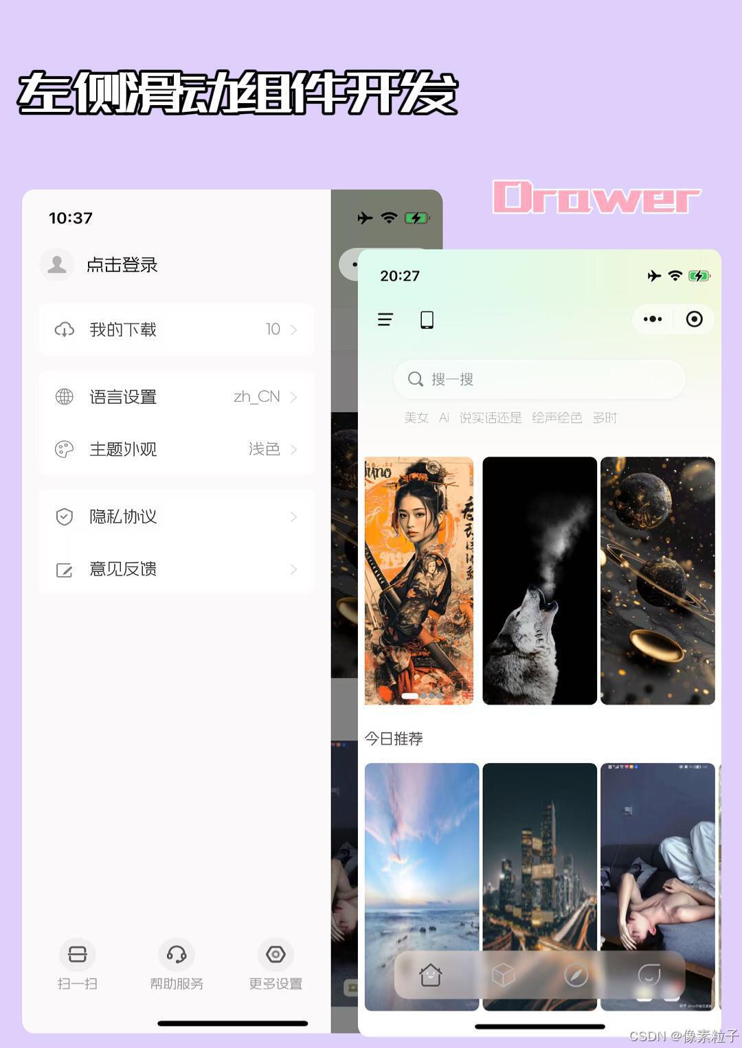
</view>五、效果预览
app主题外观切换


 扫一扫
扫一扫


 1676
1676

 被折叠的 条评论
为什么被折叠?
被折叠的 条评论
为什么被折叠?
 到【灌水乐园】发言


