


📌个人主页:个人主页
🧀 推荐专栏:小程序开发成神之路 --【这是一个为想要入门和进阶小程序开发专门开启的精品专栏!从个人到商业的全套开发教程,实打实的干货分享,确定不来看看? 😻😻】
📝作者简介:从web开发,再到大数据算法,踩过了无数的坑,用心总结经验教训,助你在技术生涯一臂之力!若想获取更多精彩内容,敬请订阅专栏或者关注😁😂🤣😃😆😉😊😋😍😘🥰
⭐️您的小小关注是我持续输出的动力!⭐️
干货内容推荐
🥇入门和进阶小程序开发,不可错误的精彩内容🥇 :
需求背景
时钟样式通常用在时间打卡类的程序中较多,很多时候时间样式更多只是简单的字符串的前端展示,并没有进行样式的优化。
特此整理了可以适配于移动端的时钟展示界面。源码基于vue 2.0和uni-app框架。完全可以根据你的需求打包到各类小程序或app中。
😁😂🤣😃😄😅😆
一、效果预览
| 样例类型 | 样例效果 |
|---|---|
钟表时钟 |  |
数字时钟 | 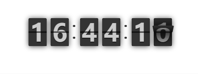 |
二、完整源码
2.1 钟表时钟
- 元素组件代码:
<template  >
	<view >
		<view id="clock">
		  <view class="hour">
		    <view class="min"></view>
		    <view class="min"></view>
		    <view class="min"></view>
		    <view class="min"></view>
		    <view class="min"></view>
		  </view>
		  <view class="hour">
		    <view class="min"></view>
		    <view class="min"></view>
		    <view class="min"></view>
		    <view class="min"></view>
		    <view class="min"></view>
		  </view>
		  <!-- <view id="alarm"> </view> -->
		  <view id="min" :style="{webkitTransform:fen}"></view>
		  <view id="hour" :style="{webkitTransform:shi}"></view>
		  <view id="sec" :style="{webkitTransform:miao}"></view>
		  <ol>
			<!-- <li>{{shijian[0]}}{{shijian[1]}}</li>
			<li>{{shijian[1]}}</li>
			<li>{{shijian[1]}}{{shijian[2]}}</li>
			<li>{{shijian[2]}}</li>
			<li>{{shijian[2]}}{{shijian[3]}}</li>
			<li>{{shijian[3]}}</li>
			<li>{{shijian[3]}}{{shijian[4]}}</li>
			<li>{{shijian[4]}}</li>
			<li>{{shijian[4]}}{{shijian[5]}}</li>
			<li>{{shijian[5]}}</li>
			<li>{{shijian[5]}}{{shijian[0]}}</li>
			<li>{{shijian[0]}}</li>  -->
		  </ol>
		</view>

	</view>

</template>

<script>

	export default {
		data() {
			return {
				  shi:0,
				  fen:0,
				  miao:0,
				  shijian:[],
				  tuichu:false,
				  hours:0,
			 }
		},
		computed:{

		},
		onLoad() {

			this.getcanshu();
			this.tuichu=true;
			if(this.tuichu){
				 this.fristdraw();
				 this.draw();
			}

		},
		onBackPress() {
			this.tuichu=false;
		},
		methods: {
			getcanshu(){
				var now = new Date();
				let then = new Date(now.getFullYear(),now.getMonth(),now.getDate(),0,0,0);
				let diffInMil = (now.getTime() - then.getTime());
				let h = (diffInMil/(1000*60*60));
				if(h>11){
					this.shijian=["午", "未", "申", "酉", "戌", "亥"]
				}else{
					this.shijian=["子", "丑", "寅", "卯", "辰", "巳"]
				}
			},
			  draw(){
				  setTimeout(() => {
						 var now = new Date(),//now
						  then = new Date(now.getFullYear(),now.getMonth(),now.getDate(),0,0,0),//midnight
						  diffInMil = (now.getTime() - then.getTime()),// difference in milliseconds
						  h = (diffInMil/(1000*60*60)),//hours

						  m = (h*60),//minutes
						  s = (m*60);//seconds

						 this.shi= "rotate(" + (h * 30 + (h / 2)-10) + "deg)";
						 this.fen= "rotate(" + (m * 6) + "deg)";
						 this.miao= "rotate(" + (s * 6) + "deg)";


						 if(this.tuichu){
							this.draw();
						 }
				  }, 1000)

			    } ,
				fristdraw(){
				 var now = new Date(),//now
				 then = new Date(now.getFullYear(),now.getMonth(),now.getDate(),0,0,0),//midnight
				 diffInMil = (now.getTime() - then.getTime()),// difference in milliseconds
				 h = (diffInMil/(1000*60*60)),//hours
				 m = (h*60),//minutes
				 s = (m*60);//seconds
				 this.shi= "rotate(" + (h * 30 + (h / 2)) + "deg)";
				 this.fen= "rotate(" + (m * 6) + "deg)";
				 this.miao= "rotate(" + (s * 6) + "deg)";
				}
		 }


	}
</script>

<style>
    @import url("./css/style.css");

</style>
- 样式代码
@charset "utf-8";
*, *:before, *:after {
  box-sizing: border-box;
}

html, body {
  height: 100%;
  width: 100%;
  padding:0;
  margin:0;
  top:0;
}

body {
  font-size: 100%;
  font-family: helvetica;
  -webkit-font-smoothing: antialiased;
  -moz-osx-font-smoothing: grayscale;
  background: linear-gradient(to bottom, #969696 0%, #6e6e6e 100%);
}

#clock {
  position: absolute;
  top: 0;
  left: 0;
  right: 0;
  bottom:200upx;
  margin: auto;
  width: 21em;
  height: 21em;
  border-radius: 50%;
  background: #eee;
  border: 0.2em solid #d0d0d0;
  box-shadow: 0 1.2em 0 -1em white, 0 -0.1em 0.3em 0 #fff, 0 0 0 0.6em #e7e7e7, 0 0.6em 1.2em 0 rgba(0, 0, 0, 0.5), inset 0 0.5em 1em 0 rgba(0, 0, 0, 0.3), inset 0 0 8em 0 rgba(0, 0, 0, 0.2);
}
#clock:before {
  display: block;
  content: "";
  position: absolute;
  background: #dedede;
  left: -2em;
  top: -2em;
  width: 25em;
  height: 25em;
  border-radius: 4.6em;
  z-index: -1;
  box-shadow: inset 0 -0.2em 0.2em 0 rgba(0, 0, 0, 0.2), inset 0 0.2em 2em 0 #fff;
}
#clock:after {
  display: block;
  content: "";
  position: absolute;
  height: inherit;
  width: inherit;
  background: transparent;
  top: 0;
  left: 0;
  border-radius: inherit;
  box-shadow: inset 12em 14em 0 -10em rgba(255, 255, 255, 0.25);
  z-index: 4;
}
#clock .hour {
  position: absolute;
  top: 0;
  left: 0;
  right: 0;
  bottom: 0;
  margin: auto;
  width: 0.5em;
  height: 16.4em;
  background: transparent;
  box-shadow: 0 -1em 0 -0.1em #383838, 0 1em 0 -0.1em #383838;
  transform: rotate(30deg);
}
#clock .hour:after, #clock .hour:before {
  display: block;
  content: "";
  position: absolute;
  height: inherit;
  width: inherit;
  background: inherit;
  box-shadow: inherit;
  backface-visibility: inherit;
}
#clock .hour:before {
  transform: rotate(30deg);
}
#clock .hour:after {
  transform: rotate(-30deg);
}
#clock .hour:nth-of-type(1) {
  transform: rotate(-60deg);
}
#clock .min {
  position: absolute;
  top: 0;
  left: 0;
  right: 0;
  bottom: 0;
  margin: auto;
  width: 0.3em;
  height: 17em;
  background: transparent;
  box-shadow: 0 -0.6em 0 -0.1em #383838, 0 0.6em 0 -0.1em #383838;
  z-index: -1;
  transform: rotate(-54deg);
}
#clock .min:after, #clock .min:before {
  display: block;
  content: "";
  position: absolute;
  height: inherit;
  width: inherit;
  background: inherit;
  box-shadow: inherit;
  backface-visibility: inherit;
  z-index: 0;
}
#clock .min:before {
  transform: rotate(6deg);

}
#clock .min:after {
  transform: rotate(12deg);
}
#clock .min:nth-child(2) {
  transform: rotate(-36deg);
}
#clock .min:nth-child(3) {
  transform: rotate(-18deg);
}
#clock .min:nth-child(4) {
  transform: rotate(6deg);
}
#clock .min:nth-child(5) {

  transform: rotate(24deg);
}

#alarm {
  position: absolute;
  top: 0;
  left: 0;
  right: 0;
  bottom: 0;
  margin: auto;
  background: #f8f8f8;
  width: 2.6em;
  height: 2.6em;
  border-radius: 50%;
  transform: rotate(-45deg);
  box-shadow: 0 0.2em 0.4em 0 rgba(0, 0, 0, 0.1);
}
#alarm:after {
  display: block;
  content: "";
  position: absolute;
  width: 0.4em;
  height: 4.8em;
  top: -4.6em;
  background: linear-gradient(to bottom, #f6f6f6 0%, #f8f8f8 100%);
  left: 0;
  right: 0;
  margin: 0 auto;
  z-index: -3;
  box-shadow: inset 0 1.2em 0 #4ca440, -0.2em -0.2em 0.3em 0 rgba(0, 0, 0, 0.1);
}

#sec {
  position: absolute;
  top: 0;
  left: 0;
  right: 0;
  bottom: 0;
  margin: auto;
  background: radial-gradient(ellipse at center, #ffd322 0%, #fbc900 100%);
  width: 2em;
  height: 2em;
  border-radius: 50%;
  border: 0.14em solid #fbc900;
  z-index: 3;
}
#sec:before, #sec:after {
  display: block;
  content: "";
  position: absolute;
}
#sec:before {
  background: #fbc900;
  width: 0.8em;
  height: 1.5em;
  top: 1.8em;
  left: 0;
  right: 0;
  margin: 0 auto;
  border-radius: 0 0 2em 2em;
}
#sec:after {
  width: 0.18em;
  height: 7.6em;
  top: -7.6em;
  background: #fbc900;
  left: 0;
  right: 0;
  margin: 0 auto;
}

#min,
#hour {
  z-index: 2;
  position: absolute;
  top: 0;
  left: 0;
  right: 0;
  bottom: 0;
  margin: auto;
  background: #fbc900;
  transform-origin: bottom center;
}

#min {
  width: 0.6em;
  height: 8.6em;
  top: -8.6em;
  border-radius: 2em 2em 0 0;
  box-shadow: inset 0 0 0 0.16em #303030, inset 0 -6em 0 0 #303030, -0.2em -0.2em 0.4em 0 rgba(0, 0, 0, 0.2);
}

#hour {
  width: 0.7em;
  height: 7em;
  top: -7em;
  border-radius: 2em 2em 0 0;
  box-shadow: inset 0 0 0 0.16em #303030, inset 0 -4.2em 0 0 #303030, -0.2em -0.2em 0.4em 0 rgba(0, 0, 0, 0.2);
}

ol {
  position: relative;
  height: inherit;
  width: inherit;
}
ol li {
  counter-increment: customlistcounter;
  font-size: 1.4rem;
  display: inline-block;
  position: absolute;
  letter-spacing: -0.1em;
  color: #383838;
  text-align: center;
}
ol li:before {
 /* content: counter(customlistcounter) ""; */
}
ol li:nth-child(1){

	    top: 2.5em;
	    right: 5.4em;
	    font-size: 1.2em;

}

ol li:nth-child(2) {
    top: 2.7em;
        position: absolute;
        right: 2.5em;
}
ol li:nth-child(3) {
  top: 7.8em;
      font-size: 1.2em;
      right: 2.4em;

}
ol li:nth-child(4) {
     top: 6.1em;
         right: 2.5em;
}
ol li:nth-child(5) {
        top: 12.90em;
        right: 4.9em;
        font-size: 1.2em;

}

ol li:nth-child(7) {
       top: 12.90em;
       right: 11.0em;
       font-size: 1.2em;
}
ol li:nth-child(8) {
  top: 6.1em;
      right: 7.5em;
}
ol li:nth-child(10) {
     top: 2.59em;

     right: 7.9em;
}
ol li:nth-child(11) {
    top: 2.6em;
    right: 10.9em;
    font-size: 1.2em;
}
ol li:nth-child(9) {
  top: 7.8em;
      font-size: 1.2em;
      position: absolute;
      left: 1.9em;
}
ol li:nth-child(6) {
        bottom: 1.1em;
        left: 4.7em;
        position: absolute;
}
ol li:nth-child(12) {
      top: 1.0em;
      left: 4.7em;
}
2.2 数字时钟
<template>
    <view class="content">
        <view class="flip-container">
            <view class="flip-items" v-for="(unit,unitIndex) of timeArr" :key="unitIndex">
                <view class="item" v-for="(item,index) of unit.max + 1" :key="index"
                    :class="{current: unit.current == index, past: unit.current - 1 == index || index==unit.max&&unit.current==0}">
                    <view class="up">
                        <view class="inner">{{index}}</view>
                        <view class="shadow"></view>
                    </view>
                    <view class="down">
                        <view class="inner">{{index}}</view>
                        <view class="shadow"></view>
                    </view>
                </view>
            </view>
        </view>
    </view>
</template>

<script>
    function getTimeStr(){
        let time = new Date();
        let hour = ('00' + time.getHours()).slice(-2)
        let minute = ('00' + time.getMinutes()).slice(-2)
        let second = ('00' + time.getSeconds()).slice(-2)
        let timeStr = hour + minute + second
        return timeStr
    }
	export default {
		data() {
			return {
                timeStr:getTimeStr(),
                timeRunner:''
			}
		},
        computed:{
            timeArr(){
                return [...this.timeStr].map((unit,index)=>{
                    let max;
                    if(index&1==1){     //时分秒的个位
                        max = 9
                    }else if(index==0){ //时十位
                        max = 2
                    }else if(index==2){ //分十位
                        max = 5
                    }else if(index==4){ //秒十位
                        max = 5
                    }
                    return {
                        max,
                        current:Number(unit),
                    }
                })
            }
        },
        methods:{
            setTimeRunner(){
                this.timeRunner = setInterval(()=>{
                    this.timeStr = getTimeStr()
                },1000)
            }
        },
		created() {
            this.setTimeRunner()
		},
        beforeDestroy() {
            clearInterval(this.timeRunner)
        },
	}
</script>

<style>
    html,body,page{
        font: normal "Helvetica Neue", Helvetica, sans-serif;
        height: 100%;
        display: flex;
        justify-content: center;
        align-items: center;
    }
</style>
<style lang="stylus">
    $width = 60rpx;
    $backgroundColor = #333
    $color = #ccc
    $time = 1s
    $height = $width * 1.5;
    $fontSize = $width * 1.3;
    $lineWidth = ($width / 60);
    $radius = ($width / 10);
    $perspective = $width * 5;
    $gap= $width * 0.2
    .flip-container
        display flex
        justify-content center
        padding 0 20rpx
        position relative
        .flip-items
            // margin 50rpx auto
            position relative
            width $width
            height $height
            font-size $fontSize
            font-weight bold
            border-radius $radius
            box-shadow: 0 2rpx 18rpx rgba(0, 0, 0, 0.7)
            &:nth-of-type(2n+1)
                margin-right $gap
            &:nth-of-type(2),&:nth-of-type(4)
                margin-right $gap * 3
                &::after,&::before
                    position absolute
                    right -(@margin-right / 2)
                    content ''
                    transform translateX(50%)
                    width ($gap / 1.5)
                    height @width
                    border-radius 50%
                    background-color $backgroundColor
                &::before
                    top 25%
                &::after
                    bottom 25%
            .item
                z-index 1
                position absolute
                top 0
                left 0
                right 0
                bottom 0
                perspective $perspective
                &:before
                    content: ''
                    position absolute
                    top (($height - $lineWidth) / 2)
                    left 0
                    z-index 9
                    width: 100%
                    height: $lineWidth
                    min-height 2px
                    background-color rgba(0, 0, 0, 0.6)
                    // background-color $backgroundColor
                .up,.down
                    position absolute;
                    left 0;
                    right 0
                    height 50%;
                    overflow hidden
                .up
                    transform-origin 50% 100%
                    top 0
                .down
                    transform-origin 50% 0%
                    bottom 0
                .inner
                    position: absolute;
                    left: 0;
                    width: 100%;
                    height: $height
                    line-height $height
                    color: $color;
                    text-shadow: 0 2rpx 4rpx #000
                    text-align: center;
                    background-color: $backgroundColor
                    border-radius: $radius
                .up .inner
                    top 0
                .down .inner
                    bottom 0
                .up .shadow
                    border-top-left-radius $radius
                    border-top-right-radius $radius
                .down .shadow
                    border-bottom-left-radius $radius
                    border-bottom-right-radius $radius
        .flip-items .item
            &.past {
              z-index: 3;
            }
            &.current {
              //反转到中间时候当前秒层级最大
              animation: highter-level ($time/2) ($time/2) linear forwards;
              z-index: 2;
            }
            &.past .up {
              animation: flip-past-up ($time/2) linear both;
            }
            &.current .down {
              animation: flip-current-down ($time/2) ($time/2) linear both;
            }
            @keyframes flip-current-down {
              from{
                transform: rotateX(90deg);
              }
              to {
                transform: rotateX(0deg);
              }
            }
            @keyframes flip-past-up {
              from{
                transform: rotateX(0deg);
              }
              to {
                transform: rotateX(-90deg);
              }
            }
            @keyframes highter-level {
              from{
                z-index: 4;
              }
              to {
                z-index: 4;
              }
            }
        // 控制阴影
        .flip-items .item
            .shadow {
              position: absolute;
              width: 100%;
              height: 100%;
            }
            &.past .up .shadow {
              background: linear-gradient(rgba(0, 0, 0, 0.1) 0%, rgba(0, 0, 0, 1) 100%);
              animation: show ($time/2) linear both;
            }
            &.past .down .shadow {
              background: linear-gradient(rgba(0, 0, 0, 1) 0%, rgba(0, 0, 0, 0.1) 100%);
              animation: show ($time/2) linear both;
            }
            &.current .up .shadow {
              background: linear-gradient(rgba(0, 0, 0, 0.1) 0%, rgba(0, 0, 0, 1) 100%);
              animation: hide ($time/2) 0.3s linear both;
            }
            &.current .down .shadow {
              background: linear-gradient(rgba(0, 0, 0, 1) 0%, rgba(0, 0, 0, 0.1) 100%);
              animation: hide ($time/2) 0.3s linear both;
            }

        @keyframes show {
          from{
            opacity: 0;
          }
          to {
            opacity: 1;
          }
        }
        @keyframes hide {
          from{
            opacity: 1;
          }
          to {
            opacity: 0;
          }
        }
    .other
        position absolute
        font-size 26px
        left 50%
        transform translateX(-50%)
        bottom 50rpx
</style>


 842
842


 被折叠的 条评论
为什么被折叠?
被折叠的 条评论
为什么被折叠?
 到【灌水乐园】发言


