


实战
import MySQLdb as mdb #加载MySQLdb
import pandas as pd #数据库
from bokeh.models.widgets import Panel, Tabs #分页展示
from bokeh.transform import dodge #多个直方图拼接
from bokeh.core.properties import value #多个直方图
from bokeh.models import ColumnDataSource #生成数据 字典 DataFrame
from bokeh.plotting import figure, show, output_file #bokeh基本插件
from bokeh.models import HoverTool #创建悬浮对象
server1=[]
s1901=[]
s1902=[]
s1903=[]
s1904=[]
s1905=[]
s1801=[]
s1802=[]
s1803=[]
s1804=[]
s1805=[]
conn = mdb.connect(host='1xxxxxxxxx8', port=xxxxxx, user='xxxxxx', passwd='xxxxxxxxx',db='superking_payment') #链接地址 库名
cursor1 = conn.cursor() #建立游标cursor()
sql1="select " \
"server_id,"\
"round(SUM(case when FROM_UNIXTIME(create_time/1000,'%y-%m')='19-01' then amount else 0 end),2)as '19-01', "\
"round(SUM(case when FROM_UNIXTIME(create_time/1000,'%y-%m')='19-02' then amount else 0 end),2)as '19-02', "\
"round(SUM(case when FROM_UNIXTIME(create_time/1000,'%y-%m')='19-03' then amount else 0 end),2)as '19-03', "\
"round(SUM(case when FROM_UNIXTIME(create_time/1000,'%y-%m')='19-04' then amount else 0 end),2)as '19-04', "\
"round(SUM(case when FROM_UNIXTIME(create_time/1000,'%y-%m')='19-05' then amount else 0 end),2)as '19-05', "\
"round(SUM(case when FROM_UNIXTIME(create_time/1000,'%y-%m')='18-01' then amount else 0 end),2)as '18-01', "\
"round(SUM(case when FROM_UNIXTIME(create_time/1000,'%y-%m')='18-02' then amount else 0 end),2)as '18-02', "\
"round(SUM(case when FROM_UNIXTIME(create_time/1000,'%y-%m')='18-03' then amount else 0 end),2)as '18-03', "\
"round(SUM(case when FROM_UNIXTIME(create_time/1000,'%y-%m')='18-04' then amount else 0 end),2)as '18-04', "\
"round(SUM(case when FROM_UNIXTIME(create_time/1000,'%y-%m')='18-05' then amount else 0 end),2)as '18-05' "\
"from superking_payment.success_record "\
"where server_id != 0 "\
"GROUP BY server_id "\
#sql语句
cursor1.execute(sql1) #查询数据 execute()用于执行一个数据库的查询命令
res = cursor1.fetchall() #获取结果fetchall()获取结果集中剩下的所有行
for i4 in range(len(res)):
server1.append(str(res[i4][0])+'服')
for i3 in range(len(res)):
s1902.append(res[i3][2])
for i in range(len(res)):
s1901.append(res[i][1])
for i in range(len(res)):
s1903.append(res[i][3])
for i in range(len(res)):
s1904.append(res[i][4])
for i in range(len(res)):
s1905.append(res[i][5])
for i in range(len(res)):
s1801.append(res[i][6])
for i in range(len(res)):
s1802.append(res[i][7])
for i in range(len(res)):
s1803.append(res[i][8])
for i in range(len(res)):
s1804.append(res[i][9])
for i in range(len(res)):
s1805.append(res[i][10])
cursor1.close() #关闭游标close()
conn.close() #关闭连接close()'''
output_file("line.html")
a=pd.DataFrame({'1901':s1901,'1902':s1902,'1903':s1903,'1904':s1904,
'1905':s1905,'1801':s1801,'1802':s1802,'1803':s1803,'1804':s1804,'1805':s1805},index=server1)
source = ColumnDataSource(a)
#生成数据,数据格式为dict; 专门把dataframe转换为字典,然后再转换为ColumnDataSource对象
serv=a.index.tolist()
tooltips_p = [ ("pay", "$y{0,0}")]
#创建悬浮对象 {0,0}取整数
p = figure(x_range=serv,y_range=(0,2500),plot_width=1200,plot_height=600,title='WAO_test_payment',tooltips=tooltips_p)
#X轴取range种类的服务器id号 添加tooltips悬浮标签
p.vbar(x=dodge('index',-0.50,range=p.x_range), top='1901',width=0.2,
source=source,color="#9ACD32", legend=value('1901'))
p.vbar(x=dodge('index',-0.25, range=p.x_range), top='1902', width=0.2, source=source,
color="#9400D3", legend=value('1902'))
p.vbar(x=dodge('index', 0.00, range=p.x_range), top='1903', width=0.2, source=source,
color="#DAA520", legend=value('1903'))
p.vbar(x=dodge('index', 0.25, range=p.x_range), top='1904', width=0.2, source=source,
color="#FF6347", legend=value('1904'))
p.vbar(x=dodge('index', 0.50,range=p.x_range), top='1905', width=0.2, source=source,
color="#778899", legend=value('1905'))
tab2 = Panel(child=p, title="19year")
#用dodge的方法把3个柱状图拼到了一起
#定义X轴的分类
#top条形图高度:Y轴取值 / 0.25和width=0.2是柱状图之间的空隙间隔,都是0.2了就没有空隙了
tooltips_p2 = [ ("pay", "$y{0,0}")]
p2 = figure(x_range=serv,y_range=(0,2500),plot_width=1200,plot_height=600,title='WAO_test_payment',tooltips=tooltips_p2)
p2.vbar(x=dodge('index',-0.50,range=p.x_range), top='1801',width=0.2,
source=source,color="#9ACD32", legend=value('1801'))
p2.vbar(x=dodge('index',-0.25, range=p.x_range), top='1802', width=0.2, source=source,
color="#9400D3", legend=value('1802'))
p2.vbar(x=dodge('index', 0.00, range=p.x_range), top='1803', width=0.2, source=source,
color="#DAA520", legend=value('1803'))
p2.vbar(x=dodge('index', 0.25, range=p.x_range), top='1804', width=0.2, source=source,
color="#FF6347", legend=value('1804'))
p2.vbar(x=dodge('index', 0.50,range=p.x_range), top='1805', width=0.2, source=source,
color="#778899", legend=value('1805'))
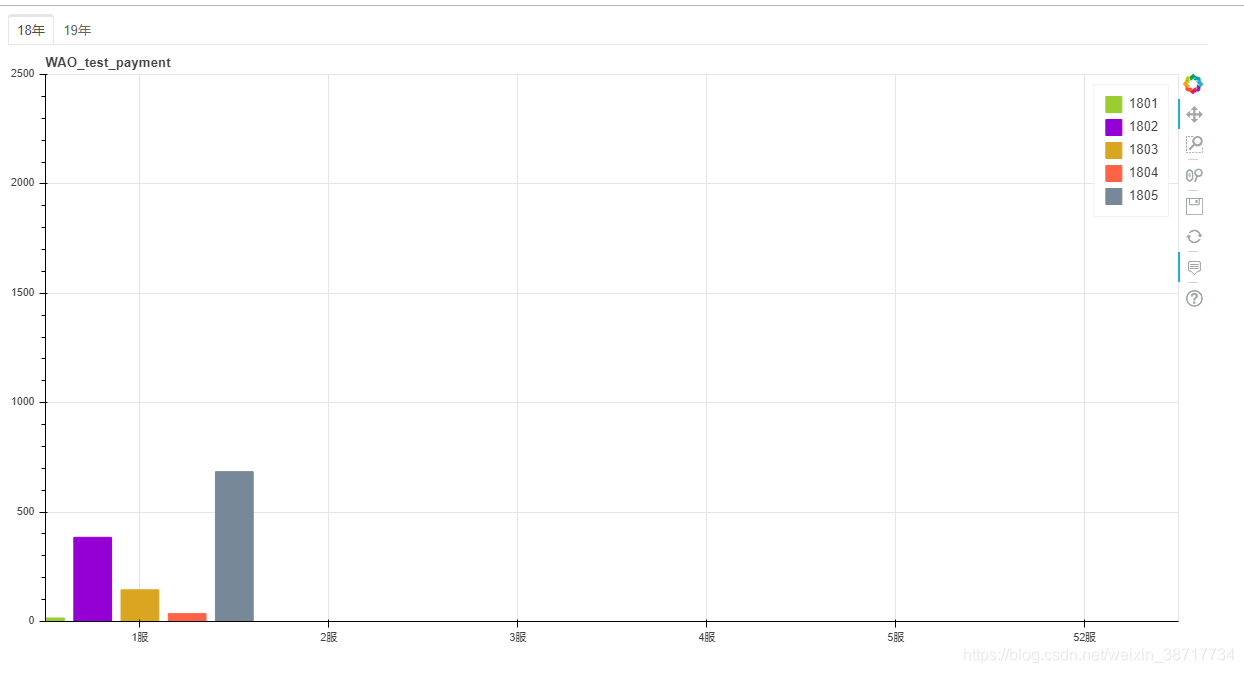
tab1 = Panel(child=p2, title="18year")
tabs = Tabs(tabs=[ tab1, tab2 ])
show(tabs)
解析:
for i4 in range(len(res)):
    server1.append(str(res[i4][0])+'服')

    摘出res数据中的每一列

tooltips_p = [ ("pay", "$y{0,0}")]
增加标签 pay的值 以Y轴坐标数为准

serv=a.index.tolist()
把数据a中(DateFrame)的索引(index)打成一个列表 赋值给serv

p = figure(x_range=serv,y_range=(0,2500),plot_width=1200,plot_height=600,title='WAO_test_payment',tooltips=tooltips_p)
定义图像范围/值
x/y_range x/y轴的范围值
tooltips=tooltips_p 加载悬浮层坐标

#重点
    p.vbar(x=dodge('index',-0.50,range=p.x_range), top='1901',width=0.2,
           source=source,color="#9ACD32", legend=value('1901'))
    x=dodge中:
    'index'索引名称
    -0.50 多个分类在X轴位置
    range X轴的范围值
     0.25和width=0.2是柱状图之间的空隙间隔,都是0.2了就没有空隙了
     source=source (  source = ColumnDataSource(a))ColumnDataSourcede化后的数据源
     color="#9400D3" 颜色
     legend=value('1901') 服务器对应的付费金额 作为长度展示


 1778
1778

 被折叠的 条评论
为什么被折叠?
被折叠的 条评论
为什么被折叠?
 到【灌水乐园】发言


