


Matplotlib使用总结图
import matplotlib.pyplot as plt
plt.rcParams['font.sans-serif']=['SimHei'] # 用来正常显示中文标签
plt.rcParams['axes.unicode_minus']=False # 用来正常显示负号
import pandas as pd
import numpy as np
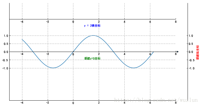
新建隐藏坐标轴
from mpl_toolkits.axisartist.axislines import SubplotZero
import numpy as np
fig = plt.figure(1, (10, 6))
ax = SubplotZero(fig, 1, 1, 1)
fig.add_subplot(ax)
"""新建坐标轴"""
ax.axis["xzero"].set_visible(True)
ax.axis["xzero"].label.set_text("新建y=0坐标")
ax.axis["xzero"].label.set_color('green')
# ax.axis['yzero'].set_visible(True)
# ax.axis["yzero"].label.set_text("新建x=0坐标")
# 新建一条y=2横坐标轴
ax.axis["新建1"] = ax.new_floating_axis(nth_coord=0, value=2,axis_direction="bottom")
ax.axis["新建1"].toggle(all=True)
ax.axis["新建1"].label.set_text("y = 2横坐标")
ax.axis["新建1"].label.set_color('blue')
"""坐标箭头"""
ax.axis["xzero"].set_axisline_style("-|>")
"""隐藏坐标轴"""
# 方法一:隐藏上边及右边
# ax.axis["right"].set_visible(False)
# ax.axis["top"].set_visible(False)
#方法二:可以一起写
ax.axis["top",'right'].set_visible(False)
# 方法三:利用 for in
# for n in ["bottom", "top", "right"]:
# ax.axis[n].set_visible(False)
"""设置刻度"""
ax.set_ylim(-3, 3)
ax.set_yticks([-1,-0.5,0,0.5,1])
ax.set_xlim([-5, 8])
# ax.set_xticks([-5,5,1])
#设置网格样式
ax.grid(True, linestyle='-.')
xx = np.arange(-4, 2*np.pi, 0.01)
ax.plot(xx, np.sin(xx))
# 于 offset 处新建一条纵坐标
offset = (40, 0)
new_axisline = ax.get_grid_helper().new_fixed_axis
ax.axis["新建2"] = new_axisline(loc="right", offset=offset, axes=ax)
ax.axis["新建2"].label.set_text("新建纵坐标")
ax.axis["新建2"].label.set_color('red')
plt.show()
# 存为图像
# fig.savefig('test.png')
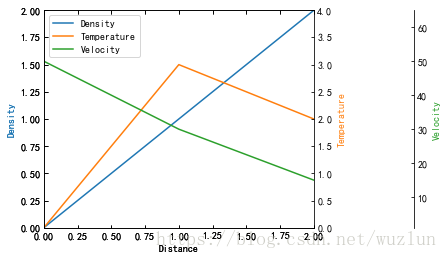
from mpl_toolkits.axes_grid1 import host_subplot
import mpl_toolkits.axisartist as AA
import matplotlib.pyplot as plt
host = host_subplot(111, axes_class=AA.Axes)
plt.subplots_adjust(right=0.75)
par1 = host.twinx()
par2 = host.twinx()
offset = 100
new_fixed_axis = par2.get_grid_helper().new_fixed_axis
par2.axis["right"] = new_fixed_axis(loc="right",
axes=par2,
offset=(offset, 0))
par1.axis["right"].toggle(all=True)
par2.axis["right"].toggle(all=True)
host.set_xlim(0, 2)
host.set_ylim(0, 2)
host.set_xlabel("Distance")
host.set_ylabel("Density")
par1.set_ylabel("Temperature")
par2.set_ylabel("Velocity")
p1, = host.plot([0, 1, 2], [0, 1, 2], label="Density")
p2, = par1.plot([0, 1, 2], [0, 3, 2], label="Temperature")
p3, = par2.plot([0, 1, 2], [50, 30, 15], label="Velocity")
par1.set_ylim(0, 4)
par2.set_ylim(1, 65)
host.legend()
host.axis["left"].label.set_color(p1.get_color())
par1.axis["right"].label.set_color(p2.get_color())
par2.axis["right"].label.set_color(p3.get_color())
plt.draw()
plt.show()
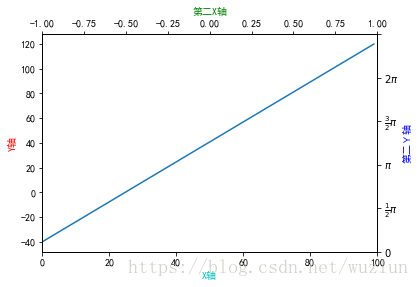
# 第二坐标
fig, ax_f = plt.subplots()
# 这步是关键
ax_c = ax_f.twinx()
ax_d = ax_f.twiny()
# automatically update ylim of ax2 when ylim of ax1 changes.
# ax_f.callbacks.connect("ylim_changed", convert_ax_c_to_celsius)
ax_f.plot(np.linspace(-40, 120, 100))
ax_f.set_xlim(0, 100)
# ax_f.set_title('第二坐标', size=14)
ax_f.set_ylabel('Y轴',color='r')
ax_f.set_xlabel('X轴',color='c')
ax_c.set_ylabel('第二Y轴', color='b')
ax_c.set_yticklabels(["$0$", r"$\frac{1}{2}\pi$", r"$\pi$", r"$\frac{3}{2}\pi$", r"$2\pi$"])
# ax_c.set_ylim(1,5)
ax_d.set_xlabel('第二X轴', color='g')
ax_d.set_xlim(-1,1)
plt.show()
刻度及标记
import mpl_toolkits.axisartist.axislines as axislines
fig = plt.figure(1, figsize=(10, 6))
fig.subplots_adjust(bottom=0.2)
# 子图1
ax1 = axislines.Subplot(fig, 131)
fig.add_subplot(ax1)
# for axis in ax.axis.values():
# axis.major_ticks.set_tick_out(True) # 标签全部在外部
ax1.axis[:].major_ticks.set_tick_out(True) # 这句和上面的for循环功能相同
 最低0.47元/天 解锁文章


 3548
3548


 被折叠的 条评论
为什么被折叠?
被折叠的 条评论
为什么被折叠?
 到【灌水乐园】发言


