


作者 | SusanLi
来源 | Medium
编辑 | 代码医生团队
上周的一天,在谷歌上搜索“ Python的统计数据 ”,结果有些没有用。大多数文献,教程和文章都侧重于使用R进行统计,因为R是一种专门用于统计的语言,并且具有比Python更多的统计分析功能。
数据科学是多学科的融合,包括统计学,计算机科学,信息技术和领域特定领域。每天都使用功能强大的开源Python工具来操作,分析和可视化数据集。
这促使写了一个主题的帖子。将使用一个数据集来审查尽可能多的统计概念。
数据
数据是可在此处找到的房价数据集。
https://www.kaggle.com/c/house-prices-advanced-regression-techniques/data
import numpy as npimport pandas as pdimport matplotlib.pyplot as pltimport seaborn as snsfrom plotly.offline import init_notebook_mode, iplotimport plotly.figure_factory as ffimport cufflinkscufflinks.go_offline()cufflinks.set_config_file(world_readable=True, theme='pearl')import plotly.graph_objs as goimport plotly.plotly as pyimport plotlyfrom plotly import toolsplotly.tools.set_credentials_file(username='XXX', api_key='XXX')init_notebook_mode(connected=True)pd.set_option('display.max_columns', 100)df = pd.read_csv('house_train.csv')df.drop('Id', axis=1, inplace=True)df.head()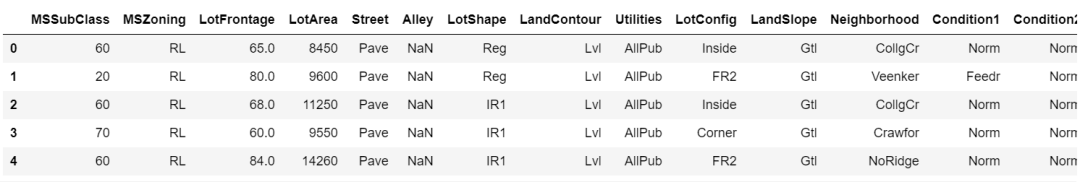
表格1
单变量数据分析
单变量分析可能是最简单的统计分析形式,关键的事实是只涉及一个变量。
描述数据
数值数据的统计摘要包括数据的均值,最小值和最大值等,可用于了解某些变量的大小以及哪些变量可能是最重要的。
df.describe().T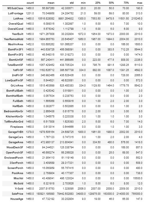
表2
分类或字符串变量的统计摘要将显示“count”,“unique”,“top”和“freq”。
table_cat = ff.create_table(df.describe(include=['O']).T, index=True, index_title='Categorical columns')iplot(table_cat)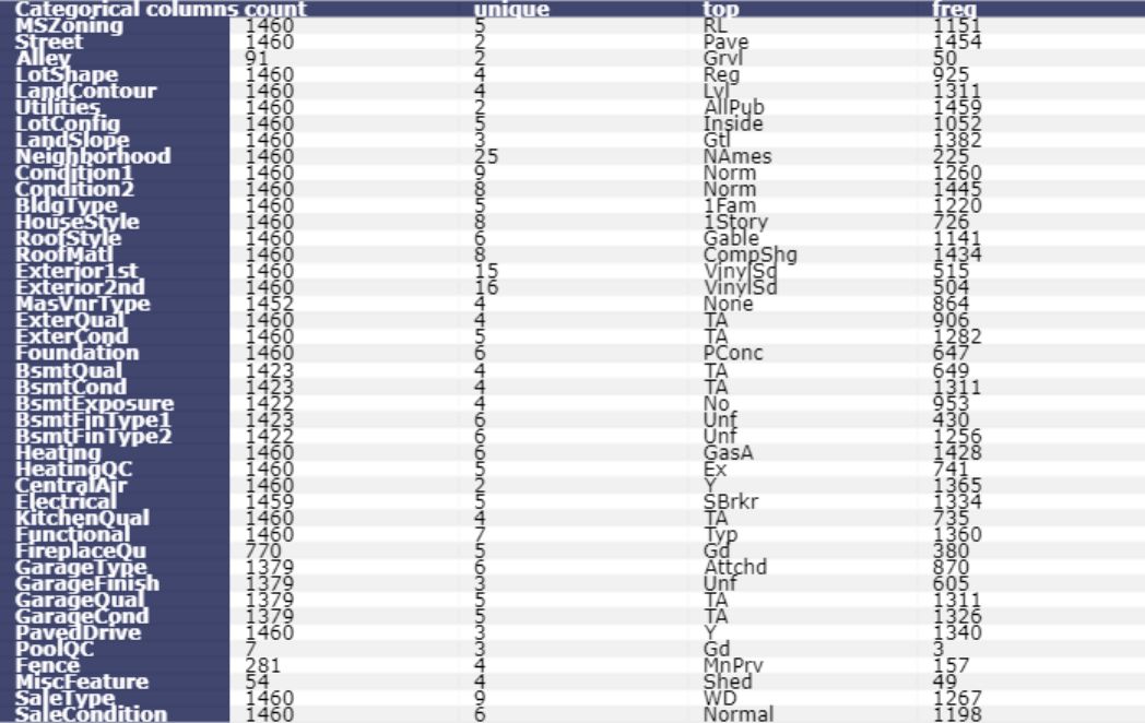
表3
直方图
绘制数据中所有房屋的SalePrice直方图。
df['SalePrice'].iplot( kind='hist', bins=100, xTitle='price', linecolor='black', yTitle='count', title='Histogram of Sale Price')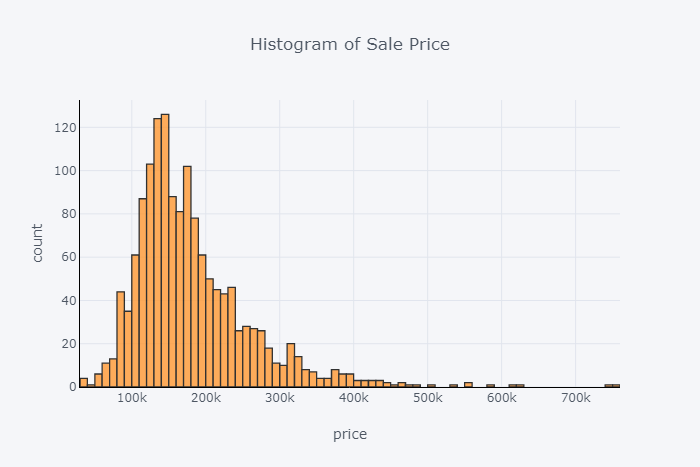
图1
箱形图
绘制数据中所有房屋的SalePrice的箱线图。箱形图不显示分布的形状,但它们可以更好地了解分布的中心和扩散以及可能存在的任何潜在异常值。箱形图和直方图通常相互补充,有助于更多地了解数据。
df['SalePrice'].iplot(kind='box', title='Box plot of SalePrice')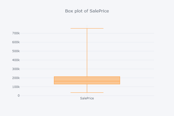
图2
组的直方图和箱图
按组绘图,可以看到变量如何响应另一个变化。例如如果房屋SalePrice与中央空调之间存在差异。或者如果房屋SalePrice根据车库的大小而变化,等等。
房屋销售价格的箱形图和直方图按有或没有空调分组
trace0 = go.Box( y=df.loc[df['CentralAir'] == 'Y']['SalePrice'], name = 'With air conditioning', marker = dict( color = 'rgb(214, 12, 140)', ))trace1 = go.Box( y=df.loc[df['CentralAir'] == 'N']['SalePrice'], name = 'no air conditioning', marker = dict( color = 'rgb(0, 128, 128)', ))data = [trace0, trace1]layout = go.Layout( title = "Boxplot of Sale Price by air conditioning") fig = go.Figure(data=data,layout=layout)py.iplot(fig)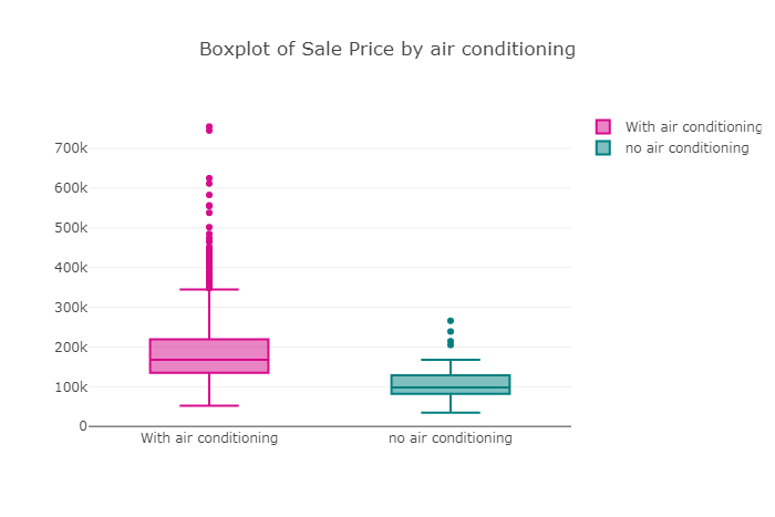
图3
trace0 = go.Histogram( x=df.loc[df['CentralAir'] == 'Y']['SalePrice'], name='With Central air conditioning', opacity=0.75)trace1 = go.Histogram( x=df.loc[df['CentralAir'] == 'N']['SalePrice'], name='No Central air conditioning', opacity=0.75) data = [trace0, trace1]layout = go.Layout(barmode='overlay', title='Histogram of House Sale Price for both with and with no Central air conditioning')fig = go.Figure(data=data, layout=layout) py.iplot(fig)
图4
df.groupby('CentralAir')['SalePrice'].describe()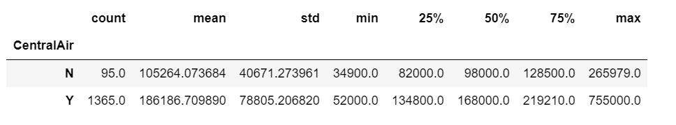
表4
显然,没有空调的房屋的平均和中位数售价远低于带空调的房屋。
Boxplot和直方图的房屋销售价格按车库大小分组
trace0 = go.Box( y=df.loc[df['GarageCars'] == 0]['SalePrice'], name = 'no garage', marker = dict( color = 'rgb(214, 12, 140)', ))trace1 = go.Box( y=df.loc[df['GarageCars'] == 1]['SalePrice'], name = '1-car garage', marker = dict( color = 'rgb(0, 128, 128)', ))trace2 = go.Box( y=df.loc[df['GarageCars'] == 2]['SalePrice'], name = '2-cars garage', marker = dict( color = 'rgb(12, 102, 14)', ))trace3 = go.Box( y=df.loc[df['GarageCars'] == 3]['SalePrice'], name = '3-cars garage', marker = dict( color = 'rgb(10, 0, 100)', ))trace4 = go.Box( y=df.loc[df['GarageCars'] == 4]['SalePrice'], name = '4-cars garage', marker = dict( color = 'rgb(100, 0, 10)', ))data = [trace0, trace1, trace2, trace3, trace4]layout = go.Layout( title = "Boxplot of Sale Price by garage size") fig = go.Figure(data=data,layout=layout)py.iplot(fig)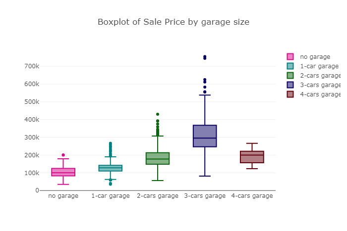
图5
车库越大房屋中位数价格越高,直到到达3车库为止。显然拥有3辆车车库的房屋中位数价格最高,甚至高于拥有4辆车车库的房屋。
没有车库的房屋销售价格直方图
df.loc[df['GarageCars'] == 0]['SalePrice'].iplot( kind='hist', bins=50, x, linecolor='black', y,)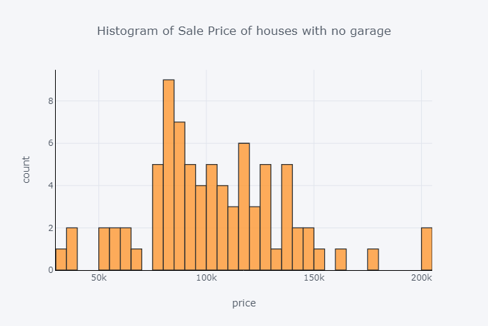
图6
房车销售价格的直方图与1车库
df.loc[df['GarageCars'] == 1]['SalePrice'].iplot( kind='hist', bins=50, x, linecolor='black', y,)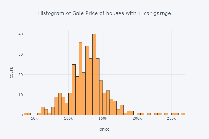
图7
房车销售价格直方图与2车库
df.loc[df['GarageCars'] == 2]['SalePrice'].iplot( kind='hist', bins=100, x, linecolor='black', y,)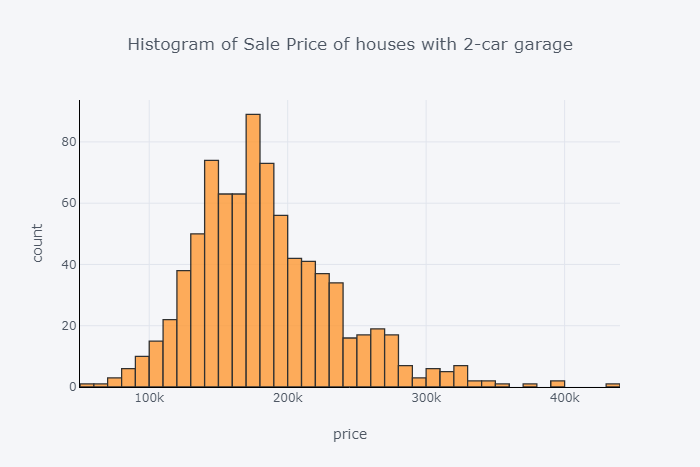
图8
房车销售价格直方图与3车库
df.loc[df['GarageCars'] == 3]['SalePrice'].iplot( kind='hist', bins=50, x, linecolor='black', y,)
图9
房车销售价格直方图与4车库
df.loc[df['GarageCars'] == 4]['SalePrice'].iplot( kind='hist', bins=10, x, linecolor='black', y,)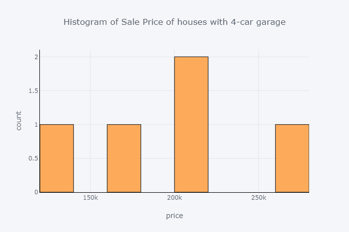
图10
频率表
频率告诉事情发生的频率。频率表提供了数据的快照,以便查找模式。
整体质量频率表
x = df.OverallQual.value_counts()x/x.sum()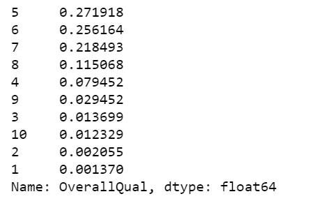
表5
车库大小频率表
x = df.GarageCars.value_counts()x/x.sum()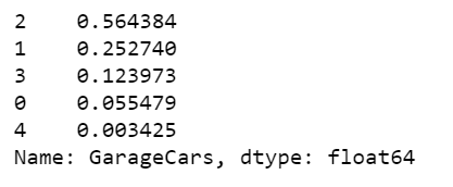
表6
中央空调频率表
x = df.CentralAir.value_counts()x/x.sum()
表7
数字摘要
获取定量变量的一组数字摘要的快速方法是使用describe方法。
df.SalePrice.describe()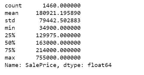
表8
还可以计算SalePrice的个别摘要统计数据。
print("The mean of sale price, - Pandas method: ", df.SalePrice.mean())print("The mean of sale price, - Numpy function: ", np.mean(df.SalePrice))print("The median sale price: ", df.SalePrice.median())print("50th percentile, same as the median: ", np.percentile(df.SalePrice, 50))print("75th percentile: ", np.percentile(df.SalePrice, 75))print("Pandas method for quantiles, equivalent to 75th percentile: ", df.SalePrice.quantile(0.75))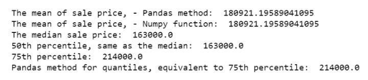
计算销售价格在第25百分位数(129975)和第75百分位数(214000)之间的房屋比例。
print('The proportion of the houses with prices between 25th percentile and 75th percentile: ', np.mean((df.SalePrice >= 129975) & (df.SalePrice <= 214000)))计算25平方英寸(795.75)和第75百分位数(1298.25)之间的基础面积总平方英尺的房屋比例。
print('The proportion of house with total square feet of basement area between 25th percentile and 75th percentile: ', np.mean((df.TotalBsmtSF >= 795.75) & (df.TotalBsmtSF <= 1298.25)))最后根据任一条件计算房屋的比例。由于某些房屋符合这两个标准,因此下面的比例小于上面计算的两个比例的总和。
a = (df.SalePrice >= 129975) & (df.SalePrice <= 214000)b = (df.TotalBsmtSF >= 795.75) & (df.TotalBsmtSF <= 1298.25)print(np.mean(a | b))
计算没有空调的房屋的销售价格IQR。
q75, q25 = np.percentile(df.loc[df['CentralAir']=='N']['SalePrice'], [75,25])iqr = q75 - q25print('Sale price IQR for houses with no air conditioning: ', iqr)
计算带空调房屋的销售价格IQR。
q75, q25 = np.percentile(df.loc[df['CentralAir']=='Y']['SalePrice'], [75,25])iqr = q75 - q25print('Sale price IQR for houses with air conditioning: ', iqr)
分层
从数据集中获取更多信息的另一种方法是将其划分为更小,更均匀的子集,并自己分析这些“层”中的每一个。将创建一个新的HouseAge列,然后将数据划分为HouseAge层,并在每个层内构建销售价格的并排箱图。
df['HouseAge'] = 2019 - df['YearBuilt']df["AgeGrp"] = pd.cut(df.HouseAge, [9, 20, 40, 60, 80, 100, 147]) # Create age strata based on these cut pointsplt.figure(figsize=(12, 5)) sns.boxplot(x="AgeGrp", y="SalePrice", data=df);
图11
房子越旧,中位数价格越低,也就是说,房价会随着年龄的增长而下降,直到100岁。100岁以上房屋的中位数价格高于80至100年间房屋的中位数价格。
plt.figure(figsize=(12, 5))sns.boxplot(x="AgeGrp", y="SalePrice", hue="CentralAir", data=df)plt.show();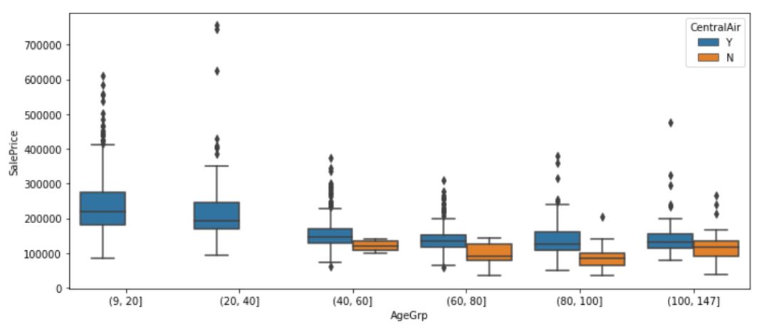
图12
之前已经了解到,房价在没有空调的情况下往往会有所不同。从上图中还发现最近的房屋(9-40岁)都配备了空调。
plt.figure(figsize=(12, 5))sns.boxplot(x="CentralAir", y="SalePrice", hue="AgeGrp", data=df)plt.show();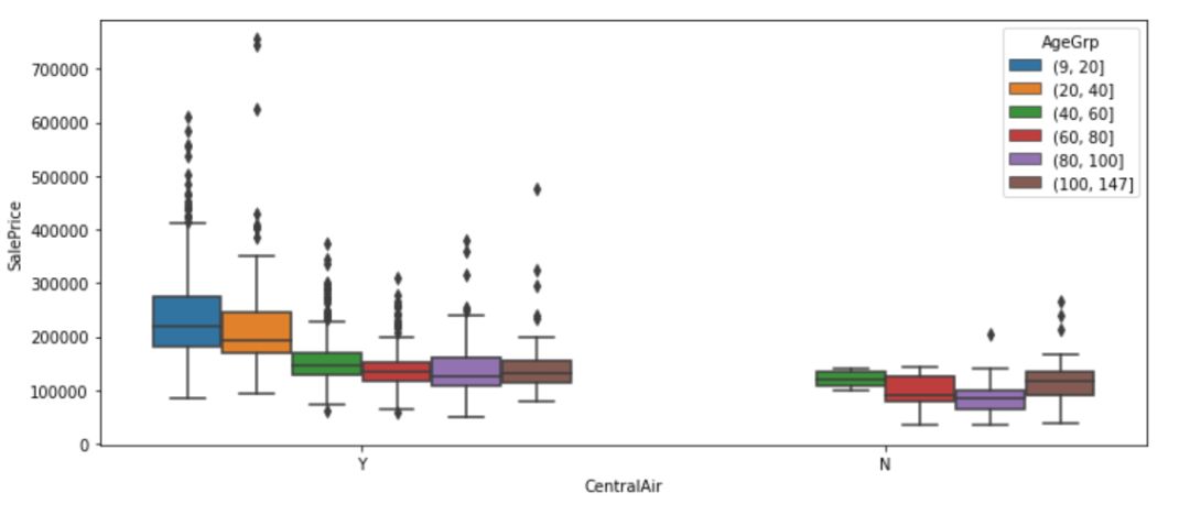
图13
现在首先按空调分组,然后按年龄段分组在空调组内。每种方法都突出了数据的不同方面。
还可以通过House年龄和空调共同分层,探索建筑类型如何同时受这两个因素的影响。
df1 = df.groupby(["AgeGrp", "CentralAir"])["BldgType"]df1 = df1.value_counts()df1 = df1.unstack()df1 = df1.apply(lambda x: x/x.sum(), axis=1)print(df1.to_string(float_format="%.3f"))
表9
对于所有家庭年龄组,数据中绝大多数类型的住所是1Fam。房子越旧,就越不可能没有空调。然而,对于一个100多岁的1Fam房屋来说,空调比不是更有可能。既没有非常新的也没有很旧的复式房屋类型。对于40-60岁的复式房屋,它更可能没有空调。
多变量分析
多变量分析基于多变量统计的统计原理,其涉及一次观察和分析多个统计结果变量。
散点图
甲散点图是定量的二元数据的一个非常普遍的和容易理解的可视化。下面制作销售价格与地面生活区平方英尺的散点图。它显然是一种线性关系。
df.iplot( x='GrLivArea', y='SalePrice', xTitle='Above ground living area square feet', yTitle='Sale price', mode='markers',title='Sale Price vs Above ground living area square feet')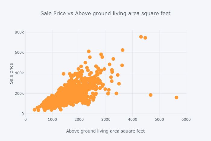
图14
2D密度联合图
以下两个地块边缘分别显示了销售价格和地上生活区域的密度,而中心的地块显示了它们的密度。
trace1 = go.Scatter( x=df['GrLivArea'], y=df['SalePrice'], mode='markers', name='points', marker=dict(color='rgb(102,0,0)', size=2, opacity=0.4))trace2 = go.Histogram2dContour( x=df['GrLivArea'], y=df['SalePrice'], name='density', ncontours=20, colorscale='Hot', reversescale=True, showscale=False)trace3 = go.Histogram( x=df['GrLivArea'], name='Ground Living area density', marker=dict(color='rgb(102,0,0)'), yaxis='y2')trace4 = go.Histogram( y=df['SalePrice'], name='Sale Price density', marker=dict(color='rgb(102,0,0)'), xaxis='x2')data = [trace1, trace2, trace3, trace4] layout = go.Layout( showlegend=False, autosize=False, width=600, height=550, xaxis=dict( domain=[0, 0.85], showgrid=False, zeroline=False ), yaxis=dict( domain=[0, 0.85], showgrid=False, zeroline=False ), margin=dict( t=50 ), hovermode='closest', bargap=0, xaxis2=dict( domain=[0.85, 1], showgrid=False, zeroline=False ), yaxis2=dict( domain=[0.85, 1], showgrid=False, zeroline=False )) fig = go.Figure(data=data, layout=layout)py.iplot(fig)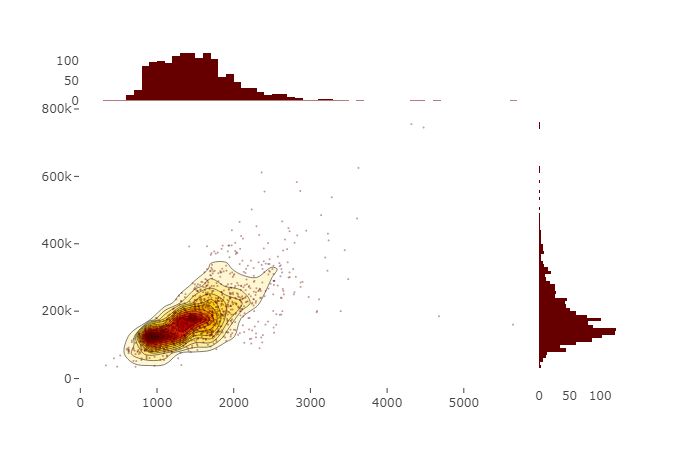
图15
异质性和分层
继续探索SalePrice和GrLivArea之间的关系,按BldgType进行分层。
trace0 = go.Scatter(x=df.loc[df['BldgType'] == '1Fam']['GrLivArea'], y=df.loc[df['BldgType'] == '1Fam']['SalePrice'], mode='markers', name='1Fam')trace1 = go.Scatter(x=df.loc[df['BldgType'] == 'TwnhsE']['GrLivArea'], y=df.loc[df['BldgType'] == 'TwnhsE']['SalePrice'], mode='markers', name='TwnhsE')trace2 = go.Scatter(x=df.loc[df['BldgType'] == 'Duplex']['GrLivArea'], y=df.loc[df['BldgType'] == 'Duplex']['SalePrice'], mode='markers', name='Duplex')trace3 = go.Scatter(x=df.loc[df['BldgType'] == 'Twnhs']['GrLivArea'], y=df.loc[df['BldgType'] == 'Twnhs']['SalePrice'], mode='markers', name='Twnhs')trace4 = go.Scatter(x=df.loc[df['BldgType'] == '2fmCon']['GrLivArea'], y=df.loc[df['BldgType'] == '2fmCon']['SalePrice'], mode='markers', name='2fmCon') fig = tools.make_subplots(rows=2, cols=3) fig.append_trace(trace0, 1, 1)fig.append_trace(trace1, 1, 2)fig.append_trace(trace2, 1, 3)fig.append_trace(trace3, 2, 1)fig.append_trace(trace4, 2, 2) fig['layout'].update(height=400, width=800, + ' by building type')py.iplot(fig)
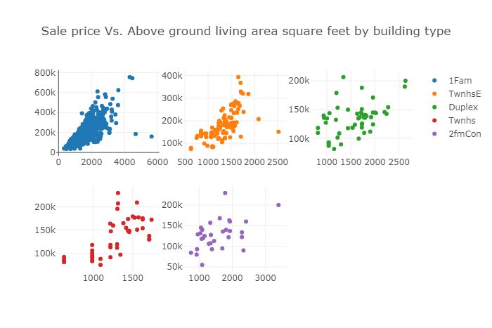
图16
在几乎所有建筑类型中,SalePrice和GrLivArea显示出正线性关系。在下面的结果中,看到SalefPrice和GrLivArea在1Fam建筑类型中的相关性最高,为0.74,而在Duplex建筑类型中,相关性最低,为0.49。
print(df.loc[df.BldgType=="1Fam", ["GrLivArea", "SalePrice"]].corr())print(df.loc[df.BldgType=="TwnhsE", ["GrLivArea", "SalePrice"]].corr())print(df.loc[df.BldgType=='Duplex', ["GrLivArea", "SalePrice"]].corr())print(df.loc[df.BldgType=="Twnhs", ["GrLivArea", "SalePrice"]].corr())print(df.loc[df.BldgType=="2fmCon", ["GrLivArea", "SalePrice"]].corr())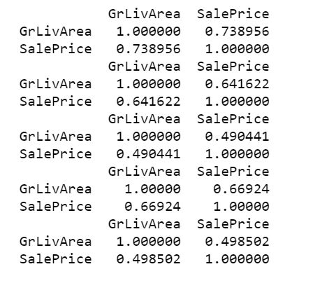
表10
分类双变量分析
创建一个列联表,计算由建筑类型和一般分区分类组合定义的每个单元中的房屋数量。
x = pd.crosstab(df.MSZoning, df.BldgType)X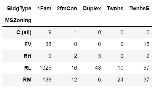
表11
下面在行内标准化。这提供了属于每个建筑类型变量的每个分区分类中的房屋比例。
x.apply(lambda z: z/z.sum(), axis=1)
表12
也可以在列内标准化。这提供了每种建筑类型中属于每个分区分类的房屋比例。
x.apply(lambda z: z/z.sum(), axis=0)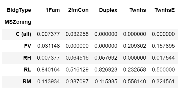
表13
更进一步,将查看每个分区类别中房屋的比例,以及空调和建筑类型变量的每个组合。
df.groupby(["CentralAir", "BldgType", "MSZoning"]).size().unstack().fillna(0).apply(lambda x: x/x.sum(), axis=1)
表14
数据中房屋的比例最高的是分区RL,空调和1Fam建筑类型。没有空调,最高比例的房屋是分区RL和双层建筑类型。
混合的分类和定量数据
为了获得更好的体验,将绘制一个小提琴图,以显示SalePrice在每个建筑类型类别中的分布情况。
data = []for i in range(0,len(pd.unique(df['BldgType']))): trace = { "type": 'violin', "x": df['BldgType'][df['BldgType'] == pd.unique(df['BldgType'])[i]], "y": df['SalePrice'][df['BldgType'] == pd.unique(df['BldgType'])[i]], "name": pd.unique(df['BldgType'])[i], "box": { "visible": True }, "meanline": { "visible": True } } data.append(trace) fig = { "data": data, "layout" : { "title": "", "yaxis": { "zeroline": False, } }}

图17
可以看到1Fam建筑类型的SalesPrice分布略微偏右,而对于其他建筑类型,SalePrice分布几乎正常。
这篇文章的Jupyter笔记本可以在Github上找到,并且还有一个nbviewer版本。
https://github.com/susanli2016/Machine-Learning-with-Python/blob/master/Practical%20Statistics%20House%20Python_update.ipynb
https://nbviewer.jupyter.org/github/susanli2016/Machine-Learning-with-Python/blob/master/Practical%20Statistics%20House%20Python_update.ipynb
参考
https://www.coursera.org/specializations/statistics-with-python?
推荐阅读
使用Dash和Plotly进行交互式可视化

关于图书
《深度学习之TensorFlow:入门、原理与进阶实战》和《Python带我起飞——入门、进阶、商业实战》两本图书是代码医生团队精心编著的 AI入门与提高的精品图书。配套资源丰富:配套视频、QQ读者群、实例源码、 配套论坛:http://bbs.aianaconda.com 。更多请见:https://www.aianaconda.com


 1584
1584


 被折叠的 条评论
为什么被折叠?
被折叠的 条评论
为什么被折叠?
 到【灌水乐园】发言


