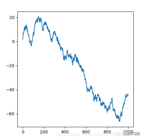
import matplotlib.pylab as pltimport seaborn as snsimport numpy as npnp.random.seed(0) my_dpi=96plt.figure(figsize=(480/my_dpi, 480/my_dpi), dpi=my_dpi) values=np.cumsum(np.random.randn(1000,1))plt.plot(values)plt.show()
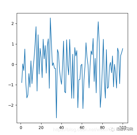
import matplotlib.pylab as pltimport seaborn as snsimport numpy as npimport pandas as pddf=pd.DataFrame({'xvalues': range(1,101), 'yvalues': np.random.randn(100) })my_dpi=96plt.figure(figsize=(480/my_dpi, 480/my_dpi), dpi=my_dpi) plt.plot( 'xvalues', 'yvalues', data=df)plt.show()
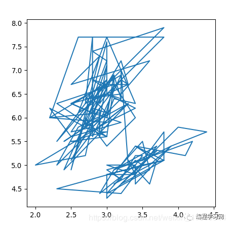
import matplotlib.pylab as pltimport seaborn as snsimport numpy as npimport pandas as pddf = sns.load_dataset('iris')my_dpi=96plt.figure(figsize=(480/my_dpi, 480/my_dpi), dpi=my_dpi) plt.plot( 'sepal_width', 'sepal_length', data=df)plt.show()
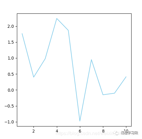
import matplotlib.pylab as pltimport seaborn as snsimport numpy as npimport pandas as pdnp.random.seed(0)df=pd.DataFrame({'x': range(1,11), 'y': np.random.randn(10) })my_dpi=96plt.figure(figsize=(480/my_dpi, 480/my_dpi), dpi=my_dpi) plt.plot( 'x', 'y', data=df, color='skyblue')plt.show()
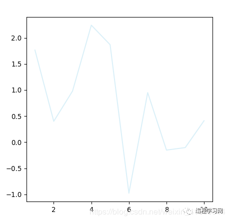
import matplotlib.pylab as pltimport seaborn as snsimport numpy as npimport pandas as pdnp.random.seed(0)df=pd.DataFrame({'x': range(1,11), 'y': np.random.randn(10) })my_dpi=96plt.figure(figsize=(480/my_dpi, 480/my_dpi), dpi=my_dpi) plt.plot( 'x', 'y', data=df, color='skyblue', alpha=0.3)plt.show()
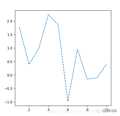
import matplotlib.pylab as pltimport seaborn as snsimport numpy as npimport pandas as pdnp.random.seed(0)df=pd.DataFrame({'x': range(1,11), 'y': np.random.randn(10) })my_dpi=96plt.figure(figsize=(480/my_dpi, 480/my_dpi), dpi=my_dpi) plt.plot( 'x', 'y', data=df, linestyle='dashed')plt.show()
import matplotlib.pylab as pltimport seaborn as snsimport numpy as npimport pandas as pdnp.random.seed(0)df=pd.DataFrame({'x': range(1,11), 'y': np.random.randn(10) })my_dpi=96plt.figure(figsize=(480/my_dpi, 480/my_dpi), dpi=my_dpi) plt.plot( [1,1.1,1,1.1,1], linestyle='-' , linewidth=4)plt.text(1.5, 1.3, "linestyle = '-' ", horizontalalignment='left', size='medium', color='C0', weight='semibold')plt.plot( [2,2.1,2,2.1,2], linestyle='--' , linewidth=4 )plt.text(1.5, 2.3, "linestyle = '--' ", horizontalalignment='left', size='medium', color='C1', weight='semibold')plt.plot( [3,3.1,3,3.1,3], linestyle='-.' , linewidth=4 )plt.text(1.5, 3.3, "linestyle = '-.' ", horizontalalignment='left', size='medium', color='C2', weight='semibold')plt.plot( [4,4.1,4,4.1,4], linestyle=':' , linewidth=4 )plt.text(1.5, 4.3, "linestyle = ':' ", horizontalalignment='left', size='medium', color='C3', weight='semibold')plt.axis('off')plt.show()

import matplotlib.pylab as pltimport seaborn as snsimport numpy as npimport pandas as pdnp.random.seed(0)df=pd.DataFrame({'x': range(1,11), 'y': np.random.randn(10) })my_dpi=96plt.figure(figsize=(480/my_dpi, 480/my_dpi), dpi=my_dpi) plt.plot( 'x', 'y', data=df, linewidth=22)plt.show()

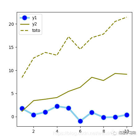
import matplotlib.pylab as pltimport seaborn as snsimport numpy as npimport pandas as pdnp.random.seed(0)df=pd.DataFrame({'x': range(1,11), 'y1': np.random.randn(10), 'y2': np.random.randn(10)+range(1,11), 'y3': np.random.randn(10)+range(11,21) })my_dpi=96plt.figure(figsize=(480/my_dpi, 480/my_dpi), dpi=my_dpi) plt.plot( 'x', 'y1', data=df, marker='o', markerfacecolor='blue', markersize=12, color='skyblue', linewidth=4)plt.plot( 'x', 'y2', data=df, marker='', color='olive', linewidth=2)plt.plot( 'x', 'y3', data=df, marker='', color='olive', linewidth=2, linestyle='dashed', label="toto")plt.legend()plt.show()
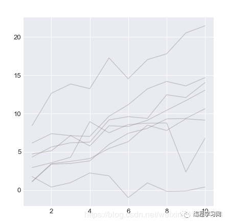
import matplotlib.pylab as pltimport seaborn as snsimport numpy as npimport pandas as pdnp.random.seed(0)df=pd.DataFrame({'x': range(1,11), 'y1': np.random.randn(10), 'y2': np.random.randn(10)+range(1,11), 'y3': np.random.randn(10)+range(11,21), 'y4': np.random.randn(10)+range(6,16), 'y5': np.random.randn(10)+range(4,14)+(0,0,0,0,0,0,0,-3,-8,-6), 'y6': np.random.randn(10)+range(2,12), 'y7': np.random.randn(10)+range(5,15), 'y8': np.random.randn(10)+range(4,14) })plt.style.use('seaborn-darkgrid')my_dpi=96plt.figure(figsize=(480/my_dpi, 480/my_dpi), dpi=my_dpi) for column in df.drop('x', axis=1): plt.plot(df['x'], df[column], marker='', color='grey', linewidth=1, alpha=0.4)plt.show()
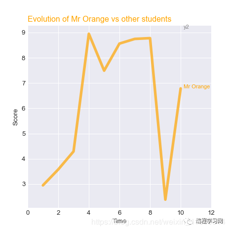
import matplotlib.pylab as pltimport seaborn as snsimport numpy as npimport pandas as pdnp.random.seed(0)df=pd.DataFrame({'x': range(1,11), 'y1': np.random.randn(10), 'y2': np.random.randn(10)+range(1,11), 'y3': np.random.randn(10)+range(11,21), 'y4': np.random.randn(10)+range(6,16), 'y5': np.random.randn(10)+range(4,14)+(0,0,0,0,0,0,0,-3,-8,-6), 'y6': np.random.randn(10)+range(2,12), 'y7': np.random.randn(10)+range(5,15), 'y8': np.random.randn(10)+range(4,14) })plt.style.use('seaborn-darkgrid')my_dpi=96plt.figure(figsize=(480/my_dpi, 480/my_dpi), dpi=my_dpi) plt.plot(df['x'], df['y5'], marker='', color='orange', linewidth=4, alpha=0.7)# 设置x轴长度plt.xlim(0,12) num=0for i in df.values[9][1:]: num+=1 name=list(df)[num] if name != 'y5': plt.text(10.2, i, name, horizontalalignment='left', size='small', color='grey') # 添加感兴趣的注释plt.text(10.2, df.y5.tail(1), 'Mr Orange', horizontalalignment='left', size='small', color='orange') # 添加标题plt.title("Evolution of Mr Orange vs other students", loc='left', fontsize=12, fontweight=0, color='orange')plt.xlabel("Time")plt.ylabel("Score")plt.show()
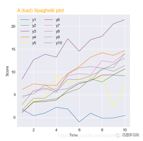
import matplotlib.pylab as pltimport seaborn as snsimport numpy as npimport pandas as pdnp.random.seed(0)df=pd.DataFrame({'x': range(1,11), 'y1': np.random.randn(10), 'y2': np.random.randn(10)+range(1,11), 'y3': np.random.randn(10)+range(11,21), 'y4': np.random.randn(10)+range(6,16), 'y5': np.random.randn(10)+range(4,14)+(0,0,0,0,0,0,0,-3,-8,-6), 'y6': np.random.randn(10)+range(2,12), 'y7': np.random.randn(10)+range(5,15), 'y8': np.random.randn(10)+range(4,14), 'y9': np.random.randn(10)+range(4,14), 'y10': np.random.randn(10)+range(2,12) }) plt.style.use('seaborn-darkgrid')my_dpi=96plt.figure(figsize=(480/my_dpi, 480/my_dpi), dpi=my_dpi) palette = plt.get_cmap('Set1')num=0for column in df.drop('x', axis=1): num+=1 plt.plot(df['x'], df[column], marker='', color=palette(num), linewidth=1, alpha=0.9, label=column) # 添加图例plt.legend(loc=2, ncol=2) plt.title("A (bad) Spaghetti plot", loc='left', fontsize=12, fontweight=0, color='orange')plt.xlabel("Time")plt.ylabel("Score")plt.show()
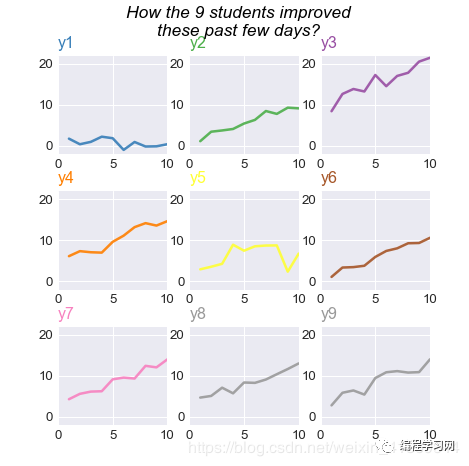
import matplotlib.pylab as pltimport seaborn as snsimport numpy as npimport pandas as pddf=pd.DataFrame({'x': range(1,11), 'y1': np.random.randn(10), 'y2': np.random.randn(10)+range(1,11), 'y3': np.random.randn(10)+range(11,21), 'y4': np.random.randn(10)+range(6,16), 'y5': np.random.randn(10)+range(4,14)+(0,0,0,0,0,0,0,-3,-8,-6), 'y6': np.random.randn(10)+range(2,12), 'y7': np.random.randn(10)+range(5,15), 'y8': np.random.randn(10)+range(4,14), 'y9': np.random.randn(10)+range(4,14) }) plt.style.use('seaborn-darkgrid')my_dpi=96plt.figure(figsize=(480/my_dpi, 480/my_dpi), dpi=my_dpi) palette = plt.get_cmap('Set1')num=0for column in df.drop('x', axis=1): num+=1 plt.subplot(3,3, num) plt.plot(df['x'], df[column], marker='', color=palette(num), linewidth=1.9, alpha=0.9, label=column) plt.xlim(0,10) plt.ylim(-2,22) if num in range(7) : plt.tick_params(labelbottom='off') if num not in [1,4,7] : plt.tick_params(labelleft='off') plt.title(column, loc='left', fontsize=12, fontweight=0, color=palette(num) ) # 标题plt.suptitle("How the 9 students improved\nthese past few days?", fontsize=13, fontweight=0, color='black', style='italic', y=1.02) plt.show()
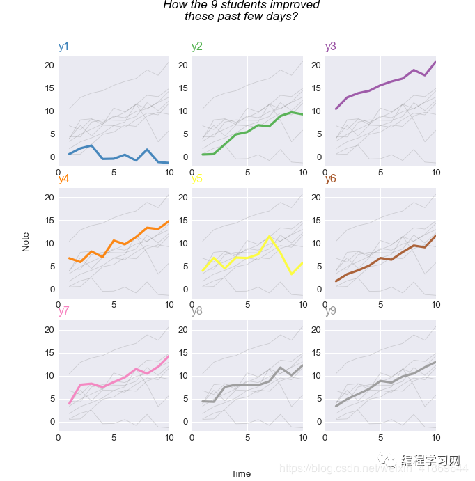
import matplotlib.pyplot as pltimport numpy as npimport pandas as pd df=pd.DataFrame({'x': range(1,11), 'y1': np.random.randn(10), 'y2': np.random.randn(10)+range(1,11), 'y3': np.random.randn(10)+range(11,21), 'y4': np.random.randn(10)+range(6,16), 'y5': np.random.randn(10)+range(4,14)+(0,0,0,0,0,0,0,-3,-8,-6), 'y6': np.random.randn(10)+range(2,12), 'y7': np.random.randn(10)+range(5,15), 'y8': np.random.randn(10)+range(4,14), 'y9': np.random.randn(10)+range(4,14) }) plt.style.use('seaborn-darkgrid')my_dpi=96fig=plt.figure(figsize=(700/my_dpi, 700/my_dpi), dpi=my_dpi) palette = plt.get_cmap('Set1') num=0for column in df.drop('x', axis=1): num+=1 plt.subplot(3,3, num) for v in df.drop('x', axis=1): plt.plot(df['x'], df[v], marker='', color='grey', linewidth=0.6, alpha=0.3) plt.plot(df['x'], df[column], marker='', color=palette(num), linewidth=2.4, alpha=0.9, label=column) plt.xlim(0,10) plt.ylim(-2,22) if num in range(7) : plt.tick_params(labelbottom='off') if num not in [1,4,7] : plt.tick_params(labelleft='off') plt.title(column, loc='left', fontsize=12, fontweight=0, color=palette(num) ) plt.suptitle("How the 9 students improved\nthese past few days?", fontsize=13, fontweight=0, color='black', style='italic', y=1.02) fig.text(0.5, 0.02, 'Time', ha='center', va='center')fig.text(0.06, 0.5, 'Note', ha='center', va='center', rotation='vertical')plt.show()
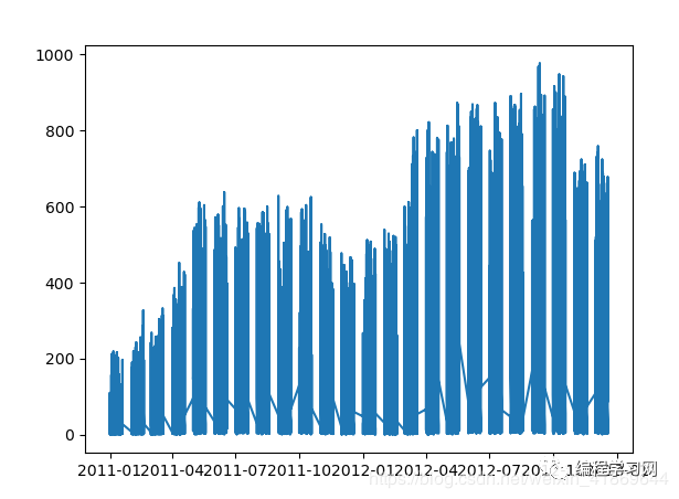
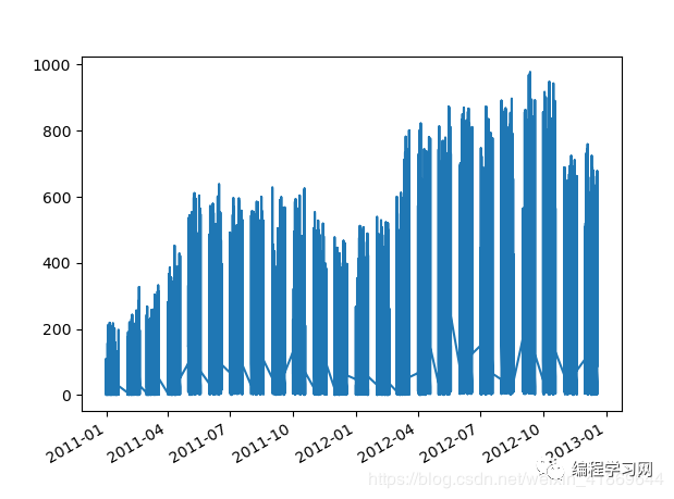
import matplotlib.pyplot as pltimport numpy as npimport seaborn as snsimport pandas as pd # https://www.kaggle.com/c/bike-sharing-demand/datadf = pd.read_csv('http://python-graph-gallery.com/wp-content/uploads/bike.csv', sep=",", index_col=0, parse_dates=True) df['weekday'] = df.index.weekdaydf['hour'] = df.index.hourdf['year'] = df.index.yeardf['date'] = df.index.date plt.plot(df['date'], df['count']) fig, ax = plt.subplots(1)x.plot(df['date'], df['count']) fig.autofmt_xdate()plt.show()


 763
763


 被折叠的 条评论
为什么被折叠?
被折叠的 条评论
为什么被折叠?
 到【灌水乐园】发言


