flutter text 左对齐_Flutter 常用布局详解(更新...)

Flutter 项目中常用的布局详情,及封装和使用,快速开发项目.

以及手势事件和滚动事件的使用

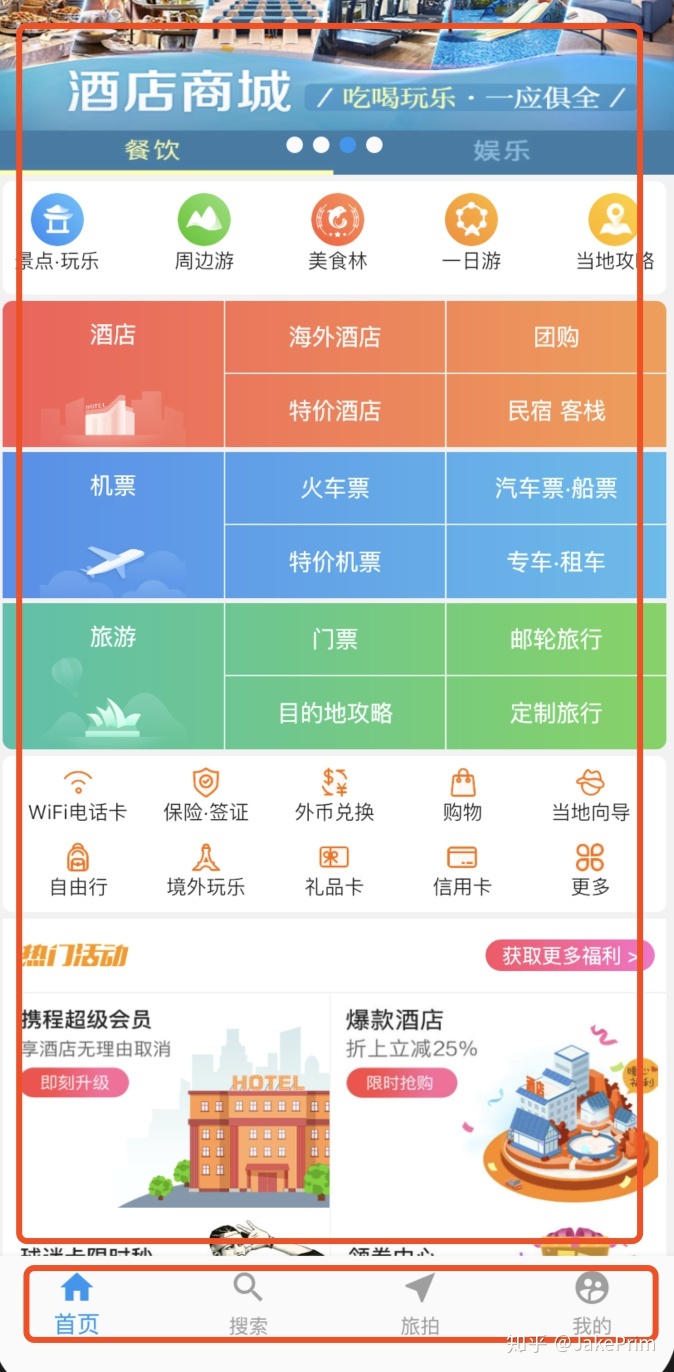
Scaffold 导航栏的实现,有些路由页可能会有抽屉菜单(Drawer)以及底部Tab导航菜单等

const Scaffold({
    Key key,
    this.appBar,//标题栏
    this.body,//内容
    this.floatingActionButton,//悬浮按钮
    this.persistentFooterButtons,//底部持久化现实按钮
    this.drawer,//侧滑菜单左
    this.endDrawer,//侧滑菜单右
    this.bottomNavigationBar,//底部导航
    this.backgroundColor,//背景颜色
    this.resizeToAvoidBottomPadding: true,//自动适应底部padding
    this.primary: true,//使用primary主色
  })

Flutter 中自带的material样式的标题栏,首先看一下AppBar具有哪些属性,代码如下:

AppBar({
    Key key,
    this.leading,//主导Widget
    this.automaticallyImplyLeading: true,
    this.title,//标题
    this.actions,//其他附加功能
    this.flexibleSpace,//伸缩空间,显示在title上面
    this.bottom,//显示在title下面
    this.elevation: 4.0,//阴影高度
    this.backgroundColor,//背景颜色
    this.brightness,//明暗模式
    this.iconTheme,//icon主题
    this.textTheme,//text主题
    this.primary: true,//是否是用primary
    this.centerTitle,//标题是否居中
    this.titleSpacing: NavigationToolbar.kMiddleSpacing,//title与leading的间隔
    this.toolbarOpacity: 1.0,//title级文字透明度
    this.bottomOpacity: 1.0,//底部文字透明度
  })

悬浮button 属性详解

const FloatingActionButton({
    Key key,
    this.child,//button的显示样式
    this.tooltip,//提示,长按按钮提示文字
    this.backgroundColor,//背景颜色
    this.heroTag: const _DefaultHeroTag(),//页面切换动画Tag
    this.elevation: 6.0,//阴影
    this.highlightElevation: 12.0,//高亮阴影
    @required this.onPressed,//点击事件
    this.mini: false//是否使用小图标
  })

底部导航栏BottomNavigationBar的实现,与经常搭配的PageView实现项目中常用的tab切换

d12ce346425c6b6ccde23c54a2c1956a.png
Scaffold(
      body: PageView(
        controller: _controller,
        children: <Widget>[//page的页面
          HomePage(),
          SearchPage(),
          TravelPage(),
          MinePage(),
        ],
        onPageChanged: (int index) {//滑动page的监听
          setState(() {//改变tab状态
            _controllerIndex = index;
          });
        },
      ),
      bottomNavigationBar: BottomNavigationBar(
          currentIndex: _controllerIndex, //当前的index
          onTap: (index) {//点击tab
            _controller.jumpToPage(index); //跳转到具体的页面
            //注意改变_controllerIndex的状态
            setState(() {
              _controllerIndex = index;
            });
          },
          type: BottomNavigationBarType.fixed,//固定
          items: [//底部tab图片、字体及颜色
            homeItem(),
            searchItem(),
            travelItem(),
            mineItem(),
          ]),
    );

BottomNavigationBarItem的实现

BottomNavigationBarItem mineItem() {
  return BottomNavigationBarItem(
      icon: Icon(
        //定义默认状态下的图片以及颜色
        Icons.supervised_user_circle,
        color: _defaultColor,
      ),
      activeIcon: Icon(
        //定义选中状态下的图片以及颜色
        Icons.supervised_user_circle,
        color: _activityColor,
      ),
      title: Text(
        //定义文字
        '我的',
        style: TextStyle(
          color: _controllerIndex != 3 ? _defaultColor : _activityColor,
        ),
      ));
}

Container

Container({
    Key key,
    this.alignment,//内部widget对齐方式
    this.padding,//内边距
    Color color,//背景颜色,与decoration只能存在一个
    Decoration decoration,//背景装饰,与decoration只能存在一个
    this.foregroundDecoration//前景装饰,
    double width,//容器的宽
    double height,//容器的高
    BoxConstraints constraints//,
    this.margin,//外边距
    this.transform,//倾斜
    this.child,//子widget
})

alignment: 内部Widget对齐方式,左上对齐topLeft、垂直顶部对齐,水平居中对齐topCenter、右上topRight、垂直居中水平左对齐centerLeft、居中对齐center、垂直居中水平又对齐centerRight、底部左对齐bottomLeft、底部居中对齐bottomCenter、底部右对齐bottomRight

padding: 内间距,子Widget距Container的距离。

color: 背景颜色

decoration: 背景装饰

foregroundDecoration: 前景装饰

width:容器的宽

height:容器的高

constraints:容器宽高的约束,容器最终的宽高最终都要受到约束中定义的宽高影响

margin:容器外部的间隔

transform: Matrix4变换

child:内部子Widget

可以通过decoration装饰器实现圆角和边框,渐变等

decoration: BoxDecoration(
            border: Border(
                bottom:
                    BorderSide(width: 1, color: Color(0xfff2f2f2))), //设置底部分割线
          ),
          borderRadius: BorderRadius.circular(12), //设置圆角
                    gradient: LinearGradient(
                      colors: [
                        Color(0xffff4e63),
                        Color(0xffff6cc9),
                      ],
                      begin: Alignment.centerLeft,
                      end: Alignment.centerRight,
                    ), //
                    )

设置网络图片

Image.network(
                salesBoxModel.icon,
                fit: BoxFit.fill,
                height: 15,
              ),

设置行布局

Column({
    Key key,
    MainAxisAlignment mainAxisAlignment = MainAxisAlignment.start,//主轴X 排列方式
    MainAxisSize mainAxisSize = MainAxisSize.max,
    CrossAxisAlignment crossAxisAlignment = CrossAxisAlignment.center,//纵轴排列方式
    TextDirection textDirection,
    VerticalDirection verticalDirection = VerticalDirection.down,
    TextBaseline textBaseline,
    List<Widget> children = const <Widget>[],
  })

设置列布局

Row({
    Key key,
    MainAxisAlignment mainAxisAlignment = MainAxisAlignment.start,
    MainAxisSize mainAxisSize = MainAxisSize.max,
    CrossAxisAlignment crossAxisAlignment = CrossAxisAlignment.center,
    TextDirection textDirection,
    VerticalDirection verticalDirection = VerticalDirection.down,
    TextBaseline textBaseline,
    List<Widget> children = const <Widget>[],
  })

设置内边距Padding

Padding 也是一个Widget,它内部可以包裹一个Widget
Padding(
              padding: EdgeInsets.only(top: 10),
              child: Text(
                model.title,
                style: TextStyle(
                  fontSize: 14,
                  color: Colors.white,
                ),
              ),
            )

设置宽度/高度撑满父布局FractionallySizedBox

FractionallySizedBox({
    Key key,
    this.alignment = Alignment.center,
    this.widthFactor,//设置为1 则宽度撑满父布局
    this.heightFactor,//设置为1 则高度撑满父布局
    Widget child,//包裹的子Widget
  })

Expanded撑满整个界面

Expanded({
    Key key,
    int flex = 1,
    @required Widget child,
  })

Stack 可以理解为栈布局,先放入的显示在最下面,后放入的显示在上面,跟Android中的ReaviteLayout相似

Stack({
    Key key,
    this.alignment: AlignmentDirectional.topStart,//对齐方式
    this.textDirection,
    this.fit: StackFit.loose,//是否按照父类宽高处理自己大小
    this.overflow: Overflow.clip,//溢出处理方式
    List<Widget> children: const <Widget>[],
  })

我们可以用Stack来实现:请求网络中的时候,显示加载中的布局;请求网络成功后,隐藏加载中的布局,显示成功的布局. 自定义一个LoadingWidget,传递isLoading是否正在加载中,child加载成功后显示的布局.这样的好处就是我们可以在任何需要用到加载中的布局时,直接使用,统一管理.使用setState来改变isLoading,来实现状态的改变.

class LoadingWidget extends StatelessWidget {
  final bool isLoading;
  final bool cover;
  final Widget child;

  //required必须传递的参数
  const LoadingWidget(
      {Key key,
      @required this.isLoading,
      this.cover = false,
      @required this.child})
      : super(key: key);

  @override
  Widget build(BuildContext context) {
    return !cover
        ? !isLoading ? child : _loadingView
        : Stack(
            children: <Widget>[child, isLoading ? _loadingView : null],
          );
  }

  Widget get _loadingView {
    return Center(
      child: CircularProgressIndicator(), //圆形的进度条
    );
  }
}

看一个简单调用的例子.

class _HomePageState extends State<HomePage> {
bool isLoading = true;//默认是加载中的状态
 @override
  void initState() {
    super.initState();
    _handleRefresh();
  }

  Future<Null> _handleRefresh() async {
    try {
      HomeModel model = await HomeDao.fetch();
      setState(() {
        gridNavList = model.localNavList;
        girdModeList = model.gridNav;
        subNavList = model.subNavList;
        salesBoxModel = model.salesBox;
        bannerList = model.bannerList;
        isLoading = false;
      });
    } catch (e) {
      print(e.toString());
      setState(() {
        isLoading = false;
      });
    }
    return null;
  }

   @override
  Widget build(BuildContext context) {
    return Scaffold(
        backgroundColor: Color(0xfff2f2f2),
        body: LoadingWidget(//使用自定义的布局
          isLoading: isLoading,
          //加载成功后显示的View
          child: Stack(
          .......
          )
          )
          );
          }
}

当然,Stack还有很多其他的使用场景,可自行翻阅文档Stack

IndexedStack

只不过IndexedStack只显示指定位置的Widget,其他的位置的Widget不会显示。

PageView 类似Android中的ViewPage组件,他还可以实现底部导航栏的效果 Flutter官网PageView 首先看一下PageView有哪些属性,代码如下:

PageView({
    Key key,
    this.scrollDirection = Axis.horizontal,
    this.reverse = false,
    PageController controller,
    this.physics,
    this.pageSnapping = true,
    this.onPageChanged,
    List<Widget> children = const <Widget>[],
    this.dragStartBehavior = DragStartBehavior.down,
  }) : controller = controller ?? _defaultPageController,
       childrenDelegate = SliverChildListDelegate(children),
       super(key: key);

来看一下各个属性的意思 this.scrollDirection = Axis.horizontal,Axis.vertical//设置滚动方向 横向和竖向 pageSnapping true 带有阻力的滑动,如果设置为false滑动到哪就停止到哪 controller 页面控制器,通过调用jumpToPage 实现页面的跳转

BottomNavigationBar

BottomNavigationBar({
    Key key,
    @required this.items,
    this.onTap,//点击事件
    this.currentIndex = 0,//当前的位置
    BottomNavigationBarType type,//底部固定和隐藏类型
    this.fixedColor,
    this.iconSize = 24.0,//图片的大小
  })

final List<BottomNavigationBarItem> items;

BottomNavigationBarItem 定义底部的icon 选中的icon 文字

const BottomNavigationBarItem({
    @required this.icon,
    this.title,
    Widget activeIcon,
    this.backgroundColor,
  }) : activeIcon = activeIcon ?? icon,
       assert(icon != null);

底部固定

enum BottomNavigationBarType {
  /// The [BottomNavigationBar]'s [BottomNavigationBarItem]s have fixed width, always
  /// display their text labels, and do not shift when tapped.
  fixed,

  /// The location and size of the [BottomNavigationBar] [BottomNavigationBarItem]s
  /// animate and labels fade in when they are tapped. Only the selected item
  /// displays its text label.
  shifting,
}

手势事件GestureDetector

GestureDetector 手势监听,它可以包裹任何Widget并处理包裹Widget的点击、滑动、双击等事件, GestureDetector extends StatelessWidget 可以直接return Widget

来看一个Widget触发点击事件的例子

GestureDetector(
            onTap: () {
              CommonModel model = bannerList[index];
              Navigator.push(
                  context,
                  MaterialPageRoute(
                      builder: (context) => WebView(
                            url: model.url,
                            title: model.title,
                            statusBarColor: model.statusBarColor,
                            hideAppBar: model.hideAppBar,
                          )));
            },
            child: Image.network(bannerList[index].icon,
                fit: BoxFit.fill), //加载网络图片,
          );

另外关于其他的双击、滑动等事件可自行翻阅文档.GestureDetector

滚动事件NotificationListener

NotificationListener 可用于监听所有Widget的滚动事件,不管使用何种Widget都可以很方便的进行处理
NotificationListener(
                      //滚动监听 list view
                      onNotification: (scrollNotification) {
                        //监听滚动的距离ScrollUpdateNotification 滚动时在进行回调
                        if (scrollNotification is ScrollUpdateNotification &&
                            scrollNotification.depth == 0) {
                          //只检测listview的滚动第0个元素widget时候才开始滚动
                          _scroll(scrollNotification.metrics.pixels);
                        }
                      },
                      child: _buildListView,
                    ),
  • 0
    点赞
  • 2
    收藏
    觉得还不错? 一键收藏
  • 0
    评论

“相关推荐”对你有帮助么?

  • 非常没帮助
  • 没帮助
  • 一般
  • 有帮助
  • 非常有帮助
提交
评论
添加红包

请填写红包祝福语或标题

红包个数最小为10个

红包金额最低5元

当前余额3.43前往充值 >
需支付:10.00
成就一亿技术人!
领取后你会自动成为博主和红包主的粉丝 规则
hope_wisdom
发出的红包
实付
使用余额支付
点击重新获取
扫码支付
钱包余额 0

抵扣说明:

1.余额是钱包充值的虚拟货币,按照1:1的比例进行支付金额的抵扣。
2.余额无法直接购买下载,可以购买VIP、付费专栏及课程。

余额充值