


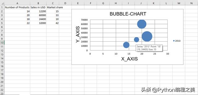
代码1:绘制气泡图。
气泡图类似于散点图,但使用第三维来确定气泡的大小。 图表可以包括多个系列。
要在Excel工作表上绘制气泡图,请使用openpyxl.chart子模块中的BubbleChart类。
代码演示:
# import openpyxl module import openpyxl # import BubbleChart, Reference, Series class # from openpyxl.chart sub_module from openpyxl.chart import BubbleChart, Reference, Series # Call a Workbook() function of openpyxl # to create a new blank Workbook object wb = openpyxl.Workbook() # Get workbook active sheet # from the active attribute. sheet = wb.active rows = [ ("Number of Products", "Sales in USD", "Market share"), (14, 12200, 15), (20, 60000, 33), (18, 24400, 10), (22, 32000, 42), ] # write content of each row in 1st, 2nd and 3rd # column of the active sheet respectively. for row in rows: sheet.append(row) # Create object of BubbleChart class chart = BubbleChart() # create data for plotting xvalues = Reference(sheet, min_col = 1, min_row = 2, max_row = 5) yvalues = Reference(sheet, min_col = 2, min_row = 2, max_row = 5) size = Reference(sheet, min_col = 3, min_row = 2, max_row = 5) # create a 1st series of data series = Series(values = yvalues, xvalues = xvalues, zvalues = size, title ="2013") # add series data to the chart object chart.series.append(series) # set the title of the chart chart.title = " BUBBLE-CHART "# set the title of the x-axis chart.x_axis.title = " X_AXIS "# set the title of the y-axis chart.y_axis.title = " Y_AXIS "# add chart to the sheet # the top-left corner of a chart # is anchored to cell E2 . sheet.add_chart(chart, "E2") # save the file wb.save("bubbleChart.xlsx") 输出:
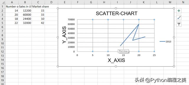
代码2:绘制散点图
散点图或xy图表类似于某些折线图。 要在Excel工作表上绘制散点图,请使用openpyxl.chart子模块中的ScatterChart类。
代码演示:
# import openpyxl module import openpyxl # import ScatterChart, Reference, Series # class from openpyxl.chart sub_module from openpyxl.chart import ScatterChart, Reference, Series # Call a Workbook() function of openpyxl # to create a new blank Workbook object wb = openpyxl.Workbook() # Get workbook active sheet # from the active attribute. sheet = wb.active rows = [ ("Number of Products", "Sales in USD", "Market share"), (14, 12200, 15), (20, 60000, 33), (18, 24400, 10), (22, 32000, 42), ] # write content of each row in 1st, 2nd and 3rd # column of the active sheet respectively . for row in rows: sheet.append(row) # Create object of ScatterChart class chart = ScatterChart() # create data for plotting xvalues = Reference(sheet, min_col = 1, min_row = 2, max_row = 5) yvalues = Reference(sheet, min_col = 2, min_row = 2, max_row = 5) size = Reference(sheet, min_col = 3, min_row = 2, max_row = 5) # create a 1st series of data series = Series(values = yvalues, xvalues = xvalues, zvalues = size, title ="2013") # add series data to the chart object chart.series.append(series) # set the title of the chart chart.title = " SCATTER-CHART "# set the title of the x-axis chart.x_axis.title = " X_AXIS "# set the title of the y-axis chart.y_axis.title = " Y_AXIS "# add chart to the sheet # the top-left corner of a chart # is anchored to cell E2 . sheet.add_chart(chart, "E2") # save the file wb.save(" ScatterChart.xlsx") 输出:
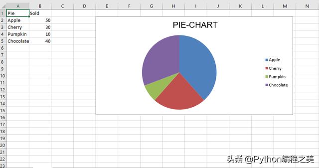
代码3:绘制饼图
饼图将数据绘制为一个圆的切片,每个切片代表整个百分比。 切片按顺时针方向绘制,圆的顶部为0°。 饼图只能获取一系列数据。
要在Excel工作表上绘制饼图,请使用openpyxl.chart子模块中的PieChart类。
代码演示:
# import openpyxl module import openpyxl # import PieChart, Reference class # from openpyxl.chart sub_module from openpyxl.chart import PieChart, Reference # Call a Workbook() function of openpyxl # to create a new blank Workbook object wb = openpyxl.Workbook() # Get workbook active sheet # from the active attribute. sheet = wb.active datas = [ ['Pie', 'Sold'], ['Apple', 50], ['Cherry', 30], ['Pumpkin', 10], ['Chocolate', 40], ] # write content of each row in 1st, 2nd and 3rd # column of the active sheet respectively . for row in datas: sheet.append(row) # Create object of PieChart class chart = PieChart() # create data for plotting labels = Reference(sheet, min_col = 1, min_row = 2, max_row = 5) data = Reference(sheet, min_col = 2, min_row = 1, max_row = 5) # adding data to the Pie chart object chart.add_data(data, titles_from_data = True) # set labels in the chart object chart.set_categories(labels) # set the title of the chart chart.title = " PIE-CHART "# add chart to the sheet # the top-left corner of a chart # is anchored to cell E2 . sheet.add_chart(chart, "E2") # save the file wb.save(" PieChart.xlsx") 输出:
代码4:绘制条形图
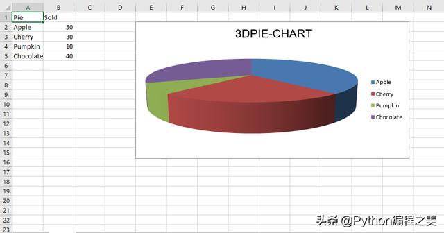
要在Excel工作表上绘制3D饼图,请使用openpyxl.chart子模块中的PieChart3D类。
代码演示:
# import openpyxl module import openpyxl # import PieChart3D, Reference class # from openpyxl.chart sub_module from openpyxl.chart import PieChart3D, Reference # Call a Workbook() function of openpyxl # to create a new blank Workbook object wb = openpyxl.Workbook() # Get workbook active sheet # from the active attribute. sheet = wb.active datas = [ ['Pie', 'Sold'], ['Apple', 50], ['Cherry', 30], ['Pumpkin', 10], ['Chocolate', 40], ] # write content of each row in 1st, 2nd and 3rd # column of the active sheet respectively . for row in datas: sheet.append(row) # Create object of PiChart3D class chart = PieChart3D() # create data for plotting labels = Reference(sheet, min_col = 1, min_row = 2, max_row = 5) data = Reference(sheet, min_col = 2, min_row = 1, max_row = 5) # adding data to the Pie chart object chart.add_data(data, titles_from_data = True) # set labels in the chart object chart.set_categories(labels) # set the title of the chart chart.title = " 3DPIE-CHART "# add chart to the sheet # the top-left corner of a chart # is anchored to cell E2 . sheet.add_chart(chart, "E2") # save the file wb.save(" 3DPieChart.xlsx") 输出:


 1137
1137


 被折叠的 条评论
为什么被折叠?
被折叠的 条评论
为什么被折叠?
 到【灌水乐园】发言


