


传统的布局解决方案,在处理一些特殊的布局方式时,非常繁琐,比如垂直居中实现起来就很不方便。而Flex在布局方面能给开发者带来极大的便利。
Flex,Flexible Box的缩写,意为:弹性布局。
任何一个容器都可以定义为 flex布局。
.box{
display: flex;
}
1
2
3
4
.box{
display:flex;
}
行内元素也可以定义为flex
span{
display: inline-flex;
}
1
2
3
4
span{
display:inline-flex;
}
webkit内核的浏览器,必须加上 -webkit 前缀。更多flex兼容性问题
.box{
display: -webkit-flex; /* Safari*/
display: flex;
}
1
2
3
4
5
.box{
display:-webkit-flex;/* Safari*/
display:flex;
}
设置为 Flex 布局后,子元素 的 float 、 clear 、 vertical-align 属性会失效。
基本概念
采用 flex 布局的元素,称为 Flex容器,
它的所有子元素自动成为容器成员,称为 Flex项目,即:flex item
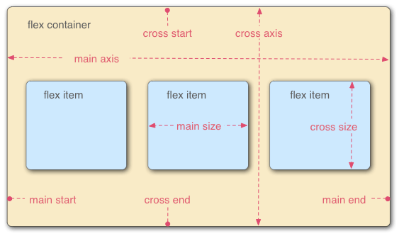
容器默认存在2根轴,水平的主轴(main axis)和 垂直的交叉轴(cross axis)
主轴的开始位置main start; 结束位置main end
交叉轴的开始位置cross start; 结束位置cross end
项目默认沿主轴排列,单个项目占据的主轴空间叫做main size,占据的交叉轴空间叫cross size
容器的属性
flex-direction
flex-wrap
flex-flow
justify-content
align-items
align-content
flex-direction
flex-direction: 决定主轴的方向,即:项目的排列方向。
flex-direction: row; 默认值,主轴为水平方向,起点在左端。
flex-direction: row-reverse; 主轴为水平方向,起点在右侧。
flex-direction: column; 主轴为垂直方向,起点在上沿。
flex-direction: column-reverse; 主轴为垂直方向,起点在底部。

flex-wrap
flex-wrap,默认情况下,项目都排在一条轴线上。flex-wrap 定义,如果一条轴线排不下,如何换行。
flex-wrap: nowrap; 默认值,不换行。

flex-wrap: wrap;

flex-wrap: wrap-reverse;

flex-flow
flex-flow 是 flex-direction 和 flex-wrap 的简写形式。默认值为:row nowrap
.box {
flex-flow: || ;
}
.wenlie{
width: 100px;
height: 50px;
display: flex;
flex-flow: row-reverse nowrap;
}
1
2
3
4
5
6
7
8
9
10
11
.box{
flex-flow:||;
}
.wenlie{
width:100px;
height:50px;
display:flex;
flex-flow:row-reversenowrap;
}
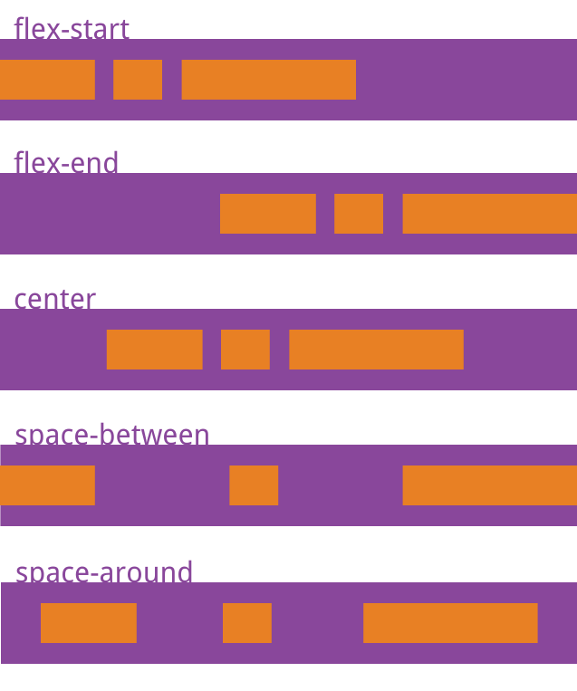
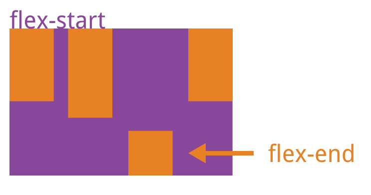
justify-content
定义项目在主轴上的对齐方式。
justify-content: flex-start | flex-end | center | space-between | space-around
具体对齐方式与主轴的方向有关。
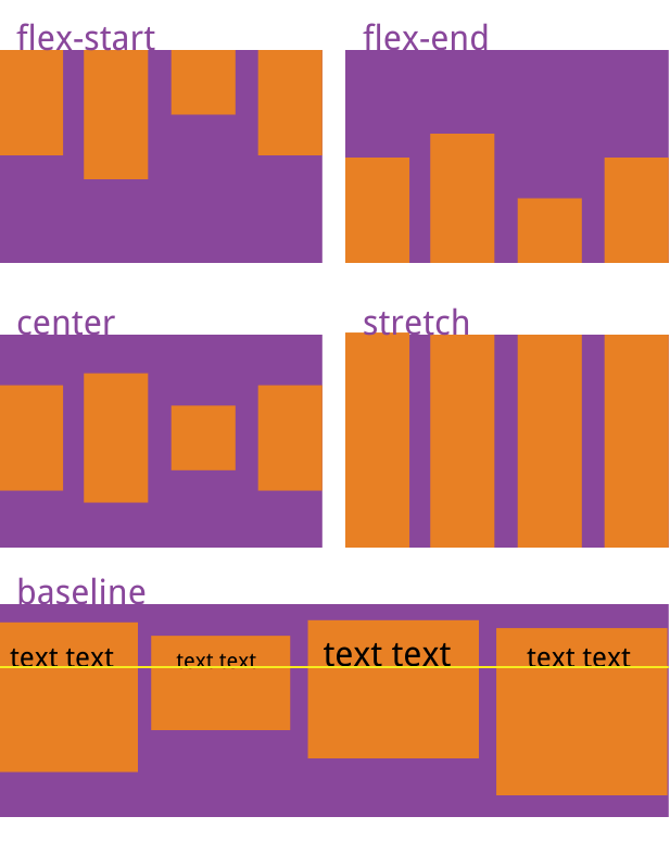
align-items
定义项目在交叉轴上的对齐方式。
align-items: flex-start | flex-end | center | baseline | stretch(默认值);
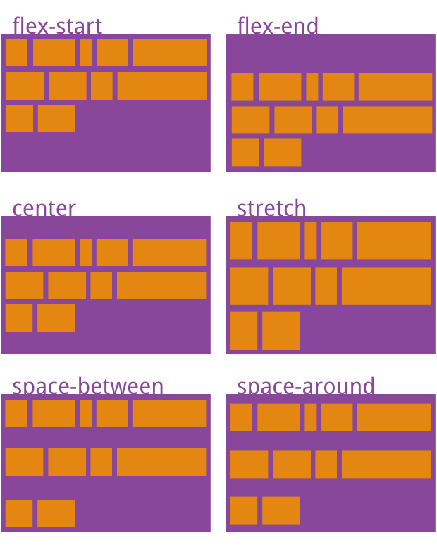
align-content
定义多根轴线的对齐方式。如果只有一根轴线,则,该属性无效。
align-content: flex-start | flex-end | center | space-between | space-around | stretch;
项目的属性
项目属性,一共6个:order, flex-grow, flex-shrink, flex-basis, flex, align-self
order
定义项目的排列顺序。数值越小,排名越靠前,默认:0
.item{
order: 0;
}
1
2
3
4
.item{
order:0;
}
flex-grow
定义项目的放大比例,默认为 0,0的时候,即使存在剩余空间,也不放大。
.item{
flex-grow: 0;
}
1
2
3
4
.item{
flex-grow:0;
}
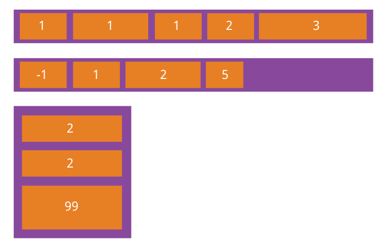
如果所有项目的flex-grow属性都为1,则它们将等分剩余空间(如果有的话)。
如果一个项目的flex-grow属性为2,其他项目都为1,则前者占据的剩余空间将比其他项多一倍。
flex-shrink
定义项目的缩小比例,默认 1,1的时候,如果空间不足,项目将缩小。负值无效
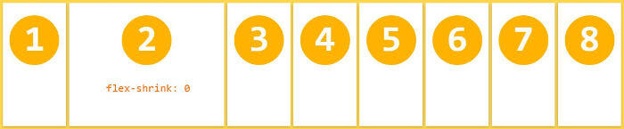
如果所有项目的flex-shrink属性都为1,当空间不足时,都将等比例缩小。
如果一个项目的flex-shrink属性为0,其他项目都为1,则空间不足时,前者不缩小。
flex-basis
定义了在分配多余空间之前,项目占据的主轴空间(main size)。浏览器根据这个属性,计算主轴是否有多余空间。默认值:auto,即项目本来大小。
.item{
flex-basis: | auto;
}
1
2
3
4
.item{
flex-basis:|auto;
}
flex
flex 属性是 flex-grow、flex-shrink、flex-basis 的简写,默认值 0 1 auto
后面两个属性可选。
flex 属性有两个快捷值 auto(代表1 1 auto), none(代表0 0 auto)
建议使用 flex,而不是分开写3个属性
.item{
flex: none | [ ? || ]
}
1
2
3
4
.item{
flex:none|[?||]
}
align-self
允许单个项目有与其他项目不同的对齐方式,可以覆盖 align-items 属性。
默认auto, 表示继承父元素的 align-items,如果没有父元素,则相当于 stretch
.item{
align-self: auto | flex-start | flex-end | center | baseline | stretch;
}
1
2
3
4
.item{
align-self:auto|flex-start|flex-end|center|baseline|stretch;
}
该属性可能取6个值,除了auto,其他都与align-items属性完全一致。


 980
980


 被折叠的 条评论
为什么被折叠?
被折叠的 条评论
为什么被折叠?
 到【灌水乐园】发言


