


前言
NG-NEST介绍
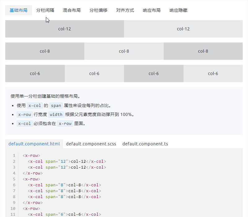
今天我们看一下 Layout 栅格布局 是如何实现的
功能分析
栅格布局是基于行和列(24栅格)来定义内容区域的,提供了以下的功能:
- 基础布局
- 分栏间隔
- 分栏偏移
- 对齐方式
- 响应布局
- 响应隐藏
代码分析
先看是如何使用的:
<x-row>
  <x-col span="12">col-12</x-col>
  <x-col span="12">col-12</x-col>
</x-row>
x-row 用来定义行,x-col 用来定义列, span 属性用来设置每列的占比 ,涉及到2个组件:
lib/ng-nest/ui/layout
├── style
├── col.component.html
├── col.component.ts                   列组件
├── row.component.html
├── row.component.ts                   行组件
├── layout.property.ts                 参数定义
└── ......
我们先看 x-row 行组件 row.component.ts 代码是如何定义的:
@Component({
  selector: `${XRowPrefix}`,
  template: '<ng-content></ng-content>',
  styleUrls: ['./row.component.scss'],
  encapsulation: ViewEncapsulation.None,
  changeDetection: ChangeDetectionStrategy.OnPush
})
export class XRowComponent extends XRowProperty implements OnInit {
  // 当有设置水平或垂直排列方式时添加 x-flex 布局样式
  @HostBinding(`class.x-flex`) get getFlex() {
    return this.justify || this.align ? true : false;
  }

  constructor(private renderer: Renderer2, private elementRef: ElementRef) {
    super();
    this.renderer.addClass(this.elementRef.nativeElement, XRowPrefix);
  }

  ngOnInit() {
    this.setSpace();
    this.setJustify();
    this.setAlign();
  }

  // 设置行的左右外边距
  setSpace() {
    if (!this.space) return;
    this.renderer.setStyle(this.elementRef.nativeElement, 'margin-left', `-${Number(this.space) / 2}rem`);
    this.renderer.setStyle(this.elementRef.nativeElement, 'margin-right', `-${Number(this.space) / 2}rem`);
  }

  // 设置行中列的水平排列方式
  setJustify() {
    if (!this.justify) return;
    this.renderer.addClass(this.elementRef.nativeElement, `x-justify-${this.justify}`);
  }

  // 设置行中列的垂直排列方式
  setAlign() {
    if (!this.align) return;
    this.renderer.addClass(this.elementRef.nativeElement, `x-align-${this.align}`);
  }
}
对应在 layout.property.ts 中的参数定义:
/**
 * Row Property
 */
@Component({ template: '' })
export class XRowProperty extends XProperty {
  /**
   * 列间隔,rem
   */
  @Input() @XInputNumber() space: XNumber;
  /**
   * flex 布局下的水平排列方式
   */
  @Input() justify: XJustify;
  /**
   * flex 布局下的垂直排列方式
   */
  @Input() align: XAlign;
}
列间距、flex 布局下列的排列方式都是通过 x-row 组件设置,接下来我们继续看 x-col 列组件都做了什么事情:
打开 col.component.ts 文件:
@Component({
  selector: `${XColPrefix}`,
  template: '<ng-content></ng-content>',
  styleUrls: ['./col.component.scss'],
  encapsulation: ViewEncapsulation.None,
  changeDetection: ChangeDetectionStrategy.OnPush
})
export class XColComponent extends XColProperty implements OnInit {
  // 如果设置了响应布局,默认添加 x-col-24 样式,占满24格
  @HostBinding(`class.x-col-24`) get getFlex() {
    return this.xs || this.sm || this.md || this.lg || this.xl || this.span == 24 ? true : false;
  }

  constructor(
    @Optional() @Host() public rowComponent: XRowComponent,
    private renderer: Renderer2,
    private elementRef: ElementRef) {
    super();
    this.renderer.addClass(this.elementRef.nativeElement, XColPrefix);
  }

  ngOnInit() {
    this.setSpan();
    this.setOffset();
    this.setSpace();
    this.setLayout();
    this.setInherit();
  }

  // 设置每列的占比样式
  setSpan() {
    if (!this.span) return;
    this.renderer.addClass(this.elementRef.nativeElement, `${XColPrefix}-${this.span}`);
  }

  // 设置每列的偏移样式
  setOffset() {
    if (!this.offset) return;
    this.renderer.addClass(this.elementRef.nativeElement, `${XColPrefix}-offset-${this.offset}`);
  }

  // 设置列与列之间的间距,来源于行组件的 space 参数
  setSpace() {
    if (!this.rowComponent?.space) return;
    this.renderer.setStyle(this.elementRef.nativeElement, 'padding-left', `${Number(this.rowComponent.space) / 2}rem`);
    this.renderer.setStyle(this.elementRef.nativeElement, 'padding-right', `${Number(this.rowComponent.space) / 2}rem`);
  }

  // 设置响应布局尺寸
  setLayout() {
    if (this.xs) {
      this.renderer.addClass(this.elementRef.nativeElement, `${XColPrefix}-xs-${this.xs}`);
    }
    if (this.sm) {
      this.renderer.addClass(this.elementRef.nativeElement, `${XColPrefix}-sm-${this.sm}`);
    }
    if (this.md) {
      this.renderer.addClass(this.elementRef.nativeElement, `${XColPrefix}-md-${this.md}`);
    }
    if (this.lg) {
      this.renderer.addClass(this.elementRef.nativeElement, `${XColPrefix}-lg-${this.lg}`);
    }
    if (this.xl) {
      this.renderer.addClass(this.elementRef.nativeElement, `${XColPrefix}-xl-${this.xl}`);
    }
  }

  // 设置宽度默认属性
  setInherit() {
    if (!this.inherit) return;
    this.renderer.addClass(this.elementRef.nativeElement, `${XColPrefix}-inherit`);
  }
}
对应在 layout.property.ts 中的参数定义:
/**
 * Col Property
 */
@Component({ template: '' })
export class XColProperty extends XProperty {
  /**
   * 24栅格布局,列占的宽度
   */
  @Input() @XInputNumber() span: XNumber;
  /**
   * 栅格左侧的间隔格数
   */
  @Input() @XInputNumber() offset: XNumber;
  /**
   * <768px
   */
  @Input() @XInputNumber() xs: XNumber;
  /**
   * ≥768px
   */
  @Input() @XInputNumber() sm: XNumber;
  /**
   * ≥992px
   */
  @Input() @XInputNumber() md: XNumber;
  /**
   * ≥1200px
   */
  @Input() @XInputNumber() lg: XNumber;
  /**
   * ≥1920px
   */
  @Input() @XInputNumber() xl: XNumber;
  /**
   * 默认样式
   */
  @Input() @XInputBoolean() inherit: XBoolean;
}
x-row 和 x-col 组件的代码都比较简单,都是根据参数设置指定的样式,列间距通过获取父组件的 space 参数来设置,我们来看一下具体样式是如何写的:
打开 lib/ng-nest/ui/layout/style/mixin.scss 文件
 @mixin row {
  display: block;
  position: relative;
  height: auto;
  &:before,
  &:after {
    content: '';
    display: table;
    clear: both;
  }
  @include flex();
}

@mixin media-screen($key, $value) {
  $col-layout-initial: $--x-col-layout;
  @while $col-layout-initial>0 {
    $col-percentage: 100% * $col-layout-initial / $--x-col-layout;
    @media only screen and #{inspect($value)} {
      &-#{$key}-#{$col-layout-initial} {
        width: $col-percentage;
      }
    }
    $col-layout-initial: $col-layout-initial - 1;
  }
}

@mixin col {
  position: relative;
  float: left;
  display: block;
  width: 100%;
  box-sizing: border-box;
  $col-layout-initial: $--x-col-layout;
  @while $col-layout-initial>0 {
    $col-percentage: 100% * $col-layout-initial / $--x-col-layout;
    &-#{$col-layout-initial} {
      width: $col-percentage;
    }
    &-offset-#{$col-layout-initial} {
      margin-left: $col-percentage;
    }
    $col-layout-initial: $col-layout-initial - 1;
  }
  @each $key, $value in $--x-size-range {
    @include media-screen($key, $value);
  }
  &-inherit {
    width: inherit;
  }
}
@mixin row 里面定义行样式,在里面又包含了一个 flex 混合,这个定义在 lib/ng-nest/ui/style/mixins/flex.scss 中,主要就是 flex 布局的一些通用样式,通过 flex 最终生成的样式如下:
.x-row.x-flex {
  display: flex;
}
.x-row.x-justify-start {
  justify-content: flex-start;
}
.x-row.x-justify-center {
  justify-content: center;
}
.x-row.x-justify-end {
  justify-content: flex-end;
}
.x-row.x-justify-space-between {
  justify-content: space-between;
}
.x-row.x-justify-space-around {
  justify-content: space-around;
}
.x-row.x-align-start {
  align-items: flex-start;
}
.x-row.x-align-center {
  align-items: center;
}
.x-row.x-align-end {
  align-items: flex-end;
}
.x-row.x-direction-column {
  flex-direction: column;
}
.x-row.x-direction-column-reverse {
  flex-direction: column-reverse;
}
.x-row.x-direction-row {
  flex-direction: row;
}
.x-row.x-direction-row-reverse {
  flex-direction: row-reverse;
}
@mixin media-screen 里面定义响应样式,$--x-col-layout 为 24 栅格,通过 @while 循环输出不同尺寸对应 @media 查询样式,最终生成的样式代码如下:
@media only screen and (max-width: 767px) {
  .x-col-xs-24 {
    width: 100%;
  }
}
@media only screen and (max-width: 767px) {
  .x-col-xs-23 {
    width: 95.8333333333%;
  }
}

...

@media only screen and (max-width: 767px) {
  .x-col-xs-1 {
    width: 4.1666666667%;
  }
}
@media only screen and (min-width: 768px) {
  .x-col-sm-24 {
    width: 100%;
  }
}

...

@media only screen and (min-width: 768px) {
  .x-col-sm-1 {
    width: 4.1666666667%;
  }
}
...
@media only screen and (min-width: 992px) {
  .x-col-md-24 {
    width: 100%;
  }
}
...
@mixin col 定义列样式,同样通过 @while 循环输出对应栅格所占用的宽度,此处还包含了偏移的格数,通过 margin-left 来设置,还有一个 @each in 的用来遍历输出定义的媒体查询参数 $--x-size-range:
// Layout
$--x-col-layout: 24;

$--x-sm: 768px !default;
$--x-md: 992px !default;
$--x-lg: 1200px !default;
$--x-xl: 1920px !default;

$--x-size-range: (
  'xs': (
    max-width: $--x-sm - 1
  ),
  'sm': (
    min-width: $--x-sm
  ),
  'md': (
    min-width: $--x-md
  ),
  'lg': (
    min-width: $--x-lg
  ),
  'xl': (
    min-width: $--x-xl
  )
);
最终生成的样式如下:
.x-col-24 {
  width: 100%;
}
.x-col-offset-24 {
  margin-left: 100%;
}

...

.x-col-1 {
  width: 4.1666666667%;
}
.x-col-offset-1 {
  margin-left: 4.1666666667%;
}
响应隐藏功能是通过公共的 var-size-hidden 这个混合实现,这个定义在 lib/ng-nest/ui/style/mixins/hidden.scss 中
@mixin var-size-hidden($hidden) {
  @each $key, $value in $hidden {
    [#{$--x-prefix}-hidden-#{$key}] {
      @media only screen and #{inspect($value)} {
        display: none !important;
      }
    }
  }
}
此处就是一个属性样式,通过在具体的 @media 查询样式下隐藏元素,在 lib/ng-nest/ui/style/core/var.scss 中使用:
@include var-size-hidden($--x-size-range-only);$--x-size-range-only 参数定义如下:
$--x-size-range-only: (
  'xs-only': (
    max-width: $--x-sm - 1
  ),
  'sm-and-up': (
    min-width: $--x-sm
  ),
  'sm-only': (
    min-width: $--x-sm
  )
  and
  (
    max-width: $--x-md - 1
  ),
  'sm-and-down': (
    max-width: $--x-md - 1
  ),
  'md-and-up': (
    min-width: $--x-md
  ),
  'md-only': (
    min-width: $--x-md
  )
  and
  (
    max-width: $--x-lg - 1
  ),
  'md-and-down': (
    max-width: $--x-lg - 1
  ),
  'lg-and-up': (
    min-width: $--x-lg
  ),
  'lg-only': (
    min-width: $--x-lg
  )
  and
  (
    max-width: $--x-xl - 1
  ),
  'lg-and-down': (
    max-width: $--x-xl - 1
  ),
  'xl-only': (
    min-width: $--x-xl
  )
);
生成的最终样式如下:
@media only screen and (max-width: 767px) {
  [x-hidden-xs-only] {
    display: none !important;
  }
}
@media only screen and (min-width: 768px) {
  [x-hidden-sm-and-up] {
    display: none !important;
  }
}
@media only screen and (max-width: 991px) {
  [x-hidden-sm-only] {
    display: none !important;
  }
}
@media only screen and (max-width: 991px) {
  [x-hidden-sm-and-down] {
    display: none !important;
  }
}
@media only screen and (min-width: 992px) {
  [x-hidden-md-and-up] {
    display: none !important;
  }
}
@media only screen and (max-width: 1199px) {
  [x-hidden-md-only] {
    display: none !important;
  }
}
@media only screen and (max-width: 1199px) {
  [x-hidden-md-and-down] {
    display: none !important;
  }
}
@media only screen and (min-width: 1200px) {
  [x-hidden-lg-and-up] {
    display: none !important;
  }
}
@media only screen and (max-width: 1919px) {
  [x-hidden-lg-only] {
    display: none !important;
  }
}
@media only screen and (max-width: 1919px) {
  [x-hidden-lg-and-down] {
    display: none !important;
  }
}
@media only screen and (min-width: 1920px) {
  [x-hidden-xl-only] {
    display: none !important;
  }
}
总结
以上就是 Layout 栅格布局 的源码分析,主要还是一些样式的应用,通过 SCSS 的混合、循环和遍历有效减少了重复的样式代码。


 1074
1074

 被折叠的 条评论
为什么被折叠?
被折叠的 条评论
为什么被折叠?
 到【灌水乐园】发言


