


网址:https://www.echartsjs.com/zh/tutorial.html#5%20%E5%88%86%E9%92%9F%E4%B8%8A%E6%89%8B%20ECharts
五分钟上手 基本配置
1.矩形参数
<!DOCTYPE html>
<html lang="en">
<head>
<meta charset="UTF-8">
<meta name="viewport" content="width=device-width, initial-scale=1.0">
<title>Document</title>
<!-- 1.引入资源 -->
<!-- <script src='js/echarts.min.js'></script> -->
<script src="https://cdn.bootcss.com/echarts/4.6.0/echarts.min.js"></script>
</head>
<body>
<!-- 2.绘图前我们需要为 ECharts 准备一个具备高宽的 DOM 容器 -->
<div id="main" style="width: 600px;height:400px;border:1px solid #999"></div>
<!-- 3.js绘制图表 -->
<script>
//1.初始化 容器
var myChart=echarts.init(document.getElementById('main'));
//2.配置参数
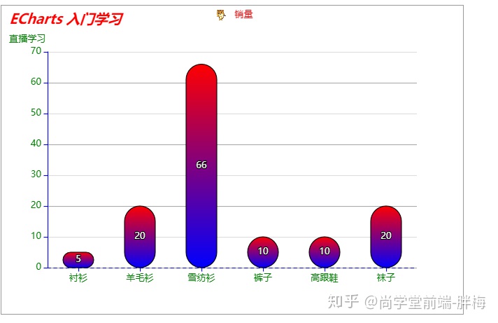
var option={//键值对={}
title: {//标题组件,包含主标题和副标题
show:true,//是否显示标题组件
text: 'ECharts 入门学习',//主标题文本,支持使用 n 换行
link:'https://www.baidu.com',//主标题文本超链接
target:'blank',//指定窗口打开主标题超链接
textStyle:{
color:'red',//主标题文字的颜色
fontStyle:'italic'
},
subtext:'直播学习',//副标题文本,支持使用 n 换行
sublink:'',//副标题文本超链接
subtextStyle:{
color:'green',//字体颜色
},
padding:10,//标题内边距,单位px,默认各方向内边距为5,接受数组分别设定上右下左边距。
itemGap:10,//主副标题之间的间距
// left:'right',//grid 组件离容器左侧的距离
// top:20,//string number
},
tooltip: {//提示框组件 悬浮在主条上的文字提示
trigger:'axis',//trigger 触发类型 axis坐标轴触发,主要在柱状图,折线图等
//提示框浮层内容格式器,支持字符串模板和回调函数两种形式 {a}(系列名称),{b}(类目值),{c}(数值)
formatter:'{a}-{b}-{c}'
},
legend: {//系列 展现了不同系列的标记(symbol),颜色和名字
// 设置文本为红色
textStyle: {
color: 'red'
},
selectedMode:false,//图例选择的模式,控制是否可以通过点击图例改变系列的显示状态
// icon:'circle',//图例项的 icon
// icon:'image://本地图片相对路径',
icon:'image://https://timgsa.baidu.com/timg?image&quality=80&size=b9999_10000&sec=1582800159978&di=5f4072248d1103ccc38b0fe0bcfa4e34&imgtype=0&src=http%3A%2F%2Fa0.att.hudong.com%2F78%2F52%2F01200000123847134434529793168.jpg',//'image://url' 设置为图片
data:['销量']
},
xAxis: {//x轴 直角坐标系 grid 中的 x 轴
axisLine:{//坐标轴轴线相关设置
// show:false,//是否显示坐标轴轴线
lineStyle:{//坐标轴线线的颜色
color:'blue',//坐标轴线的颜色修改--文字也同步修改
type:'dashed'
}
},
axisTick:{//坐标轴刻度相关设置
// show:true,//是否显示坐标轴刻度
alignWithLabel:true,//可以保证刻度线和标签对齐
},
axisLabel:{
color:'green',//刻度标签文字的颜色
},
data: ["衬衫","羊毛衫","雪纺衫","裤子","高跟鞋","袜子"]
},
yAxis: {//y轴 可以省略内容 数据series显示
axisLine:{//坐标轴轴线相关设置
lineStyle:{//坐标轴线线的颜色
color:'blue',
}
},
axisLabel:{//坐标轴刻度标签的相关设置
color:'green'
},
splitLine:{//坐标轴在 grid 区域中的分隔线。
show:true,//是否显示分隔线。默认数值轴显示,类目轴不显示。
lineStyle:{
// color:'pink' //分隔线颜色,可以设置成单个颜色
color:['#aaa','#ddd'],//隔线会按数组中颜色的顺序依次循环设置颜色
}
}
},
series: [{//系列列表。每个系列通过 type 决定自己的图表类型
name: '销量',//系列名称,用于tooltip的显示,legend 的图例筛选
type: 'bar',//柱状/条形图
label:{//图形上的文本标签,可用于说明图形的一些数据信息
show:true,//是否显示标签 默认是不显示的 true会显示区域的值
// position://label 位置
// fontSize:16,//字体大小
},
itemStyle:{//图形样式
// color:'yellowgreen',//柱条的颜色
//线性渐变---xAxis 线的样式
color: {
type: 'linear',
x: 0,//左
y: 0,//上
x2: 0,//右
y2: 1,//下
colorStops: [{
offset: 0, color: 'red' // 0% 处的颜色
}, {
offset: 1, color: 'blue' // 100% 处的颜色
}],
global: false // 缺省为 false
},
borderColor:'#000',//描边
barBorderRadius :20,//圆角
},
emphasis:{//高亮的图形样式和标签样式
label:{
show:false,
// fontSize:20
},
itemStyle:{
color:'pink'
}
},
barWidth:40,//柱条的宽度,不设时自适应。
data: [5, 20, 66, 10, 10, 20]
}]
}
//3.使用刚指定的配置项和数据显示图表
myChart.setOption(option);//setOption({ ---- })
</script>
</body>
</html>2.平滑曲线
代码如下:
<!DOCTYPE html>
<html lang="en">
<head>
<meta charset="UTF-8">
<meta name="viewport" content="width=device-width, initial-scale=1.0">
<title>Document</title>
<script src='js/echarts.min.js'></script>
</head>
<body>
<!-- 为ECharts准备一个具备大小(宽高)的Dom -->
<div id="main" style="width: 600px;height:400px;background: #0F2B5E;"></div>
<script type="text/javascript">
// 基于准备好的dom,初始化echarts实例
var myChart = echarts.init(document.getElementById('main'));
// 指定图表的配置项和数据
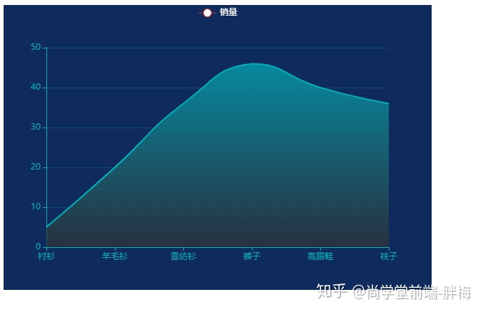
var option = {
title: {
show:false,
text: 'ECharts 入门示例'
},
tooltip: {
trigger:'axis'
},
legend: {
textStyle:{
color:'#fff'
},
data:['销量']
},
xAxis: {
axisLine:{
lineStyle :{//坐标轴线线的颜色
color:'#04B0B8'
}
},
axisTick:{
alignWithLabel:true,
},
boundaryGap:false,//坐标轴两边留白策略
data: ["衬衫","羊毛衫","雪纺衫","裤子","高跟鞋","袜子"]
},
yAxis: {
axisLine:{
lineStyle :{//坐标轴线线的颜色
color:'#04B0B8'
}
},
splitLine:{
lineStyle:{
color:'#0A4C7C'
}
}
},
series: [{
name: '销量',
type: 'line',//折线图
lineStyle:{//线条样式
color:"#04B0B8",
},
itemStyle:{
opacity:0,
borderWidth:0,//无描边
},
areaStyle:{//区域填充样式
color:{
type: 'linear',
x: 0,
y: 0,
x2: 0,
y2: 1,
colorStops: [{
offset: 0, color: '#04B0B8' // 0% 处的颜色
}, {
offset: 1, color: '#333' // 100% 处的颜色
}],
global: false // 缺省为 false
}
},
smooth:true,//是否平滑曲线显示
data: [5, 20, 36, 46, 40, 36]
}]
};
// 使用刚指定的配置项和数据显示图表。
myChart.setOption(option);
</script>
</body>
</html>


 1293
1293

 被折叠的 条评论
为什么被折叠?
被折叠的 条评论
为什么被折叠?
 到【灌水乐园】发言


