


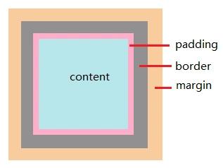
一、CSS盒子模型
盒子包括:margin、border、padding、content
边框交界处呈现平滑的斜线,利用此特点,通过设置各边框宽度和颜色可以得到小三角等。
div元素是块级元素,显示为块框,可以利用它来具体实现。
例1、一般设置高度、宽度及边框后,盒子呈现如下图:
.triangle { width: 25px; height: 25px; overflow: hidden; font-size: 0; line-height: 0; border-width: 50px; border-style: solid; border-color: rgb(235, 54, 241) rgb(86, 245, 139) rgb(76, 0, 255) rgb(46, 205, 245);}web前端开发学习Q-q-u-n: 784783012 ,分享学习的方法和需要注意的小细节,不停更新最新的教程和学习方法(详细的前端项目实战教学视频,PDF)注:设置overflow、font-size、line-height,是因为在IE6下会具有默认的字体大小和行高, 导致盒子呈现被撑开的长矩形。
例2、将例1中的宽度和高度设置为0后,盒子呈现如下图:
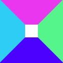
.triangle { width: 0; height: 0; overflow: hidden; font-size: 0; line-height: 0; border-width: 50px; border-style: solid; border-color: rgb(235, 54, 241) rgb(86, 245, 139) rgb(76, 0, 255) rgb(46, 205, 245);}此时,可以看到盒子是由四个三角形组成的。如果只保留一种颜色, 将其他3种颜色设置为透明或与背景同色, 就能实现三角形。根据选择留下不同位置的边,可以呈现出不同朝向的三角形。
例3、只保留底边
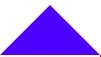
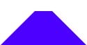
.triangle { width: 0; height: 0; overflow: hidden; font-size: 0; line-height: 0; border-width: 50px; border-style: solid; border-color: transparent transparent rgb(76, 0, 255) transparent;}例4:在例3中的宽度和高度保留,可以得到梯形
width: 0; height: 0;web前端开发学习Q-q-u-n: 784783012 ,分享学习的方法和需要注意的小细节,不停更新最新的教程和学习方法(详细的前端项目实战教学视频,PDF)例5、实现箭头
箭头其实是通过2个三角形错位叠加来实现的。
用错开1px的白色三角形覆盖蓝色三角形,形成箭头。
下面的样式实现了一个向上箭头:

. arrow { position: absolute;}. arrow:before,. arrow:after{ position: absolute; content: ''; border-top: 10px transparent solid; border-left: 10px transparent solid; border-right: 10px transparent solid; border-bottom: 10px #fff solid;}. arrow:before{ border-bottom: 10px #0099CC solid;}. arrow:after{ top: 1px; /*覆盖并错开1px*/ border-bottom: 10px #fff solid;}


 388
388


 被折叠的 条评论
为什么被折叠?
被折叠的 条评论
为什么被折叠?
 到【灌水乐园】发言


