


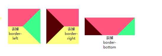
1.给一个矩形设置border,来看如何变化

<section>
<h4>来看一个正常的矩形变化过程</h4>
	<div class="b">
		<div class="b1">设置了border正常宽高</div>
		<div class="b2">border-top</div>
		<div class="b3">border-right</div>
		<div class="b4">border-left</div>
		<div class="b5">border-bottom</div>
		<div class="b6">background</div>
	</div>
</section>
.b{
	display: flex;
	align-items: center;
	justify-content: space-around;
	flex-wrap: wrap;
	font-size: 10px;
	text-align: center;
}
.b1{
	width: 100px;
	height: 70px;
	border:5px solid #00aaff;
	margin-right: 10px;
	margin-bottom: 10px;
}
.b2{
	width: 100px;
	height: 70px;
	border:5px solid #00aaff;
	border-top: 5px solid #ff557f;
	margin-right: 10px;
	margin-bottom: 10px;
}
.b3{
	width: 100px;
	height: 70px;
	border:5px solid #00aaff;
	border-top: 5px solid #ff557f;
	border-left: 10px solid #550000;
	margin-right: 10px;
	margin-bottom: 10px;
}
.b4{
	width: 100px;
	height: 70px;
	border:5px solid #00aaff;
	border-top: 5px solid #ff557f;
	border-left: 10px solid #550000;
	border-right:15px solid #3EFF8B;
	margin-right: 10px;
	margin-bottom: 10px;
}
.b5{
	width: 100px;
	height: 70px;
	border:5px solid #00aaff;
	border-top: 5px solid #ff557f;
	border-left: 10px solid #550000;
	border-right:15px solid #3EFF8B;
	border-bottom:20px solid #ffff7f;
	margin-right: 10px;
	margin-bottom: 10px;
}
.b6{
	width: 100px;
	height: 70px;
	background: pink;
	border:5px solid #00aaff;
	border-top: 5px solid #ff557f;
	border-left: 10px solid #550000;
	border-right:15px solid #3EFF8B;
	border-bottom:20px solid #ffff7f;
	margin-right: 10px;
	margin-bottom: 10px;
}
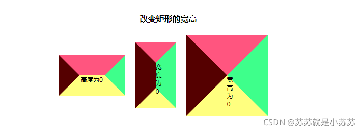
2.改变矩形的宽高
当矩形的宽或者高为0的时候,出现了梯形+三角形。
矩形的宽高都为0的时候,出现了三角。
从这一步,我们就可以大致的知道这个梯形,三角形是怎么形成的了。
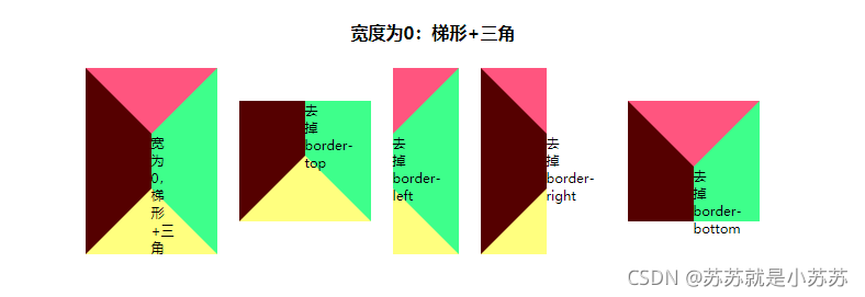
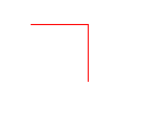
3.当矩形的高为0时
去掉border-top,我们可以得到下图第二个图片,当将border-left和border-right设置为transparent时候,出现梯形。将这个梯形用rotate进行选择,可以得到一个向下的梯形。
同理,去掉border-bottom,border-left和border-right设置为transparent时,也可以得到一个向下的梯形。

<div class="b10">高为0,出现梯形+三角</div>
<div class="b11">去掉border-top</div>
<div class="b11-tixing"><p>得到梯形</p></div>
<div class="b11-tixing-rotate"><p>rotate旋转</p></div>
.b10{
	width: 50px;
	height: 0;
	background: pink;
	border-top: 60px solid #ff557f;
	border-left: 60px solid #550000;
	border-right:60px solid #3EFF8B;
	border-bottom:60px solid #ffff7f;
	margin-right: 20px;
	margin-bottom: 10px;
}
.b11{
	width: 50px;
	height: 0;
	border-left: 60px solid #550000;
	border-right:60px solid #3EFF8B;
	border-bottom:60px solid #ffff7f;
	margin-right: 20px;
	margin-bottom: 10px;
}
.b11-tixing,.b11-tixing-rotate{
	width: 50px;
	height: 0;
	border-left: 60px solid transparent;
	border-right:60px solid transparent;
	border-bottom:60px solid #ffff7f;
	margin-right: 20px;
	margin-bottom: 10px;

}
.b11-tixing-rotate{
	transform: rotate(-180deg);
}
.b11-tixing-rotate p{
	transform: rotate(180deg);
}
设置其他情况,也能得到一些想要的图形。
4.当矩形的宽为0时
宽度为0的时候,可以得到相应的梯形,当然这个梯形也可以使用rotate旋转得来,方法并不唯一,知道即可。
5.当矩形的宽高皆为0时
当矩形的宽高皆为0时,可以看到设置不同的border时候,出现了很多三角形。

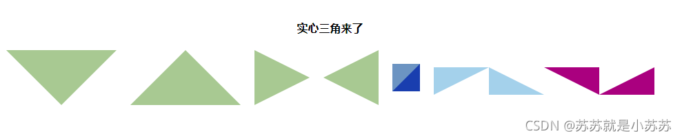
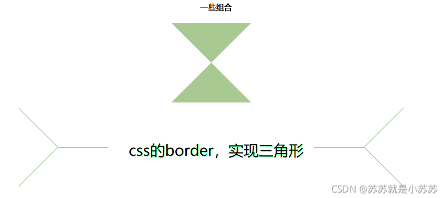
6.实心三角
假如你想得到一个向下的等腰三角,那么你只需要
(1):去掉border-bottom
(2):将border-left和border-right变成transparent
可以这么理解:设置相应的两边为transparent,一个上三角,那就设置border-bottom,去掉border-top,下三角,设置border-top,去掉border-bottom。左三角,设置border-right,右三角设置border-left。
若你想得到一个向右直角三角形:
(1):只需设置两边即可,border-top,border-right
(2):border-right设置为transparent
其他的可以多试试,可以发现是有规律存在的。
<section>
	<h4>实心三角来了</h4>
	<div class="b">
		<div class="b25"></div>
		<div class="b26"></div>
		<div class="b27"></div>
		<div class="b28"></div>
		<div class="b29"></div>
		<div class="b30"></div>
		<div class="b31"></div>
		<div class="b32"></div>
		<div class="b33"></div>
	</div>
</section>
.b25{
	width: 0;
	height: 0;
	border-top: 80px solid #A8C992;
	border-left: 80px solid transparent;
	border-right:80px solid transparent;
	margin-right: 20px;
	margin-bottom: 10px;
}
.b26{
	width: 0;
	height: 0;
	border-bottom: 80px solid #A8C992;
	border-left: 80px solid transparent;
	border-right:80px solid transparent;
	margin-right: 20px;
	margin-bottom: 10px;
}
.b27{
	width: 0;
	height: 0;
	border-left: 80px solid #A8C992;
	border-top: 40px solid transparent;
	border-bottom:40px solid transparent;
	margin-right: 20px;
	margin-bottom: 10px;
}
.b28{
	width: 0;
	height: 0;
	border-right: 80px solid #A8C992;
	border-top: 40px solid transparent;
	border-bottom:40px solid transparent;
	margin-right: 20px;
	margin-bottom: 10px;
}
.b29{
	height: 0;
	width: 0;
	border-color: #6c94c2 #193eaf transparent transparent;
	border-style: solid solid dashed dashed;
	border-width: 40px 40px 0 0;
	margin-right: 20px;
	margin-bottom: 10px;
}
.b30{
	height: 0;
	width: 0;
	border-top: 40px solid #a4d1eb;
	border-right: 80px solid transparent;
}
.b31{
	height: 0;
	width: 0;
	border-bottom: 40px solid #a4d1eb;
	border-right: 80px solid transparent;
}
.b32{
	height: 0;
	width: 0;
	border-top: 40px solid #aa007f;
	border-left: 80px solid transparent;
}
.b33{
	height: 0;
	width: 0;
	border-bottom: 40px solid #aa007f;
	border-left: 80px solid transparent;
}
7.空心三角
实现原理:先正常定义一个实心三角,利用伪元素,在定义一个比实心三角稍小一点的一个颜色为白色的三角。

.b34{
	width: 0;
	height: 0;
	border-top: 80px solid #A8C992;
	border-left: 80px solid transparent;
	border-right:80px solid transparent;
	margin-right: 20px;
	margin-bottom: 10px;
	position: relative;
}

.b34::after{
	content: "";
	position:absolute;
	top: -79px;
	left: -78px;
	width: 0;
	height: 0;
	border-top: 78px solid #fff;
	border-left: 78px solid transparent;
	border-right:78px solid transparent;
}
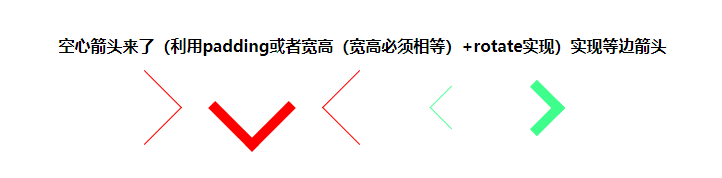
8.等边箭头
实现一个箭头有两种方式:
1.设置相应的宽高(宽和高必须相等,否则得到的是一个长度不一的箭头),并且设置border-top和border-right,得到以下:
利用 transform: rotate(-45deg)进行旋转得到不同角度的箭头。
2.不设置宽高,设置padding值,padding的值越大,这个箭头就越大,如,padding:5px。
再利用利用 transform: rotate(-45deg)进行旋转得到不同角度的箭头。
9.等腰箭头
原理:先正常定义一个实心三角,利用伪元素,在定义一个比实心三角稍小一点的一个颜色为白色的三角。对这个大的三角进行一部分的覆盖,实现等腰三角箭头。

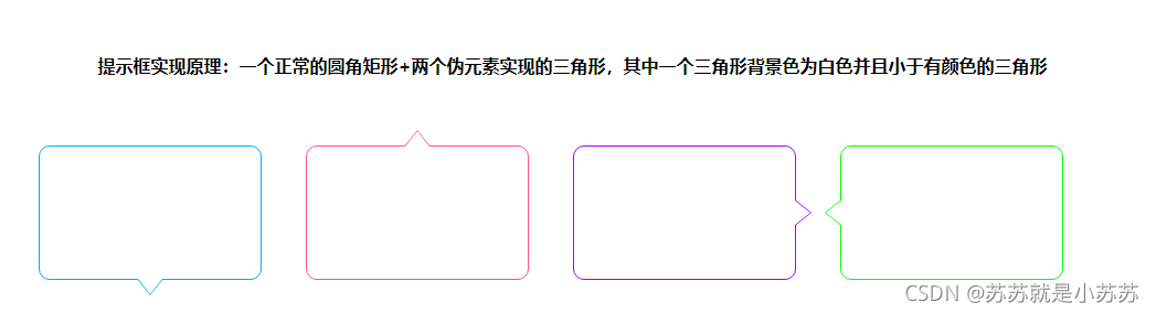
10.实现提示框
原理:
一个正常的圆角矩形+一个空心三角形
(这个空心三角形是两个伪元素实现的三角形,其中一个三角形背景色为白色并且小于有颜色的三角形)
11.一些其他样式,可以通过伪元素得到
多尝试,会发现很多不一样的东西。


 886
886


 被折叠的 条评论
为什么被折叠?
被折叠的 条评论
为什么被折叠?
 到【灌水乐园】发言


