


目录
欢迎关注公众号,DataDesigner,让我们一起白话机器学习。

一、题目介绍
1.1 英文题目介绍
Imagine standing at the check-out counter at the grocery store with a long line behind you and the cashier not-so-quietly announces that your card has been declined. In this moment, you probably aren’t thinking about the data science that determined your fate.
Embarrassed, and certain you have the funds to cover everything needed for an epic nacho party for 50 of your closest friends, you try your card again. Same result. As you step aside and allow the cashier to tend to the next customer, you receive a text message from your bank. “Press 1 if you really tried to spend $500 on cheddar cheese.”
While perhaps cumbersome (and often embarrassing) in the moment, this fraud prevention system is actually saving consumers millions of dollars per year. Researchers from the IEEE Computational Intelligence Society (IEEE-CIS) want to improve this figure, while also improving the customer experience. With higher accuracy fraud detection, you can get on with your chips without the hassle.
IEEE-CIS works across a variety of AI and machine learning areas, including deep neural networks, fuzzy systems, evolutionary computation, and swarm intelligence. Today they’re partnering with the world’s leading payment service company, Vesta Corporation, seeking the best solutions for fraud prevention industry, and now you are invited to join the challenge.
In this competition, you’ll benchmark machine learning models on a challenging large-scale dataset. The data comes from Vesta's real-world e-commerce transactions and contains a wide range of features from device type to product features. You also have the opportunity to create new features to improve your results.
If successful, you’ll improve the efficacy of fraudulent transaction alerts for millions of people around the world, helping hundreds of thousands of businesses reduce their fraud loss and increase their revenue. And of course, you will save party people just like you the hassle of false positives.
1.2 数据集浏览
同样,光看题目没啥用,我们从题目中了解到的是这个信用公司Vesta会提供一系列交易记录和身份信息让我们来预测交易是否会有欺诈行为。OK,下面来看数据,先看官网的数据描述。总的说来就是提供了两种类型的文件夹,一个是交易信息,一个是身份信息,而且强调了不是所有的数据都有对应的身份信息。
我是想打开CSV给大家看一下数据的,但是太大了,1个多G,等我换电脑的时候再说吧,下面会配合Jupyter Notebook给大家看一下数据演示。反正你会从官网download到5个文件,文件的描述如下:
- train_{transaction, identity}.csv - the training set
- test_{transaction, identity}.csv - the test set (you must predict the
isFraudvalue for these observations) - sample_submission.csv - a sample submission file in the correct format
1.3 数据集分析
OK,看完数据的基本信息我还是很懵,我并不知道这些信息对欺诈检测有什么作用,而且出于隐私的需要,这个信息提供商将某些特征的真实Name隐去,例如id,card,M这些特征,鬼知道这些特征对我到底有没有用,而且时间信息都是以时间戳的形式存入的,还有大量的空值和不规范的值在文件中,好了,下面重点来了,我们拿到这个题目究竟该怎么分析,虽然啥也不懂,但Sklearn和Plotly文档是现成的,只要你明白咋做,编程最后不是问题。思路如下:

二、开发环境
2.1 软硬件开发环境
Windows10+Jupyter Notebook
2.2 开发过程槽点
当然了,在撸代码的过程中需要参考别人的代码和思路,有些代码拿过来不能够复现,或者明明人家能运行成功,为啥你不行。OK,这个时候一般都是包的问题,尤其是pandas和xgboost的包,版本最好和我保持一致。下面教大家两招查询自己对应包版本的方法。
- 如何查询pandas版本
import pandas as pd # 这里是进入ipython
pd.__version__

pip install pandas==0.25.2 # 这里以下是在命令行,OK,如果你是anaconda的话有可能因为权限问题报错,没关系
conda install pandas=0.25.2 # 打开anaconda prompt窗口安装即可,注意,千万不要卸载!!!

# 当然不排除有些小傻子直接conda update all,这个操作太骚了,不建议使用,解决办法如下
conda list --revision
conda install --rev 1 # 选择历史版本
- xgboost版本安装及查询
pip install xgboost=0.80 # 没装过傻瓜式就行

# 下面是装过的同学。首先
pip show xgboost # 查看版本
pip uninstall xgboost
# 然后重新装即可,因为1.0的默认版本中xgboost更新了部分参数,我换到最新package不能用
三、知识储备及注意事项
3.1 知识储备
超参数寻优Hyperopt库的使用:Hyperopt的使用
Xgboost原理(最好懂一点,不然调包的时候会懵,如何加速的那一块我也没看,以后再说,嘿嘿):
针对时间序列和不平衡数据该如何切分:Stratified k-fold函数和TimeSeriesSplit的使用,以后这里会单独讲解,空个链接。
pandas,numpy,sklearn,matplotlib库的基本使用:见相关官方文档,我也得去刷刷了,老是用一遍看一遍可不行,常见的得记住!!!
3.2 注意事项
数据问题:开启下列实战代码之前务必要检查train和test数据集中的命名问题!!那个天杀的平台把-变成了_,这个错误查了我好久才查出来。
版本问题:务必使用python3.7及以上版本和对应的pandas,xgboost版本
硬件问题:我的电脑跑的都要烫手了,换个内存大一点,处理速度快一点的电脑跑
四、实战代码
我们就按照前文的思维导图的顺序来吧,这样方便大家理解这个项目整个数据分析的过程。
4.1 数据分析
# 导入数据处理的一些包,可视化绘制的包
import numpy as np
import pandas as pd
import scipy as sp
from scipy import stats
import matplotlib.pyplot as plt
import seaborn as sns
import plotly.graph_objs as go
import plotly.tools as tls
from plotly.offline import iplot, init_notebook_mode
import plotly.figure_factory as ff

# 内联模式,方便在jupyter中绘制
init_notebook_mode(connected=True)
#cufflinks.go_offline(connected=True)

# 建模的包
from sklearn import preprocessing
from sklearn.metrics import confusion_matrix, roc_auc_score
from sklearn.model_selection import StratifiedKFold, cross_val_score, KFold
from xgboost import XGBClassifier
import xgboost as xgb

## 寻找最优参数
from hyperopt import fmin, hp, tpe, Trials, space_eval, STATUS_OK, STATUS_RUNNING
from functools import partial

import os
import gc
print(os.listdir("../input"))
print(pd.__version__)
# 第一步,数据读取
df_id = pd.read_csv("../input/train_identity.csv")
df_trans = pd.read_csv("../input/train_transaction.csv")
df_id.head(5)
#df_trans.head(5)# 第二步减少内存占用,增加统计量
print(type(df_id.dtypes))
def reduce_mem_usage(df,verbose=True):
'''减少内存消耗'''
numerics = ['int16', 'int32', 'int64', 'float16', 'float32', 'float64']
start_mem =df.memory_usage().sum()/1024**2 # 源数据近1g,我们要缩小到百分之一
for col in df.columns:
# 对df的每一列进行类型转换
col_type = df[col].dtypes
if col_type in numerics:
c_min = df[col].min() #检测阈值范围,是否可以变换类型
c_max = df[col].max()
if str(col_type)[:3] == 'int':
if c_min > np.iinfo(np.int8).min and c_max < np.iinfo(np.int8).max:
df[col] = df[col].astype(np.int8) #转换为np.int8类型
elif c_min > np.iinfo(np.int16).min and c_max < np.iinfo(np.int16).max:
df[col] = df[col].astype(np.int16)
elif c_min > np.iinfo(np.int32).min and c_max < np.iinfo(np.int32).max:
df[col] = df[col].astype(np.int32)
elif c_min > np.iinfo(np.int64).min and c_max < np.iinfo(np.int64).max:
df[col] = df[col].astype(np.int64)
else:
if c_min > np.finfo(np.float16).min and c_max < np.finfo(np.float16).max:
df[col] = df[col].astype(np.float16)
elif c_min > np.finfo(np.float32).min and c_max < np.finfo(np.float32).max:
df[col] = df[col].astype(np.float32)
else:
df[col] = df[col].astype(np.float64)
end_mem = df.memory_usage().sum() / 1024**2
if verbose:
print('Mem. usage decreased to {:5.2f} Mb ({:.1f}% reduction)'.format(end_mem, 100 * (start_mem - end_mem) / start_mem))
return df
df_trans = reduce_mem_usage(df_trans)
df_id = reduce_mem_usage(df_id) def resumetable(df):
'''增加熵值为统计量'''
summary = pd.DataFrame(df.dtypes,columns=['dtypes']).reset_index()
summary['Name'] = summary['index']
summary = summary[['Name','dtypes']] #换索引名
summary['Missing'] = df.isnull().sum().values
summary['Uniques'] = df.nunique().values #每一列计算非空单元数量
summary['First Value'] = df.loc[0].values #前三行数据
summary['Second Value'] = df.loc[1].values
summary['Thrid Value'] = df.loc[2].values
for name in summary["Name"].value_counts().index:
#对df的每一列求熵
summary.loc[summary['Name']==name,'Entropy'] = \
round(stats.entropy(df[name].value_counts(normalize=True),base=2),2)
# 以2为底数,保留两位小数,valuecounts为统计unique值出现次数,非Nan
return summary
# 检测是否添加成功
resumetable(df_trans)[:25]# 从这里开始我会把自己的分析写到代码的下方
df_trans['TransactionAmt'] = df_trans['TransactionAmt'].astype(float)
total = len(df_trans)
total_amt = df_trans.groupby(['isFraud'])['TransactionAmt'].sum().sum() #总交易金额
plt.figure(figsize=(16,6))
#绘制条形图,总交易记录中的欺诈非欺诈占比
plt.subplot(121)
g = sns.countplot(x='isFraud', data=df_trans, )
g.set_title("Fraud Transactions Distribution \n# 0: No Fraud | 1: Fraud #", fontsize=22)
g.set_xlabel("Is fraud?", fontsize=18)
g.set_ylabel('Count', fontsize=18)
# 绘制显示数字
for p in g.patches:
height = p.get_height()
g.text(p.get_x()+p.get_width()/2.,
height + 3,
'{:1.2f}%'.format(height/total*100),
ha="center", fontsize=15)
# 绘制柱状图,总交易金额中的欺诈非欺诈占比
perc_amt = (df_trans.groupby(['isFraud'])['TransactionAmt'].sum()) #列表
perc_amt = perc_amt.reset_index()
plt.subplot(122)
g1 = sns.barplot(x='isFraud', y='TransactionAmt', dodge=True, data=perc_amt)
g1.set_title("% Total Amount in Transaction Amt \n# 0: No Fraud | 1: Fraud #", fontsize=22)
g1.set_xlabel("Is fraud?", fontsize=18)
g1.set_ylabel('Total Transaction Amount Scalar', fontsize=18)
for p in g1.patches:
height = p.get_height()
g1.text(p.get_x()+p.get_width()/2.,
height + 3,
'{:1.2f}%'.format(height/total_amt * 100),
ha="center", fontsize=15)
plt.show()
# 分析结果
'''我们的总交易记录中有3.5%的记录是欺诈,总交易金额中居然有差不多的百分比,我们在以下研究中会分别探究Amt和count中Fraud的占比情况'''# 下面我们对transactionamt进行研究
df_trans['TransactionAmt'] = df_trans['TransactionAmt'].astype(float)
print("Transaction Amounts Quantiles:")
#分位值
print(df_trans['TransactionAmt'].quantile([.01, .025, .1, .25, .5, .75, .9, .975, .99]))# 查看Amt分布
plt.figure(figsize=(16,12))
plt.suptitle('Transaction Values Distribution', fontsize=22) #一级标题
plt.subplot(121)
#绘制单变量分布,即值出现的可能性
g = sns.distplot(df_trans[df_trans['TransactionAmt'] <= 1000]['TransactionAmt'])
g.set_title("Transaction Amount Distribuition <= 1000", fontsize=18)
g.set_xlabel("")
g.set_ylabel("Probability", fontsize=15)
plt.subplot(122)
g1 = sns.distplot(np.log(df_trans['TransactionAmt'])) #取对数
g1.set_title("Transaction Amount (Log) Distribuition", fontsize=18)
g1.set_xlabel("")
g1.set_ylabel("Probability", fontsize=15)
plt.figure(figsize=(16,12))
# 绘制经验分布函数,注:就是以往数据的分布
plt.subplot(212)
g4 = plt.scatter(range(df_trans[df_trans['isFraud'] == 0].shape[0]),
np.sort(df_trans[df_trans['isFraud'] == 0]['TransactionAmt'].values),
label='NoFraud', alpha=.2)
g4 = plt.scatter(range(df_trans[df_trans['isFraud'] == 1].shape[0]),
np.sort(df_trans[df_trans['isFraud'] == 1]['TransactionAmt'].values),
label='Fraud', alpha=.2)
g4= plt.title("ECDF \nFRAUD and NO FRAUD Transaction Amount Distribution", fontsize=18)
g4 = plt.xlabel("Index")
g4 = plt.ylabel("Amount Distribution", fontsize=15)
g4 = plt.legend()
# 分开查看,随着数量的增多,总
plt.figure(figsize=(16,12))
plt.subplot(321)
g = plt.scatter(range(df_trans[df_trans['isFraud'] == 1].shape[0]),
np.sort(df_trans[df_trans['isFraud'] == 1]['TransactionAmt'].values),
label='isFraud', alpha=.4)
plt.title("FRAUD - Transaction Amount ECDF", fontsize=18)
plt.xlabel("Index")
plt.ylabel("Amount Distribution", fontsize=12)
plt.subplot(322)
# 透明值
g1 = plt.scatter(range(df_trans[df_trans['isFraud'] == 0].shape[0]),
np.sort(df_trans[df_trans['isFraud'] == 0]['TransactionAmt'].values),
label='NoFraud', alpha=.2)
g1= plt.title("NO FRAUD - Transaction Amount ECDF", fontsize=18)
g1 = plt.xlabel("Index")
g1 = plt.ylabel("Amount Distribution", fontsize=15)
plt.suptitle('Individual ECDF Distribution', fontsize=22)
plt.show()# 查看两种类别的分位值,分位值概念https://www.geeksforgeeks.org/numpy-quantile-in-python/
print(pd.concat([df_trans[df_trans['isFraud'] == 1]['TransactionAmt']\
.quantile([.01, .1, .25, .5, .75, .9, .99])\
.reset_index(),
df_trans[df_trans['isFraud'] == 0]['TransactionAmt']\
.quantile([.01, .1, .25, .5, .75, .9, .99])\
.reset_index()],
axis=1, keys=['Fraud', "No Fraud"]))# 第四步,进行特征的统计分析
# 按照上文说的,我们会探究某个特征与isFraud的关系(在金额和交易数两种情景下)
# 进行初步数据统计
def CalcOutliers(df_num):
'''计算传入列的统计量'''
data_mean,data_std = np.mean(df_num),np.std(df_num)
#设置切分范围,与正太分布类似
cut = data_std*3
lower,upper = data_mean-cut,data_mean+cut
outliers_lower = [x for x in df_num if x<lower]
outliers_higher = [x for x in df_num if x>upper]
outliers_total = [x for x in df_num if x < lower or x > upper]
outliers_removed = [x for x in df_num if x > lower and x < upper]
print('Identified lowest outliers: %d' % len(outliers_lower)) # 低离群值数量
print('Identified upper outliers: %d' % len(outliers_higher))
print('Total outlier observations: %d' % len(outliers_total)) # 双端离群值数量
print('Non-outlier observations: %d' % len(outliers_removed)) # 非离群值
print("Total percentual of Outliers: ", round((len(outliers_total) / len(outliers_removed) )*100, 4)) # 相对离群值的百分比
return
CalcOutliers(df_trans['TransactionAmt'])
# 结果显示只有1.7395的相对离群值# 4.1ProductCD 按产品CD和IsFraud建立交叉表,即统计数目
tmp = pd.crosstab(df_trans['ProductCD'], df_trans['isFraud'], normalize='index') * 100
tmp = tmp.reset_index()
print(tmp.head(5))
tmp.rename(columns={0:'NoFraud', 1:'Fraud'}, inplace=True)
print(tmp.head(5))
# 绘图,按产品CD类别绘制条形图
plt.figure(figsize=(14,10))
plt.suptitle('ProductCD Distributions', fontsize=22)
plt.subplot(221)
g = sns.countplot(x='ProductCD', data=df_trans)
# plt.legend(title='Fraud', loc='upper center', labels=['No', 'Yes'])
g.set_title("ProductCD Distribution", fontsize=19)
g.set_xlabel("ProductCD Name", fontsize=17)
g.set_ylabel("Count", fontsize=17)
g.set_ylim(0,500000)
for p in g.patches:
height = p.get_height()
g.text(p.get_x()+p.get_width()/2.,
height + 3,
'{:1.2f}%'.format(height/total*100),
ha="center", fontsize=14)
plt.subplot(222)
g1 = sns.countplot(x='ProductCD', hue='isFraud', data=df_trans)# 以色调区分是否欺诈
plt.legend(title='Fraud', loc='best', labels=['No', 'Yes']) #加上图例
gt = g1.twinx()# 在原图上进行绘制
gt = sns.pointplot(x='ProductCD', y='Fraud', data=tmp, color='black', order=['W', 'H',"C", "S", "R"], legend=False)
gt.set_ylabel("% of Fraud Transactions", fontsize=16)
g1.set_title("Product CD by Target(isFraud)", fontsize=19)
g1.set_xlabel("ProductCD Name", fontsize=17)
g1.set_ylabel("Count", fontsize=17)
plt.subplot(212)
g3 = sns.boxenplot(x='ProductCD', y='TransactionAmt', hue='isFraud',
data=df_trans[df_trans['TransactionAmt'] <= 2000] )# 箱线图
g3.set_title("Transaction Amount Distribuition by ProductCD and Target", fontsize=20)
g3.set_xlabel("ProductCD Name", fontsize=17)
g3.set_ylabel("Transaction Values", fontsize=17)
plt.subplots_adjust(hspace = 0.6, top = 0.85)#调整子图布局
plt.show()
# 从图一我们可以看出数量最多的是WCR
# 从图三我们可以看出WHR的Fraud分布稍微大于NoFraud
# 4.2 Card 比赛规则描述card特征是个目录,我们来看一下上表中有4个card是float类型,是数字,我们依旧来看一下分位数和分布
resumetable(df_trans[['card1', 'card2', 'card3','card4', 'card5', 'card6']])
# 这里一定要把数值变量和非数值变量分开讨论
print("Card Features Quantiles: ")
# 注意这里需要传递float类型的列表,而不是直接摘取某些列
# 通过结果我们发现card1 ,card2有较大的数值分布,caid3,5似乎是类别值转化过来的,
print(df_trans[['card1', 'card2', 'card3', 'card5']].quantile([0.01, .025, .1, .25, .5, .75, .975, .99]))
# 我们取其中99%的数据,其他标注舍弃
df_trans.loc[df_trans.card3.isin(df_trans.card3.value_counts()[df_trans.card3.value_counts() < 200].index), 'card3'] = "Others"
df_trans.loc[df_trans.card5.isin(df_trans.card5.value_counts()[df_trans.card5.value_counts() < 300].index), 'card5'] = "Others"
# 依旧绘制card特征与Fraud的分布,着重检查3,5
tmp = pd.crosstab(df_trans['card3'], df_trans['isFraud'], normalize='index') * 100
tmp = tmp.reset_index()
tmp.rename(columns={0:'NoFraud', 1:'Fraud'}, inplace=True)

tmp2 = pd.crosstab(df_trans['card5'], df_trans['isFraud'], normalize='index') * 100
tmp2 = tmp2.reset_index()
tmp2.rename(columns={0:'NoFraud', 1:'Fraud'}, inplace=True)

plt.figure(figsize=(14,22))

plt.subplot(411)
g = sns.distplot(df_trans[df_trans['isFraud'] == 1]['card1'], label='Fraud')
g = sns.distplot(df_trans[df_trans['isFraud'] == 0]['card1'], label='NoFraud')
g.legend()
g.set_title("Card 1 Values Distribution by Target", fontsize=20)
g.set_xlabel("Card 1 Values", fontsize=18)
g.set_ylabel("Probability", fontsize=18)

# 注意去空
plt.subplot(412)
g1 = sns.distplot(df_trans[df_trans['isFraud'] == 1]['card2'].dropna(), label='Fraud')
g1 = sns.distplot(df_trans[df_trans['isFraud'] == 0]['card2'].dropna(), label='NoFraud')
g1.legend() # 加图例
g1.set_title("Card 2 Values Distribution by Target", fontsize=20)
g1.set_xlabel("Card 2 Values", fontsize=18)
g1.set_ylabel("Probability", fontsize=18)

plt.subplot(413)
g2 = sns.countplot(x='card3', data=df_trans, order=list(tmp.card3.values))
g22 = g2.twinx()
gg2 = sns.pointplot(x='card3', y='Fraud', data=tmp,
                    color='black', order=list(tmp.card3.values))
gg2.set_ylabel("% of Fraud Transactions", fontsize=16)
g2.set_title("Card 3 Values Distribution and % of Transaction Frauds", fontsize=20)
g2.set_xlabel("Card 3 Values", fontsize=18)
g2.set_ylabel("Count", fontsize=18)
for p in g2.patches:
    height = p.get_height()
    g2.text(p.get_x()+p.get_width()/2.,
            height + 25,
            '{:1.2f}%'.format(height/total*100),
            ha="center")

plt.subplot(414)
g3 = sns.countplot(x='card5', data=df_trans, order=list(tmp2.card5.values))
g3t = g3.twinx()
g3t = sns.pointplot(x='card5', y='Fraud', data=tmp2,
                    color='black', order=list(tmp2.card5.values))
g3t.set_ylabel("% of Fraud Transactions", fontsize=16)
g3.set_title("Card 5 Values Distribution and % of Transaction Frauds", fontsize=20)
g3.set_xticklabels(g3.get_xticklabels(),rotation=90)
g3.set_xlabel("Card 5 Values", fontsize=18)
g3.set_ylabel("Count", fontsize=18)
for p in g3.patches:
    height = p.get_height()
    g3.text(p.get_x()+p.get_width()/2.,
            height + 3,
            '{:1.2f}%'.format(height/total*100),
            ha="center",fontsize=11)

plt.subplots_adjust(hspace = 0.6, top = 0.85)#自适应调整


plt.show()
'''
在card3特征中,我们发现150和185是最常见的数,对应的185,199,144有较高的欺诈率
card5特征中,226,224,166是最常见的数,137,147,141有较高的欺诈率
'''
#下面看一下非数字对象card4,card6
tmp = pd.crosstab(df_trans['card4'], df_trans['isFraud'], normalize='index') * 100
tmp = tmp.reset_index()
tmp.rename(columns={0:'NoFraud', 1:'Fraud'}, inplace=True)
plt.figure(figsize=(14,10))
plt.suptitle('Card 4 Distributions', fontsize=22)
plt.subplot(221)
g = sns.countplot(x='card4', data=df_trans)
# plt.legend(title='Fraud', loc='upper center', labels=['No', 'Yes'])
g.set_title("Card4 Distribution", fontsize=19)
g.set_ylim(0,420000)
g.set_xlabel("Card4 Category Names", fontsize=17)
g.set_ylabel("Count", fontsize=17)
for p in g.patches:
height = p.get_height()
g.text(p.get_x()+p.get_width()/2.,
height + 3,
'{:1.2f}%'.format(height/total*100),
ha="center",fontsize=14)
plt.subplot(222)
g1 = sns.countplot(x='card4', hue='isFraud', data=df_trans)
plt.legend(title='Fraud', loc='best', labels=['No', 'Yes'])
gt = g1.twinx()
gt = sns.pointplot(x='card4', y='Fraud', data=tmp,
color='black', legend=False,
order=['discover', 'mastercard', 'visa', 'american express'])
gt.set_ylabel("% of Fraud Transactions", fontsize=16)
g1.set_title("Card4 by Target(isFraud)", fontsize=19)
g1.set_xlabel("Card4 Category Names", fontsize=17)
g1.set_ylabel("Count", fontsize=17)
plt.subplot(212)
g3 = sns.boxenplot(x='card4', y='TransactionAmt', hue='isFraud',
data=df_trans[df_trans['TransactionAmt'] <= 2000] )
g3.set_title("Card 4 Distribuition by ProductCD and Target", fontsize=20)
g3.set_xlabel("Card4 Category Names", fontsize=17)
g3.set_ylabel("Transaction Values", fontsize=17)
plt.subplots_adjust(hspace = 0.6, top = 0.85)
plt.show()
# 我们发现97%的数据是 Mastercard(32%) and Visa(65%);欺诈率中最高的是discovertmp = pd.crosstab(df_trans['card6'], df_trans['isFraud'], normalize='index') * 100
tmp = tmp.reset_index()
tmp.rename(columns={0:'NoFraud', 1:'Fraud'}, inplace=True)
plt.figure(figsize=(14,10))
plt.suptitle('Card 6 Distributions', fontsize=22)
plt.subplot(221)
g = sns.countplot(x='card6', data=df_trans, order=list(tmp.card6.values))
# plt.legend(title='Fraud', loc='upper center', labels=['No', 'Yes'])
g.set_title("Card6 Distribution", fontsize=19)
g.set_ylim(0,480000)
g.set_xlabel("Card6 Category Names", fontsize=17)
g.set_ylabel("Count", fontsize=17)
for p in g.patches:
height = p.get_height()
g.text(p.get_x()+p.get_width()/2.,
height + 3,
'{:1.2f}%'.format(height/total*100),
ha="center",fontsize=14)
plt.subplot(222)
g1 = sns.countplot(x='card6', hue='isFraud', data=df_trans, order=list(tmp.card6.values))
plt.legend(title='Fraud', loc='best', labels=['No', 'Yes'])
gt = g1.twinx()
gt = sns.pointplot(x='card6', y='Fraud', data=tmp, order=list(tmp.card6.values),
color='black', legend=False, )
gt.set_ylim(0,20)
gt.set_ylabel("% of Fraud Transactions", fontsize=16)
g1.set_title("Card6 by Target(isFraud)", fontsize=19)
g1.set_xlabel("Card6 Category Names", fontsize=17)
g1.set_ylabel("Count", fontsize=17)
plt.subplot(212)
g3 = sns.boxenplot(x='card6', y='TransactionAmt', hue='isFraud', order=list(tmp.card6.values),
data=df_trans[df_trans['TransactionAmt'] <= 2000] )
g3.set_title("Card 6 Distribuition by ProductCD and Target", fontsize=20)
g3.set_xlabel("Card6 Category Names", fontsize=17)
g3.set_ylabel("Transaction Values", fontsize=17)
plt.subplots_adjust(hspace = 0.6, top = 0.85)
plt.show()
# 我们发现credit和debit的欺诈率最高,数据含量也最高#4.3 M M特征与Fraud的关系
# 当然了上面复制了好多次代码,这里不能再愚蠢了!!
# 先把空值填充好
for col in ['M1', 'M2', 'M3', 'M4', 'M5', 'M6', 'M7', 'M8', 'M9']:
df_trans[col] = df_trans[col].fillna("Miss")
def ploting_dist_ratio(df, col, lim=2000):
tmp = pd.crosstab(df[col], df['isFraud'], normalize='index') * 100
tmp = tmp.reset_index()
tmp.rename(columns={0:'NoFraud', 1:'Fraud'}, inplace=True)
plt.figure(figsize=(20,5))
plt.suptitle(f'{col} Distributions ', fontsize=22)
plt.subplot(121)
g = sns.countplot(x=col, data=df, order=list(tmp[col].values))
# plt.legend(title='Fraud', loc='upper center', labels=['No', 'Yes'])
g.set_title(f"{col} Distribution\nCound and %Fraud by each category", fontsize=18)
g.set_ylim(0,400000)
gt = g.twinx()
gt = sns.pointplot(x=col, y='Fraud', data=tmp, order=list(tmp[col].values),
color='black', legend=False, )
gt.set_ylim(0,20)
gt.set_ylabel("% of Fraud Transactions", fontsize=16)
g.set_xlabel(f"{col} Category Names", fontsize=16)
g.set_ylabel("Count", fontsize=17)
for p in gt.patches:
height = p.get_height()
gt.text(p.get_x()+p.get_width()/2.,
height + 3,
'{:1.2f}%'.format(height/total*100),
ha="center",fontsize=14)
perc_amt = (df_trans.groupby(['isFraud',col])['TransactionAmt'].sum() / total_amt * 100).unstack('isFraud')
perc_amt = perc_amt.reset_index()
perc_amt.rename(columns={0:'NoFraud', 1:'Fraud'}, inplace=True)
plt.subplot(122)
g1 = sns.boxplot(x=col, y='TransactionAmt', hue='isFraud',
data=df[df['TransactionAmt'] <= lim], order=list(tmp[col].values))
g1t = g1.twinx()
g1t = sns.pointplot(x=col, y='Fraud', data=perc_amt, order=list(tmp[col].values),
color='black', legend=False, )
g1t.set_ylim(0,5)
g1t.set_ylabel("%Fraud Total Amount", fontsize=16)
g1.set_title(f"{col} by Transactions dist", fontsize=18) #加f表示可以传参https://blog.csdn.net/sunxb10/article/details/81036693
g1.set_xlabel(f"{col} Category Names", fontsize=16)
g1.set_ylabel("Transaction Amount(U$)", fontsize=16)
plt.subplots_adjust(hspace=.4, wspace = 0.35, top = 0.80)
plt.show()
for col in ['M1', 'M2', 'M3', 'M4', 'M5', 'M6', 'M7', 'M8', 'M9']:
ploting_dist_ratio(df_trans, col, lim=2500)
# 只有M4在缺失值(Missing部分没有占比超过5%),即只有M4的Missing data中Fraud占比高# 4.4 探究Addr和Fraud的关系,数值变量一般都可以先查看分位值来取大多数数据,舍弃部分数据
print("Card Features Quantiles: ")
print(df_trans[['addr1', 'addr2']].quantile([0.01, .025, .1, .25, .5, .75, .90,.975, .99]))
df_trans.loc[df_trans.addr1.isin(df_trans.addr1.value_counts()[df_trans.addr1.value_counts() <= 5000 ].index), 'addr1'] = "Others"
df_trans.loc[df_trans.addr2.isin(df_trans.addr2.value_counts()[df_trans.addr2.value_counts() <= 50 ].index), 'addr2'] = "Others"
# 绘制条形图,我们发现Addr不是连续值而是离散值
# 这里补充笔记,名义数据我们使用柱状图和箱型图,散点图表示,数值图分为连续和离散
# 连续型数据我们使用直方图displot方便查看分布,离散与名义数据类似
def ploting_cnt_amt(df, col, lim=2000):
tmp = pd.crosstab(df[col], df['isFraud'], normalize='index') * 100
tmp = tmp.reset_index()
tmp.rename(columns={0:'NoFraud', 1:'Fraud'}, inplace=True)
plt.figure(figsize=(16,14))
plt.suptitle(f'{col} Distributions ', fontsize=24)
plt.subplot(211)
g = sns.countplot( x=col, data=df, order=list(tmp[col].values))
gt = g.twinx()
gt = sns.pointplot(x=col, y='Fraud', data=tmp, order=list(tmp[col].values),
color='black', legend=False, )
gt.set_ylim(0,tmp['Fraud'].max()*1.1)
gt.set_ylabel("%Fraud Transactions", fontsize=16)
g.set_title(f"Most Frequent {col} values and % Fraud Transactions", fontsize=20)
g.set_xlabel(f"{col} Category Names", fontsize=16)
g.set_ylabel("Count", fontsize=17)
g.set_xticklabels(g.get_xticklabels(),rotation=45)
sizes = []
for p in g.patches:
height = p.get_height()
sizes.append(height)
g.text(p.get_x()+p.get_width()/2.,
height + 3,
'{:1.2f}%'.format(height/total*100),
ha="center",fontsize=12)
g.set_ylim(0,max(sizes)*1.15)
#########################################################################
# 需要旋转列标签
perc_amt = (df.groupby(['isFraud',col])['TransactionAmt'].sum() \
/ df.groupby([col])['TransactionAmt'].sum() * 100).unstack('isFraud')
perc_amt = perc_amt.reset_index()
perc_amt.rename(columns={0:'NoFraud', 1:'Fraud'}, inplace=True)
amt = df.groupby([col])['TransactionAmt'].sum().reset_index()
perc_amt = perc_amt.fillna(0)
plt.subplot(212)
g1 = sns.barplot(x=col, y='TransactionAmt',
data=amt,
order=list(tmp[col].values))
g1t = g1.twinx()
g1t = sns.pointplot(x=col, y='Fraud', data=perc_amt,
order=list(tmp[col].values),
color='black', legend=False, )
g1t.set_ylim(0,perc_amt['Fraud'].max()*1.1)
g1t.set_ylabel("%Fraud Total Amount", fontsize=16)
g.set_xticklabels(g.get_xticklabels(),rotation=45)
g1.set_title(f"{col} by Transactions Total + %of total and %Fraud Transactions", fontsize=20)
g1.set_xlabel(f"{col} Category Names", fontsize=16)
g1.set_ylabel("Transaction Total Amount(U$)", fontsize=16)
g1.set_xticklabels(g.get_xticklabels(),rotation=45)
for p in g1.patches:
height = p.get_height()
g1.text(p.get_x()+p.get_width()/2.,
height + 3,
'{:1.2f}%'.format(height/total_amt*100),
ha="center",fontsize=12)
plt.subplots_adjust(hspace=.4, top = 0.9)
plt.show()
ploting_cnt_amt(df_trans, 'addr1')
ploting_cnt_amt(df_trans, 'addr2')
# 我们返现大多数的Addr2是相同值,虽然87战友88%的数量,但却有97%的交易额
# 我估摸着Addr2是国家,上面Addr1对应的是州# 4.5 P、R emaildomain特征的Fraud的分布
# 观察数据特征为Pemail—domain中邮件是不完整的
df_trans.loc[df_trans['P_emaildomain'].isin(['gmail.com', 'gmail']),'P_emaildomain'] = 'Google'
df_trans.loc[df_trans['P_emaildomain'].isin(['yahoo.com', 'yahoo.com.mx', 'yahoo.co.uk',
'yahoo.co.jp', 'yahoo.de', 'yahoo.fr',
'yahoo.es']), 'P_emaildomain'] = 'Yahoo Mail'
df_trans.loc[df_trans['P_emaildomain'].isin(['hotmail.com','outlook.com','msn.com', 'live.com.mx',
'hotmail.es','hotmail.co.uk', 'hotmail.de',
'outlook.es', 'live.com', 'live.fr',
'hotmail.fr']), 'P_emaildomain'] = 'Microsoft'
# 这里的loc要掌握,前面传入【True,false】,我们在这里把数量较少的邮箱去除
df_trans.loc[df_trans.P_emaildomain.isin(df_trans.P_emaildomain\
.value_counts()[df_trans.P_emaildomain.value_counts() <= 500 ]\
.index), 'P_emaildomain'] = "Others"
df_trans.P_emaildomain.fillna("NoInf", inplace=True)
ploting_cnt_amt(df_trans, 'P_emaildomain')
df_trans.loc[df_trans['R_emaildomain'].isin(['gmail.com', 'gmail']),'R_emaildomain'] = 'Google'
df_trans.loc[df_trans['R_emaildomain'].isin(['yahoo.com', 'yahoo.com.mx', 'yahoo.co.uk',
'yahoo.co.jp', 'yahoo.de', 'yahoo.fr',
'yahoo.es']), 'R_emaildomain'] = 'Yahoo Mail'
df_trans.loc[df_trans['R_emaildomain'].isin(['hotmail.com','outlook.com','msn.com', 'live.com.mx',
'hotmail.es','hotmail.co.uk', 'hotmail.de',
'outlook.es', 'live.com', 'live.fr',
'hotmail.fr']), 'R_emaildomain'] = 'Microsoft'
df_trans.loc[df_trans.R_emaildomain.isin(df_trans.R_emaildomain\
.value_counts()[df_trans.R_emaildomain.value_counts() <= 300 ]\
.index), 'R_emaildomain'] = "Others"
df_trans.R_emaildomain.fillna("NoInf", inplace=True)
ploting_cnt_amt(df_trans, 'R_emaildomain')
# 我们发现占比率高的邮箱的欺诈率反而不高,欺诈率最高的是Google和icloud邮箱# 4.6 C特征的Fraud的分布
resumetable(df_trans[['C1', 'C2', 'C3', 'C4', 'C5', 'C6', 'C7', 'C8',
'C9', 'C10', 'C11', 'C12', 'C13', 'C14']])
# 由于特征数多,并且均为数值型,直接查看统计类型
df_trans[['C1', 'C2', 'C3', 'C4', 'C5', 'C6', 'C7', 'C8',
'C9', 'C10', 'C11', 'C12', 'C13', 'C14']].describe()
# 把对应交易数量小于1%的数据提出(60000多数据),不然看不清楚,这里的400可以自己取
df_trans.loc[df_trans.C1.isin(df_trans.C1\
.value_counts()[df_trans.C1.value_counts() <= 400 ]\
.index), 'C1'] = "Others"
ploting_cnt_amt(df_trans, 'C1')
df_trans.loc[df_trans.C2.isin(df_trans.C2\
.value_counts()[df_trans.C2.value_counts() <= 350 ]\
.index), 'C2'] = "Others"
ploting_cnt_amt(df_trans, 'C2')
# count数最高前三个值是1、2和3,总金额也是1,2,3。我们在欺诈比率上看到了相同的模式
# 下面C3-14太多了,待会再说# 4.7 TimeDelta特征的Fraud的分布
# 参考时间戳的解决方案,我们设定2017年12月1日作为第一条数据的时间,并以此来转换其他时间数据
# https://www.kaggle.com/c/ieee-fraud-detection/discussion/100400#latest-579480
import datetime
START_DATE = '2017-12-01'
# string to date object
startdate = datetime.datetime.strptime(START_DATE, "%Y-%m-%d")
# 进行转换
df_trans["Date"] = df_trans['TransactionDT'].apply(lambda x: (startdate + datetime.timedelta(seconds=x)))
# 存储为不同字段,进行划分
df_trans['_Weekdays'] = df_trans['Date'].dt.dayofweek
df_trans['_Hours'] = df_trans['Date'].dt.hour
df_trans['_Days'] = df_trans['Date'].dt.day
ploting_cnt_amt(df_trans, '_Days')
ploting_cnt_amt(df_trans, '_Weekdays')
# 我们发现有两天比较低,猜测是周末
ploting_cnt_amt(df_trans, '_Hours')
# 现在有时间数据了,我们看一下交易数量,金额和时间的关系
#seting some static color options
color_op = ['#5527A0', '#BB93D7', '#834CF7', '#6C941E', '#93EAEA', '#7425FF', '#F2098A', '#7E87AC',
'#EBE36F', '#7FD394', '#49C35D', '#3058EE', '#44FDCF', '#A38F85', '#C4CEE0', '#B63A05',
'#4856BF', '#F0DB1B', '#9FDBD9', '#B123AC']
dates_temp = df_trans.groupby(df_trans.Date.dt.date)['TransactionAmt'].count().reset_index()
# renaming the columns to apropriate names
# creating the first trace with the necessary parameters
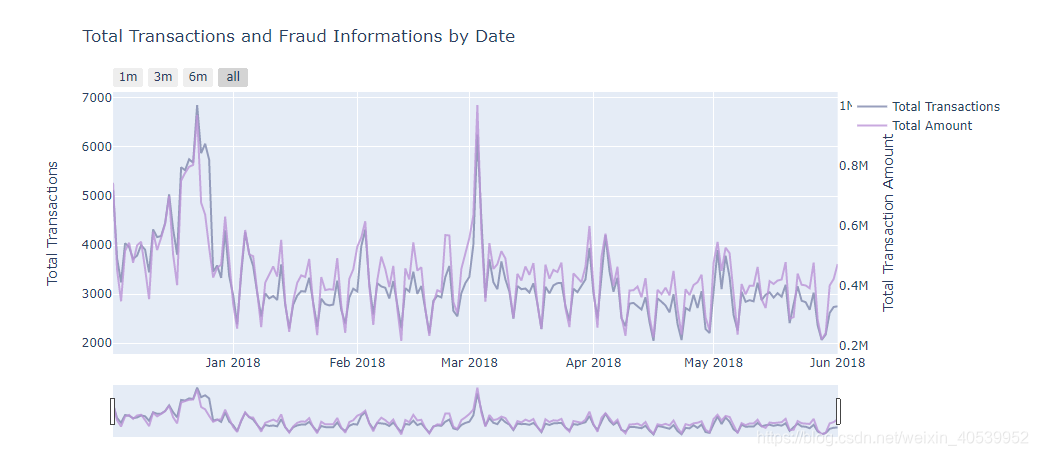
#详情见https://plotly.com/python/reference/
trace = go.Scatter(x=dates_temp['Date'], y=dates_temp.TransactionAmt,
opacity = 0.8, line = dict(color = color_op[7]), name= 'Total Transactions')
# Below we will get the total amount sold
dates_temp_sum = df_trans.groupby(df_trans.Date.dt.date)['TransactionAmt'].sum().reset_index()
# using the new dates_temp_sum we will create the second trace
# 第二坐标轴y
trace1 = go.Scatter(x=dates_temp_sum.Date, line = dict(color = color_op[1]), name="Total Amount",
y=dates_temp_sum['TransactionAmt'], opacity = 0.8, yaxis='y2')
#creating the layout the will allow us to give an title and
# give us some interesting options to handle with the outputs of graphs
layout = dict(
title= "Total Transactions and Fraud Informations by Date",
xaxis=dict(
rangeselector=dict(
buttons=list([
dict(count=1, label='1m', step='month', stepmode='backward'),
dict(count=3, label='3m', step='month', stepmode='backward'),
dict(count=6, label='6m', step='month', stepmode='backward'),
dict(step='all')
])
),
rangeslider=dict(visible = True),
type='date' ),
yaxis=dict(title='Total Transactions'),
yaxis2=dict(overlaying='y',
anchor='x', side='right',
zeroline=False, showgrid=False,
title='Total Transaction Amount') # 设定第二坐标轴
)
# 将布局和trace图连起来,放到一张图里
fig = dict(data= [trace, trace1,], layout=layout)
#rendering the graphs
iplot(fig) #等价于 plt.show()# 同样需要查看虚假交易数量,金额与时间关系
# Calling the function to transform the date column in datetime pandas object
#seting some static color options
color_op = ['#5527A0', '#BB93D7', '#834CF7', '#6C941E', '#93EAEA', '#7425FF', '#F2098A', '#7E87AC',
'#EBE36F', '#7FD394', '#49C35D', '#3058EE', '#44FDCF', '#A38F85', '#C4CEE0', '#B63A05',
'#4856BF', '#F0DB1B', '#9FDBD9', '#B123AC']
# 这里需要按两个元素聚集,方便后续统计
tmp_amt = df_trans.groupby([df_trans.Date.dt.date, 'isFraud'])['TransactionAmt'].sum().reset_index()
tmp_trans = df_trans.groupby([df_trans.Date.dt.date, 'isFraud'])['TransactionAmt'].count().reset_index()
tmp_trans_fraud = tmp_trans[tmp_trans['isFraud'] == 1]
tmp_amt_fraud = tmp_amt[tmp_amt['isFraud'] == 1]
dates_temp = df_trans.groupby(df_trans.Date.dt.date)['TransactionAmt'].count().reset_index()
# renaming the columns to apropriate names
# creating the first trace with the necessary parameters
trace = go.Scatter(x=tmp_trans_fraud['Date'], y=tmp_trans_fraud.TransactionAmt,
opacity = 0.8, line = dict(color = color_op[1]), name= 'Fraud Transactions')
# using the new dates_temp_sum we will create the second trace
trace1 = go.Scatter(x=tmp_amt_fraud.Date, line = dict(color = color_op[7]), name="Fraud Amount",
y=tmp_amt_fraud['TransactionAmt'], opacity = 0.8, yaxis='y2')
#creating the layout the will allow us to give an title and
# give us some interesting options to handle with the outputs of graphs
layout = dict(
title= "FRAUD TRANSACTIONS - Total Transactions and Fraud Informations by Date",
xaxis=dict(
rangeselector=dict(
buttons=list([
dict(count=1, label='1m', step='month', stepmode='backward'),
dict(count=3, label='3m', step='month', stepmode='backward'),
dict(count=6, label='6m', step='month', stepmode='backward'),
dict(step='all')
])
),
rangeslider=dict(visible = True),
type='date' ),
yaxis=dict(title='Total Transactions'),
yaxis2=dict(overlaying='y',
anchor='x', side='right',
zeroline=False, showgrid=False,
title='Total Transaction Amount')
)
# creating figure with the both traces and layout
fig = dict(data= [trace, trace1], layout=layout)
#rendering the graphs
iplot(fig) #it's an equivalent to plt.show()# 第五步,分析完了Transation的数据,该分析一下Identity中的数据,这部分被匿名了
# 同样,先处理数值类型
df_id[['id_12', 'id_13', 'id_14', 'id_15', 'id_16', 'id_17', 'id_18',
'id_19', 'id_20', 'id_21', 'id_22', 'id_23', 'id_24', 'id_25',
'id_26', 'id_27', 'id_28', 'id_29', 'id_30', 'id_31', 'id_32',
'id_33', 'id_34', 'id_35', 'id_36', 'id_37', 'id_38']].describe(include='all')
# 把特征合并到一个表中,反正所有特征都用来预测ISfraud的
df_train = df_trans.merge(df_id, how='left', left_index=True, right_index=True)
# 绘图函数,探究Fraud与id的关系
def cat_feat_ploting(df, col):
tmp = pd.crosstab(df[col], df['isFraud'], normalize='index') * 100
tmp = tmp.reset_index()
tmp.rename(columns={0:'NoFraud', 1:'Fraud'}, inplace=True)
plt.figure(figsize=(14,10))
plt.suptitle(f'{col} Distributions', fontsize=22)
plt.subplot(221)
g = sns.countplot(x=col, data=df, order=tmp[col].values)
# plt.legend(title='Fraud', loc='upper center', labels=['No', 'Yes'])
g.set_title(f"{col} Distribution", fontsize=19)
g.set_xlabel(f"{col} Name", fontsize=17)
g.set_ylabel("Count", fontsize=17)
# g.set_ylim(0,500000)
for p in g.patches:
height = p.get_height()
g.text(p.get_x()+p.get_width()/2.,
height + 3,
'{:1.2f}%'.format(height/total*100),
ha="center", fontsize=14)
plt.subplot(222)
g1 = sns.countplot(x=col, hue='isFraud', data=df, order=tmp[col].values)
plt.legend(title='Fraud', loc='best', labels=['No', 'Yes'])
gt = g1.twinx()
gt = sns.pointplot(x=col, y='Fraud', data=tmp, color='black', order=tmp[col].values, legend=False)
gt.set_ylabel("% of Fraud Transactions", fontsize=16)
g1.set_title(f"{col} by Target(isFraud)", fontsize=19)
g1.set_xlabel(f"{col} Name", fontsize=17)
g1.set_ylabel("Count", fontsize=17)
plt.subplot(212)
g3 = sns.boxenplot(x=col, y='TransactionAmt', hue='isFraud',
data=df[df['TransactionAmt'] <= 2000], order=tmp[col].values )
g3.set_title("Transaction Amount Distribuition by ProductCD and Target", fontsize=20)
g3.set_xlabel("ProductCD Name", fontsize=17)
g3.set_ylabel("Transaction Values", fontsize=17)
plt.subplots_adjust(hspace = 0.4, top = 0.85)
plt.show()
# 由于id值太多,我们依旧分为连续和离散,首先绘制离散(即具有unique的列)
for col in ['id_12', 'id_15', 'id_16', 'id_23', 'id_27', 'id_28', 'id_29']:
df_train[col] = df_train[col].fillna('NaN')
cat_feat_ploting(df_train, col)# 检查到Id30为名义数据,同离散
# contains用法见https://www.geeksforgeeks.org/python-pandas-series-str-contains/
# 数据不干净,只要包含windows我们就设计为Windows存入
df_train.loc[df_train['id_30'].str.contains('Windows', na=False), 'id_30'] = 'Windows'
df_train.loc[df_train['id_30'].str.contains('iOS', na=False), 'id_30'] = 'iOS'
df_train.loc[df_train['id_30'].str.contains('Mac OS', na=False), 'id_30'] = 'Mac'
df_train.loc[df_train['id_30'].str.contains('Android', na=False), 'id_30'] = 'Android'
df_train['id_30'].fillna("NAN", inplace=True) # 真改变数据,而不是返回一个copy
ploting_cnt_amt(df_train, 'id_30')
# id31同理,但是离散值太多,我们就需要挑选counts多的看
df_train.loc[df_train['id_31'].str.contains('chrome', na=False), 'id_31'] = 'Chrome'
df_train.loc[df_train['id_31'].str.contains('firefox', na=False), 'id_31'] = 'Firefox'
df_train.loc[df_train['id_31'].str.contains('safari', na=False), 'id_31'] = 'Safari'
df_train.loc[df_train['id_31'].str.contains('edge', na=False), 'id_31'] = 'Edge'
df_train.loc[df_train['id_31'].str.contains('ie', na=False), 'id_31'] = 'IE'
df_train.loc[df_train['id_31'].str.contains('samsung', na=False), 'id_31'] = 'Samsung'
df_train.loc[df_train['id_31'].str.contains('opera', na=False), 'id_31'] = 'Opera'
df_train['id_31'].fillna("NAN", inplace=True)
df_train.loc[df_train.id_31.isin(df_train.id_31.value_counts()[df_train.id_31.value_counts() < 200].index), 'id_31'] = "Others"
ploting_cnt_amt(df_train, 'id_31')到此为止,我们的对所有特征的数据分析结束了,我们暂时对这些匿名数据到底是什么有了一点点自己的判断,这些数据的分布也可视化的很清楚了,有需要的可以自己下载源码跑一下试试。
4.2 XGboost实战建模
# 六、下面开始建模,模型选定为XGboost
# 步骤:数据读取,数据压缩,数据预处理,参数选择,构建模型,开始预测,存入数据
# 6.1 数据读取
df_trans = pd.read_csv('../input/train_transaction.csv')
df_test_trans = pd.read_csv('../input/test_transaction.csv')

df_id = pd.read_csv('../input/train_identity.csv')
df_test_id = pd.read_csv('../input/test_identity.csv')

sample_submission = pd.read_csv('../input/sample_submission.csv', index_col='TransactionID')
#合并
df_train = df_trans.merge(df_id, how='left', left_index=True, right_index=True, on='TransactionID')
df_test = df_test_trans.merge(df_test_id, how='left', left_index=True, right_index=True, on='TransactionID')

print(df_train.shape)
print(df_test.shape)

# y_train = df_train['isFraud'].copy()
# 防止内存占用,我们只需要一个copy就行
del df_trans, df_id, df_test_trans, df_test_id
# 6.2 数据压缩
df_train = reduce_mem_usage(df_train)
df_test = reduce_mem_usage(df_test)
# 6.3 数据预处理
# 根据https://www.kaggle.com/c/ieee-fraud-detection/discussion/100499#latest-579654可知
# 很多邮件的后缀名同属一家公司
# 我们首先进行邮件的归并
emails = {'gmail': 'google', 'att.net': 'att', 'twc.com': 'spectrum',
          'scranton.edu': 'other', 'optonline.net': 'other', 'hotmail.co.uk': 'microsoft',
          'comcast.net': 'other', 'yahoo.com.mx': 'yahoo', 'yahoo.fr': 'yahoo',
          'yahoo.es': 'yahoo', 'charter.net': 'spectrum', 'live.com': 'microsoft',
          'aim.com': 'aol', 'hotmail.de': 'microsoft', 'centurylink.net': 'centurylink',
          'gmail.com': 'google', 'me.com': 'apple', 'earthlink.net': 'other', 'gmx.de': 'other',
          'web.de': 'other', 'cfl.rr.com': 'other', 'hotmail.com': 'microsoft',
          'protonmail.com': 'other', 'hotmail.fr': 'microsoft', 'windstream.net': 'other',
          'outlook.es': 'microsoft', 'yahoo.co.jp': 'yahoo', 'yahoo.de': 'yahoo',
          'servicios-ta.com': 'other', 'netzero.net': 'other', 'suddenlink.net': 'other',
          'roadrunner.com': 'other', 'sc.rr.com': 'other', 'live.fr': 'microsoft',
          'verizon.net': 'yahoo', 'msn.com': 'microsoft', 'q.com': 'centurylink',
          'prodigy.net.mx': 'att', 'frontier.com': 'yahoo', 'anonymous.com': 'other',
          'rocketmail.com': 'yahoo', 'sbcglobal.net': 'att', 'frontiernet.net': 'yahoo',
          'ymail.com': 'yahoo', 'outlook.com': 'microsoft', 'mail.com': 'other',
          'bellsouth.net': 'other', 'embarqmail.com': 'centurylink', 'cableone.net': 'other',
          'hotmail.es': 'microsoft', 'mac.com': 'apple', 'yahoo.co.uk': 'yahoo', 'netzero.com': 'other',
          'yahoo.com': 'yahoo', 'live.com.mx': 'microsoft', 'ptd.net': 'other', 'cox.net': 'other',
          'aol.com': 'aol', 'juno.com': 'other', 'icloud.com': 'apple'}

us_emails = ['gmail', 'net', 'edu'] # 这里暂时不知道是要干啥

# 这里邮件的归类https://www.kaggle.com/c/ieee-fraud-detection/discussion/100499#latest-579654
for c in ['P_emaildomain', 'R_emaildomain']:
    # 创建新的存储列,存放归并后的邮件
    df_train[c + '_bin'] = df_train[c].map(emails)
    df_test[c + '_bin'] = df_test[c].map(emails)

    df_train[c + '_suffix'] = df_train[c].map(lambda x: str(x).split('.')[-1])
    df_test[c + '_suffix'] = df_test[c].map(lambda x: str(x).split('.')[-1])
    # 这列存储是否是us_emails,如果在列表则不是
    df_train[c + '_suffix'] = df_train[c + '_suffix'].map(lambda x: x if str(x) not in us_emails else 'us')
    df_test[c + '_suffix'] = df_test[c + '_suffix'].map(lambda x: x if str(x) not in us_emails else 'us')
# 其他特征工程
for f in df_train.drop('isFraud', axis=1).columns:
    if df_train[f].dtype=='object' or df_test[f].dtype=='object':
        lbl = preprocessing.LabelEncoder()
        # 名义特征转化为序号,这里的id需要替换!!!!原文件中id名称不一致
        # 奶奶的!谁在原文件的列名动手脚!下次劳资砍死他!
        # 不存在的时候会返回keyerror
        lbl.fit(list(df_train[f].values) + list(df_test[f].values))
        df_train[f] = lbl.transform(list(df_train[f].values))
        df_test[f] = lbl.transform(list(df_test[f].values))
# 统计量也可以作为特征训练,这些特征没有什么逻辑,我们简单的聚集,减少一些消耗
# 参考https://www.kaggle.com/artgor/eda-and-models和我们之前的分析结果
df_train['Trans_min_mean'] = df_train['TransactionAmt'] - df_train['TransactionAmt'].mean()
df_train['Trans_min_std'] = df_train['Trans_min_mean'] / df_train['TransactionAmt'].std()
df_test['Trans_min_mean'] = df_test['TransactionAmt'] - df_test['TransactionAmt'].mean()
df_test['Trans_min_std'] = df_test['Trans_min_mean'] / df_test['TransactionAmt'].std()
df_train['TransactionAmt_to_mean_card1'] = df_train['TransactionAmt'] / df_train.groupby(['card1'])['TransactionAmt'].transform('mean')
df_train['TransactionAmt_to_mean_card4'] = df_train['TransactionAmt'] / df_train.groupby(['card4'])['TransactionAmt'].transform('mean')
df_train['TransactionAmt_to_std_card1'] = df_train['TransactionAmt'] / df_train.groupby(['card1'])['TransactionAmt'].transform('std')
df_train['TransactionAmt_to_std_card4'] = df_train['TransactionAmt'] / df_train.groupby(['card4'])['TransactionAmt'].transform('std')

df_test['TransactionAmt_to_mean_card1'] = df_test['TransactionAmt'] / df_test.groupby(['card1'])['TransactionAmt'].transform('mean')
df_test['TransactionAmt_to_mean_card4'] = df_test['TransactionAmt'] / df_test.groupby(['card4'])['TransactionAmt'].transform('mean')
df_test['TransactionAmt_to_std_card1'] = df_test['TransactionAmt'] / df_test.groupby(['card1'])['TransactionAmt'].transform('std')
df_test['TransactionAmt_to_std_card4'] = df_test['TransactionAmt'] / df_test.groupby(['card4'])['TransactionAmt'].transform('std')
df_train['TransactionAmt'] = np.log(df_train['TransactionAmt'])
df_test['TransactionAmt'] = np.log(df_test['TransactionAmt'])
# 下文进行PCA降维,提取主要特征
df_test['isFraud'] = 'test'
# 并入同一个df进行降维,反正都要降维
df = pd.concat([df_train, df_test], axis=0, sort=False )
df = df.reset_index()
df = df.drop('index', axis=1)
def PCA_change(df, cols, n_components, prefix='PCA_', rand_seed=4):
# 返回新的特征,并删除原有特征!新特征用PCA开头
pca = PCA(n_components=n_components, random_state=rand_seed)
principalComponents = pca.fit_transform(df[cols])
principalDf = pd.DataFrame(principalComponents)
df.drop(cols, axis=1, inplace=True)
principalDf.rename(columns=lambda x: str(prefix)+str(x), inplace=True)
df = pd.concat([df, principalDf], axis=1)
return df
mas_v = df_train.columns[55:394]
from sklearn.preprocessing import minmax_scale
from sklearn.decomposition import PCA
# from sklearn.cluster import KMeans
for col in mas_v:
# 填充缺失值
df[col] = df[col].fillna((df[col].min() - 2))
# 缩放特征值到0-1之间
df[col] = (minmax_scale(df[col], feature_range=(0,1)))
# 进行特征降维,返回新的特征
df = PCA_change(df, mas_v, prefix='PCA_V_', n_components=30)
print(df.head(5))
df = reduce_mem_usage(df) # 进一步缩减内存
df_train, df_test = df[df['isFraud'] != 'test'], df[df['isFraud'] == 'test'].drop('isFraud', axis=1)
# 拆分训练和测试,注意,dataframe中是可以包含dataframe的
# df_train.shape
X_train = df_train.sort_values('TransactionDT').drop(['isFraud',
'TransactionDT',
#'Card_ID'
],
axis=1) # 特征列
y_train = df_train.sort_values('TransactionDT')['isFraud'].astype(bool) #label列
X_test = df_test.sort_values('TransactionDT').drop(['TransactionDT',
#'Card_ID'
],
axis=1)
del df_train
df_test = df_test[["TransactionDT"]]# 6.4 参数选择,这里用到了一个特别好用的包Hyperopt
# https://www.jianshu.com/p/35eed1567463
from sklearn.model_selection import KFold,TimeSeriesSplit
from sklearn.metrics import roc_auc_score
from xgboost import plot_importance
from sklearn.metrics import make_scorer
import time
def objective(params):
time1 = time.time()
params = {
'max_depth': int(params['max_depth']),
'gamma': "{:.3f}".format(params['gamma']),
'subsample': "{:.2f}".format(params['subsample']),
'reg_alpha': "{:.3f}".format(params['reg_alpha']),
'reg_lambda': "{:.3f}".format(params['reg_lambda']),
'learning_rate': "{:.3f}".format(params['learning_rate']),
'num_leaves': '{:.3f}'.format(params['num_leaves']),
'colsample_bytree': '{:.3f}'.format(params['colsample_bytree']),
'min_child_samples': '{:.3f}'.format(params['min_child_samples']),
'feature_fraction': '{:.3f}'.format(params['feature_fraction']),
'bagging_fraction': '{:.3f}'.format(params['bagging_fraction'])
}
# 新的迭代的时候才会调用
print("\n############## New Run ################")
print(f"params = {params}")
FOLDS = 7
count=1
# 每次迭代包括7次交叉验证
# 当样本中各类的含量不平衡时用Stratified k-fold函数来选择训练集和学习集,单在这里不能这么用,仅写出来看一下表明思路
skf = StratifiedKFold(n_splits=FOLDS, shuffle=True, random_state=42)
#https://zhuanlan.zhihu.com/p/99674163时序的数据不能直接简单划分
tss = TimeSeriesSplit(n_splits=FOLDS)
y_preds = np.zeros(sample_submission.shape[0])
y_oof = np.zeros(X_train.shape[0])
score_mean = 0
for tr_idx, val_idx in tss.split(X_train, y_train):
clf = xgb.XGBClassifier(
n_estimators=600, random_state=4, verbose=True,
tree_method='gpu_hist',
**params
)
X_tr, X_vl = X_train.iloc[tr_idx, :], X_train.iloc[val_idx, :]
y_tr, y_vl = y_train.iloc[tr_idx], y_train.iloc[val_idx]
clf.fit(X_tr, y_tr)
#y_pred_train = clf.predict_proba(X_vl)[:,1]
#print(y_pred_train)
score = make_scorer(roc_auc_score, needs_proba=True)(clf, X_vl, y_vl)
# plt.show()
score_mean += score
print(f'{count} CV - score: {round(score, 4)}')
count += 1
time2 = time.time() - time1
print(f"Total Time Run: {round(time2 / 60,2)}")
gc.collect()
print(f'Mean ROC_AUC: {score_mean / FOLDS}')
del X_tr, X_vl, y_tr, y_vl, clf, score
# 返回训练的均值,这里的我们使用ROC_AUC指标来评估
return -(score_mean / FOLDS)
# 以下来源于XGboost官方文档,推荐的典型参数,我们在这些参数中寻优
space = {
# The maximum depth of a tree, same as GBM.
# Used to control over-fitting as higher depth will allow model
# to learn relations very specific to a particular sample.
# Should be tuned using CV.
# Typical values: 3-10
'max_depth': hp.quniform('max_depth', 7, 23, 1),
# reg_alpha: L1 regularization term. L1 regularization encourages sparsity
# (meaning pulling weights to 0). It can be more useful when the objective
# is logistic regression since you might need help with feature selection.
'reg_alpha': hp.uniform('reg_alpha', 0.01, 0.4),
# reg_lambda: L2 regularization term. L2 encourages smaller weights, this
# approach can be more useful in tree-models where zeroing
# features might not make much sense.
'reg_lambda': hp.uniform('reg_lambda', 0.01, .4),
# eta: Analogous to learning rate in GBM
# Makes the model more robust by shrinking the weights on each step
# Typical final values to be used: 0.01-0.2
'learning_rate': hp.uniform('learning_rate', 0.01, 0.2),
# colsample_bytree: Similar to max_features in GBM. Denotes the
# fraction of columns to be randomly samples for each tree.
# Typical values: 0.5-1
'colsample_bytree': hp.uniform('colsample_bytree', 0.3, .9),
# A node is split only when the resulting split gives a positive
# reduction in the loss function. Gamma specifies the
# minimum loss reduction required to make a split.
# Makes the algorithm conservative. The values can vary depending on the loss function and should be tuned.
'gamma': hp.uniform('gamma', 0.01, .7),
# more increases accuracy, but may lead to overfitting.
# num_leaves: the number of leaf nodes to use. Having a large number
# of leaves will improve accuracy, but will also lead to overfitting.
'num_leaves': hp.choice('num_leaves', list(range(20, 250, 10))),
# specifies the minimum samples per leaf node.
# the minimum number of samples (data) to group into a leaf.
# The parameter can greatly assist with overfitting: larger sample
# sizes per leaf will reduce overfitting (but may lead to under-fitting).
'min_child_samples': hp.choice('min_child_samples', list(range(100, 250, 10))),
# subsample: represents a fraction of the rows (observations) to be
# considered when building each subtree. Tianqi Chen and Carlos Guestrin
# in their paper A Scalable Tree Boosting System recommend
'subsample': hp.choice('subsample', [0.2, 0.4, 0.5, 0.6, 0.7, .8, .9]),
# randomly select a fraction of the features.
# feature_fraction: controls the subsampling of features used
# for training (as opposed to subsampling the actual training data in
# the case of bagging). Smaller fractions reduce overfitting.
'feature_fraction': hp.uniform('feature_fraction', 0.4, .8),
# randomly bag or subsample training data.
'bagging_fraction': hp.uniform('bagging_fraction', 0.4, .9)
# bagging_fraction and bagging_freq: enables bagging (subsampling)
# of the training data. Both values need to be set for bagging to be used.
# The frequency controls how often (iteration) bagging is used. Smaller
# fractions and frequencies reduce overfitting.
}
# 正式进行超参数寻优,迭代27次,每次7次交叉验证
# Set algoritm parameters
best = fmin(fn=objective,
space=space,
algo=tpe.suggest,
max_evals=27)
# 输出最优参数
best_params = space_eval(space, best)
print("BEST PARAMS: ", best_params)
best_params['max_depth'] = int(best_params['max_depth'])# 6.5 用训练好的超参数进行预测
clf = xgb.XGBClassifier(
n_estimators=300,
**best_params,
tree_method='gpu_hist'
)
clf.fit(X_train, y_train)
y_preds = clf.predict_proba(X_test)[:,1]
# 查看最重要的特征
feature_important = clf.get_booster().get_score(importance_type="weight")
keys = list(feature_important.keys())
values = list(feature_important.values())
data = pd.DataFrame(data=values, index=keys, columns=["score"]).sort_values(by = "score", ascending=False)
# Top 10 features
data.head(20)
# 存入一个新的csv
sample_submission['isFraud'] = y_preds
sample_submission.to_csv('XGB_hypopt_model.csv')
这里会生成一个XGB_hypopt_model.csv的文件,里面就是我们预测的结果。
4.3 结果展示
由于JupyterNotebook生成的可视化有点多,数据分析结果也很多,我挑几个重要的大家看一看。
部分可视化:
XGboost模型寻优结果:
BEST PARAMS: {'bagging_fraction': 0.8993155305338455, 'colsample_bytree': 0.7463058454739352, 'feature_fraction': 0.7989765808988153, 'gamma': 0.6665437467229817, 'learning_rate': 0.013887824598276186, 'max_depth': 16.0, 'min_child_samples': 170, 'num_leaves': 220, 'reg_alpha': 0.39871702770778467, 'reg_lambda': 0.24309304355829786, 'subsample': 0.7}重要的特征:
| score | |
|---|---|
| TransactionID | 27258 |
| card1 | 23536 |
| card2 | 21594 |
| TransactionAmt_to_mean_card1 | 18750 |
| addr1 | 18022 |
| TransactionAmt_to_std_card1 | 15035 |
| TransactionAmt | 13566 |
| PCA_V_13 | 10826 |
| TransactionAmt_to_std_card4 | 10541 |
| card5 | 10527 |
| D8 | 10007 |
| TransactionAmt_to_mean_card4 | 9831 |
| PCA_V_29 | 9801 |
| PCA_V_14 | 9616 |
| PCA_V_27 | 9582 |
| PCA_V_23 | 9468 |
| dist1 | 9421 |
| PCA_V_17 | 9389 |
| D15 | 9368 |
| PCA_V_26 | 9270 |
五、数据集下载
待csdn审核通过后访问:数据集下载


 649
649


 被折叠的 条评论
为什么被折叠?
被折叠的 条评论
为什么被折叠?
 到【灌水乐园】发言


