


折线图主要是看内容随时间变化的趋势情况
# 导入模块
import pandas as pd
import matplotlib.pyplot as plt

# 设置中文编码和负号的正常显示
plt.rcParams['font.sans-serif'] = 'SimHei'
plt.rcParams['axes.unicode_minus'] = False

# 读取需要绘图的数据
df = pd.read_excel(r'user_analysis.xlsx')
df
| 时间 | 新关注人数 | 取消关注人数 | 净增关注人数 | |
|---|---|---|---|---|
| 0 | NaT | NaN | NaN | NaN |
| 1 | 2017-09-01 | 87.0 | 7.0 | 80.0 |
| 2 | 2017-09-02 | 85.0 | 20.0 | 65.0 |
| 3 | 2017-09-03 | 90.0 | 10.0 | 80.0 |
| 4 | 2017-09-04 | 88.0 | 17.0 | 71.0 |
| 5 | 2017-09-05 | 78.0 | 19.0 | 59.0 |
| 6 | 2017-09-06 | 81.0 | 8.0 | 73.0 |
| 7 | 2017-09-07 | 224.0 | 11.0 | 213.0 |
| 8 | 2017-09-08 | 124.0 | 12.0 | 112.0 |
| 9 | 2017-09-09 | 59.0 | 6.0 | 53.0 |
| 10 | 2017-09-10 | 72.0 | 15.0 | 57.0 |
| 11 | 2017-09-11 | 94.0 | 10.0 | 84.0 |
| 12 | 2017-09-12 | 68.0 | 14.0 | 54.0 |
| 13 | 2017-09-13 | 110.0 | 7.0 | 103.0 |
| 14 | 2017-09-14 | 108.0 | 13.0 | 95.0 |
| 15 | 2017-09-15 | 142.0 | 10.0 | 132.0 |
| 16 | 2017-09-16 | 75.0 | 13.0 | 62.0 |
| 17 | 2017-09-17 | 85.0 | 9.0 | 76.0 |
| 18 | 2017-09-18 | 114.0 | 15.0 | 99.0 |
| 19 | 2017-09-19 | 95.0 | 10.0 | 85.0 |
| 20 | 2017-09-20 | 118.0 | 13.0 | 105.0 |
| 21 | 2017-09-21 | 87.0 | 7.0 | 80.0 |
| 22 | 2017-09-22 | 108.0 | 10.0 | 98.0 |
| 23 | 2017-09-23 | 103.0 | 12.0 | 91.0 |
| 24 | 2017-09-24 | 79.0 | 9.0 | 70.0 |
| 25 | 2017-09-25 | 93.0 | 6.0 | 87.0 |
| 26 | 2017-09-26 | 309.0 | 19.0 | 290.0 |
| 27 | 2017-09-27 | 394.0 | 19.0 | 375.0 |
| 28 | 2017-09-28 | 310.0 | 24.0 | 286.0 |
| 29 | 2017-09-29 | 756.0 | 13.0 | 743.0 |
| 30 | 2017-09-30 | 510.0 | 47.0 | 463.0 |
df.dropna(axis=0)
| 时间 | 新关注人数 | 取消关注人数 | 净增关注人数 | |
|---|---|---|---|---|
| 1 | 2017-09-01 | 87.0 | 7.0 | 80.0 |
| 2 | 2017-09-02 | 85.0 | 20.0 | 65.0 |
| 3 | 2017-09-03 | 90.0 | 10.0 | 80.0 |
| 4 | 2017-09-04 | 88.0 | 17.0 | 71.0 |
| 5 | 2017-09-05 | 78.0 | 19.0 | 59.0 |
| 6 | 2017-09-06 | 81.0 | 8.0 | 73.0 |
| 7 | 2017-09-07 | 224.0 | 11.0 | 213.0 |
| 8 | 2017-09-08 | 124.0 | 12.0 | 112.0 |
| 9 | 2017-09-09 | 59.0 | 6.0 | 53.0 |
| 10 | 2017-09-10 | 72.0 | 15.0 | 57.0 |
| 11 | 2017-09-11 | 94.0 | 10.0 | 84.0 |
| 12 | 2017-09-12 | 68.0 | 14.0 | 54.0 |
| 13 | 2017-09-13 | 110.0 | 7.0 | 103.0 |
| 14 | 2017-09-14 | 108.0 | 13.0 | 95.0 |
| 15 | 2017-09-15 | 142.0 | 10.0 | 132.0 |
| 16 | 2017-09-16 | 75.0 | 13.0 | 62.0 |
| 17 | 2017-09-17 | 85.0 | 9.0 | 76.0 |
| 18 | 2017-09-18 | 114.0 | 15.0 | 99.0 |
| 19 | 2017-09-19 | 95.0 | 10.0 | 85.0 |
| 20 | 2017-09-20 | 118.0 | 13.0 | 105.0 |
| 21 | 2017-09-21 | 87.0 | 7.0 | 80.0 |
| 22 | 2017-09-22 | 108.0 | 10.0 | 98.0 |
| 23 | 2017-09-23 | 103.0 | 12.0 | 91.0 |
| 24 | 2017-09-24 | 79.0 | 9.0 | 70.0 |
| 25 | 2017-09-25 | 93.0 | 6.0 | 87.0 |
| 26 | 2017-09-26 | 309.0 | 19.0 | 290.0 |
| 27 | 2017-09-27 | 394.0 | 19.0 | 375.0 |
| 28 | 2017-09-28 | 310.0 | 24.0 | 286.0 |
| 29 | 2017-09-29 | 756.0 | 13.0 | 743.0 |
| 30 | 2017-09-30 | 510.0 | 47.0 | 463.0 |
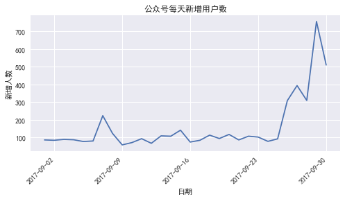
# 设置图框的大小
fig = plt.figure(figsize=(8,4))
# 绘图
plt.plot(df['时间'], # x轴数据
         df['新关注人数'], # y轴数据
        )

# 添加标题和坐标轴标签
plt.title('公众号每天新增用户数')
plt.xlabel('日期')
plt.ylabel('新增人数')

fig.autofmt_xdate(rotation = 45)

# 显示图形
plt.show()
C:\Users\Dell\AppData\Roaming\Python\Python36\site-packages\pandas\plotting\_converter.py:129: FutureWarning: Using an implicitly registered datetime converter for a matplotlib plotting method. The converter was registered by pandas on import. Future versions of pandas will require you to explicitly register matplotlib converters.

To register the converters:
	>>> from pandas.plotting import register_matplotlib_converters
	>>> register_matplotlib_converters()
  warnings.warn(msg, FutureWarning)
![[外链图片转存失败(img-iOekaEvk-1567847528812)(output_4_1.png)]](https://i-blog.csdnimg.cn/blog_migrate/f3542d07989486fbf7a478b6f89c624e.png)
# 设置图框的大小
fig = plt.figure(figsize=(8,4))

# 设置绘图风格
plt.style.use('seaborn')

# 设置中文编码和负号的正常显示
plt.rcParams['font.sans-serif'] = 'SimHei'
plt.rcParams['axes.unicode_minus'] = False

# 绘图
plt.plot(df['时间'], # x轴数据
         df['新关注人数'], # y轴数据
        )

# 添加标题和坐标轴标签
plt.title('公众号每天新增用户数')
plt.xlabel('日期')
plt.ylabel('新增人数')

fig.autofmt_xdate(rotation = 45)

# 显示图形
plt.show()
#一张图上多个折线图

# 设置图框的大小
fig = plt.figure(figsize=(8,4))

# 设置绘图风格
plt.style.use('seaborn')

# 设置中文编码和负号的正常显示
plt.rcParams['font.sans-serif'] = 'SimHei'
plt.rcParams['axes.unicode_minus'] = False

# 绘图
plt.plot(
         df['新关注人数'], # y轴数据
         marker = 'o', # 点的形状
         markersize = 5, # 点的大小
         markerfacecolor='mediumpurple' # 点的填充色
        )

plt.plot(
         df['取消关注人数'], # y轴数据
         marker = 'o', # 点的形状
         markersize = 5, # 点的大小
         markerfacecolor='orangered' # 点的填充色
)


# 添加标题和坐标轴标签
plt.title('公众号关注情况')
plt.xlabel('日期')
plt.ylabel('新增人数')

fig.autofmt_xdate(rotation = 45)

# 显示图例
plt.legend()
# 显示图形
plt.show()
![[外链图片转存失败(img-gDbBbYq7-1567847528814)(output_6_0.png)]](https://i-blog.csdnimg.cn/blog_migrate/d2711a2d9351ba81f8ca29b829660a34.png)
#一张图上多个折线图

# 设置图框的大小
fig = plt.figure(figsize=(8,4))

# 设置绘图风格
plt.style.use('seaborn')

# 设置中文编码和负号的正常显示
plt.rcParams['font.sans-serif'] = 'SimHei'
plt.rcParams['axes.unicode_minus'] = False

# 绘图
plt.plot(
         df['新关注人数'], # y轴数据
        )

plt.plot(
         df['净增关注人数'], # y轴数据
        )


# 添加标题和坐标轴标签
plt.title('公众号每天新增用户数')
plt.xlabel('日期')
plt.ylabel('新增人数')

fig.autofmt_xdate(rotation = 45)

# 显示图例
plt.legend()
# 显示图形
plt.show()
![[外链图片转存失败(img-zcVRYlDM-1567847528814)(output_7_0.png)]](https://i-blog.csdnimg.cn/blog_migrate/88a023df7b7c324315110f6cc8178d5a.png)


 353
353

 被折叠的 条评论
为什么被折叠?
被折叠的 条评论
为什么被折叠?
 到【灌水乐园】发言


