


学习过程中忍不住又想来写博客记录一些点了。之前一直在用xmind记录关键词,但刚刚遇到了一些自己觉得需要记忆的东西,就开一个新文章来记录叭~ 学习网站指路:看这里!
碎碎念:本来我是用“富文本编译器”写的,但是插入的css代码没高亮!清一色的灰底黑字太单调了!我忍不住换了markdown
目录
1.导航栏
1.1垂直导航栏
首先先创建一个列表
<ul>
<li><a href="#home">Home</a></li>
<li><a href="#news">News</a></li>
<li><a href="#contact">Contact</a></li>
<li><a href="#about">About</a></li>
</ul>
以下是css代码!效果图如下
ul
{
list-style-type:none; /*移除列表前小标志。一个导航栏并不需要列表标记*/
margin:0;
padding:0;  /*移除浏览器的默认设置将边距和填充设置为0。另一个说法是:消除文本与div边框之间的间隙*/
} /*这是垂直和水平导航栏使用的标准代码。*/
a:link,a:visited
{
display:block;/*显示块元素的链接,让整体变为可点击链接区域(不只是文本),它允许我们指定宽度*/
font-weight:bold;
color:#FFFFFF;
background-color:#98bf21;
width:120px;
text-align:center;
padding:4px;/*这里的padding相当于导航栏每个东东的间距*/
text-decoration:none;/*规定添加到文本的修饰 比如下划线underline*/
text-transform:uppercase;
}
a:hover,a:active
{
background-color:#7A991A;
}

对display:block;再说一下:对于a{display:block; width:100px; background-color:yellow;}有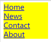 在每行的黄色区域范围内都可以点。
1.2水平导航栏
方法一
li{display:inline;},用了这个之后就不能设置width值了。
用这个创建的标签大小是根据标签内含的文字,所以大小不一定一致。要想大小一致看方法二
方法二
用float:left;(PS:一旦设置了这个,元素变成了inline-block,可设置宽高。如果没有设置,默认值由文本内容决定。float:right;和 position:absolute;均是如此)
css代码如下
ul
{
list-style-type:none;
margin:0;
padding:0;
overflow:hidden;/*用来防止li元素的文字超出列表*/
}
li
{
float:left; /*使用浮动块元素的幻灯片彼此相邻*/
}
a
{
display:block;
width:60px;
background-color:#dddddd;
}
一旦删掉overflow:hidden;后面的文字就会跑上来,不知道为什么。如图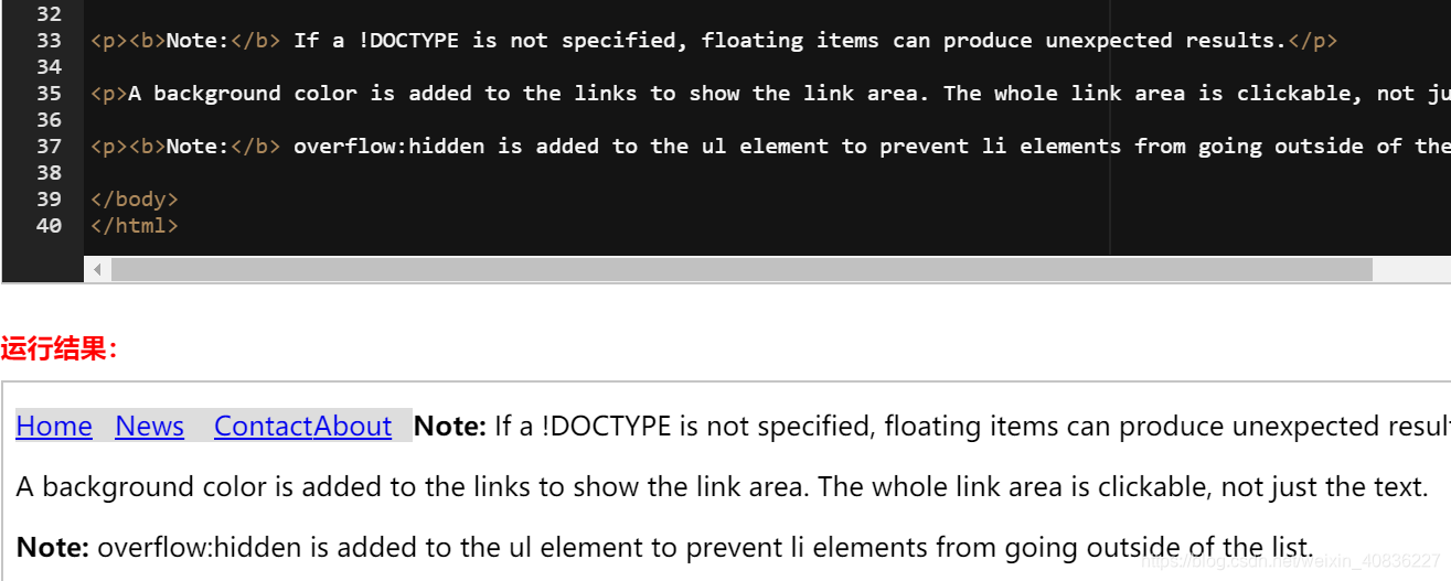
而如果删掉overflow:hidden;的同时增加p{clear:both;}后面的文字呈现出不同的效果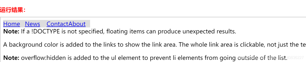
解答: 第一个做法是将overflow:hidden;去掉。overflow:hidden;的效果是清除浮动给后面元素带来的影响,如果删掉的话,相当于导航栏浮动了,后面的元素会围绕导航栏显示。第二个做法是去掉overflow:hidden;的同时添加p{clear:both;},这是清除浮动的代码。
2.下拉菜单
2.1 relative和absolute
这篇文章已经讲的很清楚了Absolute(绝对定位)与relative(相对定位)的图文讲解
总结一下:
- Absolution:元素会脱离文档流,定位是相对于离它最近的且不是static定位的父元素而言,若该元素没有设置宽度,则宽度由元素里面的内容决定,且宽度不会影响父元素,定位为absolution后,原来的位置相当于是空的,下面的的元素会来占据。
- Relative:元素仍处于文档流中,定位是相对于原本自身的位置, 若没有设置宽度,则宽度为父元素的宽度,该元素的大小会影响父元素的大小。(这句的意思是,如果元素宽度小于父元素宽度,那在没有设置自身宽度时,元素宽度会等于父元素宽度。如果元素宽度大于父元素宽度,那父元素宽度会变大,直至和元素宽度一致)
- 见下图
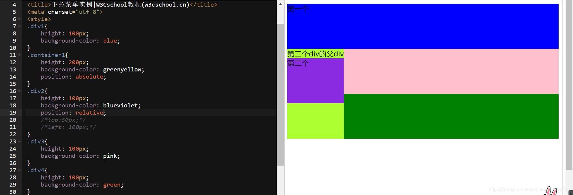
可看出紫色那块,在没有定left和top时,是从父元素的文本下面开始算的。相当于插入left:0;top:0;
源码:
<!DOCTYPE html>
<html>
<head>
<title>Absolute(绝对定位)与relative(相对定位)的示例</title>
<meta charset="utf-8">
<style>
.div1{
    height: 100px;
    background-color: blue;
}
.container1{
    height: 200px;
    background-color: greenyellow;
    position: absolute;
}
.div2{
    height: 100px;
    background-color: blueviolet;
    position: relative;
    top:0;
    left: 0;
}
.div3{
    height: 100px;
    background-color: pink;
}
.div4{
    height: 100px;
    background-color: green;
}

</style>
</head>
<body>
<div class="div1">第一个</div>
<div class="container1">
    第二个div的父div
    <div class="div2">第二个</div>
</div>

<div class="div3">第三个</div>
<div class="div4">第四个</div>

</body>
</html>
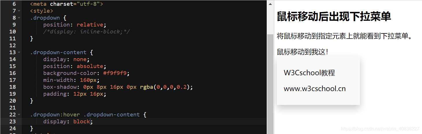
2.2 display
- 不懂实例1中的
.dropdown为什么要有display:inline-block;
但是.dropdown:hover .dropdown-content则出现了区别:
display:block;时:
display:inline-block;时: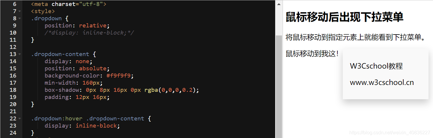
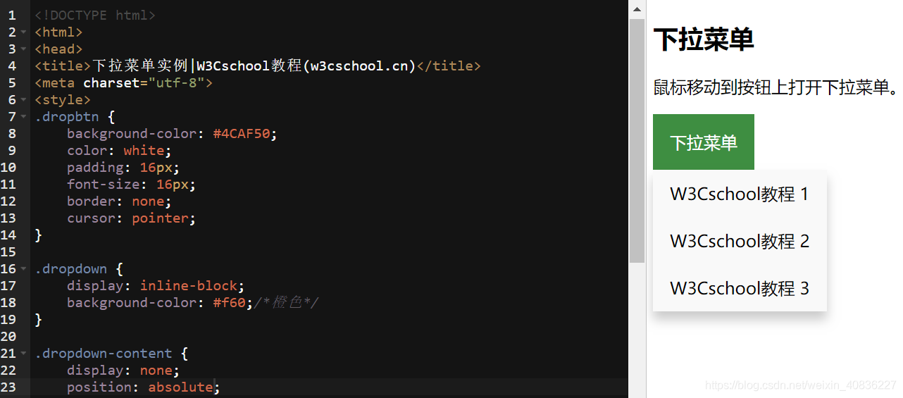
.dropdown-content的display一定要none!如果是block,看图: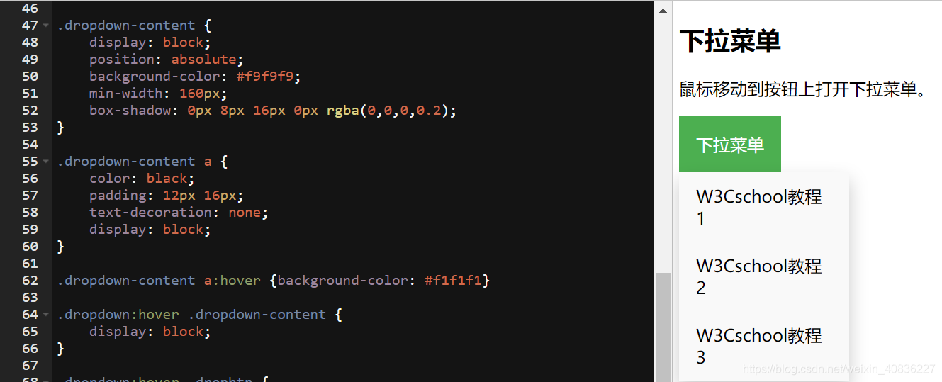
代码一运行列表就出来了,没有“下拉菜单”的效果。这也间接说明了在.dropdown:hover时.dropdown-content的display要为block
2.3 box-shadow
这个属性太强了叭!!!这里
记录一下属性值:
| 值 | 描述 |
|---|---|
| h-shadow | 必需。水平阴影的位置。允许负值。 |
| v-shadow | 必需。垂直阴影的位置。允许负值。 |
| blur | 可选。模糊距离。 |
| spread | 可选。阴影的尺寸。 |
| color | 可选。阴影的颜色。 |
| inset | 可选。将外部阴影 (outset) 改为内部阴影。 |
有不懂(已解决)
CSS
下拉菜单教程中示例2的.dropdown-content有position:relative但是倒数第一个示例:导航栏下拉中的.dropdown-content不可以有position:relative,否则会出错。但是这两个都是有dropbtn这个类,示例2的对应的是button元素,导航栏对应的是a元素。不知道为什么不行
10.11自己解答:看了半天才知道自己想说什么。以后要加强问题描述能力才行。
首先示例2的源码.dropdown-content是position:absolute,absolute是脱离文档流的,之所以之前觉得relative可以,是因为那个例子中没有父容器加背景颜色,否则能明显看到absolute和relative效果是不一样的。
position为relative时:
position为absolute时:
其次,倒数第一个示例换成relative会出错,会出什么错?(以后记得贴图)一般是父容器用relative,子容器用absolute。
最后,那两个都有dropbtn这个类,实测在这两个类中添加position:relative效果一样。
2.4 利用js制作二级动画菜单
3. 根据html写css
根据下列表的html信息,通过编写css将其显示成如图所示布局
<ul class="ipo-info">
    <li class="ipo-attr"><label>承销商</label><p>Citigroup</p></li>
    <li class="ipo-attr"><label>预计发行量</label><p>3,100,000</p></li>
    <li class="ipo-attr"><label>最低认购数量</label><p>100</p></li>
    <li class="ipo-attr"><label>认购关闭时间</label><p>2018-12-13</p></li>
    <li class="ipo-attr"><label>预计价格区间</label><p>16.50-18.50 USD</p></li>
    <li class="ipo-attr"><label>上市时间</label><p>2018-12-14</p></li>
</ul>
效果图:
用到flex布局
<!DOCTYPE html>
<html>
<head>
<title>尝试</title>
<meta charset="utf-8">
<style>
    ul{
        width: 600px;
        height: 400px;
    }
    li{
        display: flex;
        justify-content:space-between;
        align-items: baseline;/*用center也可以*/
    }
    li:nth-of-type(odd){
        width: 250px;
        float: left;
        height: 10%;
        /* background-color: violet; */
        margin-right: 10px;

    }
    li:nth-of-type(even){
        width: 250px;
        float: left;
        height: 10%;
        /* background-color: goldenrod; */
    }
</style>
</head>
<body>

<ul class="ipo-info">
    <li class="ipo-attr"><label>承销商</label><p>Citigroup</p></li>
    <li class="ipo-attr"><label>预计发行量</label><p>3,100,000</p></li>
    <li class="ipo-attr"><label>最低认购数量</label><p>100</p></li>
    <li class="ipo-attr"><label>认购关闭时间</label><p>2018-12-13</p></li>
    <li class="ipo-attr"><label>预计价格区间</label><p>16.50-18.50 USD</p></li>
    <li class="ipo-attr"><label>上市时间</label><p>2018-12-14</p></li>
</ul>

</body>
</html>
另一个写法,没有用flex
ul{
  list-style: none;
  margin: 0;
  padding: 0;
  width: 550px;
}

li.ipo-attr:nth-of-type(2n+1){
  float: left;
  width:250px;
/*   border: 1px solid black; */
}
li.ipo-attr:nth-of-type(2n+1) label{
  float:left;
  padding-top: 15px;
}
li.ipo-attr:nth-of-type(2n+1) p{
  float: right;
}
li.ipo-attr:nth-of-type(2n){
  float: right;
/*   border: 1px solid black; */
  width: 250px;
}
li.ipo-attr:nth-of-type(2n) label{
  float:left;
  padding-top: 15px;
}
li.ipo-attr:nth-of-type(2n) p{
  float: right;
}
4. 自适应
自适应太难了…浮动的方法二就没看懂。其实前面也没看懂多少。我连margin-right为负数的效果都想不出来,突然一堆塞给我…我…连谁起了什么作用都没分清
5. 等分布局
暂时只能看懂实现CSS等分布局的5种方式的第四种方法:flex
<style>
body,p{margin: 0;}
.parent{
    display: flex;
}
.child{
    flex:1;
    height: 100px;
}
.child + .child{/*CSS相邻兄弟选择器。可选择紧接在另一元素后的元素,且二者有相同父元素。(只影响加号后面的那个元素,不影响加号前面的)*/
    margin-left: 20px;
}
</style>
<div class="parent" style="background-color: lightgrey;">
    <div class="child" style="background-color: lightblue;">1</div>
    <div class="child" style="background-color: lightgreen;">2</div>
    <div class="child" style="background-color: lightsalmon;">3</div>
    <div class="child" style="background-color: pink;">4</div>
</div>
6.float(行内与块内)
行内元素和块级元素使用浮动后的变化
css — > 浮动元素与 块框/行内框重叠时的细节
<!DOCTYPE html>
<html>
<head lang="en">
    <meta charset="UTF-8">
    <title></title>
</head>
<body>
<div style="width:600px; height:600px; background-color: #d03642;margin:50px auto;text-align: center">
    <!--左浮动-->
    <span style="color:#fff;font-size: 30px; height:50px;padding:30px;width: 100px; background-color: lightseagreen;float: left">左浮动</span>
    <!--未设置浮动(父级设置了text-align:center)-->
    <!-- 未设置浮动的span的width和height是不起作用的,即将span的width设为200px或500px都一样,现在的width是由content、padding控制 -->
    <span style="color:#fff;font-size: 30px; height:50px;padding:30px;width: 500px; background-color: lightseagreen">无浮动</span>
    <!--右浮动-->
    <span style="color:#fff;font-size: 30px; height:50px;padding:30px;width: 100px; background-color: lightseagreen;float: right;">右浮动</span>
</div>
</body>
</html>
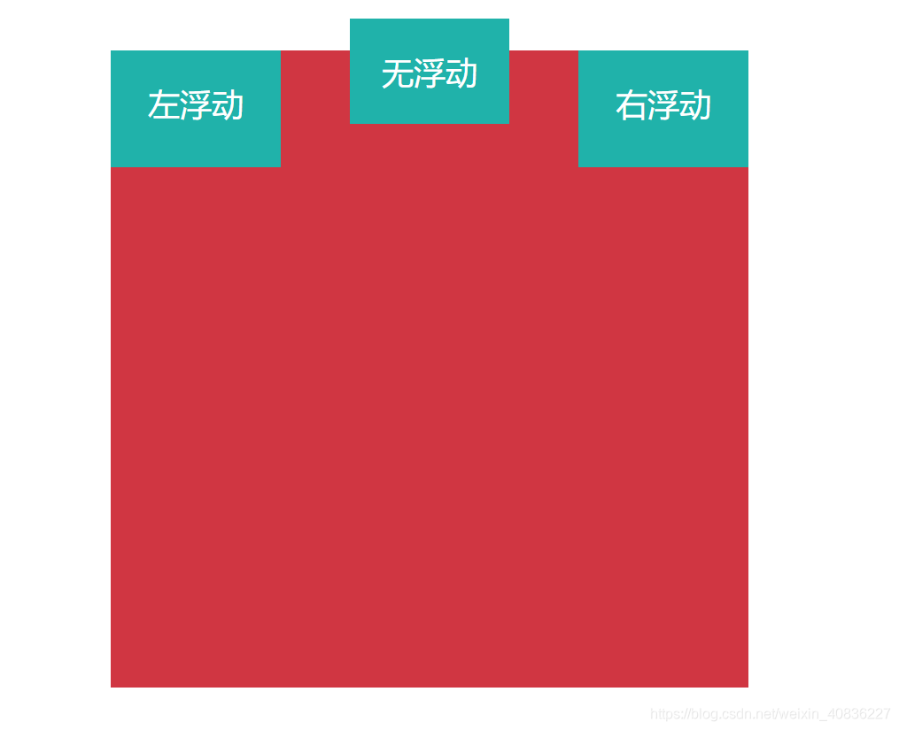
对比没有浮动时:
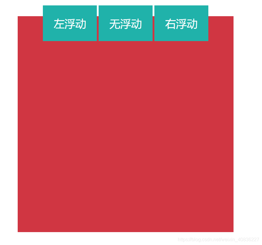
设置浮动的元素是脱离文档流的,因此会遮盖未设置浮动的元素,以最典型的块级元素div为例
<!DOCTYPE html>
<html>
<head lang="en">
    <meta charset="UTF-8">
    <title></title>
</head>
<body>
<div style="width:600px; height:600px; background-color: #d03642;margin:50px auto;text-align: center">
    <!--左浮动-->
    <div style="color:#fff;font-size: 30px; height:50px;padding:30px; background-color: lightseagreen;float: left">左浮动</div>
    <!--未设置浮动-->
    <div style="color:#fff;font-size: 30px; height:100px;padding:30px;width: 150px; background-color: blanchedalmond;border:1px solid green">无浮动</div>
</div>
</body>
</html>
7.content-box与border-box的offsetWidth
content-box: 默认值,标准盒子模型。 width=元素宽度(比如div的宽度)
offerWidth=width+border+padding(不包含margin)
border-box: width =内容+内边距+边框,但不包括外边距。
offsetWidth=width
元素宽度=width-padding-border
例子:
<!DOCTYPE html>
<html>
<head>
  <meta charset="utf-8">
  <meta name="viewport" content="width=device-width">
  <title>JS Bin</title>
  <style>
    div {
	  width: 160px;
	  height: 80px;
	  padding: 20px;
	  border: 8px solid red;
	  background: yellow;
	  margin: 20px;
	}

	#content-box {
	  box-sizing: content-box;
  /* Total width: 160px + (2 * 20px) + (2 * 8px) = 216px
     Total height: 80px + (2 * 20px) + (2 * 8px) = 136px
     Content box width: 160px
     Content box height: 80px */
	}

	#border-box {
	  box-sizing: border-box;
  /* Total width: 160px
     Total height: 80px
     Content box width: 160px - (2 * 20px) - (2 * 8px) = 104px
     Content box height: 80px - (2 * 20px) - (2 * 8px) = 24px */
	}
  </style>
</head>
<body>
<div id="content-box">Content box</div>
<br>
<div id="border-box">Border box</div>
</body>
</html>
var cb = document.getElementById('content-box');
console.log('content-box的offsetWidth:'+cb.offsetWidth);//"content-box的offsetWidth:216"(160+20*2+8*2=216)
// console.log(cb.width);//这个为啥不行嘞?
var bb = document.getElementById('border-box');
console.log('border-box的offsetWidth:'+bb.offsetWidth);//"border-box的offsetWidth:160"
8.根据html写css
根据下列表的html信息,通过编写css将其显示成如图所示布局
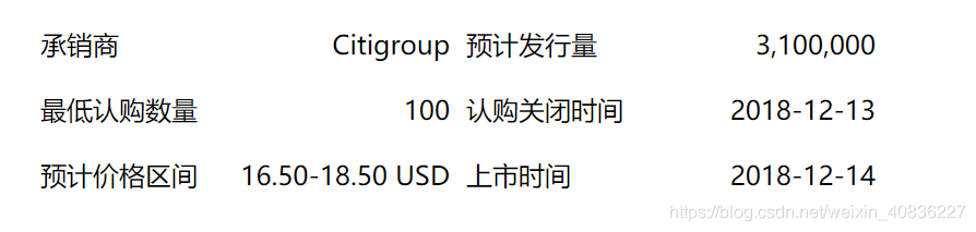
<ul class="ipo-info">
    <li class="ipo-attr"><label>承销商</label><p>Citigroup</p></li>
    <li class="ipo-attr"><label>预计发行量</label><p>3,100,000</p></li>
    <li class="ipo-attr"><label>最低认购数量</label><p>100</p></li>
    <li class="ipo-attr"><label>认购关闭时间</label><p>2018-12-13</p></li>
    <li class="ipo-attr"><label>预计价格区间</label><p>16.50-18.50 USD</p></li>
    <li class="ipo-attr"><label>上市时间</label><p>2018-12-14</p></li>
</ul>
用到flex布局
<!DOCTYPE html>
<html>
<head>
<title>尝试</title>
<meta charset="utf-8">
<style>
    ul{
        width: 600px;
        height: 400px;
    }
    li{
        display: flex;
        justify-content:space-between;
        align-items: baseline;/*用center也可以*/
    }
    li:nth-of-type(odd){
        width: 250px;
        float: left;
        height: 10%;
        /* background-color: violet; */
        margin-right: 10px;

    }
    li:nth-of-type(even){
        width: 250px;
        float: left;
        height: 10%;
        /* background-color: goldenrod; */
    }
</style>
</head>
<body>

<ul class="ipo-info">
    <li class="ipo-attr"><label>承销商</label><p>Citigroup</p></li>
    <li class="ipo-attr"><label>预计发行量</label><p>3,100,000</p></li>
    <li class="ipo-attr"><label>最低认购数量</label><p>100</p></li>
    <li class="ipo-attr"><label>认购关闭时间</label><p>2018-12-13</p></li>
    <li class="ipo-attr"><label>预计价格区间</label><p>16.50-18.50 USD</p></li>
    <li class="ipo-attr"><label>上市时间</label><p>2018-12-14</p></li>
</ul>

</body>
</html>
9.居中
9.1水平居中
9.1.1行内元素
使用text-align = center;(在块元素不起作用)
9.1.2块元素
9.1.2.1定宽块元素
设置了width,用margin = 0 auto;
9.1.2.2不定宽块元素
方法
- 加入 table 标签
- 设置 display: inline 方法:与第一种类似,显示类型设为 行内元素,进行不定宽元素的属性设置
- 设置 position:relative 和 left:50%:利用 相对定位 的方式,将元素向左偏移 50% (
left:-50%),即达到居中的目的 - 用flex布局,
justify-content:center
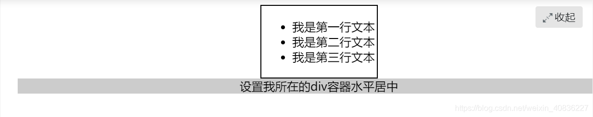
方法1. 利用table标签的长度自适应性(即table其长度根据其内文本长度决定),因此可以看做一个定宽度块元素,然后再利用定宽度块状居中的margin的方法,使其水平居中。
<!DOCTYPE HTML>
<html>
<head>
<meta charset="utf-8">
<title>不定宽块状元素水平居中</title>
<style>
table{
    border:1px solid;
    margin:0 auto;
}
.wrap{
    text-align:center;
    background:#ccc;
}
</style>
</head>
<body>
<div>
<table>
    <tr><td>
        <ul>
            <li>我是第一行文本</li>
            <li>我是第二行文本</li>
            <li>我是第三行文本</li>
        </ul>
    </td></tr>
</table>
</div>
<div class="wrap">
  设置我所在的div容器水平居中
</div>
</body>
</html>
方法二: 将块元素设置为display: inline,变成行内元素,然后用text-align:center;
方法三: 设置 position:relative和left:50%:利用 相对定位 的方式,将元素向左偏移 50%
<!DOCTYPE HTML>
<html>
<head>
<meta charset="utf-8">
<title>不定宽块状元素水平居中</title>
<style>
.container{
    border:1px solid;
    float:left;/*因为容器内的元素(li)是浮动的,所以要不把容器一起浮动,要不就用伪类:after消除溢出的情况*/
    margin-left:50%;
}
.container ul{
    list-style:none;
    padding:0;
    margin:0;
    position:relative;
    left:-50%;/*需要这个是因为,上面.container的设置完之后,左边框位于屏幕中间。如果要将内容放置中间,还需要往左移一半*/
}
.container li{
    float:left;
    display:inline;
    margin:10px;
}
</style>
</head>

<body>
<div class="container">
	<ul>
    	<li><a href="#">1</a></li>
        <li><a href="#">2</a></li>
        <li><a href="#">3</a></li>
    </ul>
</div>
</body>
</html>
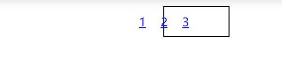
怎么说呢,这个方法有点为了居中而居中了,很不友好的。这里的页面元素只有一点点,所以看不出缺陷,而缺陷就是1的左边的空间全部不能用。
还有一个方法是直接对div进行操作的,对div先用float、margin-left再用translateX。但这个方法用的也是margin-left,也会让左边的空间不能用
<!DOCTYPE HTML>
<html>
<head>
<meta charset="utf-8">
<title>不定宽块状元素水平居中</title>
<style>
.container{
    border:1px solid;
    float:left;
    margin-left:50%;
    transform: translateX(-50%);
}
.container ul{
    list-style:none;
    padding:0;
    margin:0;
}
.container li{
    float:left;
    display:inline;
    margin:10px;
}
</style>
</head>

<body>
<div class="container">
	<ul>
    	<li><a href="#">1</a></li>
        <li><a href="#">2</a></li>
        <li><a href="#">3</a></li>
    </ul>
</div>
</body>
</html>
9.2垂直居中
9.2.1行内元素
此处有两种情形:①全都是行内元素 ②块元素内都是行内元素
不包括:父元素和子元素均是块元素
9.2.1.1 父元素高度确定的单行文本
使用height = line-height;
9.2.1.1 父元素高度确定的多行文本
父元素使用以下代码:
display:table-cell;/*此元素会作为一个表格单元格显示*/
vertical-align:middle;
9.2.2块元素
方法1: 使用flex布局。
假定交叉轴为-y轴:align-items=center;
方法2: 使用position,下面是例子
<div class="dad">
	<div class="apple"></div>
</div>
.dad{
    background:#ccc;
    width:500px;
    height:500px;
    position:relative;/*因为子元素要absolute,所以父元素要先设relative*/
}
.apple{
    background:blue;
    width:100px;
    height:100px;
    position:absolute;
    top:50%;/*会发现上边处于一半的位置*/
    left:50%;
    /*padding不能为负,margin能为负*/
    margin-top:-50px;/*为了让子元素中间到父元素一半的位置,还需移动自己宽度的一半。即100/2=50*/
    margin-left:-50px;
}
10.常见的高级选择器
- 后代选择器:a b{…},用空格隔开,选择a的后代中的b(后代指后面很多代)元素
- 子代选择器: a>b{…},用大于号隔开,选择a的子代中的b(子代指下一代)元素
- 并集选择器: a,b{…},用逗号隔开,选择满足a或者b的元素
- 交集选择器:ab{…},没有分隔符,选择同时满足a和b的元素
- a~b
a,b可以是类选择器,标签选择器,id选择器
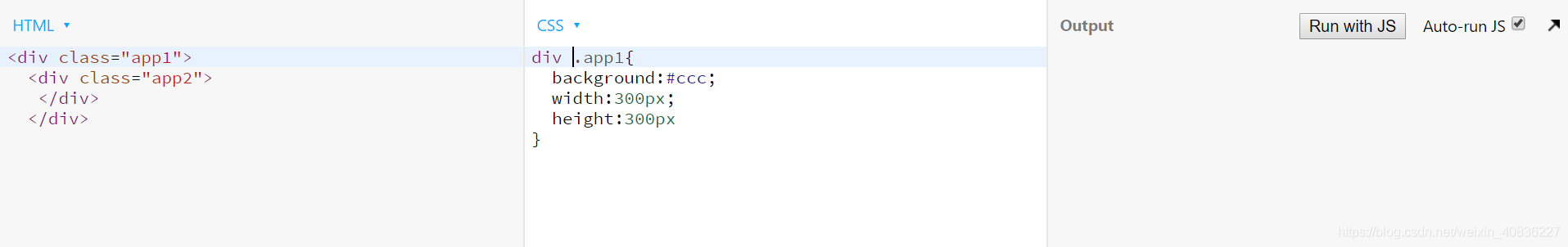
我对后代选择器和并集选择器有点混淆,经过下面的实践算是有点理清楚了:
①div .app2,app2可看做div的后代,所以可以用后代选择器
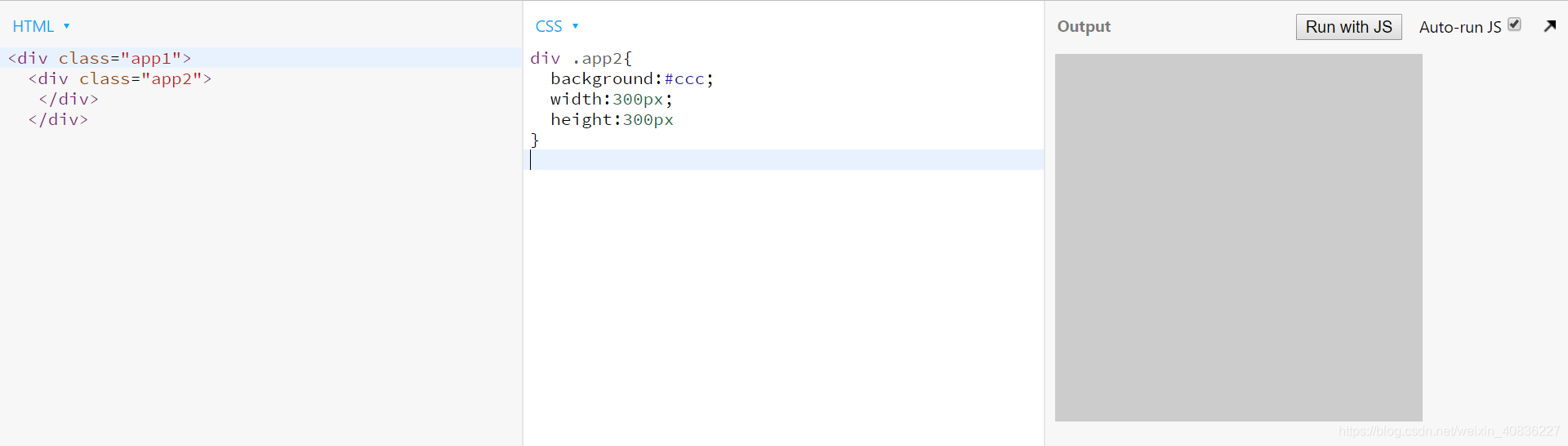
②div.app2,div和app2可作为交集,既要满足div标签,又要满足类名为’app2’。这种,app1也可用
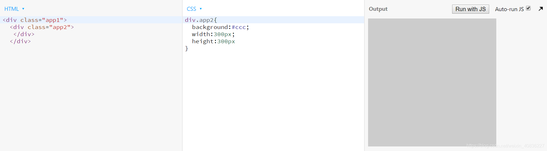
③div app1,没有显示!因为此时的.app1不是div的后代。是当代(貌似没有这个说法,能懂就好),如果在外面加多一层<div>,那有能显示了
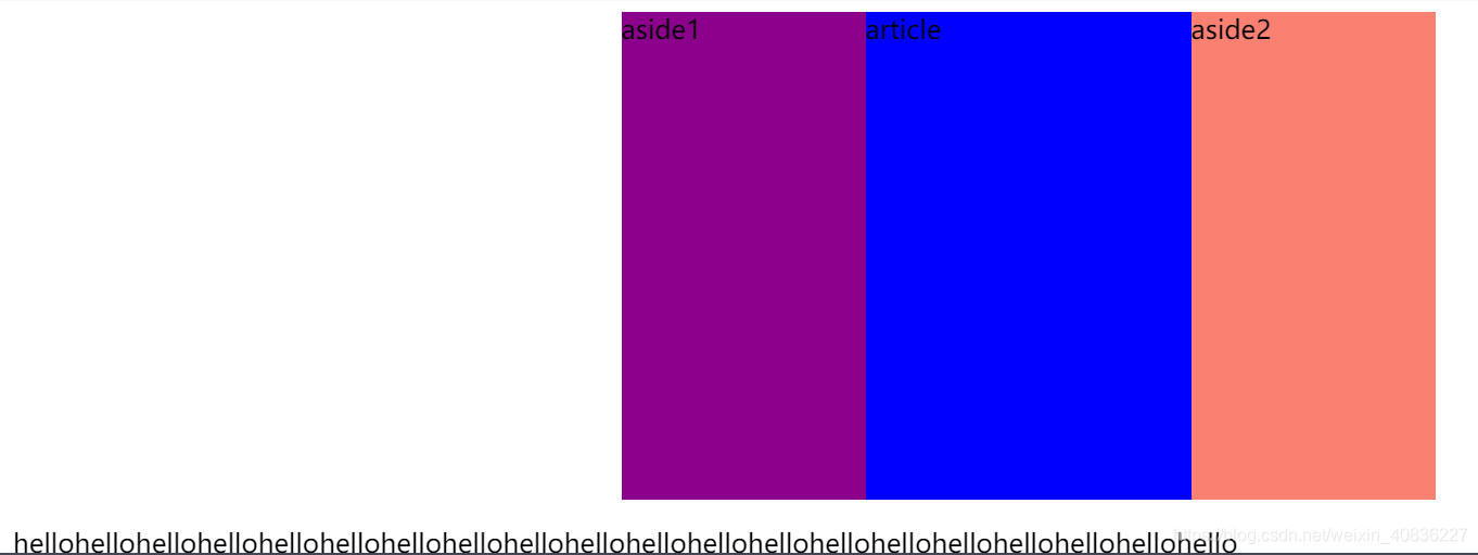
11三栏布局
html结构如下:而且已知两个侧边栏的宽度均为150px
<main>
  <article>article</article>
  <aside class=aside1>aside1</aside>
  <aside class=aside2>aside2</aside>
</main>
注意不可以直接将aside1和aside2进行浮动,因为浮动元素后面需要有不浮动的元素,但这个html里没有。
不是上面说的,应该是如果aside1和aside2都浮动,而article没有的话,会影响article的显示。
1.flex
main{
  display: flex;
  justify-content: space-between;
}
.aside1{
  order: 1;
  flex: 0 0 150px;
  background-color: blue;
}
.aside2{
  order: 3;
  flex: 0 0 150px;
  background-color: red;
}
article{
  order: 2;
  background-color: green;
  flex: 1;
}

2圣杯
main{
  width: 500px;
  height: 300px;
  background: skyblue;
  margin: 0 auto;
  /*因为这个是content-box,width代表了内容宽度,因此增加padding会是box整个宽度增加。这也是为什么圣杯的宽度看起来比双飞翼的要宽的原因*/
  padding-left: 150px;
  padding-right: 150px;
}
article{
  width: 100%;
  height: 100%;
  background: slateblue;
  float: left;
}
.aside1{
  width: 150px;
  height: 100%;
  background: darkmagenta;
  float: left;
  /*浮动自身,向上移动一行?*/
  margin-left: -100%;
  /*自身定位(relative占用了哪里的空间?*/
  position: relative;
  top: 0;
  left: -150px;
}
.aside2{
  width: 150px;
  height: 100%;
  background: salmon;
  float: left;
  /*属性值为自身长度,上一行的行尾?*/
  margin-left: -150px;

  position: relative;
  top: 0;
  right: -150px;
}

图片显示,后面的文字不会受到position:relative的影响,奇怪了。
3 双飞翼
双飞翼布局的DOM结构与圣杯布局的区别是middle还有一个子元素inner
<main>
  <article>
  	<div class="inner">article</div>
  </article>
  <aside class=aside1>aside1</aside>
  <aside class=aside2>aside2</aside>
</main>
main{
  width: 500px;
  height: 300px;
/*   background: skyblue; */
  margin: 0 auto;
}
article{
  width: 100%;
  height: 100%;
  background: slateblue;
  float: left;
}
.inner{
  height: 100%;
/*   width: 100%; 不可以要这个诶*/
  margin-left: 150px;
  margin-right: 150px;
  background: blue;
}
.aside1{
  width: 150px;
  height: 100%;
  background: darkmagenta;
  float: left;
  /*浮动自身,向上移动一行?*/
  margin-left: -100%;
}
.aside2{
  width: 150px;
  height: 100%;
  background: salmon;
  float: left;
  /*属性值为自身长度,上一行的行尾?*/
   margin-left: -150px;
}
4尝试失败
想法: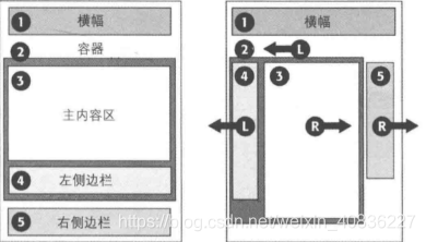
失败原因:主内容区(article)的宽度不能自适应,而且外容器的宽度控制不了,100%的话会导致右侧边栏下沉,如果把宽度固定死的话做不到自适应。
<main>
  <div class="try">
  <article>article</article>
  <aside class=aside1>aside1</aside>
  </div>
  <aside class=aside2>aside2</aside>
</main>
main{
  width: 500px;
  height: 300px;
  background: skyblue;
  margin: 0 auto;
}
.try{
  float: left;
  width: 100%;
}
article{
  float:right;
/*   width:100%; */
  background: green;
}
.aside1{
  float:left;
  width: 150px;
  background: blue;
}
.aside2{
  float: right;
  width: 150px;
  background: red;
}
5上中下布局
思路:方法①用flex,内容区的flex属性为1
方法②header和footer的position设为absolute,对应top:0和bottom:0,内容区设边距就好了
https://cloud.tencent.com/developer/article/1343979


 149
149


 被折叠的 条评论
为什么被折叠?
被折叠的 条评论
为什么被折叠?
 到【灌水乐园】发言


