


最常用的懒人组合 动画插件组合 vue-animate-onscroll + Animate.css
main.js 文件引入:
import VueAnimateOnScroll from 'vue-animate-onscroll'
Vue.use(VueAnimateOnScroll)
import 'animate.css';vue-animate-onscroll 该库包含用于在元素滚动到视口时为其设置动画的指令
animate.css 集合了很多 动画效果 供君挑选
指令后加 .repeat, 页面滚动到视图中 就会触发 动画,不加则默认是只触发一次。
animate__animated 是必须加 在 动画名前面,不加获取不了动画属性,官网也注明了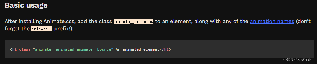
使用:
<div v-animate-onscroll.repeat="'animate__animated animate__zoomIn'">
    Animate_zoomIn
</div>
1. @keyframes 关键帧
使用@keyframes 定义每个具名关键帧的动画,时间到达哪个时间点或动画播放到哪个时刻 的关键帧的属性值
两种方式: 1. 使用 from 和 to,
2. 百分比,如 0%,25%,50%,100%
2. animation--关键帧动画作用到元素上
语法
animation: name duration timing-function delay iteration-count direction;
animation 属性是一个简写属性,用于设置六个动画属性:
| 值 | 描述 |
|---|---|
| animation-name | 规定需要绑定到选择器的 keyframe 名称。。 |
| animation-duration | 规定完成动画所花费的时间,以秒或毫秒计。 |
| animation-timing-function | 规定动画的速度曲线。 |
| animation-delay | 规定在动画开始之前的延迟。 |
| animation-iteration-count | 规定动画应该播放的次数。无限次播放:infinite |
| animation-direction | 规定是否应该轮流反向播放动画。 |
注释:请始终规定 animation-duration 属性,否则时长为 0,就不会播放动画了。
兼容其他浏览器版本,请加浏览器前缀
animation: mymove 5s ease .2s infinite normal;
animation-play-state:run;

/* Safari and Chrome */
-webkit-animation:mymove 5s ease .1s infinite alternate;
-webkit-animation-play-state:run;
animation:mymove 5s infinite; /* infinite 无限次播放 */
-webkit-animation:mymove 5s infinite; /* Safari 和 Chrome */
animation-delay: -2s          /* W3C 和 Opera */
-moz-animation-delay: -2s     /* Firefox */
-webkit-animation-delay: -2s  /* Safari 和 Chrome */
animation-timing-function 动画的速度曲线
速度曲线定义动画从一套 CSS 样式变为另一套所用的时间。
速度曲线用于使变化更为平滑。
语法
animation-timing-function: value;animation-timing-function 使用名为三次贝塞尔(Cubic Bezier)函数的数学函数,来生成速度曲线。您能够在该函数中使用自己的值,也可以预定义的值:
| 值 | 描述 | |
|---|---|---|
| linear | 动画从头到尾的速度是相同的。 | |
| ease | 默认。动画以低速开始,然后加快,在结束前变慢。 | |
| ease-in | 动画以低速开始。 | |
| ease-out | 动画以低速结束。 | |
| ease-in-out | 动画以低速开始和结束。 | |
| cubic-bezier(n,n,n,n) | 在 cubic-bezier 函数中自己的值。可能的值是从 0 到 1 的数值。 |
animation-direction 动画的播放方向
animation-direction 属性定义是否应该轮流反向播放动画。
如果 animation-direction 值是 "alternate",则动画会在奇数次数(1、3、5 等等)正常播放,而在偶数次数(2、4、6 等等)向后播放。
注释:如果把动画设置为只播放一次,则该属性没有效果。
语法
animation-direction: normal|alternate;
| 值 | 描述 | |
|---|---|---|
| normal | 默认值。动画应该正常播放。 | |
| alternate | 动画应该轮流反向播放。 |
另外两种 属性: reverse、alternate-reverse
-
normal:默认值,动画每次迭代都从 0% 到 100% 关键帧播放;
-
reverse:动画每次迭代都从 100% 到 0% 播放;
-
alternate:交替迭代,第一次以normal播放,第二次以reverse播放,然后交替循环下去;
-
alternate-reverse:逆序交替迭代,第一次以reverse播放,第二次以normal播放。
animation-play-state 动画播放状态
定义和用法
animation-play-state 属性规定动画正在运行还是暂停。
语法
animation-play-state: paused|running;
| 值 | 描述 | |
|---|---|---|
| paused | 规定动画已暂停。 | |
| running | 规定动画正在播放。 |
animation-fill-mode 动画填充模式
定义和用法
animation-fill-mode 属性规定动画在播放之前或之后,其动画效果是否可见。
语法
animation-fill-mode : none | forwards | backwards | both;
| 值 | 描述 |
|---|---|
| none | 不改变默认行为。从 0% 之前开始,结束回到 0% 之前的状态 |
| forwards | 当动画完成后,保持最后一个属性值。从 0% 之前开始,结束停留在 100% 的状态。 |
| backwards | 在 animation-delay 所指定的一段时间内,在动画显示之前,应用开始属性值。从 0% 开始,结束返回到 0% 之前的状态。 |
| both | 向前和向后填充模式都被应用。从 0% 开始,结束停留在 100% 的状态。 |
animation动画 进入例子
/* 这个动画规则我们就叫做message-move-in吧,
 *随后我们会用animation属性在某个元素上应用这个动画规则。 */
@keyframes message-move-in {
    0% {
        /* 前边分析过了,弹出动画是一个自上而下的淡入过程 */
        /* 所以在动画初始状态要把元素的不透明度设置为0,
         *在动画结束的时候再把不透明度设置1,这样就会实现一个淡入动画 */
        opacity: 0;
        /* 那么“自上而下”这个动画可以用“transform”变换属性
         * 结合他的“translateY”上下平移函数来完成 */
        /* translateY(-100%)表示动画初始状态,元素在实际位置上面“自身一个高度”的位置。 */
        transform: translateY(-100%);
    }
    100% {
        opacity: 1;
        /* 平移到自身位置 */
        transform: translateY(0);
    }
}

#message-container .message.move-in {
    /* animation属性是用来加载某个动画规则
     * 请参考 https://developer.mozilla.org/zh-CN/docs/Web/CSS/animation */
    /* message-move-in 动画帧@keyframes的声明
     * 0.3s 动画迭代一次的 时间,完成一次动画的时间
     * ease-in-out 动画的速度曲线 */
    animation: message-move-in 0.3s ease-in-out;
}
animation动画 离开例子
@keyframes message-move-out {
    0% {
        opacity: 1;
        transform: translateY(0);
    }
    100% {
        opacity: 0;
        transform: translateY(-100%);
    }
}

#message-container .message.move-out {
    animation: message-move-out 0.3s ease-in-out;
    /* 让动画结束后保持结束状态 */
    animation-fill-mode: forwards;
}


 771
771


 被折叠的 条评论
为什么被折叠?
被折叠的 条评论
为什么被折叠?
 到【灌水乐园】发言


