


CSS提供了多种工具和属性,使我们能够创建视觉上引人注目的效果。今天我们继续将深入了解几种高级CSS效果:盒子阴影、滤镜、混合模式和文本背景裁剪,提升网页设计的质感和深度。
一、盒子阴影(Box Shadow)
对于盒子元素,存在一个类似的属性——box-shadow,用于在实际的元素盒子上应用一个或多个阴影。与文本阴影一样,盒子阴影在大多数浏览器中也有良好的支持,但仅在IE9及更高版本中可用。对于使用旧版IE的用户,他们可能会看到没有阴影的效果。
盒子阴影是CSS中一个非常实用的视觉效果,它可以为元素添加阴影,增强其立体感和层次感。我们可以使用box-shadow属性来实现这个效果。它的基本语法如下:
1、单个盒子阴影
最基本的盒子阴影效果很简单。下面的例子展示了一个带有单个盒子阴影的元素:
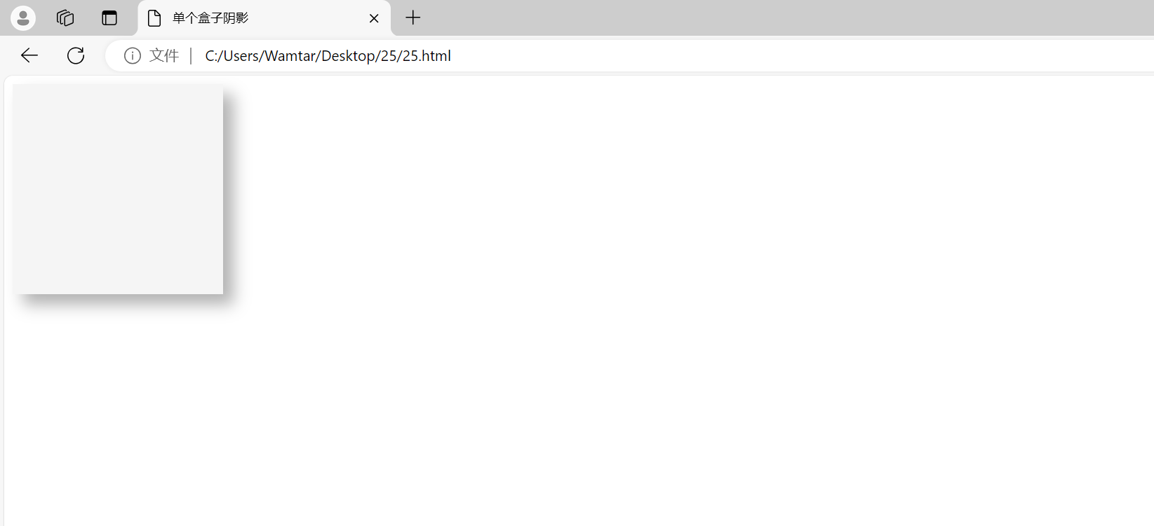
上述例子中,.box元素的阴影设置如下:
- 水平偏移:10px(向右偏移10像素)
- 垂直偏移:10px(向下偏移10像素)
- 模糊半径:15px(阴影的模糊程度)
- 颜色:
rgba(0, 0, 0, 0.3)(半透明黑色)
2、多个盒子阴影
通过为元素设置多个阴影,可以创建更复杂的视觉效果。下面的代码展示了如何实现多个盒子阴影:
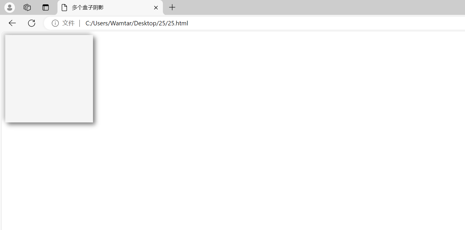
在这个例子中,.box元素有两个阴影:
- 第一个阴影:向右下方偏移5px,模糊半径10px,颜色为半透明黑色。
- 第二个阴影:向左上方偏移5px,模糊半径10px,颜色为较淡的半透明黑色。
这种组合效果可以产生更丰富的视觉层次感。
二、滤镜(Filters)
CSS 滤镜提供了一种对元素进行过滤的方式,允许你对元素应用各种视觉效果,如模糊、亮度调整、对比度改变等。类似于在 Photoshop 等设计软件中应用过滤效果。接下来首先来介绍其语法,并展示其带来的有趣效果。
基本上滤镜可以应用于任何类型的元素,包括块级元素和行内元素——只需使用 filter 属性,并指定一个滤镜函数的值即可。一些滤镜选项与其他 CSS 特性效果相似,例如 drop-shadow() 的效果与 box-shadow 或 text-shadow 相似。但滤镜的独特之处在于,它们作用于元素内容的实际形状,而不仅仅是整个盒子,这种效果通常看起来更出色,尽管有时可能不会完全符合预期。
filter属性的基本语法如下:
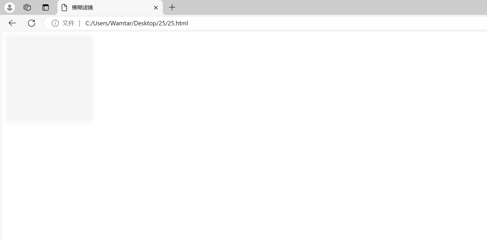
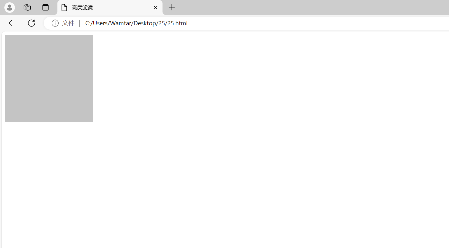
1、常见滤镜效果
- 模糊(blur):使元素变得模糊。单位是像素。
- 亮度(brightness):调整元素的亮度。值大于1会增加亮度,小于1则减小亮度。
- 对比度(contrast):调整元素的对比度。值大于100%会增加对比度,小于100%则减小对比度。
- 灰度(grayscale):将元素转换为灰度图像。值为100%时完全灰度。

2、组合滤镜效果
滤镜效果可以组合使用,通过空格分隔。例如:
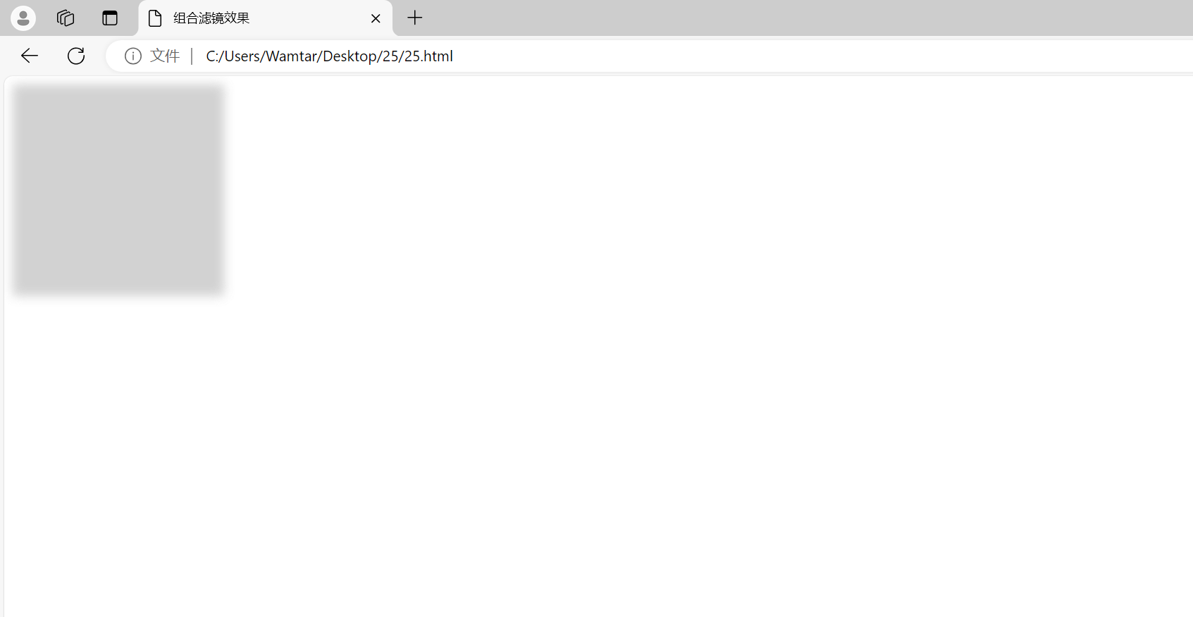
元素被模糊、降低亮度并增加对比度,产生了复合效果。
三、混合模式(Blend Modes)
CSS混合模式允许你定义元素与其背景之间的交互方式,产生各种有趣的效果。当两个元素重叠时,这种效果会影响每个像素的最终显示颜色,即这些像素的颜色将根据其原始颜色和下层元素颜色的混合结果来呈现。对于经常使用Photoshop 等图形软件的朋友来说,混合模式应该比较熟悉。
在 CSS 中,有两个相关的属性:
background-blend-mode:用于将单个元素的多重背景图像和背景颜色进行混合。mix-blend-mode:用于将一个元素与其覆盖的元素的背景和内容进行混合。
1、背景混合模式(background-blend-mode)
background-blend-mode用于控制背景图像和背景颜色的混合模式。它的常见值包括 normal、multiply、screen、overlay、darken 等。
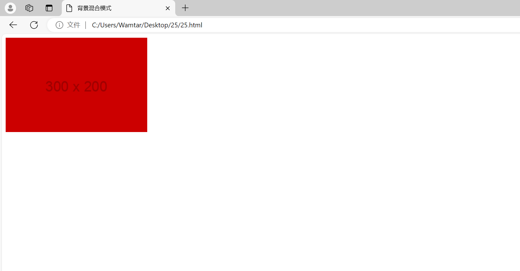
背景颜色和背景图像以 multiply 模式混合,生成了一种加深的效果。
2、混合模式(mix-blend-mode)
mix-blend-mode用于定义元素如何与其父元素混合。常见的值包括 normal、multiply、screen、overlay、darken 等。
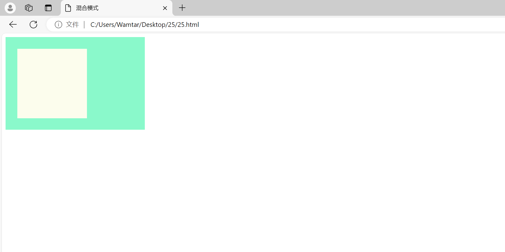
.box元素的背景颜色通过 screen 模式与 .container 背景颜色混合,产生了亮化的效果。
四、文本背景裁剪(-webkit-background-clip: text)
-webkit-background-clip: text 是一个Webkit特有的属性,它允许我们将背景图像或颜色裁剪到文本的前景中,从而实现图像填充文本的效果。
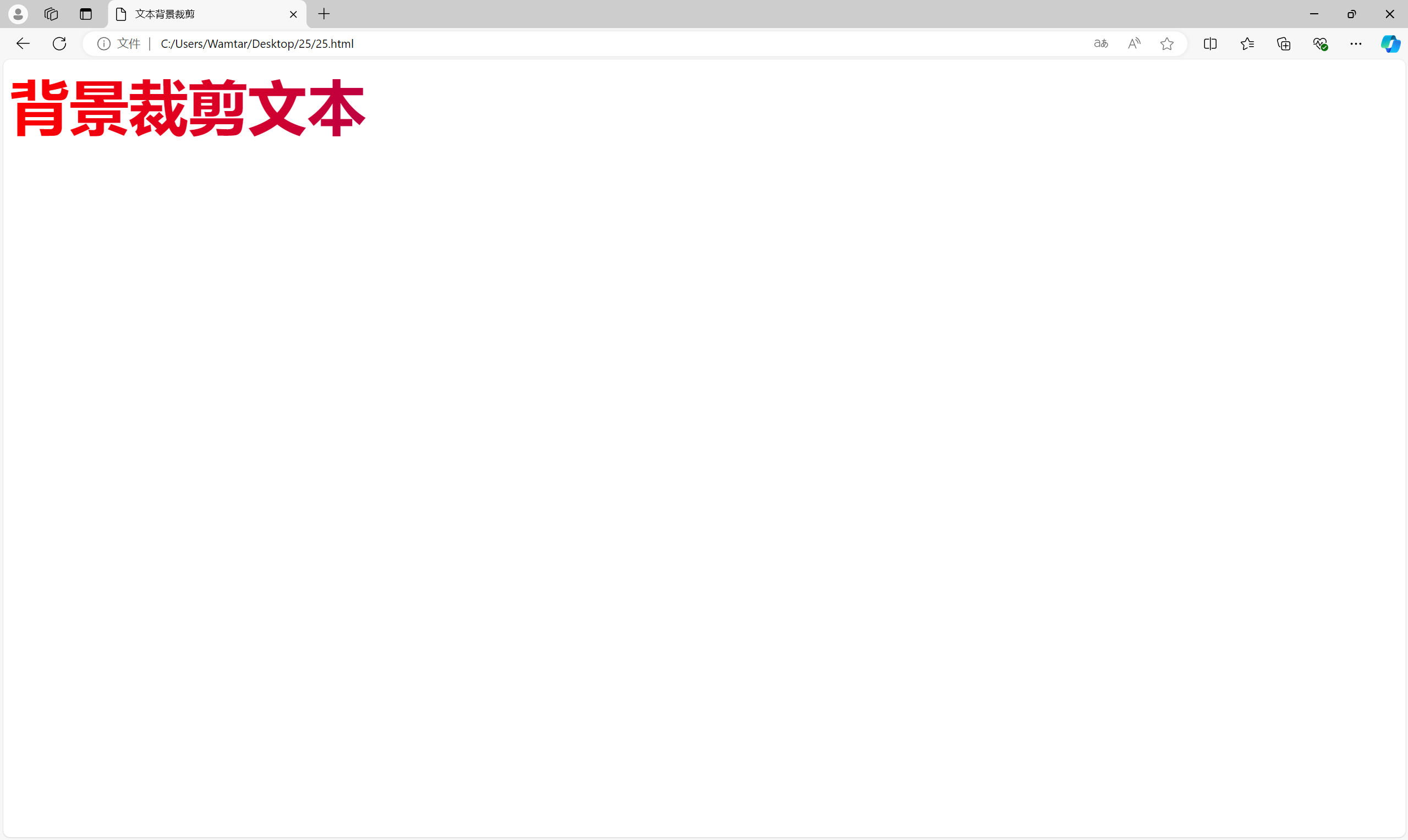
background-clip: text 将背景渐变裁剪到文本中,使文本显示渐变背景色,同时 color: transparent 使文本本身的颜色透明,以便只显示背景。
综合练习
题 1:创造一个具有多个阴影、滤镜和混合模式的复杂元素
要求:
- 创建一个
div元素,具有多个盒子阴影、滤镜和混合模式效果。 - 使用盒子阴影创建一个有层次感的效果。
- 结合滤镜效果使元素具有模糊和调整亮度的效果。
- 应用混合模式,使元素与其背景交互,产生独特效果。
示例代码:
题 2:创建一个带有文本背景裁剪和多个滤镜效果的标题
要求:
- 创建一个
h1标题,背景使用渐变色。 - 将背景裁剪到文本中,使文本显示背景渐变。
- 应用多个滤镜效果(如模糊、亮度调整),使标题更具视觉冲击力。
示例代码:

如有表述错误及欠缺之处敬请批评指正。


 扫一扫
扫一扫
 775
775

 被折叠的 条评论
为什么被折叠?
被折叠的 条评论
为什么被折叠?
 到【灌水乐园】发言


