


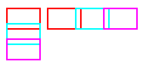
负margin特点
设置margin-left和margin-top时,当前元素往设置方向收缩;
设置margin-right和margin-bottom时,后续元素往设置方向靠拢;
<!-- css -->
<style>
    .margin-character {
        float: left;
        padding: 0 5px;
    }
    .margin-character>div {
        height: 30px;
        width: 50px;
        border: 2px solid;
    }
</style>
<!-- html -->
<div class="margin-character">
   <div style="border-color:#FF0000;"></div>
   <div style="border-color:#00FFFF; margin-top: -10px; margin-bottom: -10px;"></div>
   <div style="border-color:#FF00FF;"></div>
</div>
<div class="margin-character">
   <div style="border-color:#FF0000; float: left;"></div>
   <div style="border-color:#00FFFF; float: left; margin-left: -10px; margin-right: -10px;"></div>
   <div style="border-color:#FF00FF; float: left;"></div>
</div>
左侧可看出,元素2向上移动覆盖了元素1的一部分; 元素3向上靠拢覆盖了元素2的一部分。 右侧同理
图片和文本对齐
在img标签上添加margin: 0 3px -3px 0样式,可以使得文本与图片底部对齐
<div>
    <img alt="" src="./hello.jpg" style="margin: 0 3px -3px 0;" />
    <span>向你问好</span>
</div>

自适应布局
一列固定宽度,一列自适应
语法
主元素
	width: 100%;
	float: left;
	margin-right: -侧边栏宽度;
侧边元素
	width: 侧边栏宽度;
	float: left;
例子
<section>
    <div style="width: 100%; height: 200px; float: left; margin-right: -200px; background: pink;">
    	主内容
    </div>
    <aside style="width: 200px; height: 200px; float: left; background: #fff566;">
    	侧边内容
    </aside>
</section>

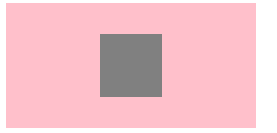
水平垂直居中
<!-- css -->
<style>
	.box {
		position: relative;
		width: 200px;
		height: 100px;
		background: pink;
	}
	.box>div {
		position: absolute;
		width: 50px;
		height: 50px;
		background: gray;
		top: 50%;
		left: 50%;
		margin-top: -25px;
		margin-left: -25px;
	}
</style>

<!-- html -->
<div class="box">
    <div>/div>
</div>
tab选项卡
更多 …
学习资料:《Web前端开发精品课:HTML与CSS进阶教程》


 316
316


 被折叠的 条评论
为什么被折叠?
被折叠的 条评论
为什么被折叠?
 到【灌水乐园】发言


