


负margin对普通文档流元素的影响,可以分为两种情况:
- 当元素的margin-top或者margin-left为负数时,“当前元素”会被拉向指定方向。
- 当元素的margin-bottom或者margin-right为负数时,“后续元素”或被拉向指定发向。
举例:margin-top或margin-bottom为负数
<html lang="en">
<head>
    <meta charset="UTF-8">
    <meta name="viewport" content="width=device-width, initial-scale=1.0">
    <title>Document</title>
    <style type="text/css">
        #wrapper div
        {
            width: 200px;
            height: 60px;
            line-height: 60px;
            font-size: 21px;
            font-weight: bold;
            text-align: center;
            color: white;
        }
        #first{background-color: hotpink;}
        #second{background-color: lightblue;}
        #third{background-color: purple;}
    </style>
</head>
<body>
    <div id="wrapper">
        <div id="first">1</div>
        <div id="second">2</div>
        <div id="third">3</div>
    </div>
</body>
</html>
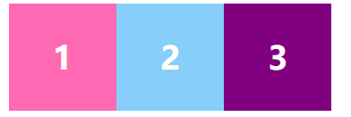
未设置margin-top和margin-bottom时

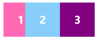
给第二个div添加margin-top: -30px;
#second{background-color: lightblue;margin-top: -30px;}

此时我们看到的就是当前元素(第2个div)被拉向上方
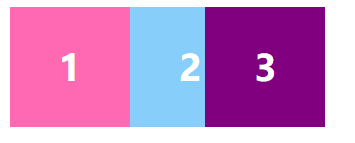
当我们给第二个div添加margin-bottom: -30px;后
#second
        {
            background-color: lightblue;
            margin-bottom: -30px;
        }

此时我们会发现后续元素(第3个div)被拉向上方。
举例:margin-left或margin-right为负数
<!DOCTYPE html>
<html lang="en">
<head>
    <meta charset="UTF-8">
    <meta name="viewport" content="width=device-width, initial-scale=1.0">
    <title>Document</title>
    <style type="text/css">
        /*去除inline-block元素之间的间距*/
        #wrapper{font-size: 0;}
        #wrapper div
        {
            display: inline-block;
            height: 80px;
            width:80px;
            line-height: 80px;
            font-size: 24px;
            font-weight: bold;
            text-align: center;
            color: white;
        }
        #first{background-color: hotpink;}
        #second{background-color: lightskyblue;}
        #third{background-color: purple;}
    </style>
</head>
<body>
    <div id="wrapper">
        <div id="first">1</div>
        <div id="second">2</div>
        <div id="third">3</div>
    </div>
</body>
</html>
未设置margin-left或者margin-right时
给第二个div添加margin-left: -30px;
#second{background-color: lightskyblue;margin-left: -30px;}
此时我们可以由图看出当前元素(第二个div)被拉向左方
给第二个div添加margin-right: -30px;
#second{background-color: lightskyblue;margin-right: -30px;}
此时我们可以看到,后续元素(第三个div)被拉向左方
负margin的使用很灵活,应用也非常广泛,常用的技巧有以下四个:
- 图片与文本对齐
- 自适应两列布局
- 元素垂直居中
- tab选项卡
1、图片与文本对齐
当图片和文本放到一起的时候,它们在底部水平方向往往都不是对齐的。如果想让它们在底部水平方向对齐,有两种方法:一种是使用vertical-align:text-bottom;另一种是使用负margin技术。
举例:
<!DOCTYPE html>
<html lang="en">
<head>
    <meta charset="UTF-8">
    <meta name="viewport" content="width=device-width, initial-scale=1.0">
    <title>Document</title>
</head>
<body>
    <div>
        <img src="../图片/3.png" alt="">百度一下,你就知道
    </div>
</body>
</html>
默认情况下,图片与文字底部是不对齐的,这时我们可以在css中添加
<style type="text/css">
        img{margin:0 3px -3px 0;}
    </style>
这样就可以使得图片与文字底部对齐了,这里的margin:0 3px -3px 0;可以当作公式去记忆。
2、自适应两列布局
自适应两列布局,指的是在两列布局中,其中一列的宽度是固定的,而另外一列宽度自适应如果使用浮动来做的话,只能使用固定的两列布局,并不能实现其中一列为自适应的布局。
举例:
<!DOCTYPE html>
<html lang="en">
<head>
    <meta charset="UTF-8">
    <meta name="viewport" content="width=device-width, initial-scale=1.0">
    <title>Document</title>
    <style type="text/css">
        #main,#sidebar
        {
            float: left;
            color: white;
        }
        #main
        {
            width: 100%;
            margin-right: -200px;
            background-color: hotpink;
        }
        #sidebar
        {
            width: 200px;
            background-color: lightskyblue;
        }
        /*防止浏览器可视区域宽度不足时发生文本重叠*/
        #main p{margin-right:210px;}
        /*200px+10px,10px是他们的间距*/
    </style>
</head>
<body>
    <div id="main">
        <p>这是主体部分,自适应宽</p>
    </div>
    <div id="sidebar"><p>这是侧边栏部分,固定宽度</p></div>
</body>
</html>

当我们改变浏览器的宽度,就可以很容易地看出自适应两列布局地实际效果。
3、元素垂直居中
我们可以使用position结合负margin来实现,具体语法如下:
父元素
{
  position:relative;
}
子元素
{
  position:absolute;
  top:50%;
  left:50%;
  margin-top:"height值一半地负值";
  margin-left:"width值一般得负值";
}
举例
<!DOCTYPE html>
<html lang="en">
<head>
    <meta charset="UTF-8">
    <meta name="viewport" content="width=device-width, initial-scale=1.0">
    <title>Document</title>
    <style type="text/css">
        #father
        {
            position: relative;
            width: 200px;
            height: 160px;
            border: 1px solid silver;

        }
        #son
        {
            position:absolute;
            top: 50%;
            left: 50%;
            margin-top:-30px ;
            margin-left:-50px;
            width: 100px;
            height: 60px;
            background-color: hotpink;
        }
    </style>
</head>
<body>
    <div id="father">
        <div id="son"></div>
    </div>
</body>
</html>

<!DOCTYPE html>
<html lang="en">
<head>
    <meta charset="UTF-8">
    <meta name="viewport" content="width=device-width, initial-scale=1.0">
    <title>Document</title>
    <style type="text/css">
        *{padding:0;margin:0;}
        .tab
        {
            width: 500px;
            height: 300px;
            border: 1px solid silver;
            margin: 10px auto;
            overflow: hidden;
        }
        ul
        {
            list-style-type:none;
            overflow: hidden;
        }
        ul li
        {
            float: left;
            width: 25%;
            line-height: 35px;
            text-align: center;
            box-sizing: border-box;
            border-right: 1px solid silver;
            border-bottom: 1px solid silver;
            margin-top: -1px;
            font-weight: bold;
            cursor: pointer;
        }
        li:last-child{border-right: none;}
        .active
        {
            background-color: #ffffff;
            border-bottom: none;
        }
        .tab div
        {
            width: 100%;
            height: 300px;
            display: none;
        }
    </style>
    <script>
        window.onload=function()
        {
            var aDiv=document.querySelectorAll(".tab div");
            var aTab=document.querySelectorAll(".tab ul li");
            for(var i=0;i<aTab.length;i++)
            {
                aTab[i].index=i;
                aTab[i].onmouseover=function(){
                    for(var j=0;j<aTab.length;j++)
                    {
                        aDiv[j].style.display="none";
                        aTab[j].className="";
                    };
                    aDiv[this.index].style.display="block";
                    this.className="active";
                };
            };
        }
    </script>
</head>
<body>
    <div class="tab">
        <ul>
            <li class="active">娱乐</li>
            <li>科技</li>
            <li>经济</li>
            <li>时事</li>

        </ul>
        <div style="display: block;">"娱乐"部分的内容......</div>
        <div>"科技"部分的内容......</div>
        <div>"经济"部分的内容......</div>
        <div>"时事"部分的内容......</div>
    </div>
</body>
</html>


 315
315


 被折叠的 条评论
为什么被折叠?
被折叠的 条评论
为什么被折叠?
 到【灌水乐园】发言


