


This is one of the post from my posts from Tackle category, which can be found on my github repo here. All posts from this category:
- How to learn from BigData Files on low memory — Incremental Learning
- Make your Data Talk!- From 0 to Hero in visualization with matplotlib and seaborn
Index
- Introduction
- Single Distribution Plots (Hist, KDE, -[Box, Violin])
- Relational Plots (Line, Scatter, Contour, Pair)
- Categorical Plots (Bar, +[Box, Violin])
- Multiple Plots
- Interactive Plots
- Others
- Further Reading
- References
NOTE:
This post goes along with Jupyter Notebook available in my Repo on Github:HowToVisualize
1. Introduction
What is data, nothing but numbers. If we are not visualizing it to get a better understanding of the world inside it, we are missing out on lots of things. I.e. we can make some sense out of data as numbers, but magic happens when you try to visualize it. It makes more sense and it suddenly it becomes more perceivable.
We are sensual beings, we perceive things around us through our senses. Sight, Sound, Smell, Taste and Touch. We can, to some extent, distinguish things around us according to our senses. For data, Sound and Sight seems to be the best options to represent it as it can be easily transformed. And we mostly use Sight as a medium to perceive data because probably we are accustomed to differentiating different object through this sense and also, though in lower level, we are also are accustomed to perceiving things in higher dimensions through this sense which comes in handy in multi variate data sets.
In this post we look into two of the most popular libraries for visualization of data in Python and use them to make data talk, through visualization:
1.1 Matplotlib
Matplotlib was made keeping MATLAB’s plotting style in mind, though it also has an object oriented interface.
- MATLAB style interface: You can use it by importing pyplot from matplotlib library and use MATLAB like functions.
When using this interface, methods will automatically select current figure and axes to show the plot in. It will be so (i.e. this current figure will be selected again and again for all your method calls) until you use pyplot.show method or until you execute your cell in IPython.
2. Object Oriented interface: You can use it like this:
import matplotlib.pyplot as plt

figure, axes = plt.subplots(2) # for 2 subplots

# Now you can configure your plot by using
# functions available for these objects.
It is low level library and you have total control over your plot.
1.2 Seaborn
Seaborn is a higher level library for visualization, made on top of matplotlib. It is mainly used to make quick and attractive plots without much hassle. Though seaborn tries to give some control over your plots in a fancy way, but still you cannot get everything you desire from it. For that you will have to use matplotlib’s functionality, which you can use with seaborn too (as it is built on matplotlib).
2. Distribution Plots

Distribution plots (or Probability plots) tells us how one variable is distributed. It gives us probability of finding a variable in particular range. I.e. if we were to randomly select a number from total range of a variable, it gives us probabilities of this variable being in different ranges.
Distribution plots should be Normally distributed, for better results. This is one of the assumptions of all Linear models, i.e. Normality. Normal distribution looks like a medium hump on middle with light tails.
(: Tips #1 ? >
-
- You can get away with using matplotlib.pyplot’s function’s provided parameters for your plots, in most cases. Do look into function’s parameters and their description.
-
- All matplotlib’s functions and even seaborn’s functions returns all components of your plot in a dictionary, list or object. From there also you can change any property of your components (in matplotlib’s language Artists).
Box Plots and Violin Plots are in Categorical Section.
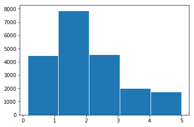
1 Histograms and Kernel Density Estimate Plots (KDEs):
# Simple hist plot
_ = plt.hist(train_df['target'], bins=5, edgecolors='white')
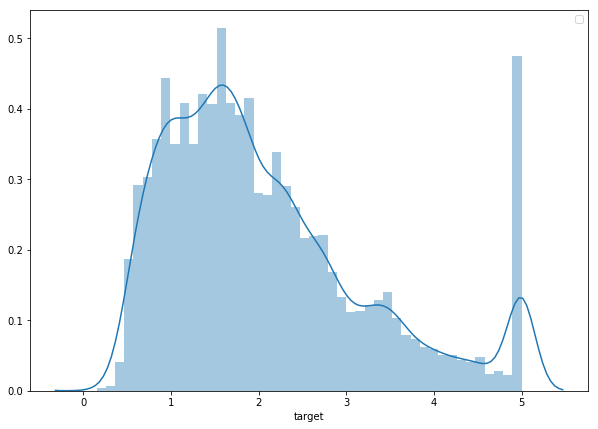
# with seaborn
_ = sns.distplot(train_df['target'])
(: Tips #2 ? < >
3) For giving some useful information with your plot or drawing attention to something in plot you can mostly get away with either plt.text() or plt.annotate().
4) Most necessary parameter for a plot is‘label’, and most necessary methods for a plot are ‘plt.xlabel’, ‘plt.ylabel’, ‘plt.title’, and ‘plt.legend’.
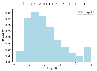
A] To effectively convey your message you should remove all unwanted distractions from your plot like right and top axis, and any other unwanted structure in your plot.
import matplotlib.pyplot as plt

_ = plt.hist(data, bins=10, color='lightblue',
             label=lbl, density=True, ec='white')
plt.legend()
plt.title("Target variable distribution", fontdict={'fontsize': 19,
          'fontweight':0.5 }, pad=15)
plt.xlabel("Target Bins")
plt.ylabel("Probability");

import matplotlib.pyplot as plt
from SWMat.SWMat import SWMat

swm = SWMat(plt) # Initialize your plot

swm.hist(data, bins=10, highlight=[2, 9])
swm.title("Carefully looking at the dependent variable revealed
           some problems that might occur!")
swm.text("Target is a bi-model dependent feature.\nIt
          can be <prop fontsize='18' color='blue'> hard to
          predict.<\prop>");

# Thats all! And look at your plot!!

3. Relational Plots

This is an important step in Data Exploration and Feature Engineering.
c) 2D-Histograms, Hex Plots and Contour Plots
a) Line Plots:
Line Plots are useful for checking for linear relationship, and even quadratic, exponential and all such relationships, between two variables.
(: Tips #3 ? < >
-
You can give an aesthetic look to your plot just by using parameters ‘color’ / ‘c’, ‘alpha’ and ‘edgecolors’ / ‘edgecolor’.
-
Seaborn has a parameter ‘hue’ in most of its plotting methods, which you can use to show contrast between different classes of a categorical variable in those plots.
B] You should use lighter color for sub parts of plot which you do want in plot but they are not the highlight of the point you want to make.
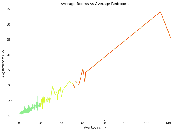
plt.plot('AveRooms', 'AveBedrms', data=data,
         label="Average Bedrooms")

plt.legend() # To show label of y-axis variable inside plot
plt.title("Average Rooms vs Average Bedrooms")
plt.xlabel("Avg Rooms  ->")
plt.ylabel("Avg BedRooms  ->");
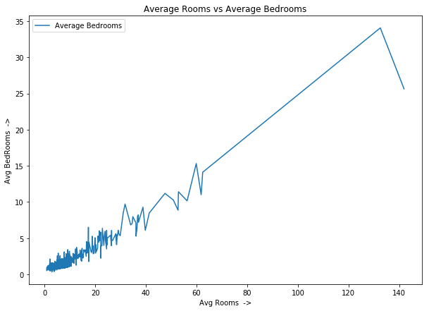
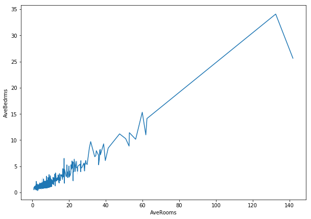
You can also color code them manually like this:
plt.plot('AveRooms', 'AveBedrms', data=data, c='lightgreen')
plt.plot('AveRooms', 'AveBedrms', data=data[(data['AveRooms']>20)],
         c='y', alpha=0.7)
plt.plot('AveRooms', 'AveBedrms', data=data[(data['AveRooms']>50)],
         c='r', alpha=0.7)

plt.title("Average Rooms vs Average Bedrooms")
plt.xlabel("Avg Rooms  ->")
plt.ylabel("Avg BedRooms  ->");
# with seaborn
_ = sns.lineplot(x='AveRooms', y='AveBedrms', data=train_df)
swm = SWMat(plt)

swm.line_plot(data_x, data_y, line_labels=[line_lbl], highlight=0,
         label_points_after=60, xlabel=xlbl, point_label_dist=0.9,
         highlight_label_region_only=True)
swm.title("There are some possible outliers in 'AveRooms' and
           'AveBedrms'!", ttype="title+")
swm.text("This may affect our results. We should\ncarefully
          look into these and <prop color='blue'>finda\n
          possible resolution.<\prop>",
          position="out-mid-right", fontsize=20,
          btw_line_dist=2.2);

# 'point_label_dist' (to adjust distance between points' labels and
# lines) in `.line_plot` method and 'btw_line_dist' (to adjust lines
# between two lines in text) in `.text` method are only used when
# result given by library is not what you want. Most of the times
# this library tries to give the right format, but still some
# mistakes can happen. I will try to make it fully automatic in
# future.

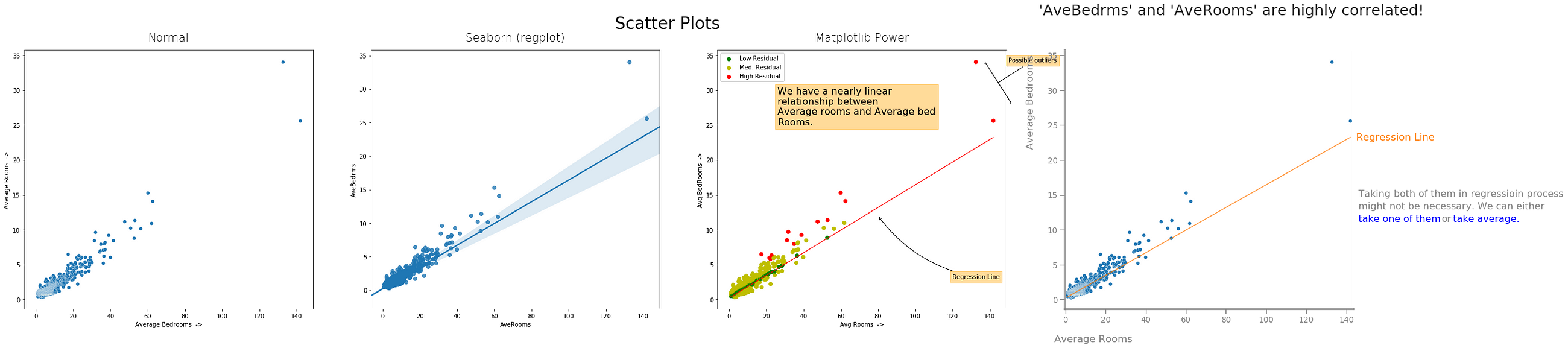
- Normal Matplotlib, 2) Seaborn, 3) Matplotlib Power, 4) Storytelling With Matplotlib
b) Scatter Plots: ^
Not every relationship between two variables is linear, actually just a few are. These variables too have some random component in it which makes them almost linear, and other cases have a totally different relationship which we would have had hard time displaying with linear plots.
Also, if we have lots of data points, scatter plot can come in handy to check if most data points are concentrated in one region or not, are there any outliers w.r.t. these two or three variables, etc.
We can plot scatter plot for two or three and even four variables if we color code the fourth variable in 3D plot.
(: Tips #4 ? < >
- You can set size of your plot(s) in two ways. Either you can import figure from matplotlib and use method like: ‘figure(figsize=(width, height))’ {it will set this figure size for current figure} or you can directly specify figsize when using Object Oriented interface like this: figure, plots = plt.subplots(rows, cols, figsize=(x,y)).
C] You should be concise and to the point when you are trying to get a message across with data.
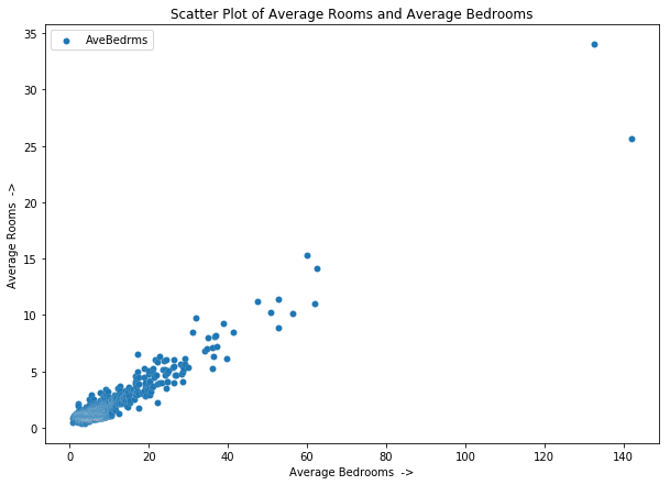
from matplotlib.pyplot import figure
figure(figsize=(10, 7))

plt.scatter('AveRooms', 'AveBedrms', data=data,
            edgecolors='w', linewidths=0.1)

plt.title("Scatter Plot of Average Rooms and Average Bedrooms")
plt.xlabel("Average Bedrooms  ->")
plt.ylabel("Average Rooms  ->");
# With Seaborn
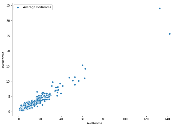
from matplotlib.pyplot import figure
figure(figsize=(10, 7))
sns.scatterplot(x='AveRooms', y='AveBedrms', data=train_df,
label="Average Bedrooms");
(: Tips 5 ? < >
-
In .text and .annotate methods there is a parameter bbox which takes a dictionary to set properties of box around the text. For bbox, you can get away with pad, edgecolor, facecolor and alpha for almost all cases.
-
In .annotate method there is a parameter for setting properties of an arrow, which you will be able to set if you have set xytext parameter, and it is arrowprops. It takes a dictionary as an argument, and you can get away with arrowstyle andcolor.
-
You can use use matplotlib’s fill_between or fill_betweenx to fill with a color between two curves. This can come in handy to highlight certain regions of a curve.
D] You should take your time thinking about how you should plot your data and which particular plot will get your message across the most.
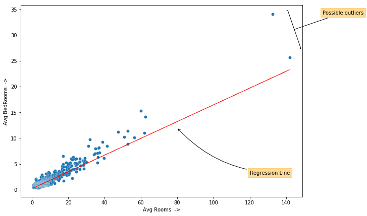
from matplotlib.pyplot import figure
figure(figsize=(10, 7))

plt.scatter('AveRooms', 'AveBedrms', data=data)
plt.plot(train_df['AveRooms'], Y, linewidth=1, color='red',
         linestyle='-', alpha=0.8)

plt.xlabel("Avg Rooms  ->")
plt.ylabel("Avg BedRooms  ->")

# Adding annotations:
plt.annotate("Possible outliers", xy=(144, 31), xytext=(160, 34),
             arrowprops={'arrowstyle':'-[,widthB=4.0', 'color':
                         'black'},
             bbox={'pad':4, 'edgecolor':'orange', 'facecolor':
                   'orange', 'alpha':0.4})

plt.annotate("Regression Line", xy=(80, 12), xytext=(120, 3),
             arrowprops={'arrowstyle':'->', 'color': 'black',
                         "connectionstyle":"arc3,rad=-0.2"},
             bbox={'pad':4, 'edgecolor':'orange', 'facecolor':
                   'orange', 'alpha':0.4});
swm = SWMat(plt)
plt.scatter(x, y, edgecolors='w', linewidths=0.3)
swm.line_plot(x, Y, highlight=0, highlight_color="#000088",
              alpha=0.7, line_labels=["Regression Line"])
swm.title("'AveBedrms' and 'AveRooms' are highly correlated!",
          ttype="title+")
swm.text("Taking both of them in regressioin process\nmight not be
          necessary. We can either\n<prop color='blue'>take one of
          them</prop> or <prop color='blue'>take average.</prop>",
          position='out-mid-right', btw_line_dist=5)
swm.axis(labels=["Average Rooms", "Average Bedrooms"])

# 'SWMat' has an `axis` method with which you can set some Axes
# properties such as 'labels', 'color', etc. directly.
 ##### c) 2D-Histograms, Hex Plots and Contour Plots: ^
2D-Histograms and Hex Plots can be used to check relative density of data at particular position.
Contour plots can be used to plot 3D data in 2D, or plot 4D data in 3D. A contour line (or color strip in filled contour) tells us location where function has constant value. It makes us familiar with the whole landscape of variables used in plotting. For example it can be used in plotting cost function w.r.t. different theta’s in Deep Learning. But to make it you need a lot of data, to be accurate. As for plotting the whole landscape you will need data for all points in that landscape. And if you have a function for that landscape you can easily make these plots by calculating values manually.
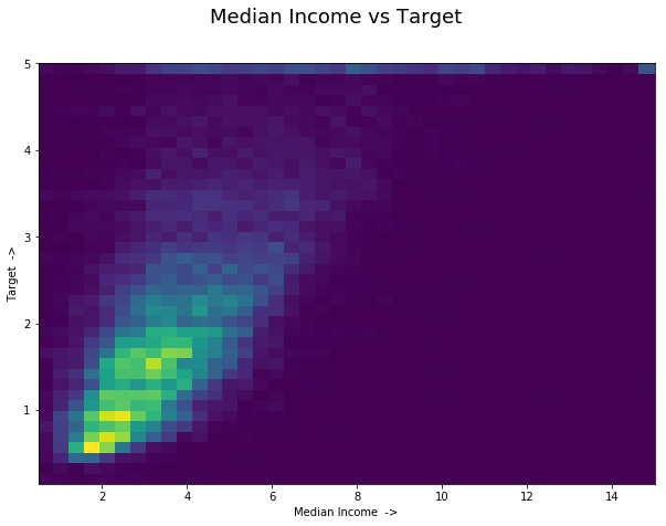
from matplotlib.pyplot import figure
figure(figsize=(10, 7))

plt.hist2d('MedInc', 'target', bins=40, data=train_df)
plt.xlabel('Median Income  ->')
plt.ylabel('Target  ->')
plt.suptitle("Median Income vs Target", fontsize=18);
# Hexbin Plot:
from matplotlib.pyplot import figure
figure(figsize=(10, 7))

plt.hexbin('MedInc', 'target', data=train_df, alpha=1.0,
           cmap="inferno_r")

plt.margins(0)
plt.colorbar()
plt.xlabel('Median Income  ->')
plt.ylabel('Target  ->')
plt.suptitle("Median Income vs Target", fontsize=18);
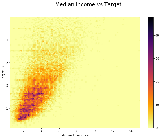
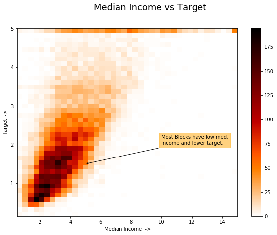
from matplotlib.pyplot import figure
figure(figsize=(10, 7))

plt.hist2d('MedInc', 'target', bins=40, data=train_df,
           cmap='gist_heat_r')
plt.colorbar()
plt.xlabel('Median Income  ->')
plt.ylabel('Target  ->')
plt.suptitle("Median Income vs Target", fontsize=18)

# Adding annotations:
plt.annotate("Most Blocks have low med.\nincome and lower target.",
             xy=(5, 1.5), xytext=(10, 2),
             arrowprops={'arrowstyle': '->', 'color': 'k'},
             bbox={'facecolor': 'orange', 'pad':4, 'alpha': 0.5,
                   'edgecolor': 'orange'});


 被折叠的 条评论
为什么被折叠?
被折叠的 条评论
为什么被折叠?
 到【灌水乐园】发言


