


如何做Python 的数据可视化?
pyecharts 是一个用于生成 Echarts 图表的类库。 Echarts 是百度开源的一个数据可视化 JS 库。主要用于数据可视化。
一、安装
pyecharts 兼容 Python2 和 Python3。目前版本为 0.1.4
1.pip install pyecharts
Bar(柱状图/条形图)
Bar3D(3D 柱状图)
Boxplot(箱形图)
EffectScatter(带有涟漪特效动画的散点图)
Funnel(漏斗图)
Gauge(仪表盘)
Geo(地理坐标系)
Graph(关系图)
HeatMap(热力图)
Kline(K线图)
Line(折线/面积图)
Line3D(3D 折线图)
Liquid(水球图)
Map(地图)
Parallel(平行坐标系)
Pie(饼图)
Polar(极坐标系)
Radar(雷达图)
Sankey(桑基图)
Scatter(散点图)
Scatter3D(3D 散点图)
ThemeRiver(主题河流图)
WordCloud(词云图)
2.公共属性
1.标题栏的属性:一般在实例化(初始化)类型时给与,如bar = Bar(“大标题”,“副标题”,···各种属性···)
title_color = “颜色”:标题颜色,可以是‘red’或者‘#0000’
title_pos = ‘位置’:标题位置,如‘center’,‘left’···
width = 1200:图表的宽
height = 800:图表的高
background_color = "颜色":图表的背景色
·····
2、标签栏的属性:
bar.add(“标签”,x,values,···属性···)
'mark_'类,通个'mark_'显示,如 mark_point['max', 'min', 'average']:标出最大最小和平均值的点,
mark_point_textcolor,mark_line_symbolsize·····
'legend_'类,如legend_pos=‘left’:标签的位置
'is_'类,如is_label_show=True:显示每个点的值,is_datazoom_show=True:实现移动控制x轴的数量
is_convert = True:x,y轴是否调换
二、入门
1.首先开始来绘制你的第一个图表
from pyecharts import Bar
bar =Bar("我的第一个图表", "这里是副标题")
bar.use_theme('dark') #设置背景色
bar.add("服装", ["衬衫", "羊毛衫", "雪纺衫", "裤子", "高跟鞋", "袜子"], [5, 20, 36, 10, 75, 90])
bar.show_config()#打印输出图表的所有配置项
bar.render()#默认将会在根目录下生成一个 render.html 的文件

Tip:可以按右边的下载按钮将图片下载到本地
add()主要方法,用于添加图表的数据和设置各种配置项
show_config()打印输出图表的所有配置项
render()默认将会在根目录下生成一个 render.html 的文件,支持 path 参数,设置文件保存位置,如 render(r"e:my_first_chart.html"),文件用浏览器打开.默认的编码类型为 UTF-8,在 Python3 中是没什么问题的,Python3 对中文的支持好很多。但是在 Python2 中,编码的处理是个很头疼的问题,暂时没能找到完美的解决方法,目前只能通过文本编辑器自己进行二次编码,我用的是 Visual Studio Code,先通过 Gbk 编码重新打开,然后再用 UTF-8 重新保存,这样用浏览器打开的话就不会出现中文乱码问题了。
基本上所有的图表类型都是这样绘制的:
chart_name = Type() 初始化具体类型图表。
add() 添加数据及配置项。
render() 生成 .html 文件。
三、图表类型
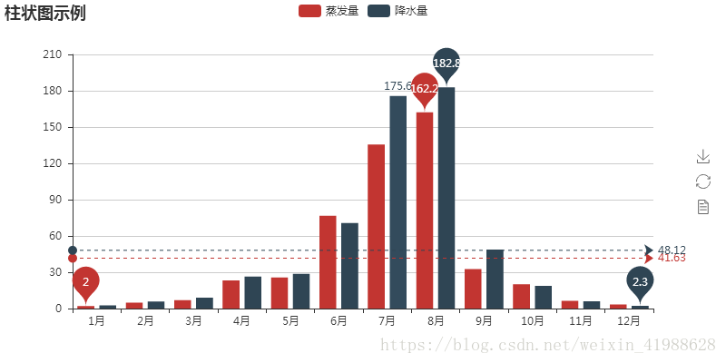
1.柱状图
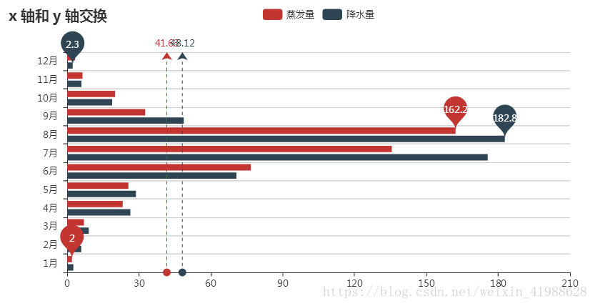
某地区的降水量,并转换x,y轴
attr = ['{}月'.format(i) for i in range(1,13)]
v1 = [2.0,4.9,7.0,23.2,25.6,76.7,135.6,162.2,32.6,20.0,6.4,3.3]
v2 = [2.6,5.9,9.0,26.4,28.7,70.7,175.6,182.8,48.7,18.8,6.0,2.3]
bar = Bar("柱状图示例")
bar.add("蒸发量", attr,v1,mark_line = ['average'],mark_point = ["max","min"])#画平均线,标记最大最小值
bar.add("降水量", attr,v2,mark_line = ['average'],mark_point = ["max","min"])
bar.render()

bar = Bar("x 轴和 y 轴交换") #print交换x轴和y轴
bar.add("蒸发量", attr, v1,mark_line = ['average'],mark_point = ["max","min"])
bar.add("降水量", attr, v2,mark_line = ['average'],mark_point = ["max","min"], is_convert=True)#is_convert是否转换
bar.render()
2.Pie(饼图)
from pyecharts import Pie
attr =["衬衫", "羊毛衫", "雪纺衫", "裤子", "高跟鞋", "袜子"]v1 =[11, 12, 13, 10, 10, 10]pie =Pie("饼图示例")
pie.add("", attr, v1, is_label_show=True)
pie.show_config()
pie.render()

attr =["衬衫", "羊毛衫", "雪纺衫", "裤子", "高跟鞋", "袜子"]
v1 =[11, 12, 13, 10, 10, 10]
v2 =[19, 21, 32, 20, 20, 33]
pie =Pie("饼图实例2-玫瑰图示例", title_pos='center', width=900,title_text_size=40)#标题,title_pos调整标题位置,title_text_size调整主标题文字大小
pie.add("商品A",attr,v1,center=[25, 50], is_random=True, radius=[30, 75], rosetype='radius')
pie.add("商品B",attr,v2,center=[75, 50], is_random=True, radius=[30, 75], rosetype='area', is_legend_show=False, is_label_show=True)
pie.show_config()
pie.render()#radius为半径,第一个为内半径,第二个是外半径;
#rosetype为是否展示成南丁格尔图( 'radius' 圆心角展现数据半分比,半径展现数据大小;'area' 圆心角相同,为通过半径展现数据大小)
# is_label_show为是否显示标签(各个属性的数据信息); label_text_size为调整标签字体大小;

2.各类电影中"好片"所占的比例
from pyecharts import Pie
pie =Pie('各类电影中"好片"所占的比例', "数据来着豆瓣", title_pos='center')
pie.add("", ["剧情", ""], [25, 75], center=[10, 30], radius=[18, 24], label_pos='center', is_label_show=True, label_text_color=None, )
pie.add("", ["奇幻", ""], [24, 76], center=[30, 30], radius=[18, 24], label_pos='center', is_label_show=True, label_text_color=None, legend_pos='left')
pie.add("", ["爱情", ""], [14, 86], center=[50, 30], radius=[18, 24], label_pos='center', is_label_show=True, label_text_color=None)
pie.add("", ["惊悚", ""], [11, 89], center=[70, 30], radius=[18, 24], label_pos='center', is_label_show=True, label_text_color=None)
pie.add("", ["冒险", ""], [27, 73], center=[90, 30], radius=[18, 24], label_pos='center', is_label_show=True, label_text_color=None)
pie.add("", ["动作", ""], [15, 85], center=[10, 70], radius=[18, 24], label_pos='center', is_label_show=True, label_text_color=None)
pie.add("", ["喜剧", ""], [54, 46], center=[30, 70], radius=[18, 24], label_pos='center', is_label_show=True, label_text_color=None)
pie.add("", ["科幻", ""], [26, 74], center=[50, 70], radius=[18, 24], label_pos='center', is_label_show=True, label_text_color=None)
pie.add("", ["悬疑", ""], [25, 75], center=[70, 70], radius=[18, 24], label_pos='center', is_label_show=True, label_text_color=None)
pie.add("", ["犯罪", ""], [28, 72], center=[90, 70], radius=[18, 24], label_pos='center', is_label_show=True, label_text_color=None, is_legend_show=True, legend_top="center")
pie.show_config()
pie.render()

3.带有涟漪特效动画的散点图
这段代码参考简书网 https://www.jianshu.com/p/b718c307a61c ,强烈推荐大家学习chenjiandongx大神的文章。完整代码如下:
- # -*- coding:utf-8 -*-
- from pyecharts import EffectScatter
- es = EffectScatter("动态散点图各种图形示例")
- es.add("", [10], [10], symbol_size=20, effect_scale=3.5, effect_period=3, symbol="pin")
- es.add("", [20], [20], symbol_size=12, effect_scale=4.5, effect_period=4, symbol="rect")
- es.add("", [30], [30], symbol_size=30, effect_scale=5.5, effect_period=5, symbol="roundRect")
- es.add("", [40], [40], symbol_size=10, effect_scale=6.5, effect_brushtype='fill', symbol="diamond")
- es.add("", [50], [50], symbol_size=16, effect_scale=5.5, effect_period=3, symbol="arrow")
- es.add("", [60], [60], symbol_size=6, effect_scale=2.5, effect_period=3, symbol="triangle")
- es.render()

4.绘制3D图形
1.绘制3D折线图代码如下:
 最低0.47元/天 解锁文章


 2393
2393


 被折叠的 条评论
为什么被折叠?
被折叠的 条评论
为什么被折叠?
 到【灌水乐园】发言


