


01. 坐标轴刻度样式设置
import matplotlib.pyplot as plt
import numpy as np
from matplotlib.ticker import AutoMinorLocator,MultipleLocator,FuncFormatter
主要使用到的函数
MultipleLocator()
定义主刻度线的间隔
AutoMinorLocator()
定义次刻度的间隔
FuncFormatter()
设置自定义的刻度标签格式(如小数位数)
FormatStrFormatter()
设置自定义的刻度标签格式(如小数位数、添加单位符号)
ax.xaxis.set_major_locator()
ax.xaxis.set_minor_locator()
设置主/次坐标轴的刻度位置
ax.xaxis.set_major_formatter
ax.xaxis.set_minor_formatter()
设置主/次坐标轴的刻度格式(小数位数)
ax.tick_params()
设置主/次坐标轴刻度线和刻度标签样式(大小、颜色)
ax.xaxis.get_ticklabels()
ax.xaxis.get_ticklines()
获取主/次坐标轴刻度线和刻度标签对象
x=np.linspace(0.5,3.5,100)
y=np.sin(x)
fig=plt.figure(figsize=(8,8))
ax=fig.add_subplot(1,1,1) # 行 列 序号
# 主刻度线设置
ax.xaxis.set_major_locator(MultipleLocator(1.0))# 在x轴的1倍处设置主刻度线
ax.yaxis.set_major_locator(MultipleLocator(1.0))
# 次刻度线设置
ax.xaxis.set_minor_locator(AutoMinorLocator(4))# 设置次要刻度线的显示位置,分为四等分
ax.yaxis.set_minor_locator(AutoMinorLocator(4))
# 设置x轴刻度格式,小数位数
def minor_tick(x,pos):
if not x%1.0:
return ""
return "%.2f"%x
ax.xaxis.set_minor_formatter(FuncFormatter(minor_tick))
# 设置坐标轴样式和标签
# y轴刻度及标签
ax.tick_params("y",which="major",
length=15,width=2,
colors="r")
# x轴刻度及标签
ax.tick_params(which="minor",
length=5,width=1,
labelsize=10,labelcolor="0.25")
# 设置x,y轴范围
ax.set_xlim(0,4)
ax.set_ylim(0,2)
# 绘制图形
ax.plot(x,y,c=(0.25,0.25,1.00),lw=2,zorder=10) # zorder:设置绘图层级
# ax.plot(x,y,c=(0.25,0.25,1.00),lw=2,zorder=0)
# 设置格网
ax.grid(linestyle="-",linewidth=0.5,color='r',zorder=0)
plt.show()

fig=plt.figure(facecolor=(1.0,1.0,0.9412))
ax=fig.add_axes([0.1,0.1,0.5,0.5]) # left, bottom, width, height = 0.1, 0.1, 0.8, 0.8
for ticklabel in ax.xaxis.get_ticklabels():
ticklabel.set_color("slateblue")
ticklabel.set_fontsize(18)
ticklabel.set_rotation(30)
for tickline in ax.yaxis.get_ticklines():
tickline.set_color("lightgreen")
tickline.set_markersize(20)
tickline.set_markeredgewidth(2)
plt.show()
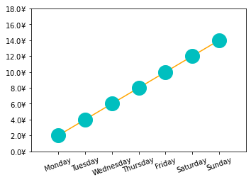
from calendar import month_name,day_name
from matplotlib.ticker import FormatStrFormatter
fig=plt.figure()
ax=fig.add_axes([0.2,0.2,0.7,0.7])
x=np.arange(1,8,1)
y=2*x
ax.plot(x,y,ls="-",color="orange",marker="o",ms=20,mfc="c",mec="c")
ax.yaxis.set_major_formatter(FormatStrFormatter(r"$%1.1f\yen$"))
plt.xticks(x,day_name[0:7],rotation=20)
ax.set_xlim(0,8)
ax.set_ylim(0,18)
plt.show()
参考链接:
《Python数据可视化之matplotlib实践》, 电子工业出版社, 2018-9


 6434
6434


 被折叠的 条评论
为什么被折叠?
被折叠的 条评论
为什么被折叠?
 到【灌水乐园】发言


