


文章目录
【移动Web开发之综合案例】前端小抄(19)
本学习笔记是个人对 Pink 老师课程的总结归纳,转载请注明出处!
黑马面面布局开发
一、目的
- 了解移动端页面开发流程
- 掌握移动端常见布局思路
1.1 技术方案
1. 弹性盒子 + rem + LESS
4. 最小适配设备为 iphone5 320px,最大设配设备为 iphone8plus(ipad 能正常查看内容即可)
1.2 代码规范
1. 类名语义化,尽量精短、明确,必须以字母开头命名,且全部字母为小写,单词之间统一使用下划线 “_” 连接
2. 类名嵌套层次尽量不超过三层
3. 尽量避免直接使用元素选择器
4. 属性书写顺序
   布局定位属性:display / position / float / clear / visibility / overflow
   尺寸属性:width / height / margin / padding / border / background
   文本属性:color / font / text-decoration / text-align / vertical-align
   其他属性(CSS3):content / cursor / border-radius / box-shadow / text-shadow
5. 避免使用 id 选择器
6. 避免使用通配符 * 和 !important
1.2 目录规范
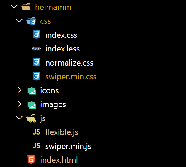
项目文件夹:heimamm
	样式文件夹:css
	业务类图片文件夹:images
	样式类图片文件夹:icons
	字体类文件夹:fonts
二、流程开发
2.1 蓝湖/摹客协作平台
- UI 设计师将 psd 效果图完成后,会上传到蓝湖、摹客里面,同时会拉前端工程师进入开发
- 大部分情况下,UI 会把图片按照前端设计要求给切好
- UI 设计师上传蓝湖到或者/摹客(了解)
1. 摹客官网地址:https://www.mockplus.cn/  注册一个账号
2. 下载 moke ps 插件
3. PS 安装 摹客/蓝湖 插件
3. 打开 PS 摹客/蓝湖 插件
4. 上传(需要切图,需要先标注切图)
5. 查看项目
6. 邀请成员进入(分享按钮,链接地址)
- 前端设计师可以直接 摹客/蓝湖 测量取值
2.2 适配方案
- flex 布局
- 百分比布局
- rem 布局
- vw/vh 布局
- 响应式布局
- 本次案例 flex + rem + flexible.js + LESS
2.3 初始化文件
-
引入 normalize.css
-
less 中初始化 body 样式
-
约束范围
@media screen and (min-width: 750px) {
    html {
      font-size: 37.5px !important;
    }
 }
2.4 布局模块
-
头部模块 .header 高度为 80px
-
nav 模块制作多用 flex
-
充电学习 阴影
box-shadow: 0 0px 10px rgba(0, 0, 0, 0.1)
2.5 swiper 插件使用
官网地址:https://www.swiper.com.cn/
- 下载需要的 css 和 js 文件 html 页面中引入相关文件
- 官网找到类似案例,复制 html 结构,css 样式 js 语法
- 根据需求定制修改模块
2.6 图标字体上传下载
上传步骤:
-
让 UI 美工准备好图标字体(必须是 svg 格式)
-
点上传按钮(保留颜色并提交)
-
生成之后加入购物车即可
-
点击下载 — 下载代码
小技巧:如何批量下载全部字体图标呢?
var span = document.querySelectorAll('.icon-cover');
for (var i = 0, len = span.length; i < len; i++) {
     console.log(span[i].querySelector('span').click());
}
2.7 上传码云并发布部署静态网站
准备工作:需要下载 git 软件,需要码云注册账号
git 可以把我们的本地网站提交上传到远程仓库(码云 gitee)里面,类似以前的 ftp
码云:就是远程仓库,类似服务器
-
码云创建新的仓库:heimamm
-
利用 git 提交把本地网站提交到码云新建的仓库里面
-
在网站根目录右键-- Git Bash Here
-
如果是第一次利用 git 提交,请配置好全局选项
git config --global user.name "用户名" git config --global user.email "你的邮箱地址" -
初始化仓库
git init -
把本地文件放到暂存区
git add . -
把本地文件放到本地仓库里面
git commit -m '提交黑马面面网站' -
链接远程仓库
git remote add origin 你新建的仓库地址 -
把本地仓库的文件推送到远程仓库 push
git push -u origin master
-
-
码云部署发布静态网站
-
在当前仓库中,点击“服务”菜单
-
选择 Gitee Pages
-
选择“启动”按钮
-
稍等之后,会拿到地址,就可以利用这个地址来预览网页了
-
当然你也可以利用 草料二维码 生成二维码 https://cli.im/
-
最后:如果提交网站,你不愿意用git 提交, 可以直接找到仓库,里面有文件,选择上传本地文件即可。
但是,1个小时内,只能上传 20 个以内的文件, 前端人员 git 必备技能
【案例代码】
- 项目结构
- index.less
body {
  min-width: 320px;
  max-width: 750px;
  margin: 0 auto;
  background-color: #f2f4f7;
}

a {
  text-decoration: none;
  color: #707070;
}

// 约束当屏幕大于 750px 的时候,html字体大小就不不变化了
@media screen and (min-width: 750px) {
  html {
    font-size: 37.5px !important;
  }
}

.warp {
  background-color: #fff;
  padding-bottom: 1.146667rem;
}

.header {
  height: 2.133333rem;
  border-bottom: 1px solid #eaeaea;
  text-align: center;
  line-height: 2.133333rem;
  font-size: 0.933333rem;
  color: #1c1c1c;
}

.nav {
  display: flex;
  // 显示不开就换行
  flex-wrap: wrap;
  padding: 1.2rem 0 1.6rem 0;

  .item {
    display: flex;
    width: 33.33%;
    // 纵向显示
    flex-direction: column;
    // 水平居中
    align-items: center;

    img {
      width: 3.706667rem;
      height: 3.706667rem;
    }

    span {
      font-size: 0.666667rem;
      color: #707070;
    }

    // 选择前面三个 -n + 3 选择前3个
    &:nth-child(-n + 3) {
      margin-bottom: 1.653333rem;
    }
  }
}

.go {
  margin: 0 0.266667rem 0 0.48rem;
}

.content {
  padding: 1.066667rem 0.64rem;
  background-color: #fff;
  margin-top: 0.266667rem;

  .con-hd {
    display: flex;
    justify-content: space-between;
    height: 1.013333rem;
    line-height: 1.013333rem;
    margin-bottom: 0.906667rem;

    h4 {
      margin: 0;
      font-size: 0.746667rem;
      color: #333333;

      .icon {
        display: inline-block;
        width: 1.013333rem;
        height: 1.013333rem;
        // 添加这个代码,可以让后面的文字垂直居中
        vertical-align: middle;
      }
    }

    .more {
      font-size: 0.586667rem;
      color: #999999;
    }
  }
}

.get_job_focus {
  position: relative;

  .swiper-container {
    // width: 100%;
    height: 100%;
    // 根据需求把宽度定位 540px
    width: 14.4rem;
  }

  .swiper-slide {
    text-align: center;
    font-size: 18px;
    background: #fff;

    /* Center slide text vertically */
    display: -webkit-box;
    display: -ms-flexbox;
    display: -webkit-flex;
    display: flex;
    // 竖向显示
    flex-direction: column;
    /* Center slide text vertically */
    display: -webkit-box;
    display: -ms-flexbox;
    display: -webkit-flex;
    display: flex;
    -webkit-box-pack: center;
    -ms-flex-pack: center;
    -webkit-justify-content: center;
    justify-content: center;
    -webkit-box-align: center;
    -ms-flex-align: center;
    -webkit-align-items: center;
    align-items: center;
    transition: 300ms;
    // 其余的兄弟是 0.8
    transform: scale(0.8);
    opacity: 0.4;

    a {
      width: 9.013333rem;
      height: 10.026667rem;

      img {
        width: 100%;
        height: 100%;
      }
    }

    p {
      width: 9.013333rem;
      font-size: 0.666667rem;
      margin-top: 0.64rem;
      color: #333;
    }
  }

  // 当前选中的 slide   中间那个
  .swiper-slide-active,
  .swiper-slide-duplicate-active {
    transform: scale(1);
    z-index: 999;
    opacity: 1;
  }

  .swiper-button-next,
  .swiper-button-prev {
    outline: none;

    &:after {
      font-size: 1.066667rem;
      color: #333;
    }
  }
}

.study_con {
  padding-bottom: 3.733333rem;
}

// 学习模块的轮播图
.study {
  .study_fo {
    padding: 0.266667rem;
  }

  .swiper-slide {
    font-size: 18px;
    background: #fff;
    width: 7.733333rem;
    height: 9.066667rem;
    background-color: #fff;
    border-radius: 0.266667rem;
    box-shadow: 0 0px 10px rgba(0, 0, 0, 0.1);

    h5 {
      font-size: 0.693333rem;
      margin: 0.533333rem 0;
      font-weight: 400;
      padding: 0 0.266667rem;
    }

    p {
      font-size: 0.693333rem;
      color: #ff4400;
      padding: 0 0.266667rem;
    }
  }
}

.footer {
  position: fixed;
  left: 0;
  bottom: 0;
  height: 2.933333rem;
  width: 100%;

  z-index: 99999;
  display: flex;
  padding: 0.533333rem;
  background-color: #fff;
  border-top: 1px solid #ccc;

  .item {
    flex: 1;
    display: flex;
    flex-direction: column;
    align-items: center;

    img {
      width: 1.04rem;
      height: 1.093333rem;
    }

    p {
      font-size: 0.586667rem;
      color: #666666;
      margin-top: 0.266667rem;
    }
  }
}
- flexible.js
(function flexible(window, document) {
  var docEl = document.documentElement
  var dpr = window.devicePixelRatio || 1

  // adjust body font size
  function setBodyFontSize() {
    if (document.body) {
      document.body.style.fontSize = (12 * dpr) + 'px'
    } else {
      document.addEventListener('DOMContentLoaded', setBodyFontSize)
    }
  }
  setBodyFontSize();

  // set 1rem = viewWidth / 20
  function setRemUnit() {
    var rem = docEl.clientWidth / 20
    docEl.style.fontSize = rem + 'px'
  }

  setRemUnit()

  // reset rem unit on page resize
  window.addEventListener('resize', setRemUnit)
  window.addEventListener('pageshow', function (e) {
    if (e.persisted) {
      setRemUnit()
    }
  })

  // detect 0.5px supports
  if (dpr >= 2) {
    var fakeBody = document.createElement('body')
    var testElement = document.createElement('div')
    testElement.style.border = '.5px solid transparent'
    fakeBody.appendChild(testElement)
    docEl.appendChild(fakeBody)
    if (testElement.offsetHeight === 1) {
      docEl.classList.add('hairlines')
    }
    docEl.removeChild(fakeBody)
  }
}(window, document))
- index.html
<!DOCTYPE html>
<html lang="en">

<head>
  <meta charset="UTF-8" />
  <meta name="viewport" content="width=device-width, initial-scale=1.0" />
  <title>黑马面面</title>
  <link rel="stylesheet" href="./css/normalize.css" />
  <!-- 先引入css文件 放到自己css文件的上面 -->
  <link rel="stylesheet" href="./css/swiper.min.css" />
  <link rel="stylesheet" href="./css/index.css" />
</head>

<body>
  <section class="warp">
    <!-- 头部区域 -->
    <header class="header">黑马面面</header>
    <!-- 导航栏部分 -->
    <nav class="nav">
      <a href="#" class="item">
        <img src="./icons/icon1.png" alt="" />
        <span>HR面试</span>
      </a>
      <a href="#" class="item">
        <img src="./icons/icon2.png" alt="" />
        <span>笔试</span>
      </a>
      <a href="#" class="item">
        <img src="./icons/icon3.png" alt="" />
        <span>技术面试</span>
      </a>
      <a href="#" class="item">
        <img src="./icons/icon4.png" alt="" />
        <span>模拟面试</span>
      </a>
      <a href="#" class="item">
        <img src="./icons/icon5.png" alt="" />
        <span>面试技巧</span>
      </a>
      <a href="#" class="item">
        <img src="./icons/icon6.png" alt="" />
        <span>薪资查询</span>
      </a>
    </nav>
    <!-- go模块 -->
    <section class="go">
      <img src="./images/go.png" alt="" />
    </section>
  </section>
  <!-- 就业指导模块 -->
  <section class="content">
    <!-- 头部 -->
    <div class="con-hd">
      <h4>
        <span class="icon"><img src="./icons/i2.png" alt="" /></span>
        就业指导
      </h4>
      <a href="#" class="more">更多>></a>
    </div>
    <!-- 旋转木马轮播图模块 -->
    <div class="get_job_focus">
      <!-- Swiper -->
      <div class="swiper-container get_job_fo">
        <div class="swiper-wrapper">
          <div class="swiper-slide">
            <a href="#"><img src="./images/pic.png" alt="" /></a>
            <p>老师教你应对面试技巧</p>
          </div>
          <div class="swiper-slide">
            <a href="#"><img src="./images/ldh.jpg" alt="" /></a>
            <p>老师教你应对面试技巧</p>
          </div>
          <div class="swiper-slide">
            <a href="#"><img src="./images/3.jpg" alt="" /></a>
            <p>老师教你应对面试技巧</p>
          </div>
        </div>
      </div>
      <!-- Add Arrows 根据需求这个代码放到 container外面 添加左右箭头-->
      <div class="swiper-button-next"></div>
      <div class="swiper-button-prev"></div>
    </div>
  </section>
  <!-- 充电学习模块 -->
  <section class="content study_con">
    <!-- 头部 -->
    <div class="con-hd">
      <h4>
        <span class="icon"><img src="./icons/i2.png" alt="" /></span>
        充电学习
      </h4>
      <a href="#" class="more">更多>></a>
    </div>
    <!-- 学习模块轮播图模块 -->
    <div class="study">
      <!-- Swiper -->
      <div class="swiper-container study_fo">
        <div class="swiper-wrapper">
          <div class="swiper-slide">
            <img src="./images/pic1.png" alt="" />
            <h5>说低调英语,告别中式英语</h5>
            <p>156人学习</p>
          </div>
          <div class="swiper-slide">
            <img src="./images/pic2.png" alt="" />
            <h5>说低调英语,告别中式英语</h5>
            <p>156人学习</p>
          </div>
          <div class="swiper-slide">
            <img src="./images/pic1.png" alt="" />
            <h5>说低调英语,告别中式英语</h5>
            <p>156人学习</p>
          </div>
          <div class="swiper-slide">
            <img src="./images/pic1.png" alt="" />
            <h5>说低调英语,告别中式英语</h5>
            <p>156人学习</p>
          </div>
        </div>
        <!-- Add Pagination -->
        <div class="swiper-pagination"></div>
      </div>
    </div>
  </section>
  <footer class="footer">
    <a href="#" class="item">
      <img src="./icons/home.png" alt="" />
      <p>首页</p>
    </a>
    <a href="#" class="item">
      <img src="./icons/ms.png" alt="" />
      <p>模拟面试</p>
    </a>
    <a href="#" class="item">
      <img src="./icons/net.png" alt="" />
      <p>技术面试</p>
    </a>
    <a href="#" class="item">
      <img src="./icons/user.png" alt="" />
      <p>我的首页</p>
    </a>
  </footer>
  <script src="./js/flexible.js"></script>
  <!-- 比如引入js文件 -->
  <script src="./js/swiper.min.js"></script>
  <script>
    // 第一个函数里面是 就业指导轮播图
    (function () {
      var swiper = new Swiper(".get_job_fo", {
        // 能够显示的 slider的个数
        slidesPerView: 2,
        // 每一个slide之间的距离
        spaceBetween: 30,
        centeredSlides: true,
        loop: true,
        // 添加左右箭头
        navigation: {
          nextEl: ".swiper-button-next",
          prevEl: ".swiper-button-prev",
        },
      });
    })();
    // 第二个函数的轮播图
    (function () {
      //  如果有多个轮播图最好修改下 swiper-container
      var swiper = new Swiper(".study_fo", {
        // 我们可以可以看看到的是 2个半
        slidesPerView: 2.2,
        spaceBetween: 20,
      });
    })();
  </script>
</body>

</html>
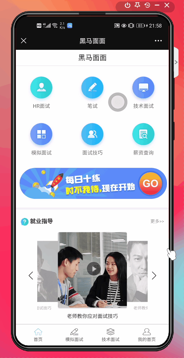
- 效果图


 2097
2097


 被折叠的 条评论
为什么被折叠?
被折叠的 条评论
为什么被折叠?
 到【灌水乐园】发言


