


 本文介绍了如何使用 Echarts 创建分类柱状图,详细讲解了配置项,包括设置各类目图例、监听 legend 事件以实现图例控制柱状条的隐藏与展示,以及图表的自适应窗口变化功能。
Echarts – 柱状图 分类
本次实现的 echarts 更以往有所不同,柱状图的分类情况:
每个柱状代表着不同的类目,同时通过 legend 来设置该类目是否展示。
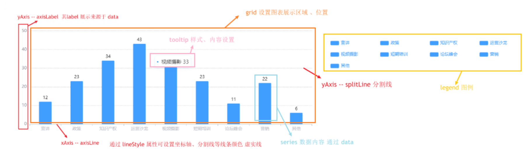
熟悉 echarts 配置项
首先来熟悉一下 echarts 各个部分的配置项
对echarts配置不太熟悉的情况下 可以参考 echarts 的配置项手册 ,通过各个项的配置调整图表的整体样式
/ 指定图表的配置项和数据
        var option = {
        	//--------------    标题 title  ----------------
            title: {
                text: '主标题',
                textStyle:{					//---主标题内容样式
                	color:'#fff'
                },
                subtext:'副标题',			//---副标题内容样式
                subtextStyle:{
                	color:'#bbb'
                },
                padding:[0,0,100,100]				//---标题位置,因为图形是是放在一个dom中,因此用padding属性来定位
            },

           	//----------------   图例 legend  -----------------
            legend: {
            	type:'plain',				//----图例类型,默认为'plain',当图例很多时可使用'scroll'
            	top:'1%',					//----图例相对容器位置,top\bottom\left\right
            	selected:{
            		'销量':true,			//----图例选择,图形加载出来会显示选择的图例,默认为true
            	},
            	textStyle:{					//----图例内容样式
            		color:'#fff',				//---所有图例的字体颜色
            		//backgroundColor:'black',	//---所有图例的字体背景色
            	},
            	tooltip:{					//图例提示框,默认不显示
            		show:true,
            		color:'red',
            	},
                data:[						//----图例内容
                	{
                		name:'销量',
                		icon:'circle',			//----图例的外框样式
                		textStyle:{
                			color:'#fff',		//----单独设置某一个图例的颜色
                			//backgroundColor:'black',//---单独设置某一个图例的字体背景色
                		}
                	},
                    {
                		name:'哈哈哈',
                         icon: 'image://' + imgSrc2 + '',  //----自定义图例来源于 url
                		textStyle:{
                			color:'#fff',		//----单独设置某一个图例的颜色
                			//backgroundColor:'black',//---单独设置某一个图例的字体背景色
                		}
                	}
                ],
            },

            //--------------   提示框 -----------------
            tooltip: {
            	show:true,					//---是否显示提示框,默认为true
            	trigger:'item',				//---数据项图形触发
            	axisPointer:{				//---指示样式
            		type:'shadow',
            		axis:'auto',

            	},
            	padding:5,
            	textStyle:{					//---提示框内容样式
            		color:"#fff",
            	},
            },

            //-------------  grid区域  ----------------
            grid:{
            	show:false,					//---是否显示直角坐标系网格
            	top:80,						//---相对位置,top\bottom\left\right
            	containLabel:false,			//---grid 区域是否包含坐标轴的刻度标签
            	tooltip:{					//---鼠标焦点放在图形上,产生的提示框
            		show:true,
            		trigger:'item',			//---触发类型
            		textStyle:{
            			color:'#666',
            		},
            	}
            },

            //-------------   x轴   -------------------
            xAxis: {
            	show:true,					//---是否显示
            	position:'bottom',			//---x轴位置
            	offset:0,					//---x轴相对于默认位置的偏移
            	type:'category',			//---轴类型,默认'category'
            	name:'月份',				//---轴名称
            	nameLocation:'end',			//---轴名称相对位置
            	nameTextStyle:{				//---坐标轴名称样式
            		color:"#fff",
            		padding:[5,0,0,-5],	//---坐标轴名称相对位置
            	},
            	nameGap:15,					//---坐标轴名称与轴线之间的距离
            	//nameRotate:270,			//---坐标轴名字旋转

            	axisLine:{					//---坐标轴 轴线
            		show:true,					//---是否显示

            		//------------------- 箭头 -------------------------
            		symbol:['none', 'arrow'],	//---是否显示轴线箭头
            		symbolSize:[8, 8] ,			//---箭头大小
            		symbolOffset:[0,7],			//---箭头位置

            		//------------------- 线 -------------------------
            		lineStyle:{
            			color:'#fff',
            			width:1,
            			type:'solid',
            		},
            	},
            	axisTick:{					//---坐标轴 刻度
            		show:true,					//---是否显示
            		inside:true,				//---是否朝内
            		lengt:3,					//---长度
            		lineStyle:{
            			//color:'red',			//---默认取轴线的颜色
            			width:1,
            			type:'solid',
            		},
            	},
            	axisLabel:{					//---坐标轴 标签
            		show:true,					//---是否显示
            		inside:false,				//---是否朝内
            		rotate:0,					//---旋转角度
            		margin: 5,					//---刻度标签与轴线之间的距离
            		//color:'red',				//---默认取轴线的颜色
                     rotate : 60                  //---倾斜label
            	},
            	splitLine:{					//---grid 区域中的分隔线
            		show:false,					//---是否显示,'category'类目轴不显示,此时我的X轴为类目轴,splitLine属性是无意义的
            		lineStyle:{
            			//color:'red',
            			//width:1,
            			//type:'solid',
            		},
            	},
            	splitArea:{					//--网格区域
            		show:false,					//---是否显示,默认false
            	},
                data: ["1月","2月","3月","4月","5月","6月","7月","8月","9月","10月","11月","12月"],//内容
            },

            //----------------------  y轴  ------------------------
            yAxis: {
            	show:true,					//---是否显示
            	position:'left',			//---y轴位置
            	offset:0,					//---y轴相对于默认位置的偏移
            	type:'value',			//---轴类型,默认'category'
            	name:'销量',				//---轴名称
            	nameLocation:'end',			//---轴名称相对位置value
            	nameTextStyle:{				//---坐标轴名称样式
            		color:"#fff",
            		padding:[5,0,0,5],	//---坐标轴名称相对位置
            	},
            	nameGap:15,					//---坐标轴名称与轴线之间的距离
            	//nameRotate:270,			//---坐标轴名字旋转

            	axisLine:{					//---坐标轴 轴线
            		show:true,					//---是否显示

            		//------------------- 箭头 -------------------------
            		symbol:['none', 'arrow'],	//---是否显示轴线箭头
            		symbolSize:[8, 8] ,			//---箭头大小
            		symbolOffset:[0,7],			//---箭头位置

            		//------------------- 线 -------------------------
            		lineStyle:{
            			color:'#fff',
            			width:1,
            			type:'solid',
            		},
            	},
            	axisTick:{					//---坐标轴 刻度
            		show:true,					//---是否显示
            		inside:true,				//---是否朝内
            		lengt:3,					//---长度
            		lineStyle:{
            			//color:'red',			//---默认取轴线的颜色
            			width:1,
            			type:'solid',
            		},
            	},
            	axisLabel:{					//---坐标轴 标签
            		show:true,					//---是否显示
            		inside:false,				//---是否朝内
            		rotate:0,					//---旋转角度
            		margin: 8,					//---刻度标签与轴线之间的距离
            		//color:'red',				//---默认取轴线的颜色
            	},
            	splitLine:{					//---grid 区域中的分隔线
            		show:true,					//---是否显示,'category'类目轴不显示,此时我的y轴为类目轴,splitLine属性是有意义的
            		lineStyle:{
            			color:'#666',
            			width:1,
            			type:'dashed',			//---类型
            		},
            	},
            	splitArea:{					//--网格区域
            		show:false,					//---是否显示,默认false
            	}
            },

            //------------ 内容数据  -----------------
            series: [
	            {
	                name: '销量',				//---系列名称
	                type: 'bar',				//---类型
	                legendHoverLink:true,		//---是否启用图例 hover 时的联动高亮
	                label:{						//---图形上的文本标签
	                	show:false,
	                	position:'insideTop',	//---相对位置
	                	rotate:0,				//---旋转角度
	                	color:'#eee',
	                },
	                itemStyle:{					//---图形形状
	                	color:'blue',
	                	barBorderRadius:[18,18,0,0],
	                },
	                barWidth:'20',				//---柱形宽度
	                barCategoryGap:'20%',		//---柱形间距
	                data: [3020, 4800, 3600, 6050, 4320, 6200,5050,7200,4521,6700,8000,5020]
	            }
            ]
        };
柱状图–分类配置及样式
const option = {
        //-------------  tooltip   ----------------
        tooltip: {
          trigger: 'item',
          extraCssText: 'box-shadow: 0px 2px 8px rgba(64, 158, 255, 0.15);',
          color: '#333',
          backgroundColor: '#fff', // 设置背景颜色
          textStyle: {
            color: 'black', // 设置文字颜色
          },
          // 坐标轴指示器配置项
          axisPointer: {
            type: 'shadow',
            shadowStyle: {
              color: 'rgba(127,196,251,0.3)',
            },
          },

          formatter (params) {
            const label = params.data[0]
            const data = params.data[1]
            return `  <span style="display:inline-block; margin-right:4px; width: 4px;height:4px;border-radius: 50%; background-color: 						#409eff; margin-bottom:3px"></span>
                      <span style="color: #333">${label}  <span style="color: #409EFF margin-left: 10px"> ${data} </span> </span>`
          },

        },

       //-------------  grid 区域  ----------------
        grid: { // 图标展示区域
          left: '3%', //  组件离容器左侧的距离。
          right: '45%',
          top: '5%',
          bottom: '10%',
          containLabel: true,
        },

        //-------------  legend 图例  ----------------
        legend: {
          // 图例布局朝向 'horizontal'
          orient: 'horizontal',
          // 图例每项之间的间隔。横向布局时为水平间隔,纵向布局时为纵向间隔。
          itemGap: 20,
          // 图例标记的图形宽度
          itemWidth: 24,
          itemHeight: 12,
          formatter: ['{a|{name}}'].join('\n'),
          textStyle: { // 图列内容样式
            // width: 130,
            fontSize: 14,
            color: '#409EFF', // 字体颜色
            textBorderType: 'solid',
            // 在 rich 结合 formatter ,可以自定义富文本样式。利用富文本样式,在标签中做出非常丰富的效果
            rich: {
              a: {
                width: 90,
                verticalAlign: 'middle',
              },
            },

          },
          x: '58%', // 图例位置,设置right发现图例和文字位置反了,设置一个数值就好了
          y: '12%', // 延Y轴居中,

        },
 	    //-------------  x 轴  ----------------
        xAxis: {
          data: xArr,
          axisLine: { // 坐标轴
            lineStyle: {
              color: '#C2C4CC',
            },
          },
          axisLabel: { // 坐标轴标签
            show: true,
            interval: 0,
            textStyle: {
              color: '#C2C4CC',
            },
          },
        },

        //-------------  y 轴  ----------------
        yAxis: [
          {
            type: 'value',
            axisLabel: {
              show: true,
              textStyle: {
                color: '#909399',
                margin: 15,
              },
            },
            axisLine: {
              lineStyle: {
                color: '#fff',
              },
            },
            splitLine: { // 分割线配置
              show: true,
              lineStyle: {
                color: '#C2C4CC',
                type: 'dash',
              },
            },

          },
        ],
        color: ['#409EFF'], // 柱状图的颜色
        //-------------  series    ----------------
        series: series,
      }
series 配置、设置各类目图例
series 中 name 属性对应 图例的 label展示,
data 数据用于图标中的数据展示,
在这次的项目中 series 数据需要手动处理成对象数组形式,每一项对应一个类目 。
  // X轴的 label来源
      var xArr = ['宣讲', '政策', '知识产权', '运营沙龙', '视频摄影', '短期培训', '论坛峰会', '营销', '其他']
      // label 对应的数值
      var yArr = [12, 23, 34, 43, 33, 23, 11, 22, 6]
      var series = []
      // 设置 series 数据   series的 name 用于对用 legend 图例展示
      for (let i = 0; i < xArr.length; i++) {
        series.push({
          name: xArr[i],
          type: 'bar',
          barWidth: '40%',  // 柱状的宽度
          barGap: '-100%', // 不同系列的柱间距离
          // 数据处理传入 series 用于展示柱状数据
          data: [
            [xArr[i], yArr[i]],
          ],
          // 数据展示样式
          itemStyle: {
            normal: {
              barBorderRadius: [2, 2, 0, 0],
              // 柱状图 展示 label
              label: {
                show: true,		// 开启显示
                position: 'top',	// 在上方显示
                textStyle: { // 数值样式
                  color: 'black',
                  fontSize: 12,
                },
              },
            },
          },
        })
      }
监听 legend 事件
由于本次需求实现的是分类情况下的柱状图,每个柱状数据相互独立,并通过 legend 设置 该类目的隐藏与展示。但此时我们无法通过 legend 设置柱状图的展示与否,需要通过监听 legendselectchanged ,判断当前所有 legend 状态,显示对应类目的柱状条。
 // 监听 legend 点击事件  判断该字段是否展示 并渲染
      echart.on('legendselectchanged', function (params) {
        const { selected } = params
        const arr = []

        // 通过 for...in 遍历对象中的属性
        for (const key in selected) {
          if (!selected[key]) {
            arr.push(key)
          } else {
            // 展示 点击的字段
            if (xArr.indexOf(key) === -1) {
              xArr.push(key)
            }
          }
        }
        // 从x坐标中移除 false 的字段
        arr.map(item => {
          const index = xArr.indexOf(item)
          if (index !== -1) {
            xArr.splice(index, 1)
          }
        })
        echart.setOption(option)
     })
图表自适应
当页面窗口改变时 通过 echart.resize() 方法设置 echarts 自适应
// echarts 自适应
setTimeout(() => {
    window.onresize = function () {
    	echart.resize()
    }
}, 20)
效果实现
  renderChart () {
      // X轴的 label来源
      var xArr = ['宣讲', '政策', '知识产权', '运营沙龙', '视频摄影', '短期培训', '论坛峰会', '营销', '其他']
      // label 对应的数值
      var yArr = [12, 23, 34, 43, 33, 23, 11, 22, 6]
      var series = []
      // 设置 series 数据   series的 name 用于对用 legend 图例展示
      for (let i = 0; i < xArr.length; i++) {
        series.push({
          name: xArr[i],
          type: 'bar',
          barWidth: '40%',  // 柱状的宽度
          barGap: '-100%', // 不同系列的柱间距离
          // 数据处理传入 series 用于展示柱状数据
          data: [
            [xArr[i], yArr[i]],
          ],
          // 数据展示样式
          itemStyle: {
            normal: {
              barBorderRadius: [2, 2, 0, 0],
              // 柱状图 展示 label
              label: {
                show: true,		// 开启显示
                position: 'top',	// 在上方显示
                textStyle: { // 数值样式
                  color: 'black',
                  fontSize: 12,
                },
              },
            },
          },
        })
      }
      const option = {
        //-------------  tooltip   ----------------
        tooltip: {
          trigger: 'item',
          extraCssText: 'box-shadow: 0px 2px 8px rgba(64, 158, 255, 0.15);',
          color: '#333',
          backgroundColor: '#fff', // 设置背景颜色
          textStyle: {
            color: 'black', // 设置文字颜色
          },
          // 坐标轴指示器配置项
          axisPointer: {
            type: 'shadow',
            shadowStyle: {
              color: 'rgba(127,196,251,0.3)',
            },
          },

          formatter (params) {
            const label = params.data[0]
            const data = params.data[1]
            return `  <span style="display:inline-block; margin-right:4px; width: 4px;height:4px;border-radius: 50%; background-color: 						#409eff; margin-bottom:3px"></span>
                      <span style="color: #333">${label}  <span style="color: #409EFF margin-left: 10px"> ${data} </span> </span>`
          },

        },

       //-------------  grid 区域  ----------------
        grid: { // 图标展示区域
          left: '3%', //  组件离容器左侧的距离。
          right: '45%',
          top: '5%',
          bottom: '10%',
          containLabel: true,
        },

        //-------------  legend 图例  ----------------
        legend: {
          // 图例布局朝向 'horizontal'
          orient: 'horizontal',
          // 图例每项之间的间隔。横向布局时为水平间隔,纵向布局时为纵向间隔。
          itemGap: 20,
          // 图例标记的图形宽度
          itemWidth: 24,
          itemHeight: 12,
          formatter: ['{a|{name}}'].join('\n'),
          textStyle: { // 图列内容样式
            // width: 130,
            fontSize: 14,
            color: '#409EFF', // 字体颜色
            textBorderType: 'solid',
            // 在 rich 结合 formatter ,可以自定义富文本样式。利用富文本样式,在标签中做出非常丰富的效果
            rich: {
              a: {
                width: 90,
                verticalAlign: 'middle',
              },
            },

          },
          x: '58%', // 图例位置,设置right发现图例和文字位置反了,设置一个数值就好了
          y: '12%', // 延Y轴居中,

        },
 	    //-------------  x 轴  ----------------
        xAxis: {
          data: xArr,
          axisLine: { // 坐标轴
            lineStyle: {
              color: '#C2C4CC',
            },
          },
          axisLabel: { // 坐标轴标签
            show: true,
            interval: 0,
            textStyle: {
              color: '#C2C4CC',
            },
          },
        },

        //-------------  y 轴  ----------------
        yAxis: [
          {
            type: 'value',
            axisLabel: {
              show: true,
              textStyle: {
                color: '#909399',
                margin: 15,
              },
            },
            axisLine: {
              lineStyle: {
                color: '#fff',
              },
            },
            splitLine: { // 分割线配置
              show: true,
              lineStyle: {
                color: '#C2C4CC',
                type: 'dash',
              },
            },

          },
        ],
        color: ['#409EFF'], // 柱状图的颜色
        //-------------  series    ----------------
        series: series,
      }
      const echart = echarts.init(this.$refs.activeChart)
      echart.setOption(option)

      // 监听 legend 点击事件  判断该字段是否展示 并渲染
      echart.on('legendselectchanged', function (params) {
        const { selected } = params
        const arr = []

        // 通过 for...in 遍历对象中的属性
        for (const key in selected) {
          if (!selected[key]) {
            arr.push(key)
          } else {
            // 展示 点击的字段
            if (xArr.indexOf(key) === -1) {
              xArr.push(key)
            }
          }
        }
        // 从x坐标中移除 false 的字段
        arr.map(item => {
          const index = xArr.indexOf(item)
          if (index !== -1) {
            xArr.splice(index, 1)
          }
        })
        echart.setOption(option)
      })

      // echarts 自适应
      setTimeout(() => {
        window.onresize = function () {
          echart.resize()
        }
      }, 20)
    },


 扫一扫
扫一扫


 8389
8389

 被折叠的 条评论
为什么被折叠?
被折叠的 条评论
为什么被折叠?
 到【灌水乐园】发言


