


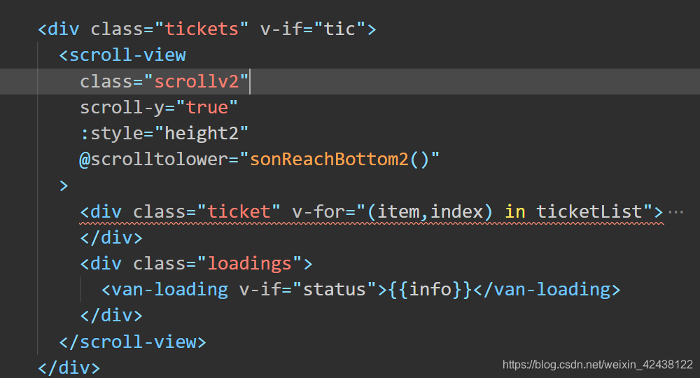
这是代码图,外围tic里面嵌套一个scroll-view。
:style=“height”
就是自适应的高度,要经过计算。
我们在data里面计算height属性
// 获取屏幕的高度
let windowHeight = wx.getSystemInfoSync().windowHeight;
// 获取屏幕的宽度
let windowWidth = wx.getSystemInfoSync().windowWidth;
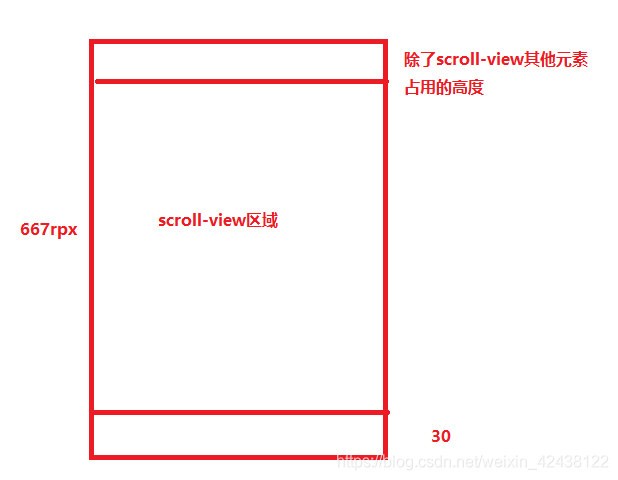
this.scroll_height = windowHeight * 750 / windowWidth - (除了scroll-view其他元素占用的高度)- 30;
this.height = "height:" + this.scroll_height2 + "rpx";
举个例子 ,假设开发页面的iphone6/7/8,高度是667rpx,那么下图的scroll-view区域换其他屏幕也是不会变的,就好像设置了比例一样。
贴上样式代码:
.tickets {
  margin-top: 20rpx;
}
.scrollv2 {
  margin-top: 15rpx;
  margin-bottom: -85rpx;
}


 502
502


 被折叠的 条评论
为什么被折叠?
被折叠的 条评论
为什么被折叠?
 到【灌水乐园】发言


